2022 Collab: Week 19 “Sci-fi weapons” - CLOSED

This is the Blender collaboration 2022, week 19 challenge. Don’t be afraid to join, a lot of us are beginners. This is all to practice, have fun, learn, and get together.

This week’s subject is “Sci-fi weapons”.

  • Science fiction is fiction based on imagined future scientific or technological advances and major social or environmental changes, frequently portraying space or time travel and life on other planets. Let your imagination go wild and create your own sci-fi themed weapon!

  • Subject selected by the previous week 17 “Character & Posing" winner: Cathy_N

The rules are simple. 1 subject, 1 entry, 1 week.
You create whatever object or scene or whatever you can think of that has something to do with the subject. It can be as simple or complicated as you want, all entries are welcome!
Post your picture here in this thread. And at the end of the week, we start to vote. And if you are the winner, you may choose the next subject and win a unique badge.

Deadline: 2022-05-14T21:55:00Z

If you want to stay informed of the @ BlenderCollab ?
Subscribe or unsubscribe to this “BlenderCollab” group.

5 Likes

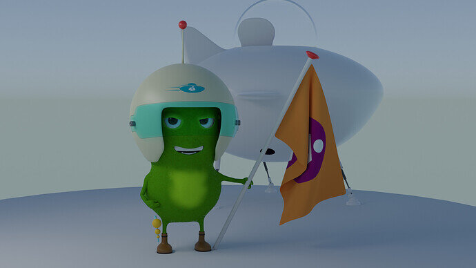
Old project …

11 Likes

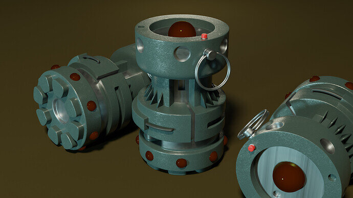
Another old project: Maxantium grenade.
Part of the 2D art course by Grant, here on Gamedev.
I converted the 2D concept art into Blender 3D.

9 Likes

Oh! That is a cool subject! I hope I’ll get enough time for working on it! :slight_smile:

@Cathy_N did you intend this subject to cover hand-held scify weapons… or any scify weapon? Like a scify ICBM or weapon mounted on scify space ship or scify weapon turret? All of those are cool to work on :smiley:

3 Likes

I intended to include weapons of all types and sizes! It doesn’t matter whether it’s a spaceship with canons, LRAD, laser handgun or some sort of environmental weapon! In other words, I’d like to see some sci-fi madness! :laughing:

5 Likes

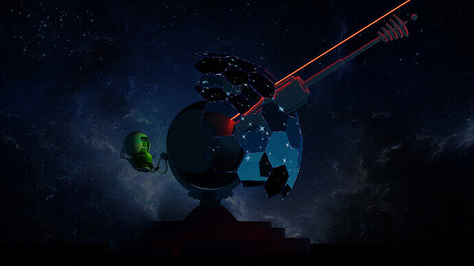
WIP. It’s the same problem with my latest projects. The computer becomes so slow.
Low poly, but then material nodes design and composition slows down the project. Cycles glow configuration with Cryptomat slower and slower.

I want to add so many details …

10 Likes

Oh but that looks awesome!

maybe bake them down and use just as simple textures (even at lower res) - till you are ready for ‘final render’?

I want you to do it :eyes:

4 Likes

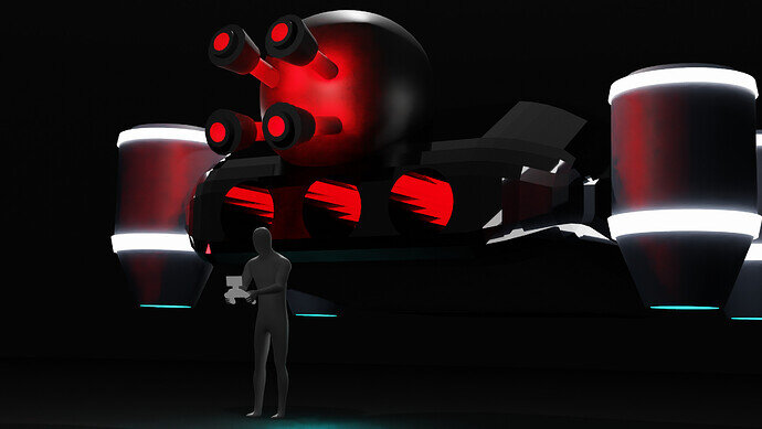
I thought I might make something this week. Needed to practice trying out quick ideas and desgins. So I thought of this idea of a massive drone like thing hovering behind a regular person. I have purposely made most of the drone hard to see so it kind of blends into the background in some points to make you assume their might be more of it.

7 Likes

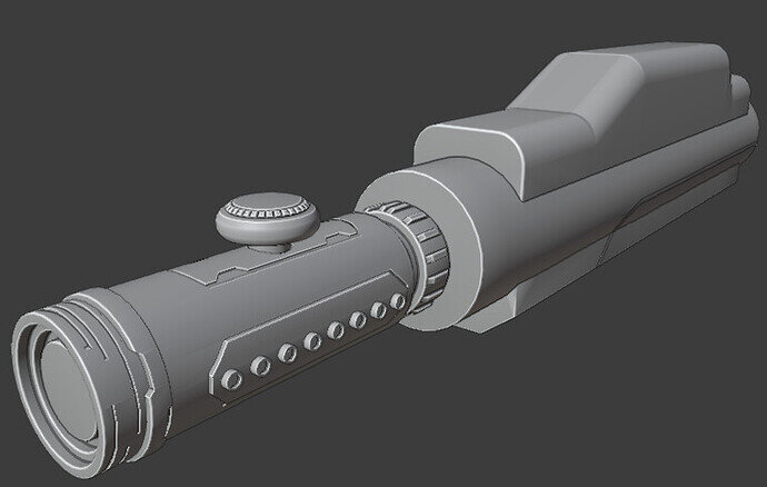
Hard-surface modeling is really hard for me personally so I’m trying to get better at it this week. I got the Boxcutter add-on which is absolutely amazing and so worth getting. I’ll get the Hard Ops one too as soon as I’m more familiar with Boxcutter tools. So far I’m following a couple of tutorials. I’m trying to add my own details but it’s really difficult to come up with a unique mechanical design at this point. I finished the tip of the gun and have no idea what the rest of it is going to look like… :woozy_face:

6 Likes

looks cool! and doesn’t look like it’s something you might have struggled with!

BoxCutter+HOps are excellent for hard surface.

I might have even followed some of the same ones in the past :blush:

References, references and more references for inspiration! :slight_smile:

(and yeah, mechanical design is not easy)

3 Likes

it’s not that much modeling, but material tweaking and node configuration. A slow process.

11 Likes

It’s been a struggle! I nearly quit twice from frustration! I did get a better grasp of the Boxcutter though. Hopefully, with practice I can come out with something more elaborate.
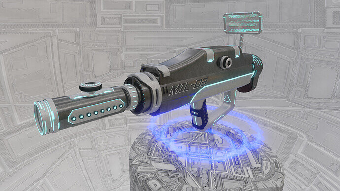
The idea is that this gun has an automatic targeting system. That’s why there’s no trigger.

11 Likes

But then, you still need it to point it in the right direction …?

2 Likes

There’s a handle at the bottom, all you need to do is hold the gun and point it in the enemy’s direction. The targeting system automatically marks the enemies and triggers the gun to shoot. That’s the concept I had in mind :grinning:

3 Likes

We @BlenderCollab have a few days to vote. You can vote fast but also think slowly about design, colors, technique, difficulty, subject, realism, etc. Choose consciously and not on your own entry.
And the new subject week 20 “Spaceships” has already started. The winner of this week’s “Sci-fy Weapons” challenge may select a subject for week 21.


4 Likes

Awesome stuff, guys! Glad to see you’ve kept the collab going!

2 Likes

Welcome back …?

Congratualtion FedPete!

  • Cathy_N - Form follows function! Even with imaginary weapons. The way we should hold the weapon is puzzling. The design is good, nicely done hard surface. But the (background) presentation could be improved.
  • Oliver_Noone-Jones - It is a nice design, but difficult to “read”. The drone platform, could function as anything. Add more details so viewers get the feeling (reading the image) it’s a weapon. The person in front is a really good way to give scale to things. May add it to the current collab spaceships.

Notes FedPete:
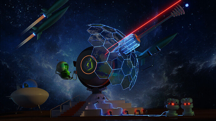
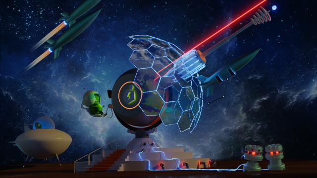
I struggled a lot with my entry! It got cluttered.
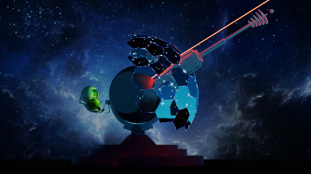
I really like my first concept, simple to the point, with good focus. But not so much Blender.
My goal was to add a reflection of the universe to the magnetic shield and how to make it a magnetic shield …
So I added stuff, working with light because it is a dark scene.
But then, too much blue at the right side of the scene, which made it look heavier (out of balance). Adding more weight on the left side by adding an unnecessary spaceship. Which left the left top corner empty, so I added quickly a couple of rockets … adding more and more …
Then the magnetic shield was a big problem. First I created earth outside the view field but reflected by the shield dome. Didn’t work as I expected, lot of long renders … I used an image plane, something better but not the results I needed.
Then I discovered that the hexagon dome faces do have strong angles. Impossible to reflect a planet on all dome faces. So I switched over to a UVMap with an image map. But then my earth bitmap doesn’t have enough DPI to show high details on the dome. You can see Europa but pixelated. The same problem I have with my entry for spaceships. Using 8k maps isn’t sufficient I need 24K or so … And now I see the red circle is off. Too much attention and it is weapon color. Better used green, alien color schema. Decisions, decisions …

So what do you think … A or B testing?

Simple or detailed design, what your opinion?
  • Sci-Fy_Weapon03b
  • Sci-Fy_Weapon18b

0 voters

Have fun. Keep practicing. Redo an old project and see if you could do it faster and better …

CU FedPete.

2 Likes

They both look great. I prefer the simpler one because I think it has a clearer focus.

1 Like

Privacy & Terms