The difference here is that the examples linked to the explanation were all without textures, it seemed, so I thought that was an element. In the previous low poly, the criteria was simply 1000 tris.
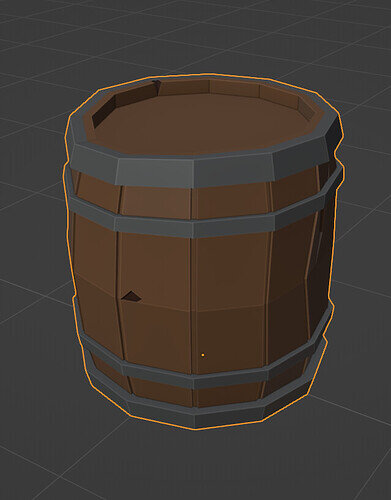
Yes, this time my intention was to aim not in some polygon count, but to aim at low poly art style. It usually has low triangles… but not always! For example, this barrel (not a submission):
is 1082 triangles… but it has this art style… The helmet I made in previous collab had less triangles (1000), but is not in the low poly art style.
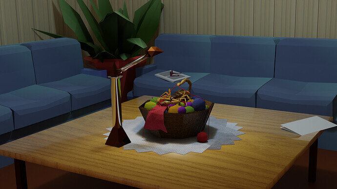
Is that a scorpion yarn and needle holder, or is the scorpion knitting?!? 
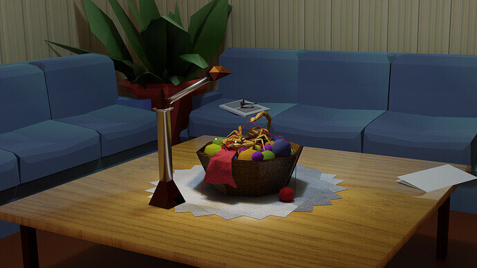
I feel it could use some slightly stronger lighting to accentuate it, it’s such a stand out element of the scene, but it’s hard to see at first.
My eye is drawn to the metallic holder as the main focal point, which might not be what you want?
I also like the newspaper and glasses in the back, but I wonder how the scene would look with some more depth of field.
yes, the scorpion is knitting… Thanks for the feedback. I’ll see if I can improve the lighting. I can see the scorpion and what it’s doing perhaps because I know it’s there and what it’s doing, hahahahaha! And no, the metallic holder is not the focal point. I tried to make it that the scorpion knitting is discovered as you look at the scene, but if it is hard to tell what it is doing, then this is not successful. As for depth of field  no idea how to change that.
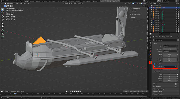
If you select your camera, then go to it’s properties, you can check Depth of Field:
Then you can either manually adjust the focus or select an object for it to auto focus on.
Great! thanks. I knew I’d seen that somewhere.
Nice Construction. Something Ancient Greek about it.
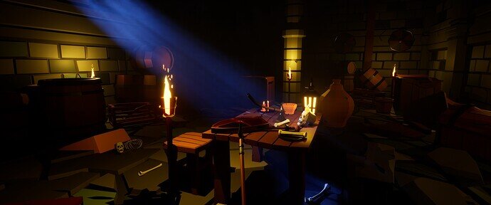
I challenged myself to make multiple objects that have exactly the same style and theme.
Here's a close up of each model.
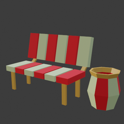
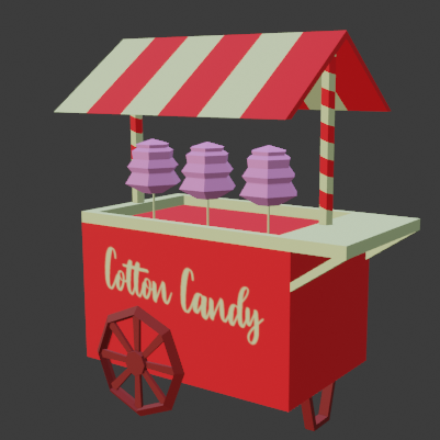
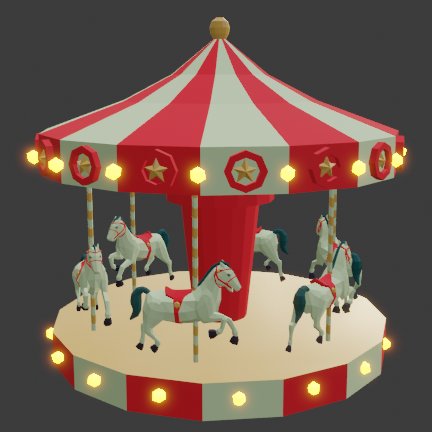
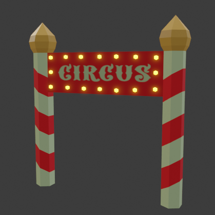
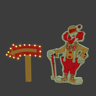
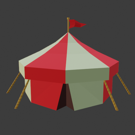
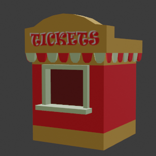
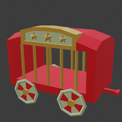
Very nice. Looks like you were a busy bee. 
Oh, I barely made it. Breakdown will be in Modular dungeon final project - WIP/Diary as the models are the part of that project.
Thanks! Not really… I reused a couple of objects from my previous projects so it didn’t take much time at all to finish it! 
We @BlenderCollab have a few days to vote. You can vote fast but also think slowly about design, colors, technique, difficulty, subject, realism, etc. Choose consciously and not on your own entry.
And the new subject [week 19 “Sci-fi Weapons” has already started. The winner of this week’s “Low poly art style game props” challenge may select a subject for week 20.
Breakdown is ready. Here is direct link to the post: Modular dungeon final project - WIP/Diary - #30 by bOBaN
And I made a short video from that dungeon room:
Are you moving with First Person Shooter model? In which engine, unity or unreal?
Yes, FPP controller in unreal.
@bOBaN , congratulations for your low poly game assets presentation. Such a fun dungeon to display all kinds of low poly products in a particular style. The composition is very well done and the blue haze give a nice contract to the used color schema.
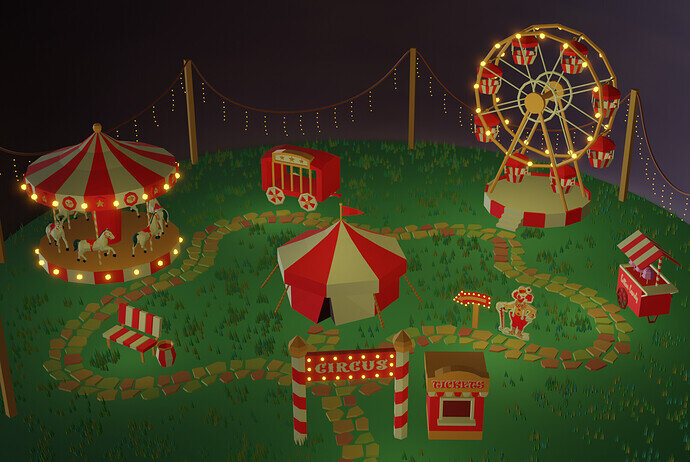
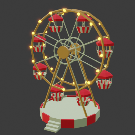
- Cathy_N - I like the theme of an amusement park. Like bOBaN using a theme for game props is a good idea. I do miss some variation in colors used. It’s like the used colors are the theme not the amusement park.
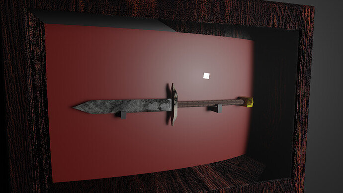
- Suryansh - The weapon is a good example of a low poly game prop! But, if you removed the wooden frame then you have more room for weapon variants on the wall. It would be a good example of game props. What is making me curious, is the white square?
- mimsybean - I like what you did, but someone else already mentioned it. Parts (scorpion) are barely distinguishable from the rest. They cling together as it were. In the center of the image, there’s much going on; a plant, a book/glasses, a lamp, a knitting basket, and a scorpion. Try to put more effort in composition. The objects are really good examples of low poly!
Lol, it is the area light’s reflection “XD” 

I also noticed that after 2 days of submitting my submission, so I left it untouched.
Ahh, yes, I’ve had the same ‘light’ experience … 


