2021 Collab: Week 26 “Meadow” - CLOSED

This is the Blender collaboration 2021, week 26 challenge. Don’t be afraid to join, a lot of us are beginners. This is all to practice, to have fun, to learn, and get together.

This week’s subject is “Meadow”.

  • Meadow - A meadow is an open habitat, or field, vegetated by grass, herbs and other non-woody plants. Meadows may be sparsely covered with trees or shrubs, as long as they maintain an open character. They may be naturally occurring or artificially created from cleared shrub or woodland.
  • Subject selected by the previous week 24 winner Mateusz - “Neon”

The rules are simple. 1 subject, 1 entry, 1 week.

You create whatever object or scene or whatever you can think of that has something to do with the subject. It can be as simple or complicated as you want, all entries are welcome!
Post your picture here in this thread. And at the end of the week, we start to vote. And if you are the winner, you may choose the next subject.

Deadline: 2021-07-03T21:55:00Z

1 Like

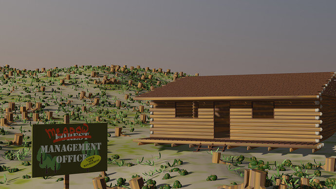
Under new management.

7 Likes

Nice entry.
I think, your last week forest entry is more “Meadow”. But, to be honest, no clue what ‘meadow’ really is.

Can I change my submission?

Yes you can, deadline is in 7 days.

Ok

Here is my final submission

9 Likes

A meadow is a grassy field.

Meadow definition , a tract of grassland used for pasture or serving as a hayfield.

Used for grass eating livestock. It might be let to grow and cut for winter forage, hay, too. Predominantly lowland grassland, not higher hill pasture land. Strongly linked to ‘flower meadow’ as once probably before modern chemical sprays such grassland would usually have a mix of flowers in it.
Lush, green, strongly growing with flowers grassland.

1 Like

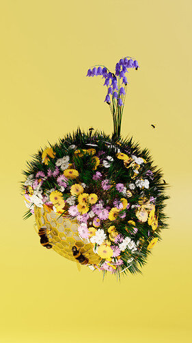
Hi. My submission for this week. Keeping it the same style like last week. Thinking of making series of few nature spheres. It’s a joy to make them.

10 Likes

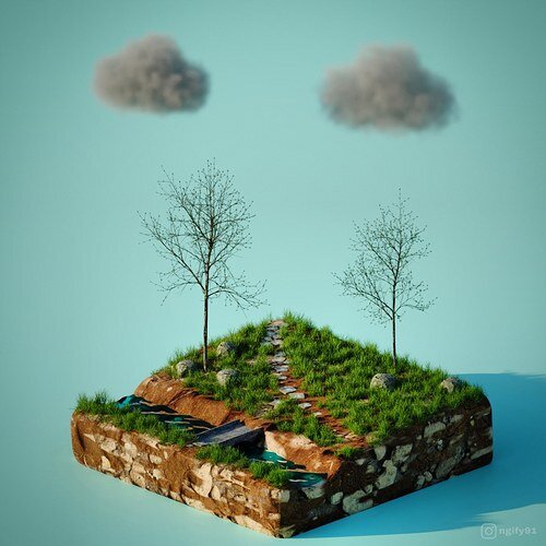
Your entry is amazing but I think there are two things that kinda ruin it; the clouds are way too similar killing the realism of the piece, and same for the trees, I can clearly see you just inverted them, which is fine to save time but the human eye tends to pick these things up very quickly, another rotation might help.

Other than that, I love your scene.

1 Like

That would be cool! I like this one. Especially the bees. I think it would benefit from a different background color though. Something like a light blue might make the yellows in the sphere pop more.

3 Likes

Thanks for the feedback.
I was experimenting with different colours background and the honey was getting saturated with them. I havent play much with it. I my change it but with this background I was trying to enfycise warm summer noon time. So I’d have a nigh, sunrise, noon and sunset theme.

1 Like

Thanks buddy for your suggestions. Actually I have learnt smoke simulation lately. After getting a decent result I was so exited that I hit the render button without thinking other.

3 Likes

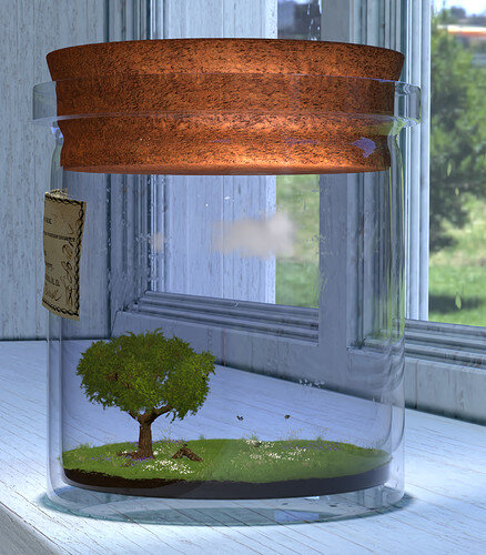
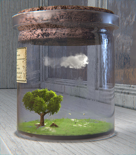
I practiced a lot of skills for this one, it was good for routines.
I also learned about the Volume object and using the Volume to Mesh modifier for the clouds in the vial.

6 Likes

Excellent :ok_hand:

If you want to preserve something (keeping it in a bottle/jar).
I would have chosen a more desolate (different) environment.
Looking outside the window and to see nature …?
But it’s more my way of thinking.

The glass, could have more glass properties (bevel, old stained glass).

3 Likes


here’s mine.

3 Likes

hi,@Digitz
You can render it on (cycles) to get better results
cycles can be used for realism
nice work BTW

@Yash2009 thank you, although I’m not too sure what made you think I didn’t render with Cycles. Denoising maybe or that it didn’t come out looking as realistic as I was trying for I suppose.

@FedPete I appreciate your feedback as always. I tried setting up a more desert type look outside the window. I thinned out the glass mesh on the vial, and added some more defined details like grunge and fingerprints to the window and vial glass too.

Lastly I thickened up the little cloud and adjusted the lighting, the colors were looking a bit too saturated.

9 Likes

Privacy & Terms