2022 Collab: Week 48 "Office supplies" - VOTE CLOSED

This is the Blender collaboration 2022, week 48 challenge. Don’t be afraid to join, a lot of us are beginners. This is all to practice, have fun, learn, and get together.

This week’s subject is “Office supplies” .

  • “Office supplies" are consumables and equipment regularly used in offices by businesses and other organizations, by individuals engaged in written communications, recordkeeping or bookkeeping, janitorial and cleaning, and for storage of supplies or data. The range of items classified as office supplies varies, and typically includes small, expendable, daily use items, consumable products, small machines, higher cost equipment such as computers, as well as office furniture and art.
  • Subject selected by the previous Week 46 “Gnomes” winner: FedPete

The rules are simple. 1 subject, 1 entry, 1 week.
You create whatever object or scene or whatever you can think of that has something to do with the subject. It can be as simple or complicated as you want, all entries are welcome!
Post your picture here in this thread. And at the end of the week, we start to vote. And if you are the winner, you may choose the next subject and win a unique badge.

Deadline: 2022-12-03T22:55:00Z

If you want to stay informed of the @ BlenderCollab ?
Subscribe or unsubscribe to this “BlenderCollab” group.

5 Likes

Eevee render

12 Likes

12 Likes

Add a switch, cable?

5 Likes

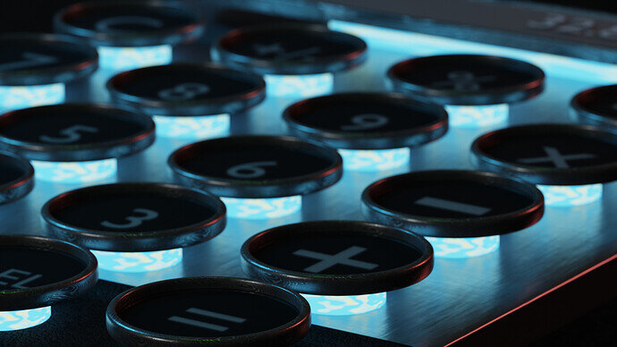
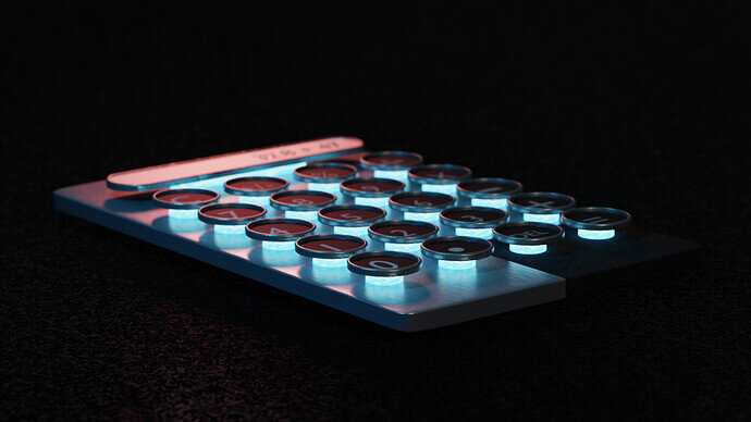
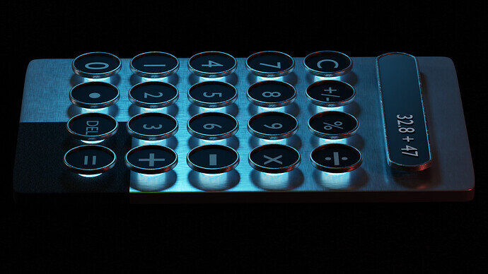
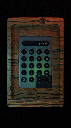
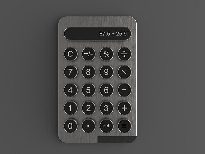
MODERN CALCULATOR


Refrence

Please use the second render for voting purposes.

I hope you all liked it. :innocent: :innocent:

19 Likes

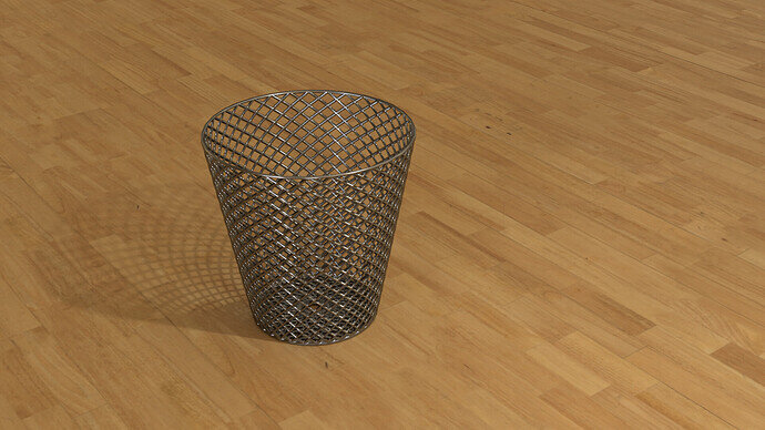
Essential filing equipment.

13 Likes

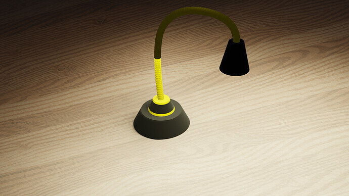
It works with batteries and you turn it off/on by clapping. Welcome to the future… … … or… the past, I don’t know.

5 Likes

Sure!
But it makes it more interesting to look at.
The basic (iconic) shapes are there, next step is to add at certain location more details.


  • Iconic shapes
  • Primary shapes
  • Secondary shapes (distribution of details)
  • Tertiary shapes (negative shapes).
2 Likes

Yes

3 Likes

“Essential filling equipment” - that is so on the spot, it is hilarious :grinning_face_with_smiling_eyes: :+1: :+1: :+1: :+1: :+1:

3 Likes

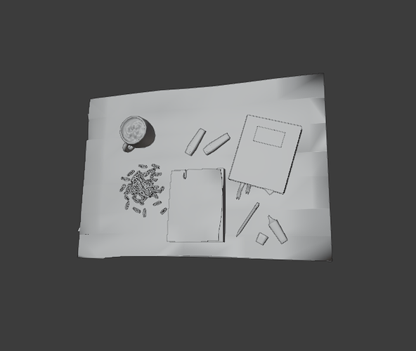
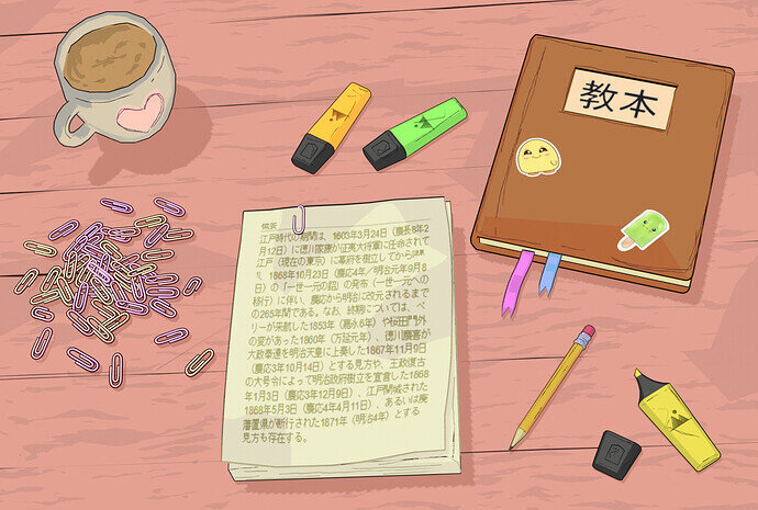
Here’s my entry ( pic 2). I finally managed to free up some time for the weekly challenge. I’ve never made a cel shader before so I decided to give it a try. The scene really does look like a 2D image which is pretty cool. It’s very different to what I’m used to making. I’ll leave a solid mode screenshot for comparison. P.S. Don’t mind shading artefacts in the first pic, they were necessary to achieve the result I was going for! :grinning_face_with_smiling_eyes:

19 Likes

It is just so great. I am getting confused about where you used normal maps and where you modeled the mesh for 3D looks. Like the shading on the tea, it seems that you modeled the tea surface to be a bit uneven, and for the heart shape on the cup, you used a normal map. Am I right? Well, whatever it is, it is just perfect. :star_struck: :star_struck:

3 Likes

Thank you so much! I might as well break down the entire scene!
The only object that has a normal map plugged in is the table (the wood pattern is made procedurally with a couple of noise textures). As for the mug, I added the tea part to a vertex group and applied the Displace modifier with a cloud texture to it. The heart is basically an image texture mixed with the toon shader, and the dark outline around it is a grease pencil object. Paperclips are set to pick a random colour within the range of 4 shades, their position is a result of a drop simulation. I made a particle system around a sphere with paperclips as the rendered object, gave them random rotation and then played a drop simulation.
Overall, each object has an outline made with the inverted hull method ( all meshes are duplicated, scaled up and their normals are flipped inside out), and I also added a few thin squiggly lines on the surface with a grease pencil to make the scene look like it was drawn by hand. It’s a very fast and different workflow as geometry doesn’t matter as much, and it’s all about setting up the light correctly and adjusting the colours.
I got the impression that toon shader makes everything look good no matter how simple or complex your geometry is, so I feel like it’s more about choosing the style and colour scheme of your composition rather than being very precise and technical with your setup. I will definitely play with it more, it was quite refreshing and fun :smiley:

4 Likes

still a quite bit to do

11 Likes

12 Likes

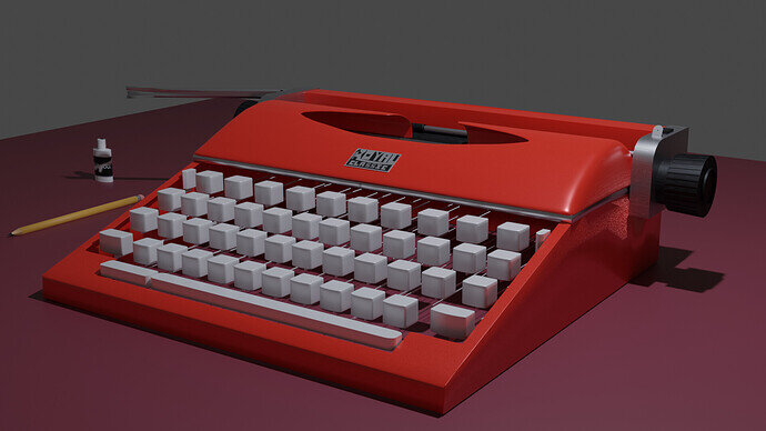
I couldn’t think of anything interesting to make, so I decided to try a texturing technique I haven’t tried before.

11 Likes

This is my participation.


There are some little things I would like to change but I don’t know if I will have the time. In any case, let me know what you think.

12 Likes

Did I make it on time?

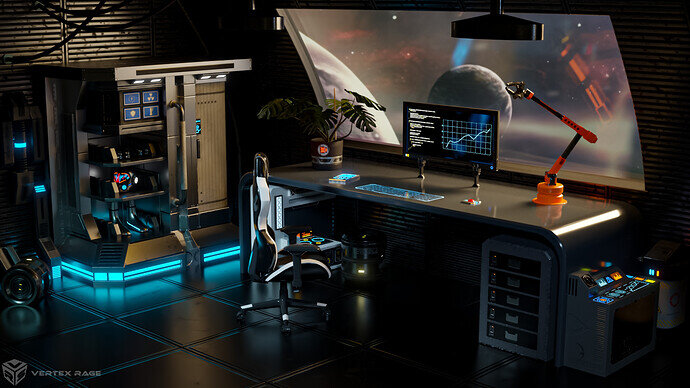
Long time didn’t participate and finally managed to squeeze some time for Collab :partying_face:.

Instead of just office supplies… I made an office… and office on a space station.

Some more info

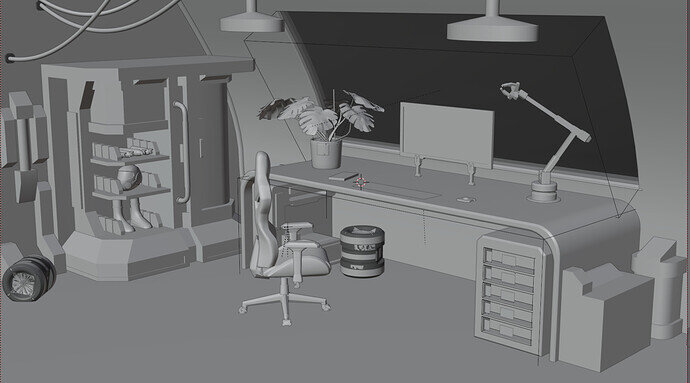
Here is viewport:

I did re-use some of my old models, esp. the one I describe doing here: Making hard surface models for games and Fusion Core Mk II - hard surface doodle .

The plant I found on blenderswap (CC0) by Simon_M and modified it to fit on the space station.

The chair is CC-BY from sketchfab. “Gaming chair” (https://skfb.ly/6VDIv) by snjvsngh_negi is licensed under Creative Commons Attribution (http://creativecommons.org/licenses/by/4.0/).

Edit: replace the file with fixed one (uploaded not final version previously :sweat_smile: )
Edit2: Made artstation page for this one: https://www.artstation.com/artwork/B3rl66

8 Likes

not much time this week so this is it for me


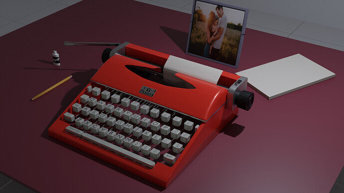
Photo by Jessica Rockowitz on Unsplash

8 Likes

Privacy & Terms