Remember, I will pick the last uploaded entry!
You mean in terms of my two posted entries or do you mean to say that the winner will be the last who posts here? 
I believe what @FedPete means he will choose each entrant’s last/final version of her/his entry.
Some folks post entries while they work through their projects, so he wants every one to know the last version of their project will be the one he’ll choose for the Collab, unless, of course, you tell him otherwise.
Hope that helps.
Thank you, Miss B 
I just wanted to tease FedPete a bit with this question 
Hello, i hope i’m not too late.
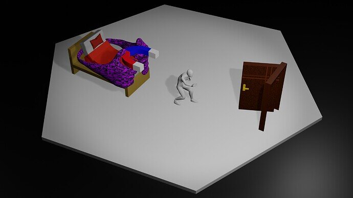
This image explains how difficult it is for someone to fight his shadow. The “bed” in here represents Shadow, how laziness and doing nothing are such a pleasure things but we don’t realize that it actually leads us to something bad for our life
And the “door” in here represents Light, how hard for us to start and keep improving (grinding) consistenly. Also the door is a symbol of opportunity. We never know what will happen to our future. But if we keep learning as long as there is a way, i believe we will find Amazing Life in our future 
I’m sorry for my bad english 
We @BlenderCollab have a few days to vote. You can vote fast but also think slowly about design, colors, technique, difficulty, subject, realism, etc. Choose consciously and not on your own entry.
And the new subject week 48 “Office Supplies” has already started. The winner of this week’s “Light and Shadow” challenge may select a subject for week 1 2023 and wins a badge.
0 voters
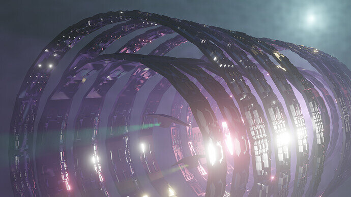
I saw that one! Really cool. It made me want to make some big sci-fi structures. “Greebles” could be a cool challenge topic, but I don’t know how wide-reaching it would be. Awesome submission, by the way.
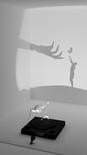
@zeRgenTa Your submission is really clever. How did you figure out how to place the things in the right places to make the shadow like that?
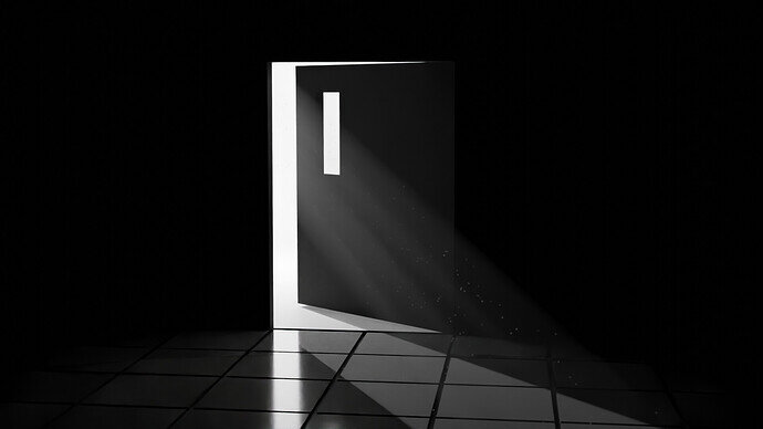
@Ginger I like this a lot! Simple, but well-composed and compelling.
@FedPete I watched that whole workshop after seeing your link. Interesting to see how to quickly build massive structures/environments like this in a more controlled way than using geo nodes. I must try this out myself some time.
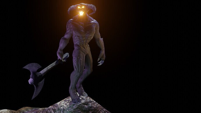
@Jack_Mak_Morn Very nice sculpt. I especially like the abs, pecs, and shoulders. Is it meant to be as big as in LOTR? Can’t get a good grasp of its scale
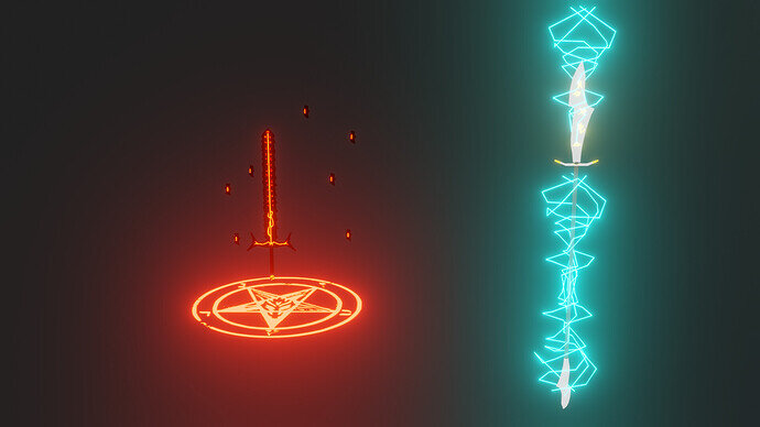
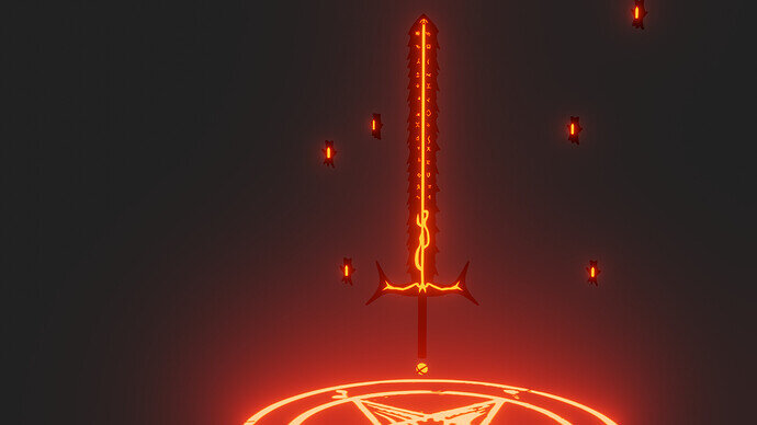
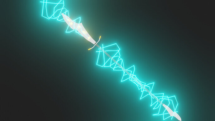
@Cows I was looking forward to seeing what you guys come up with together. Interesting weapon variations from you though. Suitable for strong heroes
@Ginger I originally wanted to do something like this with my last weeks collab entry. Nice volumetric lighting. Eevee or Cycles?
@zeRgenTa Very clean and artistic. Nice take on light and shadows. I’m also curious about your process.
@falfalfal19 You had a very symbolic light and shadow submission. But I like your idea, because I’m very symbol-minded myself 
@Tyger2
Thanks, that’s nice to hear.
It’s not as hard to do as it may appear, because there are a near infinite number of ways that one can make a given shadow.
@Gordon
Thanks, it is good to hear that I was able to convey the style I was going for. 
It is a fairly simple process.
- Collect some references of what you want to cast a shadow of.
- Import the references and align them with the surface you want the shadows to be on.
- Set up a spotlight with 0 radius. (It needs to be turned up for rendering, but it’s easier to work with it at zero.)
- Set up a workspace with two viewports, one for the object, the other for the shadow.
After everything is set up, all that has to be done is moving objects around (In my case, I mostly used curves due to time constraints.) until it matches the references.
Brilliant - I love it 
I did it in cycles. I couldn’t get the light cone with eevee
Thank you so much, sir ! 
Idk sir perhaps often giving a symbolic/meaning in my several artworks is kind of my habit Hahaha 
Hi Gordon,
thanks a lot 
I tried to go with a big authentical scale for the Balrog, but I did not find any relieble things about them. Tolkien has described them kind of differently in different sources and so I decided to make him something between 3 and 4 m of hight. That seemed intimidating enough and still not too small; I mean hey, they incinerate and swing fiery weapons or black axes, I guess 3.5 m in hight should be sufficient 
I usually try to keep close to realistic dimensions with most meshes, it just makes it easier when combining with other elements and doesn’t feel off too much.
But I was seriously tempted to scale Val down a fair bit for the render with the wings, sparks and flames… it was a real pain to work on fire, smoke and sparks on that size.
Very cool. Having realistic dimensions is def the best. So it is actually 3.5m in your scene? Having an ordinary sized human or object in the scene could give the audience a better impression of how huge it actually is.
It looks like I have a good chance of winning and won’t be participating in next week collab, so does anyone have a subject that they would like to explore?
Hi @zeRgenTa, traditionally, we use the last month of the year, as a Christmas, and or happy new year special. People then can work (if they wish to) on a longer project, ending on Dec. 31, 2022.
I will message you to talk about the start of the Collab year 2023, for a new subject!
@zeRgenTa , congratulations on your artistic and creative winning Collab entry “Light and Shadow”. In every aspect, it is playing with light and shadow. Not only visually but also story-wise. Darkness but also playful. It’s very imaginative. An absolute winner!
- Ginger - It’s a good entry, maybe a bit too simple. Add details like a doorknob, a bit more color (grey). Adding details where you can.
- Jack_Mak_Morn - Skillfull crafted model. You could have added more “Light and Shadow” effects to the scene. The black is just black.
- FedPete - I find the glow is too much and the shadows are less pronounced.
- falfalfal19 - The story, in this scene, is difficult to see, to ‘read’. A magnet in bed, hand hands holding it. It is hard to see a connection at a glance.
- Cows - Very mystical, but the connection between those items is lost, besides being magical. What is the story between them?
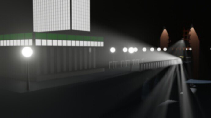
- DANB1 - A great play with light and shadows. It could use more diversity in light colors and intensity. I mean the white building in the back (yellowish lights, warm tones).
Note: I don’t want to offend anyone for any reason. I try to write down positive ideas and visions that I have in my simple use of the English language. I am also sometimes more inspired by a particular subject or solution. I’m also learning from you!


