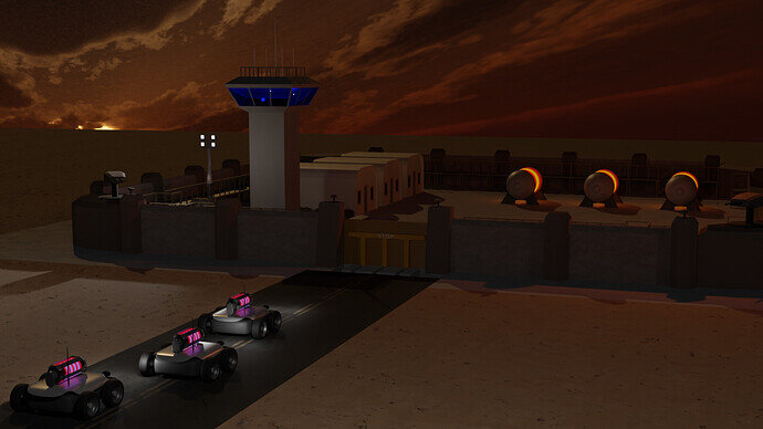
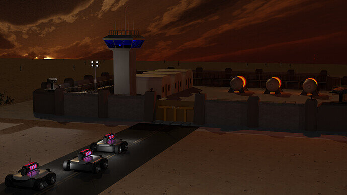
Thanks. It’s just solid shaded mode with cavity shading enabled. I found out about it recently and I really like it too.
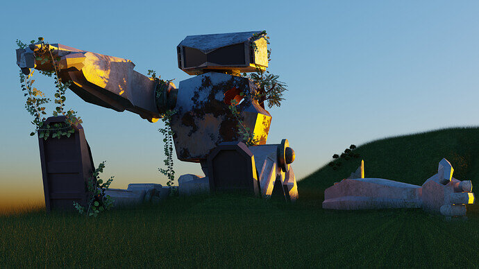
I added an HDR sky based on the suggestion of @3DE_Study. I think it improves it quite a bit. Thanks.
Also fiddled with the lighting, moved something things around, and added some more subdivision surface maps to make it a little less low poly.
This will probably be my last render.
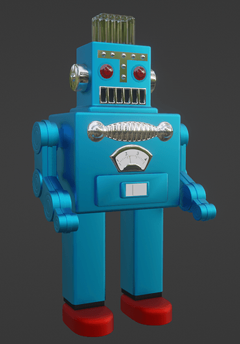
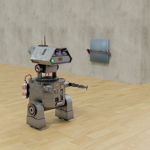
Here’s my final submission. Just added a texture for the meter on his belly and tweaked the eye texture a bit.
I also found this awesome video by Guillaume Rio Fournigault on the CGIBros YouTube page. I would love to be able to make something of this quality some day.
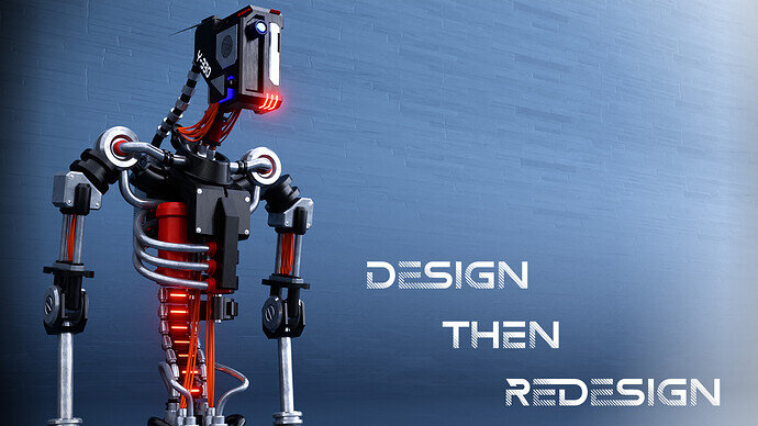
This will be my submission for the robot collab:
I wanted to do so much more to this, but I need a break. I had made more than several leg configurations to it, but didn’t think any of them fit. I have been trying to speed up my workflow these past few weeks such as keybinding functions so I don’t need to spend so much time looking through menus (literal headache inducer) as well as improve my design skills.
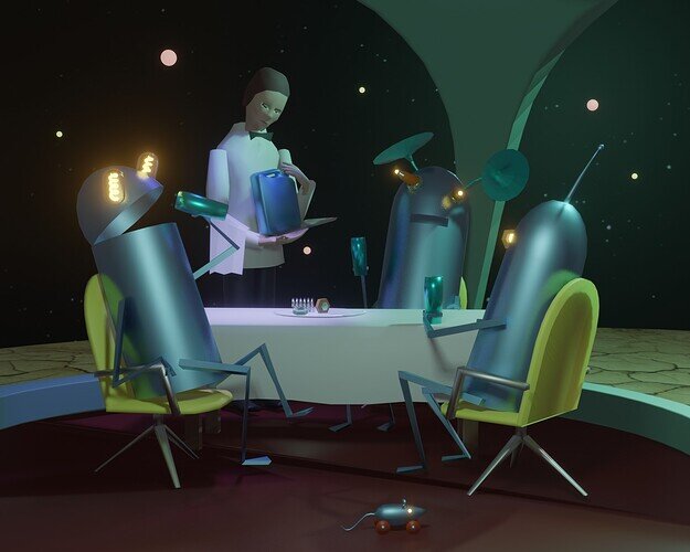
I saw the topic for “robots” and there was no way I wasn’t going to participate. I didn’t have any particular composition in mind (just the robot), so I thought I’d make it look like a motivational poster. Any feedback is appreciated. 
Nice 
Thanks!
It looks great. I like the way the steel parts have minor scuffs that make them look realistic. I like the ‘clean’ look with the simple background.
The only thing I could think of to improve it might be a glass lens for the eye/camera.
I think it looks great… too bad there isn’t a background. Maybe next time just stick in into an existing scene or just use a white ‘floor’ like in an Amazon ad?
There we go. I added a blue color to the lens. I also thought I’d add a bloom affect to the lights. Thanks for the feedback, it made the difference.
This is fantastic! Great details in both modeling and textures, and the robot really has a lot of character. I think I’d probably crop out most of the right side of the image and just make it a portrait, but that may just be personal preference. The bloom and blue eye are a definite improvement.
Nice work!
Thanks! Yeah I just didn’t take the time to do a scene for this one. If I did, in might do something like I did for my wooden train set, i.e. toys scattered on a carpet or in a toy box.
Great short film story, didn’t expect the end.
Instead of “Do androids dream of electric sheep?”
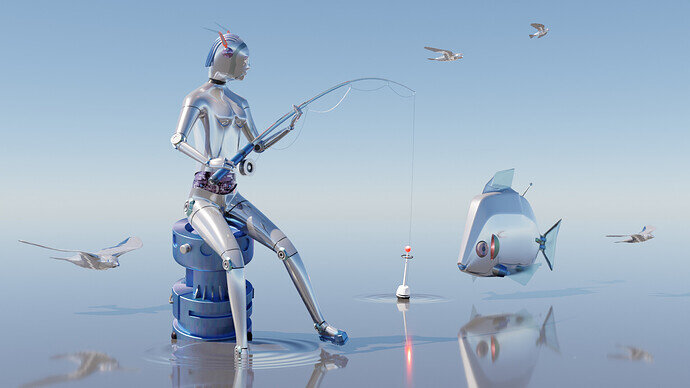
I made “Do robots fish?”
Summary
- Buoy, and fish are old projects of mine.
- Birds, no time to make them drone-like. I had this idea just before the deadline. But I’m tired of 7 hours working on this project today.
- Wanted to have many reflections. Waves could be improved but applied a new technique. And learned something.
- The robot was a very low poly female. Which was already rigidified. After posing I applied the pose and did here and there some manual adjustments. Block modeling and some sculpting, without adding more vertices.
- So it’s handy to have some objects ready for re-use.
We @BlenderCollab have a few days to vote. You can vote fast but also think slowly about design, colors, technique, difficulty, subject, realism, etc. Choose consciously and not on your own entry.
And the new subject week 40 “non-human city” has already started. The winner of this week’s “Robots” challenge may select a subject for next week 41.
0 voters
I like your story.
Nowadays, here in the west, petrol is a very expensive brand … 
Congratulations to FedPete!
After and mostly while doing this project, I got a lot of ideas. Which is dangerous if you are on a deadline. Because I found the image too simple, I added quickly “mechanical” seabirds. Which do fit the scene, but they must be more of a drone type. Which fits the subject of the collab.
The sea (water) and sky are blending nicely into infinity. So maybe the sky is also water and vice versa. With this in mind, I could add the same “fishing float?” into the sky as a satellite. Or showing the robot feet (underwater part) and also in the sky …
I like to model, but the most part goes into the composition. I do a rough sketch and then later add details on a certain spot. Trying to influence the way people look at a scene. Using the golden rule, triangles, and lines. Like the two lower birds, I wanted to have a reflection, but emphasize also the horizontal skyline. The fishing rod line is expanded by the two birds.
- 3DE_study - I think I understand your technical design choices. And I do like the mechanical feel of the robot. Great recognizable shapes, fine color set (not too much, just emphasizing details). Your concept could fit as a big billboard poster in a futuristic city. Now I miss the complete robot.
- Joey_Cuevas - Great story! And the lighting is amazing. Early morning, late at the evening highlife … Adding more detail here and then would help the composition. Just adding details mechanical parts, tubes, wires … easy to make. Or add some strange (technical) textures to it. Bevel the mesh … to improve highlights
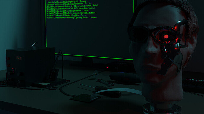
- Willrun - I like the details you’ve put into the scene. But I think the first attention goes to the green screen, which is also in the middle of the composition. The hard work went into the terminator and computer. Both are placed at the side of the scene. Arnold at the middle and the center tools are to the right. Then the green monitor glow gives a nice backlight, through the hair …
- GameProgrammer2K - Looking at a fun game! But I miss robots … Everybody has in his mind the shape of something, like a car or a robot. Creating images (movies, games) means you need to express this in the illustrations used. I see an object with four wheels. My brain will interpret this as a car. Visual communication is difficult. See how Google designs all kinds of icons to express something visual on the screen, without telling what it is.
- Typer2 - Lovely robot toy. I miss the finishing touch; the background, the floor. Maybe artifacts of usage. Which makes it more interesting to look at, and explore.
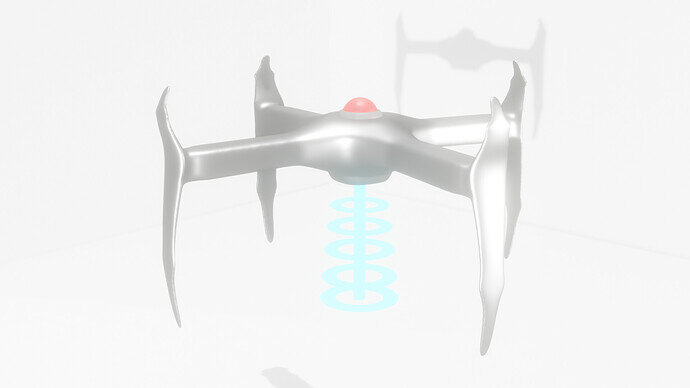
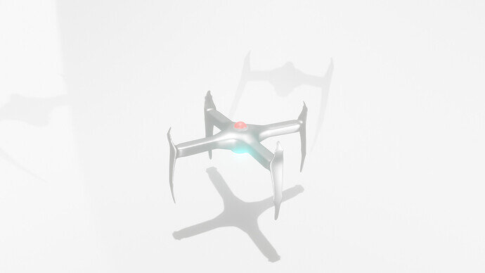
- Cows - It’s too white to see the details, zoom in more, so we can see the details better. Multiple shadows make it more mysterious. And with one object you could easily create a swarm of bots …
- NP5 - I appreciate the highly detailed mechanical robot. The lighting is excellent. The robot could be more in focus (zoomed in), because of those details. The robot is of industrial complexity and usage. With this in mind (a working bot), The facial expression, eyes, and mouth, don’t fit the overall look, and (expected) robot function. I don’t get the feeling of a household robot, more of working in the industry. If so, a different context is needed (background). - I see this bot, welding pipes, in a dark environment with welding spots and lights, nicely reflecting on this metal surface …
Note: I don’t want to offend anyone for any reason. I try to write down positive ideas and visions that I have. In my simple use of the English language. I am also sometimes more inspired by a certain subject or solution. I’m also learning from you!

