2022 Collab: Week 39 ¨Robots¨ - VOTE CLOSED

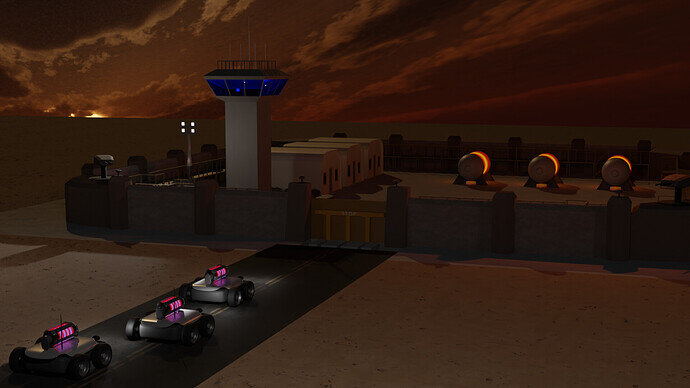
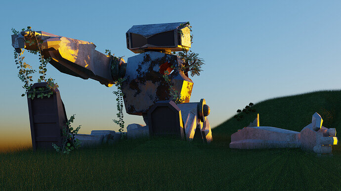
Thanks. I don’t know why I didn’t think to add an HDR. I guess because I’ve made an effort to keep the sky out of the scene. This was just mean to be my sample scene for the modular game assets.

I’ll give it a try. I’ve used an HDR in Unity, but not in blender yet. I’ll take a look back at the course.

The ‘Real Rush’ portion of the course is the closest to the type of game I want to make (RTS) and I like tower defense. So I’m going to try to make at least a ‘complete’ playable game, and try out all the techniques I want to try in the future (Destructible elements, power management, smoke/fire/explosions, etc.). I think I’ll probably add some kind of sky-box to the game as well, so this will be good practice.

I’ve gotten more into the Blender side of things than I planned. It’s been more fun that I expected. I’ve taken a couple of art classes, but it’s not my strongest skill.

2 Likes

@Joey_Cuevas I really like the robot and the lighting. And the hanging weeds. It gives it a real sense of ‘realness’.

Maybe something more for scale would be good? A tree, building, piece of a building?

4 Likes

Thanks, I’ll work on something to bring perspective

1 Like

It is possible to have the sky from the HDR removed from the final render. In the second picture I provided (the island) the sky is an image plane while the lighting is from an HDR. In the render properties tab, under “Film”, there is a check box called transparency. When checked, it removes the HDR’s image but keeps the lighting.

However, I like the lighting in the scene as it is. The hard shadows provided by the spot lights with the soft shadows from the sunset reminds me of moments when I’d be outside as the sun goes down and the street lights had just turned on.

2 Likes

As @GameProgrammer2k suggested, I added a little element to help with scale

10 Likes

Yes, it can. More Blender configuration. I’ve no time to explain, search the web.

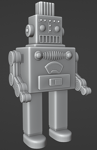
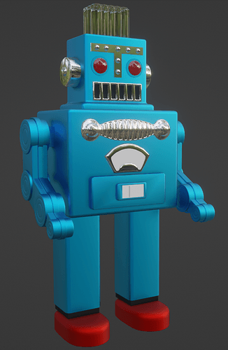
The Smoking Spaceman


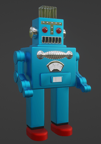
It’s not totally finished but I don’t know if I’ll have time tomorrow, so here it is. Vintage robot toy The Smoking Spaceman.

10 Likes

Love the plastic look.

1 Like

I agree with @FedPete about the nice plastic look, but I also like the first render where he’s not yet textured. :slight_smile:

2 Likes

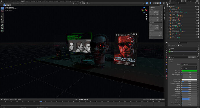
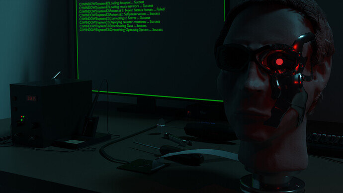
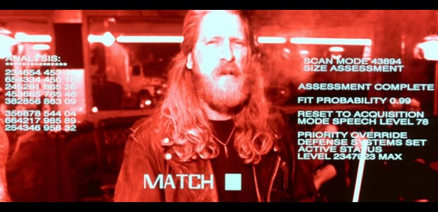
I was originally going to recreate Arnold’s head but time constraints so just did a rough head sculpt, I liked the shades so did a quick model…Terminators must wear shades it’s in their charter somewhere lol


Maybe just some minor tweaks to go here or there.

10 Likes

@Willrun I’d change the computer display since Skynet’s hardware doesn’t run on Microsoft’s software. You got a nice scene there
image

3 Likes

Yeah true. thought about it maybe Microsoft bought them out lol

2 Likes

Thanks. It’s just solid shaded mode with cavity shading enabled. I found out about it recently and I really like it too.

1 Like

I added an HDR sky based on the suggestion of @3DE_Study. I think it improves it quite a bit. Thanks.

Also fiddled with the lighting, moved something things around, and added some more subdivision surface maps to make it a little less low poly.

This will probably be my last render.

7 Likes


Here’s my final submission. Just added a texture for the meter on his belly and tweaked the eye texture a bit.

I also found this awesome video by Guillaume Rio Fournigault on the CGIBros YouTube page. I would love to be able to make something of this quality some day.

6 Likes

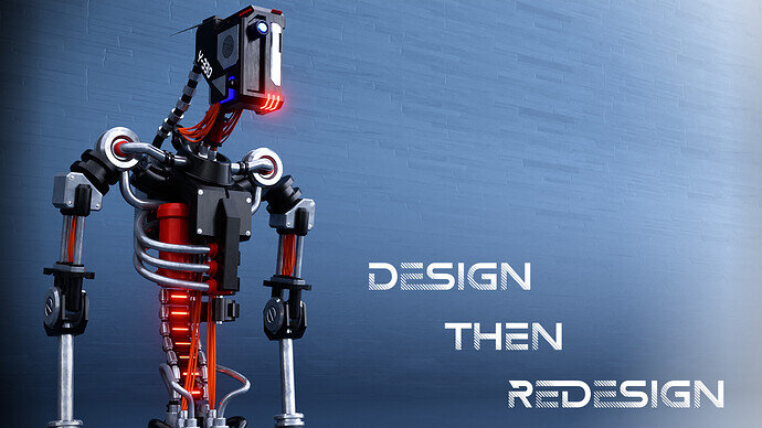
This will be my submission for the robot collab:

I wanted to do so much more to this, but I need a break. I had made more than several leg configurations to it, but didn’t think any of them fit. I have been trying to speed up my workflow these past few weeks such as keybinding functions so I don’t need to spend so much time looking through menus (literal headache inducer) as well as improve my design skills.

I saw the topic for “robots” and there was no way I wasn’t going to participate. I didn’t have any particular composition in mind (just the robot), so I thought I’d make it look like a motivational poster. Any feedback is appreciated. :+1:

10 Likes

Nice :+1:

1 Like

Thanks!

1 Like

It looks great. I like the way the steel parts have minor scuffs that make them look realistic. I like the ‘clean’ look with the simple background.

The only thing I could think of to improve it might be a glass lens for the eye/camera.

2 Likes

I think it looks great… too bad there isn’t a background. Maybe next time just stick in into an existing scene or just use a white ‘floor’ like in an Amazon ad?

2 Likes

Privacy & Terms