2022 Collab: Week 29 “Music instruments" - VOTE CLOSED

This is the Blender collaboration 2022, week 29 challenge. Don’t be afraid to join, a lot of us are beginners. This is all to practice, have fun, learn, and get together.

This week’s subject is “Music instruments”.

  • A musical instrument is a device created or adapted to make musical sounds. In principle, any object that produces sound can be considered a musical instrument — it is through purpose that the object becomes a musical instrument. A person who plays a musical instrument is known as an instrumentalist.
  • Subject selected by the previous week’s 28 “chimera" winner: TheDespicableDM

The rules are simple. 1 subject, 1 entry, 1 week.
You create whatever object or scene or whatever you can think of that has something to do with the subject. It can be as simple or complicated as you want, all entries are welcome!
Post your picture here in this thread. And at the end of the week, we start to vote. And if you are the winner, you may choose the next subject and win a unique badge.

Deadline: 2022-07-23T21:55:00Z

If you want to stay informed of the @ BlenderCollab ?
Subscribe or unsubscribe to this “BlenderCollab” group.

3 Likes

Ting, ting. it doesn’t have to be that difficult. Have fun.

11 Likes

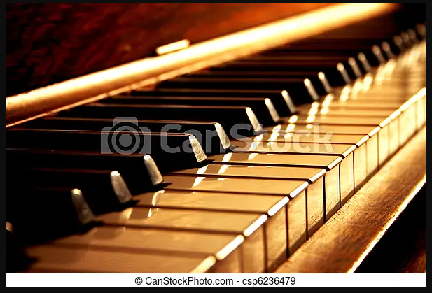
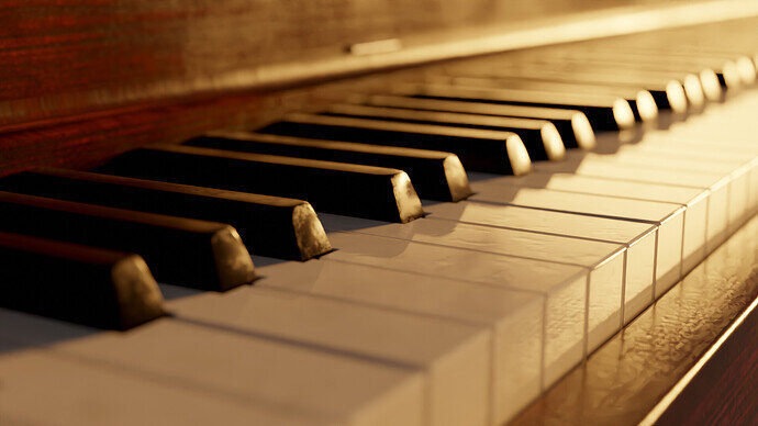
I’m going to try to recreate this:

2022-07-18 16_26_17-Window

We’ll see how it goes. Here’s a thread to track my progress.

6 Likes

Wip


10 Likes


Final Render

15 Likes


almost done need to do a few more things

8 Likes

Not very happy but definitely burned out…

9 Likes


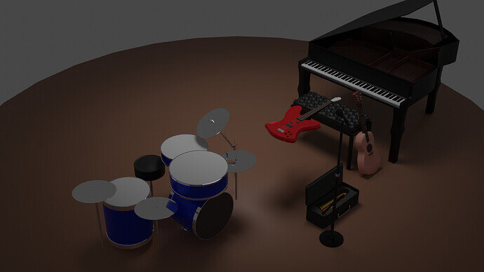
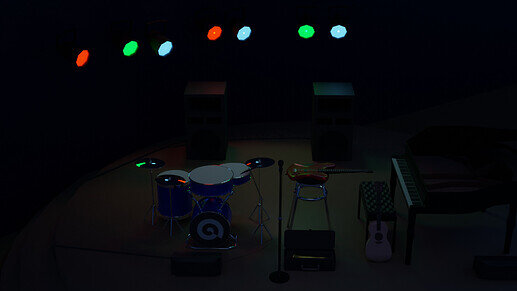
overview of all objects in scene

Final Render

8 Likes


Credits:
Velvet texture from sharetextures.com
Concrete material made with the help of a “Ryan King Art” tutorial.

10 Likes

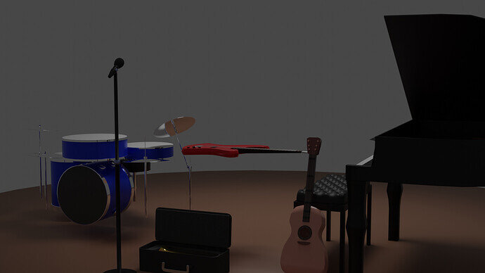
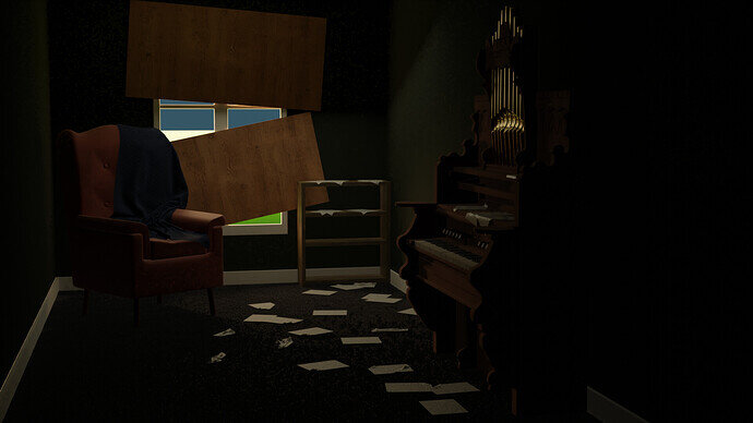
The scene i s a bit too dark.
Maybe adding a single light (candle, torch …?) to highlight (focus) on the organ.

I appreciate the feedback. I’m not sure why my images are showing extremely dark for others. But unfortunately I’m out of town today and thought, mistakenly, that the collab ended tomorrow :laughing:. I’ll get it right one of these days haha.
2 Likes

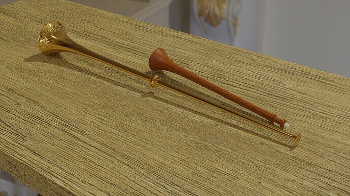
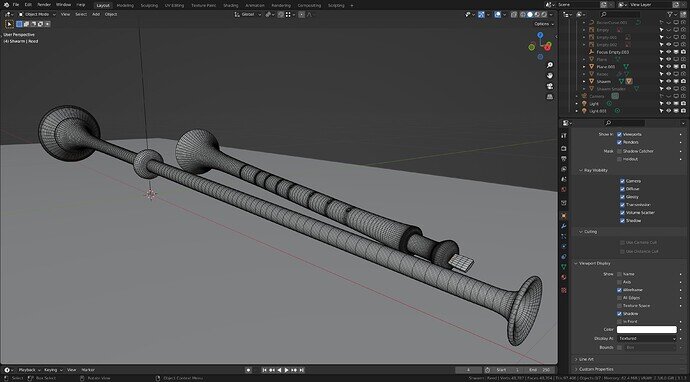
Buisine, herald’s trumpet, and a Shwam, medieval instruments.
Started a Rebec too but not close to done.

The only good bit was I made a normal map from a sculpted section, for the chasing/engraving on the buisine, just to use the method. Though in reality, I could have used the sculpted section it is not exactly heavy on polys.

9 Likes

It is always Fun and learning experience…
Everyone here gave outstanding results
Here’s mine little cartoony but my thoughts are that its because of background I chose! Maybe
Love to hear your thoughts :slight_smile:


10 Likes

We @BlenderCollab have a few days to vote. You can vote fast but also think slowly about design, colors, technique, difficulty, subject, realism, etc. Choose consciously and not on your own entry.
And the new subject week 30 “Flowering plants” has already started. The winner of this week’s “Music Instruments” challenge may select a subject for week 31.


3 Likes

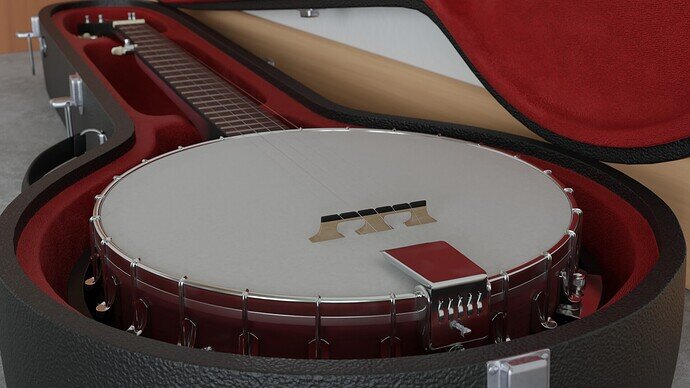
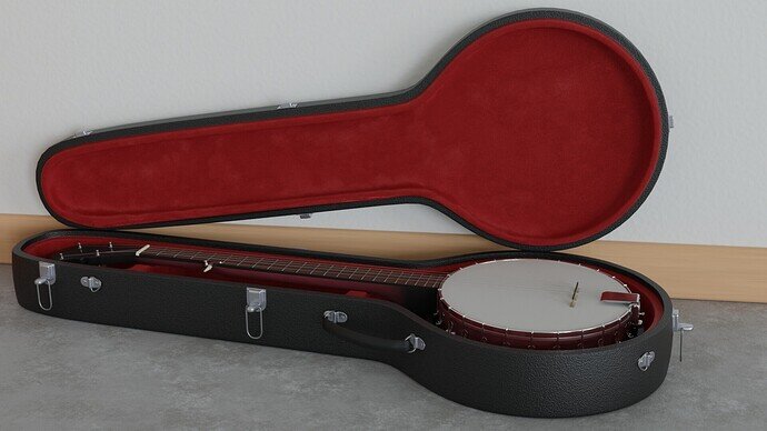
@zeRgenTa, congratulations on your winning entry in the “Music instruments” weekly Collab. I must say the texturing and material choice are excellent. The metal parts give nice little details (highlights) to the composition. Emphasizes the dark parts, but also guides the viewer to look at those details. I think I understand why the scene (object) is partly cut off, I would like to see more of a complete chest. But then you need more environmental filling, which is always a struggle.


  • Tyger2 - Love your remake. It looks like an exact copy. Details in wood texture and reflection of light are impressive. Well deserved second place.
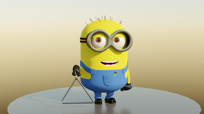
  • FedPete - I hadn’t any intentions to steal any votes. It’s all about musical instruments and not the sidekick. I only created the triangle to have a relation to the subject.
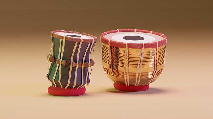
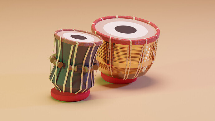
  • Abdullah_Ahsan - My personal favorite, because of the design and lighting, which contains colors but they are not that obvious. I like the cartoon shapes and tiny details. Well done.
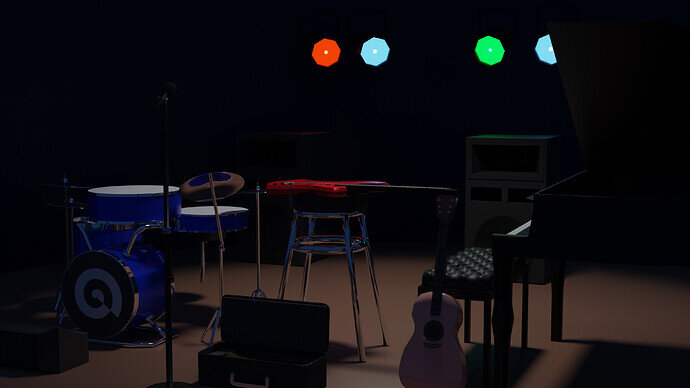
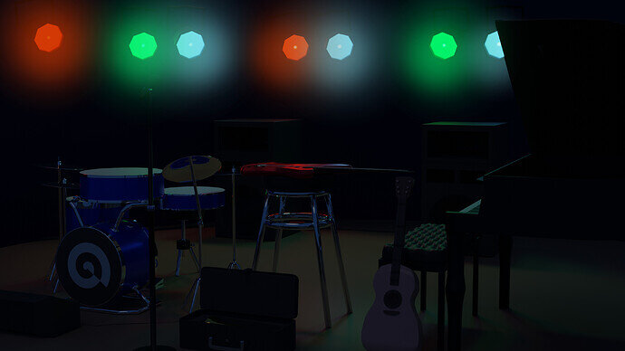
  • Willrun - The concept is great, with real showtime vibes. But the lights do take all the viewer’s attention, and instruments are in the dark. Try to improve the lighting. The metal parts could be more reflective and help to define the shapes. I’m missing a spotlight to high-lite the instruments.
  • Foolishjester - The concept is clear. But too dark in the sense of finding the real subject, the organ. The window light and floor paper are guiding the viewer, without a visual clue, connecting to the organ (too dark). Try to improve the composition. Lesser chair, more prominent organ. Because it is a great concept!!
  • NP5 - You’ve spent much time on the most important details of chasing/engraving on the buisine. But this detail is barely visible. I think the composition could be improved in the same way as zeRgenTa and Typer2 did. Zoom in on the signature details and leave the rest to the viewer’s imagination.
6 Likes

That’s right. And it most definitely didn’t have anything to do with any unseemly UV stretching hovering just out of frame.


Looking back at it, it was just an edge that was missing bevel weight. :man_shrugging:

4 Likes

Privacy & Terms