2022 Collab: Week 27 “Chimera" - VOTE CLOSED

No, never used it. Some of it is just sloppy “paint” work.

Nope again, did not use the sharpen tool this time.

Nope again, did not redraw it :slight_smile:

Nope, about 8.

Actually, probably, give or take.

Methods:

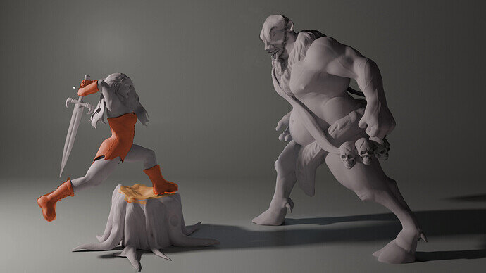
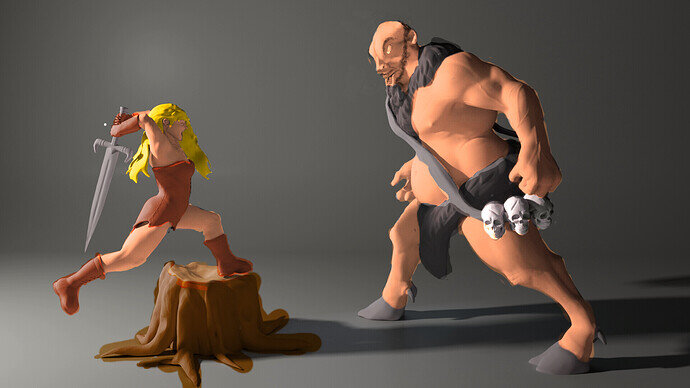
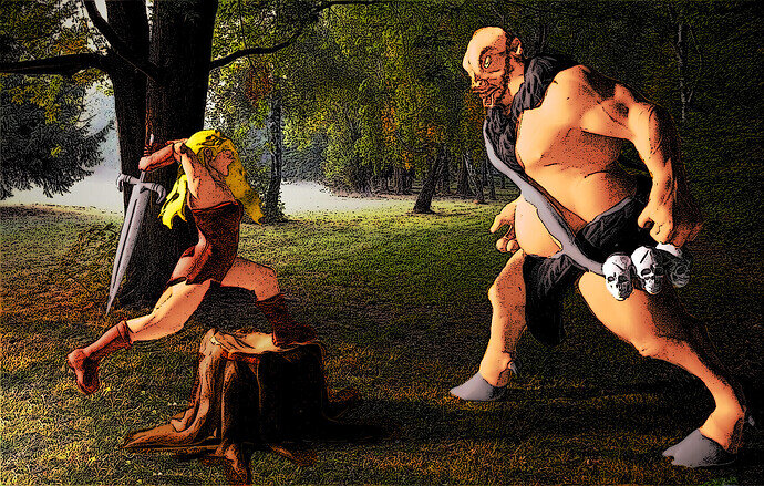
  1. Layering and Overlay: I simply used overlay on my layers and painted a solid colour. It is your render’s shadows and textures that is doing all the heavy lifting. Some of the lines are sloppy, but I was not going for perfection.

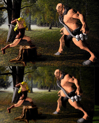
  2. Inking: No edge detect, no sharpening, just simply applying a “artistic” filter- Ink sketch. Twiddle with the features a little. Then I duplicated it and blurred it. This layer I imposed on top as a Relflective layer (I think, but glow, overlay, and some others were pretty close contenders). I turned down the layer filter. This allowed for a nice glow and reflective look, as well as some dynamic colour changes and transitions- making it “pop” if you will.

  3. Clone stamp: I did not redraw the head, I actually reused all the material that was already there. I cut the nose and mouth and placed it where I wanted it on another layer, and then used the other parts of the head, in conjunction with the head and mouth parts, as my colour palette. Turning the colour solidity way down (around 24ish in most cases, the highest transparency being about 255), I was able to clone what a wanted and have a decent enough transition between the pieces.

The Scraggly short hair on his head was a happy accident when trying to apply the back of the head shadow. It looked like hair, so I began cloning it everywhere.

I was going to be ambitions and add boots on the villain using the woman’s boots, but I saw that would have been too much out of scope (believe it or not, I actually stopped myself :open_mouth: )

Here is the modified head and some colour. His head is different here. I copy and pasted the shoulder chest hair to the other side where it never existed.

More colour quickly pasted on, with some slight touchups, not really caring if I make mistakes.

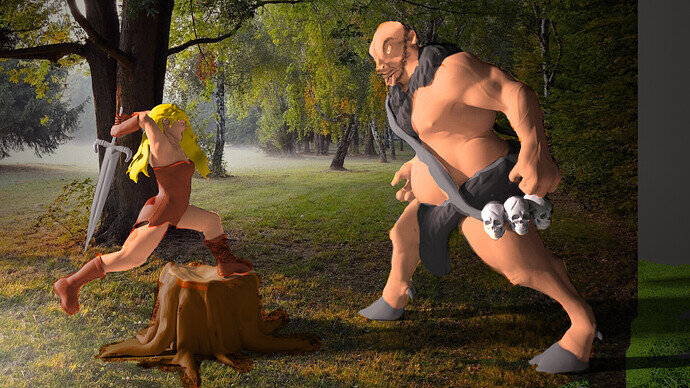
Background using the overlay features and doing some cloning to fill in the picture. If you look closely you will see that come of the picture bleeds into the character. Those are spot that I did not erase due to laziness. Likewise, colour bleeds into the picture.

I inked it and then Blurred it:

Giving it the dynamic finished look:

Did I plan this? No, it was on the fly.
image
@NP5
5 Likes

I was wrong on all accounts :laughing:
Forgot about the clone tool, and an ink filter makes sense.
Very nicely done sir :clap:
Just goes to show how much can be done post-process.

1 Like

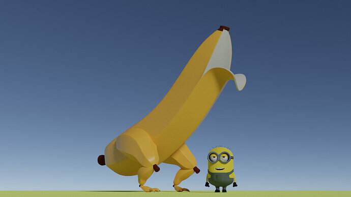
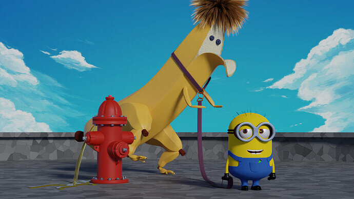
Banana-Saures

8 Likes

Haha I love it! My only gripe is that I don’t think those ankles would support his weight. But it’s a Banana-Saurus so I guess it’s probably not meant to be realistic :laughing:.

1 Like

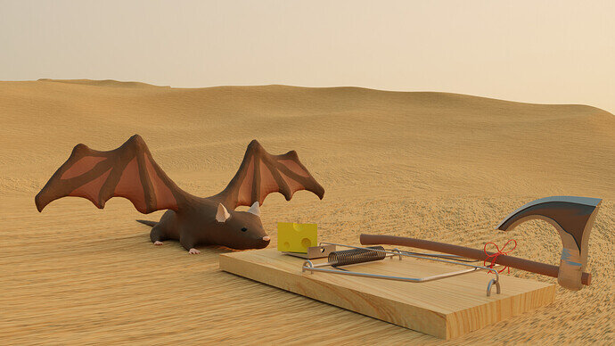
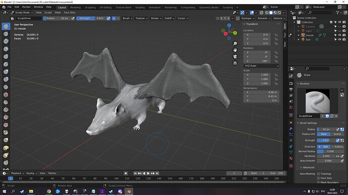
“Do cats eat bats? Do cats eat bats?” and sometimes, “Do bats eat cats?”

Just a little homage to Lewis Carroll’s “Alice”. Also, in my mothers tongue “bats” called “flying mice”

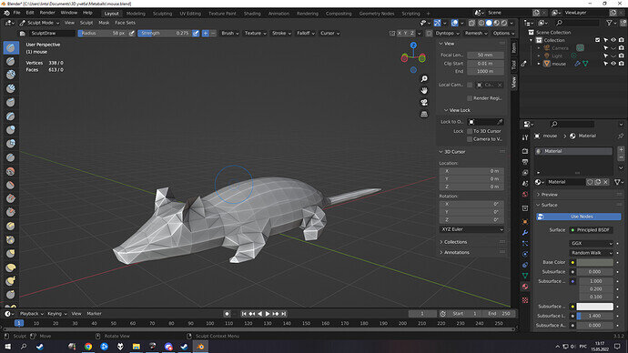
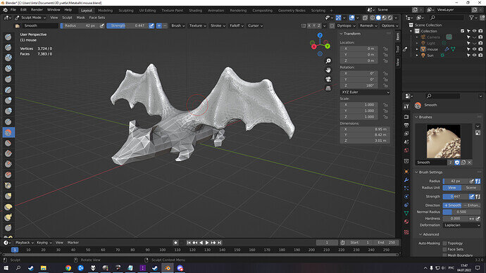
It’s my first sculpting project that came out of “Frankencaterpillar” lesson. Then I left Blender for 2 months and now I’m back in work.

First WIP (2 months ago)

Now with wings! GMO free!

Details-detail-details!

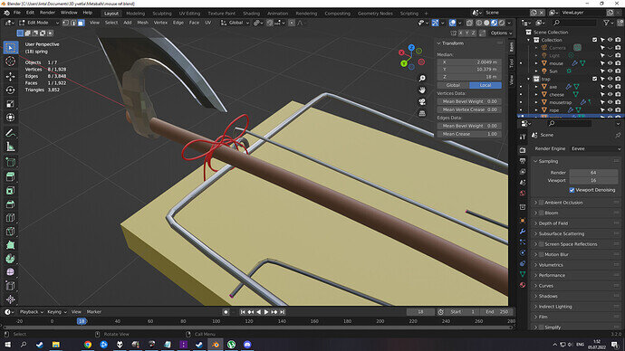
Mousetrap. I’m especially proud of this knot. I found the way to create it by myself.

I took desert out of my old project. Don’t have much time to create some enviroment, sorry.
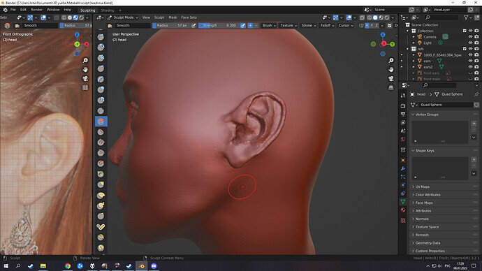
Now i’m selflessly working on head sculping lesson. It already took over 10 hours and I’m still far from perfection :sob:
Some behind the scene on this project:


(yep, over 10 hours and i’m still polish the ears :laughing:)

5 Likes

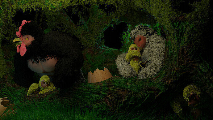
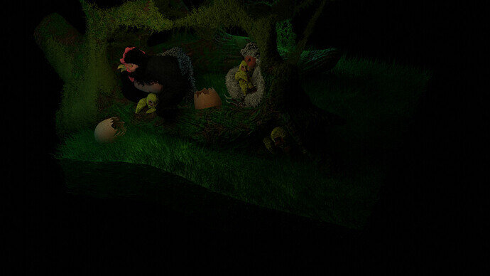
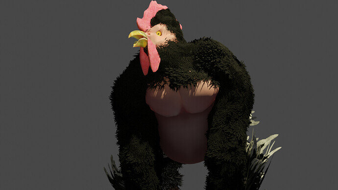
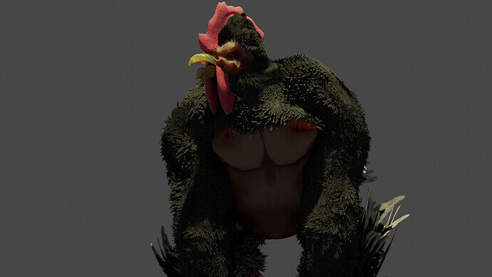
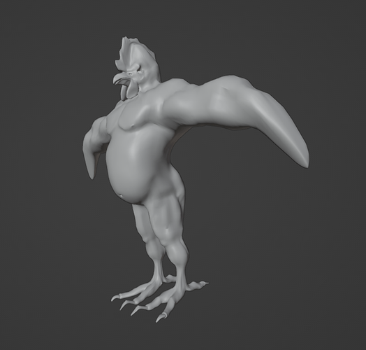
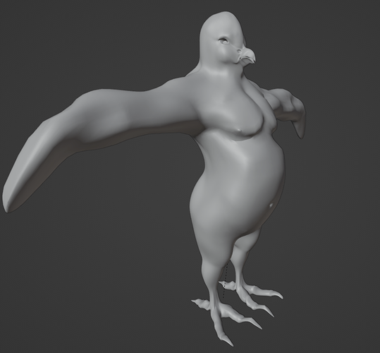
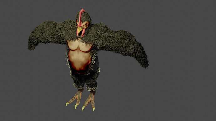
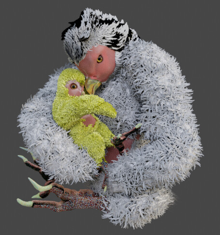
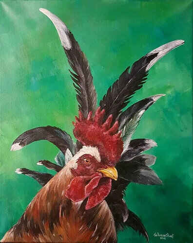
I finally have something in- it took a little bit to do. I was hoping to do something with a barn and a farmyard animal- No barn, but Chorillas are the result:

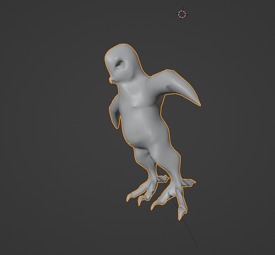
Here are some other shots and iterations, not included in the challenge. :

Gorilla


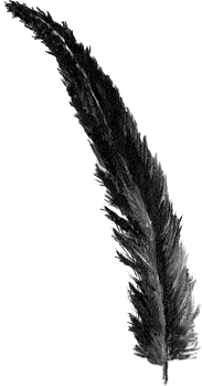
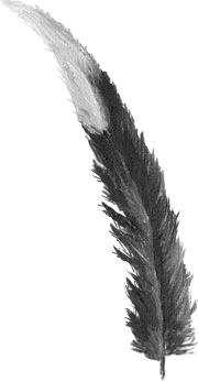
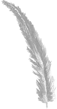
The feathers use the hair particle system. I found some feather paintings, cut them, edited them so that I had the individual feathers I wanted, then attached them as a hair particle object. It more or less works.

6 Likes

Fantastic! My favorites are pictures 4 and 5. The first one has a nice environment/background, but I like the framing of the individual images better. The mother and child image is powerful! I know it’s kind of silly (because it’s a Chorilla) but it conveys a deep emotion. I can feel something from it. Great job on the feathers, BTW.

2 Likes

@Zangk , be sure to let me know which one is the final, normally I will select the last entry!

1 Like

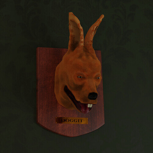
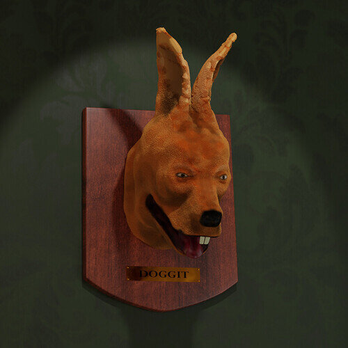
Doggit

This rabbit dog (or doggit, colloquially), an odd-looking beast even in life, was not done any favors by its taxidermist.

Edit:
Updated with better light

5 Likes

It will never fly! :rofl:

Great animal mix!

1 Like


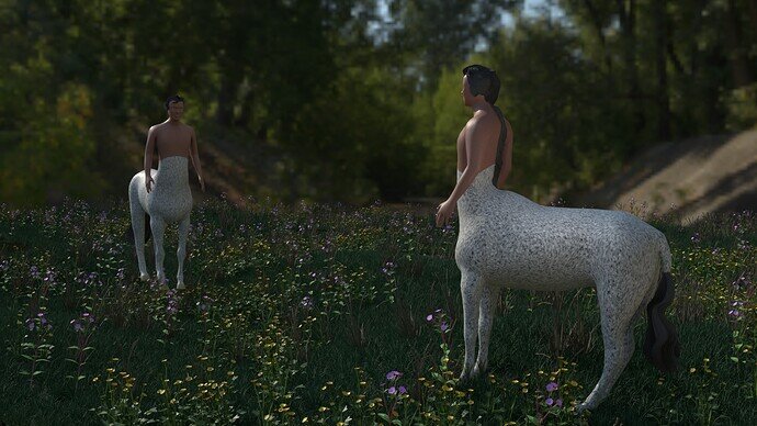
A more traditional Chimera.

7 Likes

BananaSaurus - 23

6 Likes

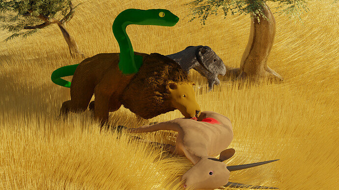
Interesting mix. Two carnivores snake and lion and a herbivore goat. Eating decisions must be interesting!

1 Like

It was the first one, I was not clear enough.

But at @Tyger2 suggestion, I agree, Send in picture 4 as the entry one.

Nice Doggit, by the way, I actually mean to make my Chorillas dorky as well, but it accidently turned out kind of, well “Legit”. That was not on purpose- since I prefer the joke.

image

It has better lighting and has less going on, the other, is a little cluttered.

Here are my resources for the feathers and texture (crest for the Roarilla :slight_smile: )

babydown


crest
Feather1
Feather2
Feather3
Feather4
Feather5
whitefeather

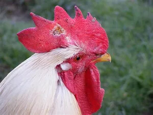
The Crest came from this Pic:
image
the beak something I picked up online, and the feathers were grabbed from this painting:

Can you locate the three feathers I used?

2 Likes

New and improved!, with Banana arms and blueberry eyes- but it seems to be leaking orange juice.

I like the texturing.

1 Like

Hmm, your comments seem to fly over my head!

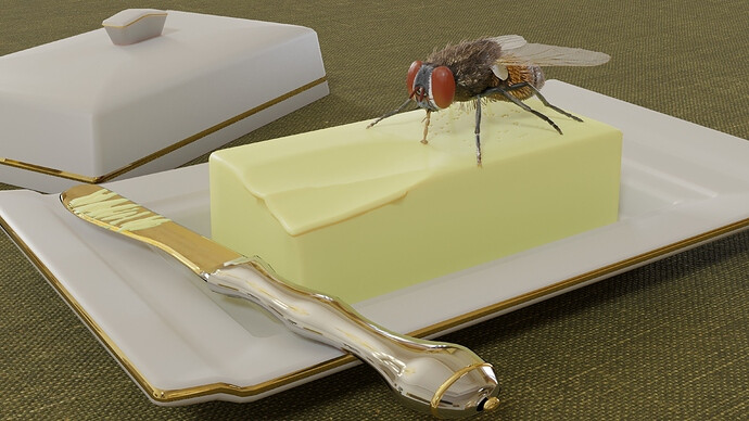
Cut it out, Are you trying to butter me up?

1 Like

Rather classical and ordinary.
Still needs heaps of work, but at least I got something usable done!
Found a use for my geometry node grass and flower scattering experiments of a while ago though!
Stupidly made an entirely new horse / man. Should have used my mule and a human I have somewhere as a starting point.

6 Likes

The old thing done well is just as worth trying, especially if it fits the bill- speaking of bill, does a platypus count as a chimera?

Good use of geometry nodes, I had some for vines in my original submission, but that was taken from here,if anyone wanted to try it (free). It lacks branches, but it implies them I find.

My environment was an experiment as well- the tree and previously mentioned ivy were pulled from tutorials. I agree with @Tyger2 about it, I stayed up too late at night to try to finish it, and so light and “energy” of that piece faded as I faded. More contrast, even if just different lighting, would likely have improved it some.

Irony of ironies, my final submission choice was not intentional- that Chorilla and baby were only side tangents to fill the picture in, both built off off the original Roarilla mesh- not meant to be the main event.

Reminds me of a saying I heard: “You cannot direct artists, you can only herd them.” They will give you what they give you, but in the end it is the people that have to like it. How many artists in any disciple had a work they laboured long hours over just have it rejected, but some incidental piece everyone seemed to like and they thought was rubbish? Even with poets, more often than not, their reader gets more out of it than the poet. This was Socrates complaint (Ancient Greece), and a Rockstar’s comment on his lyrics (he choose it not because of their depth, but because it rhymed).

3 Likes

We @BlenderCollab have a few days to vote. You can vote fast but also think slowly about design, colors, technique, difficulty, subject, realism, etc. Choose consciously and not on your own entry.
And the new subject week 28 “Vehicle” has already started. The winner of this week’s “Chimera” challenge may select a subject for week 29.


3 Likes

@TheDespicableDM Congratulations on your dangerous (deadly) looking Chimera. Your scene layout is good. It tells a little story about how deadly your creature is. The Chimera (and the animals presented) fit into the overall scene. Grassland, prey.


In general, I must say, all entries look good in their own way of implementation of a Chimera. We can see that back in the votes. Basically one or two votes distance. There’s not a distinctive winner. I think because most entries are based on some sort of sculpting, which is hard to do. Or at least time-consuming, for one week.


  • Zangk - a great concept, but also difficult to read due to the feathers. The gorilla chicken (black one) has a more ‘Chimera feel’.
  • Lintary - I really like this idea of a bat and a rat (mouse) blending in. I miss the fragile-looking wings (subsurface, blood arteries/veins). And the most attention goes to the trap. The story is clear!
  • NP5 - a more traditional Chimera and well performed too. I think I understand why you choose a white horse body. But then the contrast with the human body is high. I would expect more blending in. Love the grass, so nice.
  • Tyger2 - I find your solution very smart. Simple and effective. Smart because you only need to model the head. Simple because the scene is self-explanatory, using a label like “Doggit”. A bit more attention to the details maybe?
1 Like

Privacy & Terms