Piano (but mostly just the keys)

This is a progress thread for my project for this week’s Blender Collab Challenge.


My progress so far

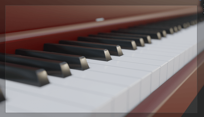
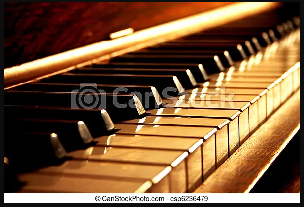
I’m trying to recreate this picture:
2022-07-18 16_26_17-Window

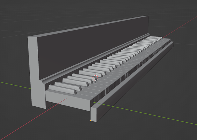
I was able to get the basic modeling done surprisingly fast. Pianos are complicated, but by limiting my scope to just the keys, I was able to simplify it a lot.

Here you can see how simple, especially considering I only had to make one octave of keys and use an array mod.

I think the key to making this one look good is going to be the textures and lighting. Hopefully I can find an HDRI to fit the scene.

If you’re interested, come check out the Collab and even join in! Anyone can take part, and we have people of all different skill levels. Cheers!

6 Likes

I like the lighting in the reference image a lot :heart_eyes_cat:. And your progress so far looks great. You are right about textures and lighting. Great textures with the right lighting can make a scene look exceptional. Have fun! And good luck!

3 Likes

Looking very good so far. Add colour to the light for that orange sunset like look of the photo, and reduce the roughness on the materials to make them reflect more.

2 Likes

Errr are you going to be recreating the name across the front?

2 Likes

:laughing: I think I’ll probably skip that.

2 Likes


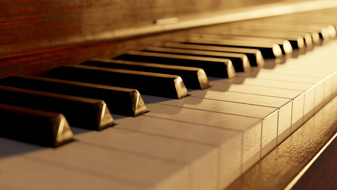
Here’s my progress after a couple more hours.

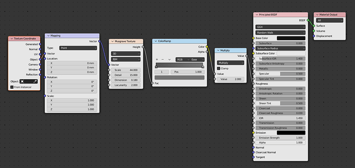
There are still some details I’d like to perfect, but I’m pretty happy with how it’s going. I found a really nice wood texture from Textures.com which included roughness and normal maps. The textures for the keys I made procedurally.

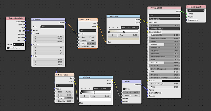
Here are the node setups if anyone’s curious:


White keys


Black keys

4 Likes

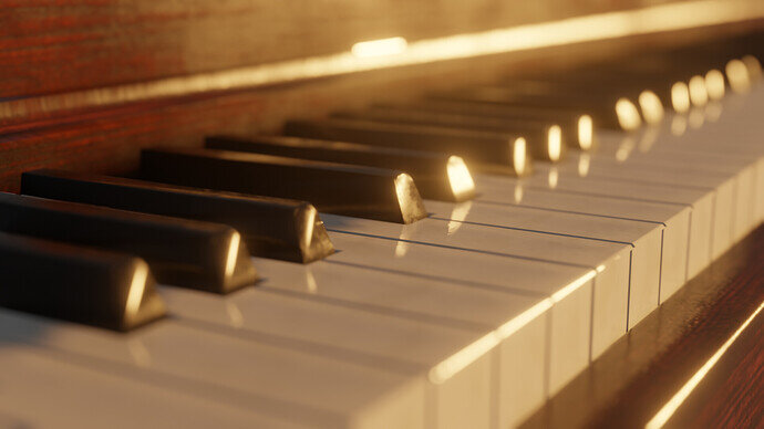
Moved the light more towards the back and rendered in Cycles this time.

7 Likes

Nice :heart_eyes_cat:. I LIKE it. Nice scratches, bumpiness and worn on the keys. And I like the wood texture. And amazing job recreating the lighting by the way. Have fun!

2 Likes

Thanks! I tried to give it some imperfections to make it look more real. The light was done with just a single sun lamp! And yeah the wood is awesome. Textures.com has some great stuff and a lot of it is free. All I did was hook up the nodes and fiddle the nobs a bit until I was satisfied, so I can’t take too much credit there.

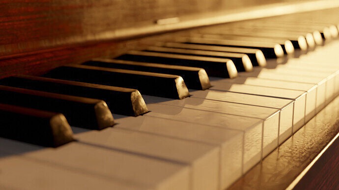
Here’s the final render:

I fixed a slight glitch on some of the black keys you can see in earlier renders, and made the gaps between the white keys a little bigger. Finally, I applied the array modifier to the white keys and rotated some of them just a tiny bit to give it more of those little imperfections.

Thanks for checking it out, all. Come take a look at the Collab to see what the others came up with!

P.S.
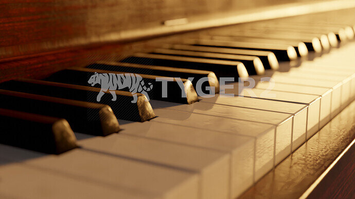
Here’s one more for @Cows . Enjoy! :laughing:

5 Likes

Privacy & Terms