The Blender Collab: Week 32 "A Mystical Place"

Thanks for the feedback :smiley: Sure something to take into consideration in my future work !
Continue participating in these challenges and we will all improve :+1:
It’s great to see so many entries every week.

For me I really like the feeling, colors and lighting of @niladri_ghosh graveyard :+1:

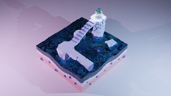
@Flavio_Paniconi Very interesting work as well. I like that the bridge is like cut off, the water effects are also really cool and stylised. I could see this as for example a piece on a map for an RPG or something

1 Like

Thanks, @Ducaluk I also like your sunset scene very much. Keep up the good work.

Thank You guys, what an amazing community!
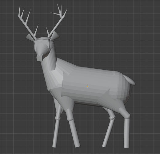
@yo_johann I didn’t get to sculpting yet so I bashed some primitives around :sweat_smile:

6 Likes

Yeah, I think I may have stepped too much out of my comfort zone this week :sweat_smile:
I feel like I tried to make pancakes but somehow ended up with cabbage soup… :tired_face:

1 Like

What did you use to make the mist? Is that a physics property? I would have liked some of that in mine.

I used the Principled Volume Shader plugged into the Material Volume output. I did this for the world shader for the “low-frequency” mist and an extra box in the fore-ground for the “wispy” mist. Ineffectual streaks done with particles. The Principled Volume Shader is like a 3d version of the Principled Shader - But I’m new to it so don’t really know what works and what doesn’t yet.

2 Likes

Thanks Johann, I appreciate that. I don’t know how other people feel but I thought it was difficult to keep things mystical as it was quite easy to start looking like a horror or suspense scene. My idea was to make some things orange and yellow as any darker colours go from dreamlike into nightmare. It was very easy to make that church look like Dracula is about to appear and I didn’t want that.

I’m in the habit of fixing the camera at the beginning and then modelling “in camera” rather than creating the whole scene and setting the camera up later on, and again I’d be interested to hear how other people do it. It does mean I don’t really think to change angles after starting.

3 Likes

That’s interesting. It does lead to sort of a painting-like look and it’s certainly a style. Personally I model my subject first, find the best camera angle for my scene, rough in the background/foreground elements and adjust my angle accordingly. I come from a film background so I wouldn’t think to do it any other way. It does lead to some extra work sometimes where elements don’t make it on camera.

Not something every scene needs to worry about but maybe there’s a way to make this or future compositions more dynamic.

3 Likes

I do “In camera”, its more efficient.
You’re composing the scene.
Instead of creating a (too) complex scene, to just find a nice composition.

But this means, also to think in front. Prepare what you are trying to achieve.

2 Likes

Awesome feedback this week too.

@Leon_V I think there are advantages to to doing it either way. Like @FedPete said, “in camera“ can be more efficient because you know which aspects of the scene need more details.

Maybe it depends what type of end product you’re going for. If it’s a complex scene, I personally like to block out the scene with primitives or very low poly stand-in models. Then I model the objects individually, sometimes in separate files.

But if my scene has just one central object which is the primary focus, then I’d probably just start with that and find a dramatic camera angle later.

2 Likes

Just a little update of my project, i wanted to share with you my method to apply only 2 materials in all my scene controlling.

So that basically the final result.

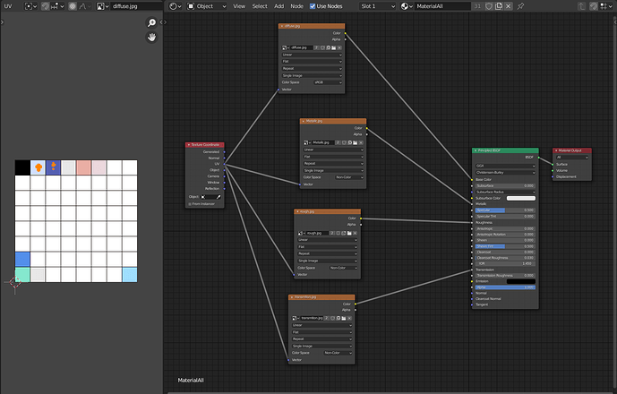
and this is my shader

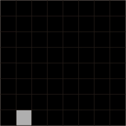
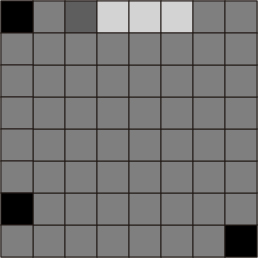
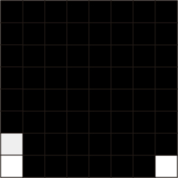
how you can see, there are 31 objects sharing the same material, and as you can see in the uv screen there are 10 differents colors on the grid, but it could support ass many ass i want, in my case that grid is 8x8. Ofcourse my 3d only have solid colors so i didnt need a texture just a solid color, but the thing is that there was a lot of objects that use differents speculars, metallics, roughness, etc…
so for control that i make mostly the same process to controll all of them, so know that grid start to work like a coord. Just need to take the uv and put it in the correct cuad of the grid.
Then you can start to think like this cuad like a new material, it has limitations ofcourse, but the rendering time is reduced a lot.
So there are the other textures.
diffuse
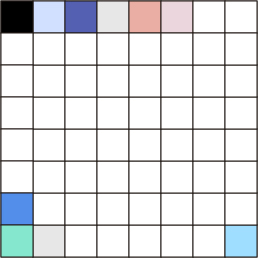
diffuse
metallic
Metallic
roughness
rough
specular
Specular
transmition
transmition
there are only 2 objects that have a different material, but they share it between them, the watter and the cristal. that couse i wanted to use a volumen absorption shader, and at the moment i couldnt find a way to difference if an object should or not use a shader in the same material.

Any way, as you can see at the moments im not using all the grid, but still work for what i want, btw all texture are only 256x256…

Well i just wanted to share part of my process!

Btw, i didnt correct the text couse i have to leave fast, so i hope you understand hahaha

3 Likes

Looking really good! I do think that the backround floor should go, it’ll give it more of an elegant feel I think.

1 Like

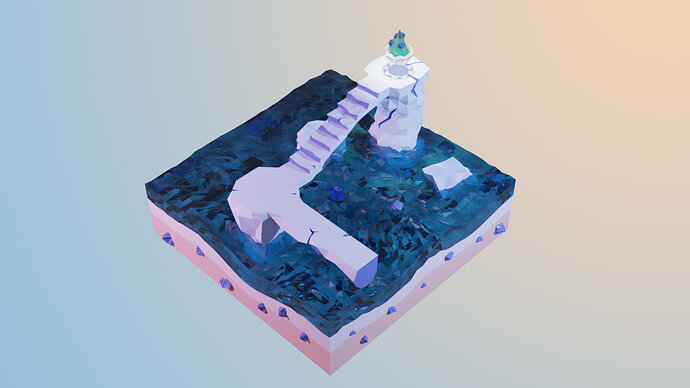
Something like this?
maybe the gradient give it some good vibe…

4 Likes

Amazing improvement! Another thing you could try is making the blue backround a bit darker and a bit of a more royal blue and maybe reducing the size of the sunshine at the same time.

1 Like

Votes were spread really thin this week because there were so many good entries, but the results are in!
Congratulations @Sblendid with :1st_place_medal: - You may choose the new topic!

Congrats @Ducaluk, @niladri_ghosh and @yo_johann with shared :2nd_place_medal:

…and @Alexandra_Ispas, @Blest, @Digitz, @Flavio_Paniconi and @Leon_V with shared :3rd_place_medal:
Great work everyone!

6 Likes

Up to the next one :muscle:
Great to see so many participations !

@Sblendid Very nice work on the sculpt and the dinosaur shadow is the icing on the cake :t_rex:

6 Likes

It was a tough competition :muscle:
Congratulations @Sblendid you deserve it. Now give us a nice topic.

4 Likes

Oh wow! Thanks everyone! I’ll start to set up the new topic right now! :smiley:

2 Likes

Here’s the new topic!
Let your creativity flow and have fun! Can’t wait to see your ideas!

@niladri_ghosh I hope the topic is “nice” enough :stuck_out_tongue: :smiley:

6 Likes

Yes indeed you give this time lots of creative freedom to the rookie like me :grin::grin::grin: come up with a good scene. Otherwise it is getting harder and harder with each challenge :sweat::sweat::sweat:

1 Like

Privacy & Terms