
Ah, now I get what you meant! I’ll try it out immediatly! 
1 Like
So, I love the bump! Thanks again for your feedback!!
I played around with some nodes and lights and here are my results! (Plus a bit of a more mysterious night version) I don’t know. What do you guys think? 

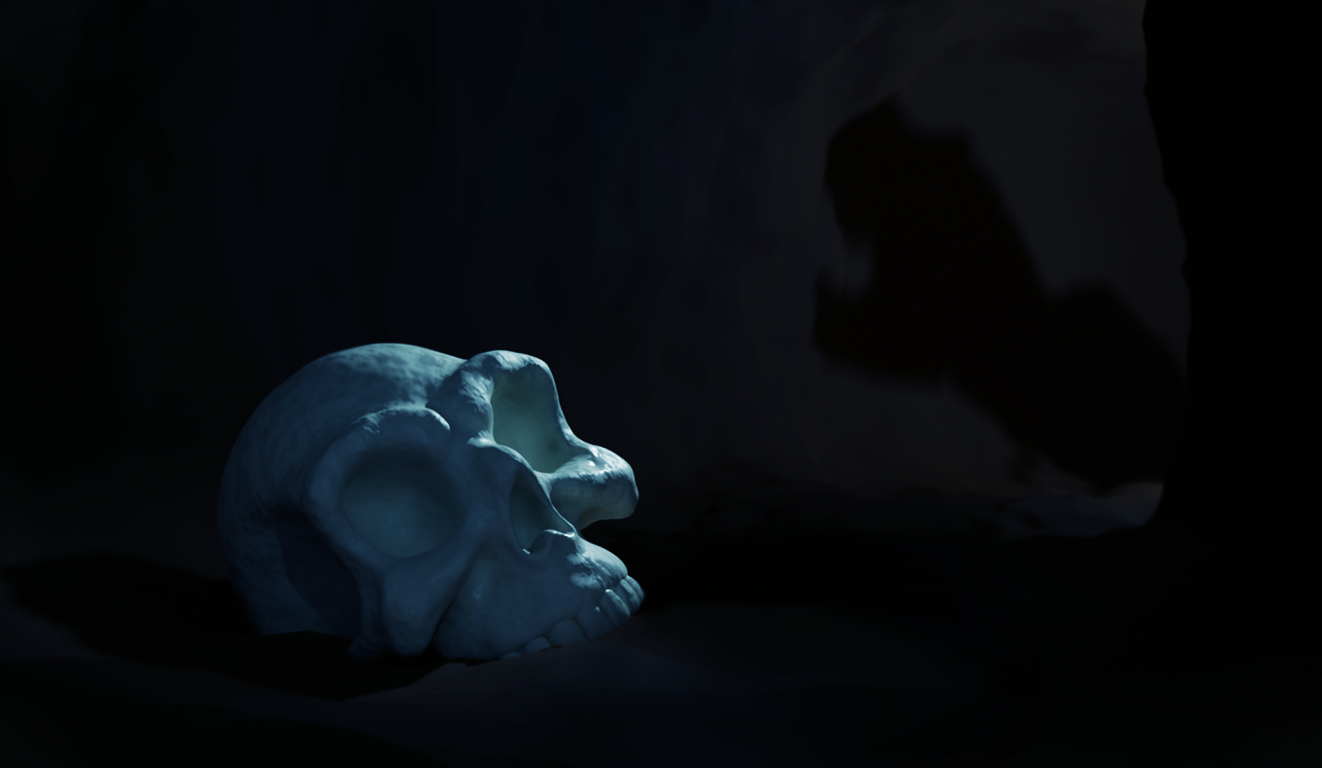
As comparison (old version)

12 Likes
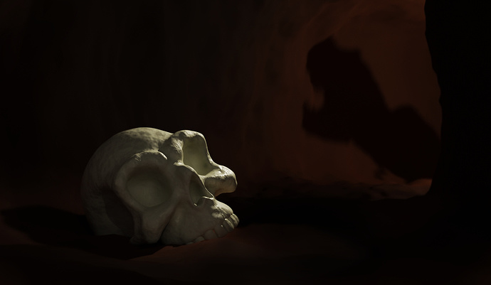
Massive improvement with the bumps… The rim-light really brings out the sculpt much better also. 
I think I prefer the brownish one, the shadow gets a bit lost in the blueish one, even tho it has a more agreeable tone 
Either would be considered a great entry!
2 Likes
I agree with you! Brown one it is!  Thanks again a lot. Your feedback really made a difference!
2 Likes
Looks amazing with the bumps added as well as the change in the lighting, I personally like the night one, but I do agree that the shadow does get a bit lost.
3 Likes
A really nice improvement on the skull! It was a bit flat before, but the bump really makes it pop. And the side lighting is much better. I liked the T-Rex (I think it’s a T-Rex anyway) shadow in the old one best. Tough to balance all those elements though! I still have yet to try different render/view layers but I feel like that might be the solution to that kind of problem.
2 Likes
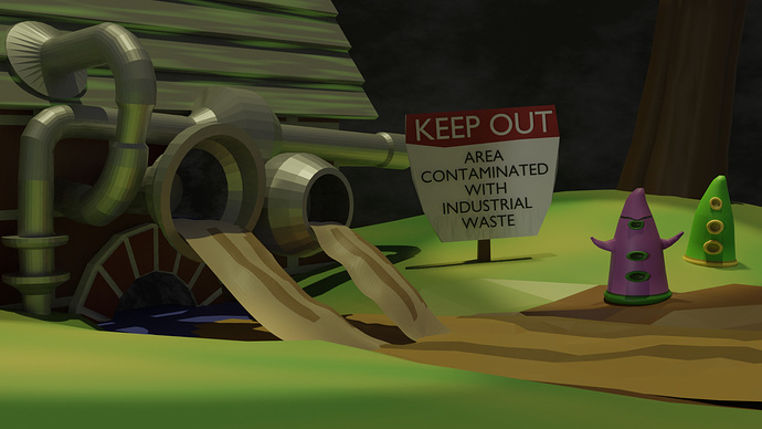
okk but i prefer to do this way . it makes me push and learn something . Though using previously made models is certainly a good idea as it saves time and helps in focusing on the main elements .
2 Likes

More Info
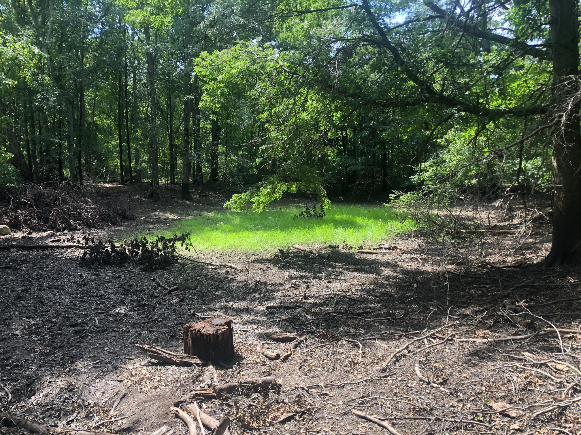
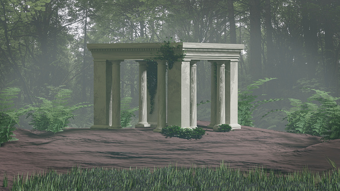
I based this on some real life research this week:
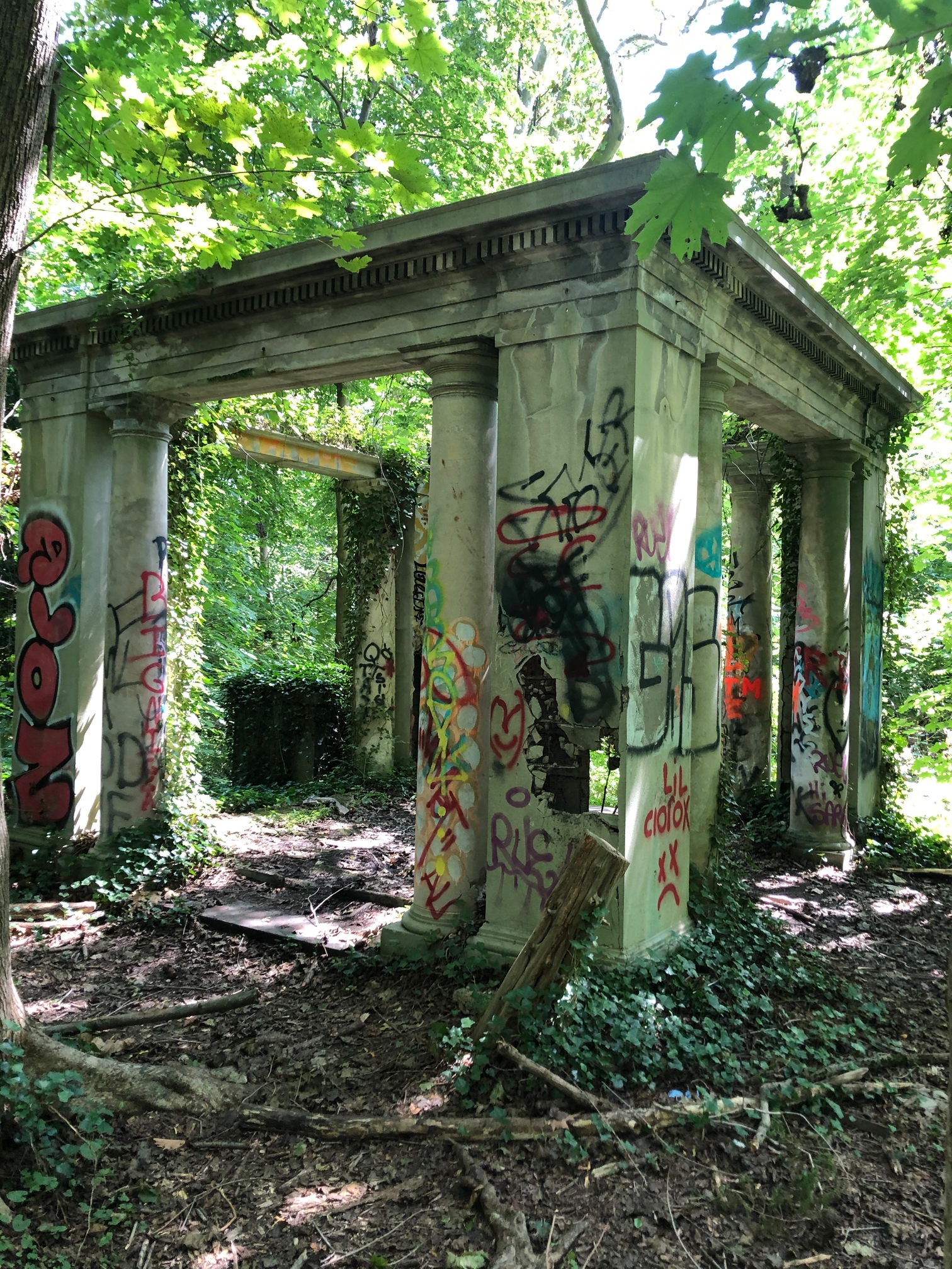
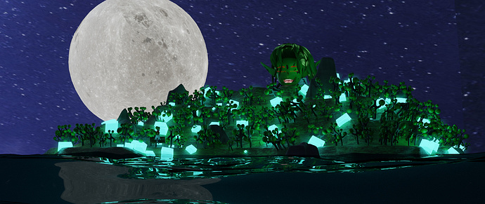
Muttontown Preserve hiking trail, aka King Zog’s castle in Long Island, New York. I modeled a cleaner version, sans graffiti. On the hiking trail I also found this dried up pond which had really mystical energy that I wanted to integrate. It ended up not making it into the final composition for the most part but serves as a basis for the grass.
The grass, vine leaves and ferns are downloaded textures. The ground is procedural. The gazebo is a mix. Background is a downloaded hdri.
Edit: Mist pass added in compositing for dramatic/mystical effect .
13 Likes
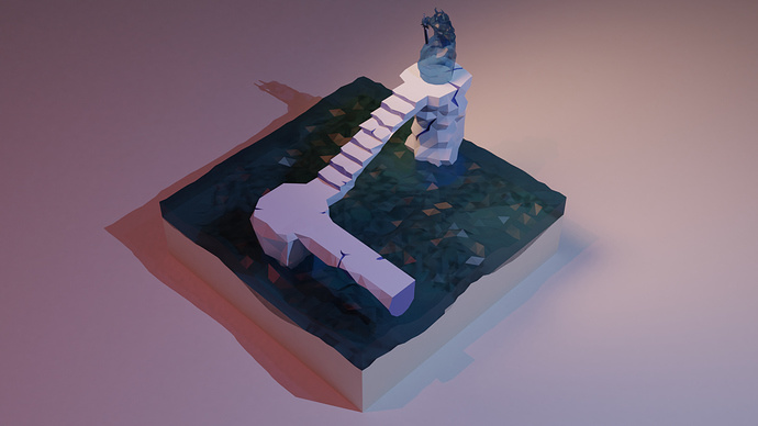
Well hello again… i didnt make enought time this week to prepare something more big, to be honest was a mini jam of 4/5 hours, i will finish this one later couse i like how is going, but anyway i wanted to share it and participate, hope you like it… i tryed this style that i saw in a few places and i really like it, hope you enjoy it!

12 Likes
niiiice!!!
1 Like
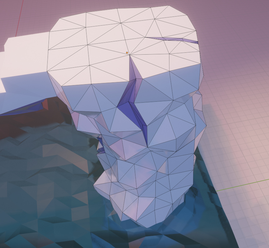
Looks like the start of something great!! I like that style too ^^. I would love to see your end result! Oh, and would you mind posting a screenshot of how your mesh looks like? Curious about the cracks (looove them!)
Poll!
There’s only one rule: don’t vote for yourself 
Aside from that rule, you can choose the parameter to judge the entries, some possibilities:
- best embodies the theme
- most colorful
- funny
- technically advanced
- realistic
WARNING: Clicking on any of these images counts as a vote that cannot be undone. Please scroll up to see full-rez versions.
I may be wrong, but I think this is a record number of entries for these weekly collabs… voting will be difficult. Good work everyone! 
4 Likes
Really great stuff guys! Sad I wasn’t able to make an entry this week, as it was a hectic work week. Love seeing all the things you guys made though! Picking a favorite is another tough decision that I will need to think on …
5 Likes
So many good ones this time around, it was very difficult to choose who to vote for.
1 Like
tough to decide maan… so creative all of them…
Hey thx!!
i start with the topology in polygons, then i add some cuts with the knife, and i was carefull to join the vertex to dont let ngons, anyway at the end i liked how it look with triangulate, but make the joins before helps to ends with a good topology.
Then for push the feeling of the cracks i add a different material (basically the same one but change the color to a darkness one).
Now the next step i want to do i couse i already know the colour pallete i want i to create a texture with those colors and like coords then makes some uvs and another one to the roughness so i can reduse the materials and get a faster render and improve performance, i know is not necesary but i think is a good practice.
Fortunately when i plan this piece i was thinking in solid colors and not textures so i think is gonna work good!

10 Likes
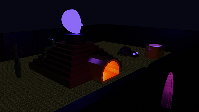
Could definitely be a level in a game, really like the dramatic effect with the light shining on the top pillar.
1 Like
Was debating between @Alexandra_Ispas, @niladri_ghosh, @Sblendid, and @Flavio_Paniconi but ultimately decided on @Sblendid’s submission, really great lighting and amazing texture on the skull, great effect with the shadow.
2 Likes
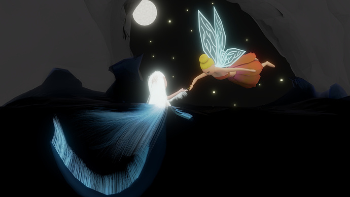
This was a very interesting week, I think you guys did a great job experimenting and all of you went somehow out of your comfort zone, that lead to some quite interesting compositions, the one I personally liked the most was @Alexandra_Ispas fairies, it’s clean and conveys a great feeling. @Flavio_Paniconi was also great but that shadow, I think it ruins the whole scene, I think it would benefit a lot if you remove the… floor?
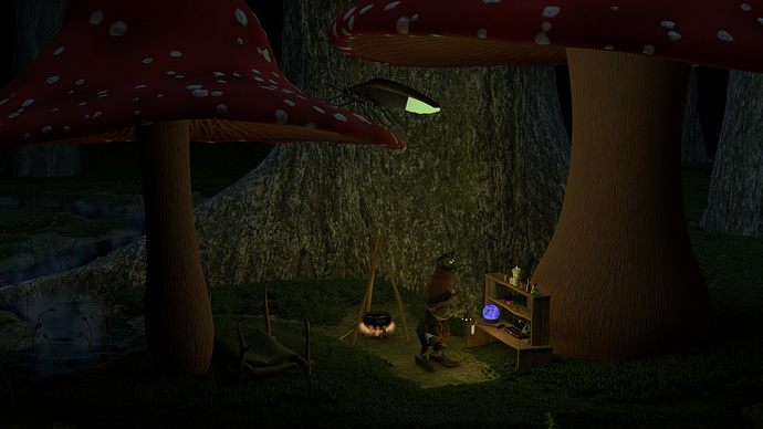
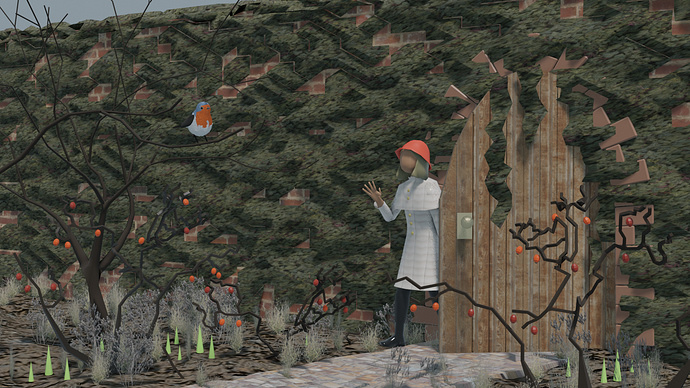
The one thing that I certainly noticed is that this week, compositions were a little exaggerated on both sides, meaning half of them have way too much detail, it get’s distracting and the use of color was not the best, like @Blest 's work, I think the dress blends way too much with the ground and the trees blend too much with the background, it gets a little hard so see the details, also the constant orange color gets distracting, the obvious protagonists of the scene (the bird and the girl) lost their spotlight because of all those other details with the same color, the same I could say about @Jaco_Pretorius work, everything blends way too much, it’s hard to tell what is going on and the fog makes it even worse, the effect is super cool, but it doesn’t help the composition. @Sahil_Nain, pretty much the same, way too much things calling for my attention, the face at the top is way too hard to see with all those bright things, also the moon, at least from my perspective, gets way too much attention in the overall scene. @Digitz The color palette isn’t great, the thing that call for my attention the most are those huge mushroom, I don’t think that’s intended, the issue is that the other details kinda blend with the ground and the tree’s texture.
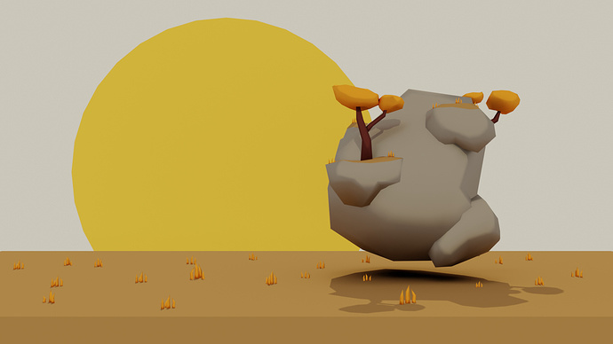
Then we go to the other side of the coin, the super simplistic work, like @Ducaluk, which isn’t bad, but it’s just not great, the composition lacks a story, it’s just a floating rock but is not trying to truly convey anything, once a professor told me that difference between a work of art and a master piece is that art conveys an emotion, a master piece is just something that has an almost perfect technique but doesn’t truly has a feeling to it, that’s exactly what’s going on for me, great execution but no feeling.
Overall I think this week was the best so far, a lot of you went out of your comfort zone and it showed. Yes, compositions were far from being the best, but I think that’s the point, the more mistakes the more we learn.
7 Likes
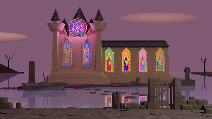
@Leon_V Every week your color palettes always seem to really pop. I’m a sucker for stained glass anywhere so you got my vote again this week. Nice job. I might like to see it composed from a slightly different angle just to add more depth.
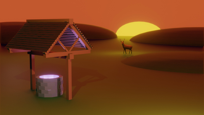
@Mario_Klosowski Incredible first entry! Runner up in my book. The only thing that held me back was the lack of texturing on the well but you’ll get there. The background is great, excellent colors. I’m curious, did you sculpt the deer?
@Sblendid The textures really make the composition when you’re that close to the object. Another nice submission!
3 Likes