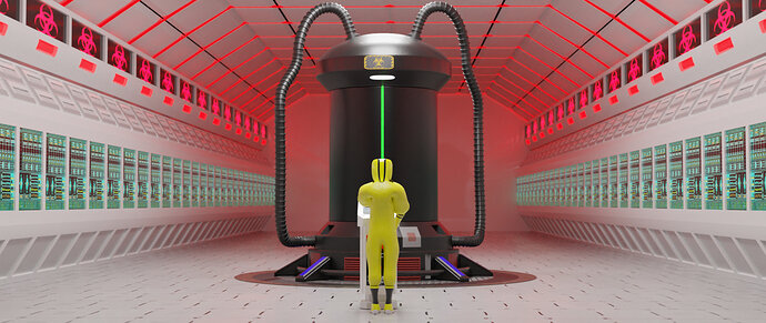
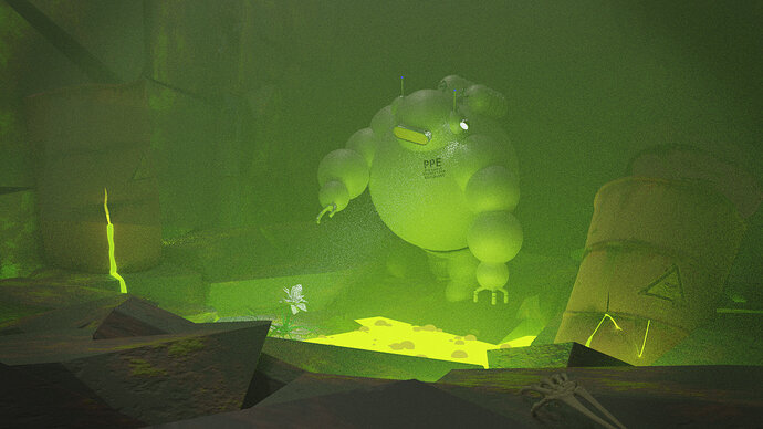
You can mess with Covid-19 big time with this outfit!
Tremendous effort Yee, it’s looking very good!
Thanks! I go really inspired with this one, it started as something really simple, but then I had to force myself to stop xD
for a second there, I thought you were replying to my submission (bc it’s right below it); & you can imagine: “I got really inspired with this one…started as something simple…then had to force myself to stop…” I thought you were having a sex-romp or something, inspired by…well, anyway…hahaha  . (it’s not you, it’s me…)
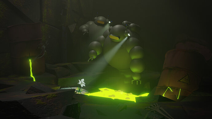
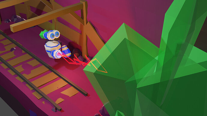
anyway, Yee, your mining robots are awesome!
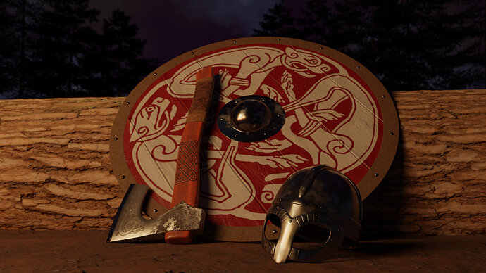
Never walk away from home ahead of your axe and sword. You can’t feel a battle in your bones or foresee a fight.
~The Havamal
Details
- Textures.com: dirt, wood, tree bark, leather
- Celtic patterns from Google image search with “labeled for reuse” enabled
- Metal materials procedural
- Trees made using Sapling addon
- Time Spent: 27 hours (according to time tracker addon)
- More details about construction process in this thread if you’re interested
Awesome stuff guys! It’s already going to be tough to choose, and I have a feeling there will still be a few more.
@FedPete Welcome to the party! You’ve been holding out on us! 
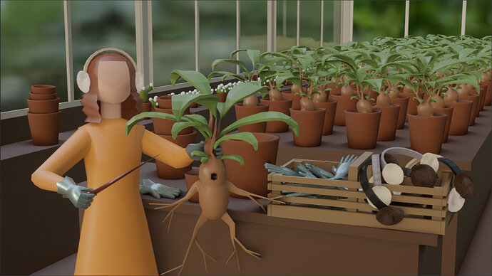
@Bradley_Bowers A provocative work! Are you anticipating the competition will be graded on a… curve? 
Geez we have so many amazing ones this week! Great job guys!
My guess is you spent quite a bit of time on this one pal!
Great work everyone, amazing job!
Ok time over. Some great entries. Good variation of item too.
Time to vote.
There’s only one rule: don’t vote for yourself 
Aside from that rule, you can choose the parameter to judge the entries, some possibilities:
- best embodies the theme
- most colorful
- funny
- technically advanced
- realistic
Note: These are just thumbnails representing the submissions to save space. If you want to see the full submissions, scroll up ↑
In order of submission.
How do you get the lightray of the flashlight?
Because I added a lite volumetric fog (principled volume) to the scene. (Just a cube, with that shader)
If you do this in Cycles, you get a lot of firefly problems.
The squares at the beginning of the beam is just an Eevee artifact.
I have no idea (yet) how to get rid of it. But I saw it also as a lucky accident (I like it).
Here a test run in Cycles 128 samples. The beam is nearly gone, but the light glow is much much better. In Eevee I added more lights to get some of the glow back (it’s not all blooming effect).
And in my final scene, I used 7 lights.
It looks like so. But it’s all basic Blender stuff you can learn here. Really!
PPE Suite just a bunch of spheres attached to an armature (for posing arms). The barrel is a cylinder. The flower is a random thing. The wall and floor, using a cell fracture add-on (breaks a cube into parts).
Important is time and project management!
You need to be able to finish on time. And easily switch, combine, move and or re-use objects.
 Not my intention.
But while I was working on my latest animation, I became disillusioned with animation aspects of Eevee. And then I saw this challenge, got some renewed inspiration. Taking distance from the other project and rethinking how to solve my Eevee problems later on.
With this weekly challenge I had no problems with Eevee at all. I even liked Eevee …
The glow in the cycles version is cool, but it’s a bit over-powering. Also the spotlight is pretty crucial, so it sucks to lose it. I think you made the right choice going with the Eevee render.
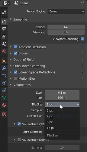
This was my only nitpick, since the rest of the beam is smooth, and the scene is high poly. A very minor thing though. I think “Tile Size” is how you change it:
Lower numbers are higher quality, so 2 px is actually the best, but more intensive.


