Is there any chance we might be able to vote for more entries this week? These are all such good submissions it’s impossible to choose just one alone.
I haven’t done any work really on mine . But I think I’ll be able to get it done before the deadline. We’ll see how it turns out. Great submissions everybody!
Not my concept it was created by a woman by the name of Natalia Tsy. Hope you guys like, concept is on the left my model is on the right.
Good stuff you guys! I was hoping we’d get some good ones for this topic, and you did not disappoint.
I found some spare time and made some last second additions to mine. It’s rendering now, hope I can get it in under the wire
edit: Here it is!
edit 2: additional details
- borrowed the trees and sky from my Viking PPE
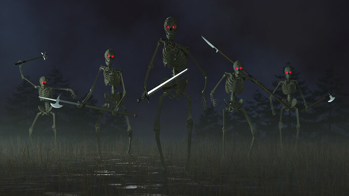
I can add an hour, I’m in a hurry too.
Awesome. I was worried you weren’t going to submit it. Nice work, man.
While I do like to take part in the challenges, I do also think to give more room for new people.
Because the quality of entries is growing, which is good. But also a barrier to participate if you are fairly new to Blender. So I hesitated.
Poll!
There’s only one rule: don’t vote for yourself!
Aside from that rule, you can choose the parameter to judge the entries, some possibilities:
- best embodies the theme
- most colorful
- funny
- technically advanced
- realistic
The poll ends on 2020-11-05T10:00:00Z
Such a hard choice! Really really good work. Wanted to leave some feedback since I feel like a vote never really does justice to all the cool stuff everybody makes. Split into two messages since I can’t @ so many people in one message.
@Bruno_42 Really cool game assets in a cohesive style.
@Yee Yours also feels game-like to me. I think it’s because of the pixel art style. And you nailed the characters exactly. My only nit-pick is that the texture of the house siding doesn’t quite line up at the corner.
@Digitz Great fur on your monster, which is both cute and slightly unsettling.
@Alexandra_Ispas definitely keep that wardrobe closed! The lighter render is nice because I can see everything more clearly, but the darker one has a spookier mood. I feel like this is a familiar dilemma, but one which I still don’t know how to solve. Also I like your spider webs. Is it a texture with alpha?
@Leon_V Those are some freaky lawn decorations! Is that an Enderman? And is that Ursula from the Little Mermaid on the right? just a guess
@Phillip_Boswell That’s a really good recreation of the inspiration! I feel like you captured the mood/expression of the character.
part 2:
@Ethan_Martinez Another one of my favorites of yours. Immediately recognized it and heard their wicked laugh from the Mario 64.
@horlahmah I like the first of the two renders (Eevee, I think). I like how the jack-o-lanterns are lit in that one.
@Blest Nice figures. Though it’s not the focus of the image. I’m really impressed with that cat. Very life-like, and interesting shading.
@Tetiana_Stasiv Wow so cool! Great texture on the pumpkin, and awesome atmosphere/lighting.
@FedPete Maybe my favorite of your work. Lots of really nice subtle touches. The flame, the glass, the vignette; all fantastic. A little more subsurface scattering on the candle wax might be nice.
@anfloy I love it! A very nice composition with a lot of nice touches. I especially like the fog. I feel like a touch of depth of field would be nice.
Thanks for the feedback! Yeah, definitely keep that wardrobe closed, we don’t want monsters crawling out of it unless we can control them, right?
To answer your question about the webs, they’ve actually got a transparent BSDF. Here’s what it looks like in Dev mode, solid mode, UV unwrapping and the shader nodes. The only other thing that I had to figure out on my own to make it work (that wasn’t in the tutorial) was that I had to play with the material settings -> blend mode -> alpha blend, because otherwise I’d still have the full mesh on display.
I noticed it now. I was lost in my tweaking frenzies, bummer … you lose something you win something …
I used the grease pencil to draw a simple web.
Converted it to a mesh and added some random vertices displacement.
That last action will create the bumps in the shiny material, more/less reflective faces.
It needs more attention but time is a factor on these collabs.
Thin threads and low cycle samples are a bad combination.
Oh I didn’t think about the grease pencil. I’m guessing it could take more time, though.
You know, I was actually wondering how you did those webs in your submission, they look so neat. Now everything makes sense. Thanks for the info!