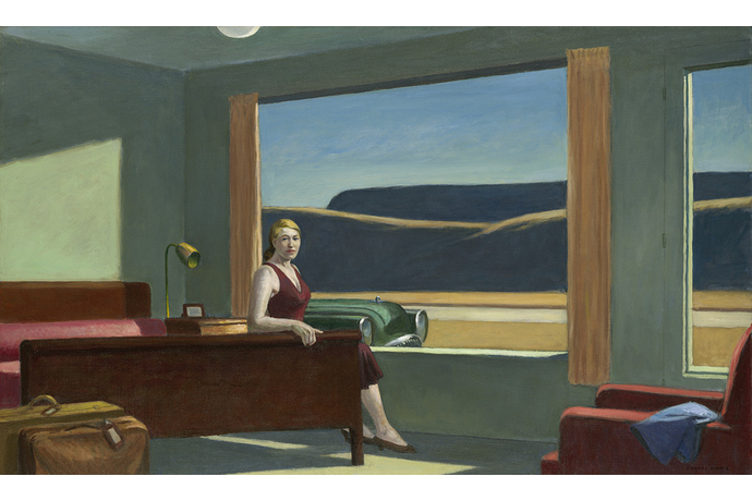
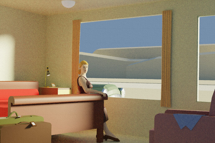
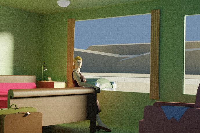
Team Project 1 - Hopper's Western Motel

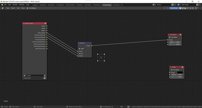
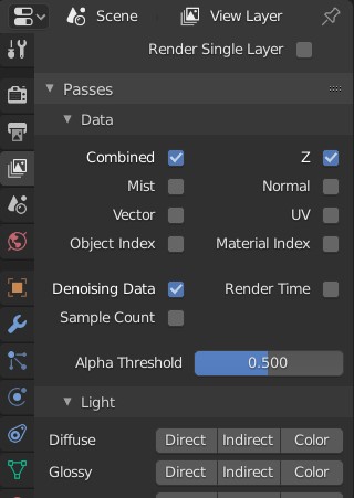
I Dont use the denoise option down there use the denoise node under composting i found that one better compared to the way @tryger2 mentioned . Maybe a personal choice it seems .

Annotation 2020-07-20 194651

In my workflow i keep this option selected in the default blender file , so i can add the node later even after rendering.

2 Likes

Oh nice! I didn’t even know about that.

Cool, I’ll look into these settings

Denoising can also be part of the post composition part.

Photoshop has a lot of filters, but these are more presets based on the defaults available.
Blender has only the basic stuff, you need to be creative in the compositor, to create your own “paint stroke” effect. I have no experience in this. But why not photoshop? Or Gimp, or Krita (better).

Coming together better. Good light on the back wall replication. yet the shadow does not go on down across the bed headboard? I guess the painter cheated a lot with the lighting too!

The bed footboard curled over bit the woman’s hand rests on is too big. The leg too fat. Plus I suspect the whole floor needs to come up, shortening the foot end of the bed a bit but getting the bed leg fully in the frame. The woman probably need a general scale up bigger a bit. I should rearrange those feet, left back and up a fraction leveling them. Body still needs a bit more twist towards us. Bed has no got the ‘pillow’, long red tube. Bed headboard should not touch the bedside unit. Lamp should tip up and shade be bigger and not lit.

Next time let’s use a photo not a painting!

1 Like

@albesca How’s it going? Which stage are we on / how can we help to finish this?

edit:
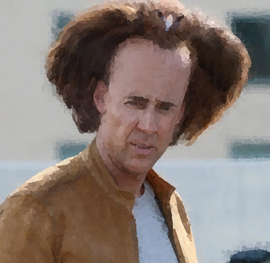
about the post processing / paint effect, here are some quick GIMP filters I tried on a sample picture.

  1. Default Image:

  2. “Canvas” filter:

  3. “Oilify” filter:

  4. “Water Pixels” filter:

  5. “Cubism” filter:

Maybe one of these could be helpful in obtaining that painting look. I’m no photo wizard, but I could put some variant of one of these on the final image, assuming we don’t have a gifted photo-shopper hiding among us.

3 Likes

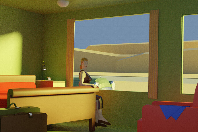
I fiddled a bit with the scene, added the pillow to the bed and a light to lessen the shadows on the woman, this is a higher quality rendering with some of the filters applied:


Tomorrow I’ll tweak the colors of models and lights and I’ll post the final rendering (unless someone volunteers to work on rendering or postprocessing, in any case I’ll push all the settings on the repository)

2 Likes

It’s looking pretty good. I think there are a number of things we could tweak, as @NP5 pointed out before, if we wanted to do another pass (i.e. I played with the curtains just a bit to try to make them less flat / more lifelike, but still low poly). This would allow us to get closer to the painting. On the other hand, it might be nice to just finish it off and move on to the next project. I’d vote for one more pass of fine tuning, but I’ll follow @albesca either way.

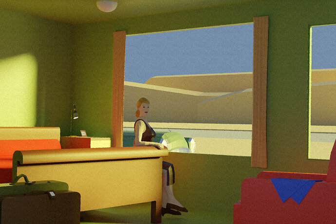
I’ll volunteer for the post processing too, unless somebody else really wants to. Here’s a first draft with a combined “canvas” and “oilify” filters:

Whether we do another pass or not, I’d say the biggest issue now is the lighting on the woman, since she’s the focal point of the scene. She’s still too dark compared to the reference:

referenceImage3624

4 Likes

It’s good progress! Yes, a lot of problems. Due to the fact you’re using a mathematical (Blender) model. In comparison to the artist freedom. Maybe adding some extra area lights on the person?

For me, personally, the colors of the bed and suitcases … chair are different.

I changed the colors of the landscape, the room and the couch, resized and generally tweaked the woman and shifted a bit the sunlight direction, this is the latest iteration of the rendering (with the same filter combination a used last time):

Everything is already committed to repository, if anyone wants to tweak it (easy things like rescaling the suitcases or something harder like fixing the width-height ratio of the scene).

2 Likes

Yes as @FedPete mentioned some colours could do with matching. the bed wood in the painting is quite a dark mahogany? The reds deeper, darker. The last run the walls lost the green tinge that was closer but too ‘lime’. landscape too bright rocks.

I was tempted to fiddle with the woman when I saw last night, but was late and now you leveled her feet anyway.You moved her arm forward, wheras from shoulder to elbow in painting it goes a bit backwards. It is getting to the situation I suspect where we just can’t match the painting, sitting on that bed and be twisted enough round without knees inside the bed footboard!

Happy for @Tyger2 to do more or @albesca but I feel we have learnt a lot about the difficulties of this which may be better to move on from, to a better selected thing to work on next time. With more small items more people can contribute to. Further, I think the lead should make the ‘room’ first, even block out very very basically the other items in scales and positions as a reference point for each separate later specific model. Even setting a camera position up so each modeler can view what they have made form the final camera position. Oh possibly with the image plane with the intended thing we are copying all lined up with that camera position?

Still not entirely at home with the github stuff.
3 Likes

Ok, here’s (for me, at least) the last rendering of the scene:

I did a bit of color correction here and there, darkened the mountains and rescaled the suitcases.
I agree with @NP5, while there are things that could be improved I think that this project is pretty much done.

If @Tyger2 or someone else wants to just rerender and postprocess the scene, I’ve committed my last tweaks.

4 Likes

Looks good to me.

We finished our first team project! Woo hoo!!! :champagne: :champagne: :champagne: :clinking_glasses: :clinking_glasses: :clinking_glasses: :tada: :confetti_ball: :balloon: :sparkler: :fireworks:

Nice job, everybody! That was fun, and a good learning experience.

3 Likes

Yeah, I’m going to step away from the project and in a couple of day I’ll try to put down a list of what I learned from it, from the subject selection to the workflow and team management.

We did well for a first collaborative project like this and I look forward to the next one, great job guys!

3 Likes

Wow, that was a cool project!

I wonder if this initiative was continued?

We could try again but we have learnt a lot and it probably would need to be different.

Paintings are not good to copy as the painter cheats or is bad at accuracy.

I feel a new try at this would be better if there was a theme different people make assets for intended to go together.

So if the theme were an aquarium. Everyone could make a fish, a coral, a seaweed, a crustation etc. Then someone assembles them into a scene? Or maybe all contributors could create a scene of their own from all the assets?

It would need some debate.

@bOBaN Did you see the tiled world idea I floated as a multi participant project? That may be easier and more flexible to people’s time and participation.

4 Likes

That would be cool to try something like that!

Yeah, I can imagine. Also painting have a different aim and different limitation to work with…

That kind of idea is nice. I’ve seen something similar being executed right now in Imphenzia community (people in Jan build city blocks, now they are building vehicles to populate the city and Imphenzia is assembling it as a big scene).

For sure. I’m guessing that kind of work would take multiple weeks - so the idea should be really cool for at least a few people to see it to completion. I guess many people might want to join, but taking on a longer project and finishing is not a common thing nowadays :sweat_smile:

Maybe a new subject for brainstorming for ideas in #blender:blender-collab ?

Yes! That subject actually lead me here! :slight_smile:

3 Likes

I’ve created new topic for it here:

3 Likes

Privacy & Terms