I decided to make my HUD from scratch, but it just ended up looking like Michaels. Oh well. 

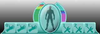
The left side has the health meter and standard attacks. the right side has the energy meter and magic attacks which use the energy.

I decided to make my HUD from scratch, but it just ended up looking like Michaels. Oh well. 

The left side has the health meter and standard attacks. the right side has the energy meter and magic attacks which use the energy.
HUD inspired by Guild Wars 2 style.
Utilised the provided Red Orb, all the rest is made from scratch. Layer groups came in extremely handy for this one, especially in combination with linking layers for moving about. Would recommend trying them out! (little folder icon next to the new layer icon)
This exercise was definitely a great way to put into use all that we have learned! 


Just having 40 minutes of fun  And forgot to use my icy c(g)old color set.
I used a lot of cloning and found out that Gimp is a bit slow in moving folders in folders.

Literally spent like 2 hours on this 
I didn’t get fancy with the background but I made a HUD based on Altair’s equipment/skills from the original Assassin’s Creed (sans bow but whatever). I got really lazy towards the end and started painting icons components all on one layer. I will have to try to break my bad, bad habit orz
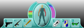
Created a simplified HUD using icons from previous challenges (and some new ones). It was fun to create icons using only one colour and a small space. Especially since many seem to be fantasy/medieval while I’ve gone for a modern/futuristic set.
![]()

Here’s my HUD for a retro-style action RPG. My idea is to have weapon “cores” equipped to a character to add to their stats and give them powers.

Here’s my HUD that definitely took a good chunk of time to make
I made a bunch of random sprites and then made gauges for the mana and health. The currently selected item has a blue outline

Hi.
And another challenge accomplished 

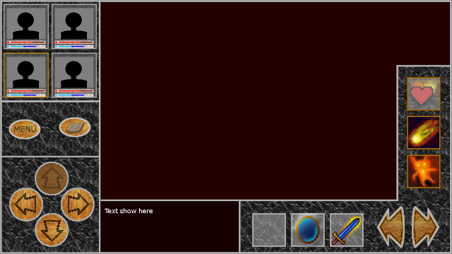
I was thinking about sth for mobile. Definetely, that bars under portraits are to not visible enough, but I would rather go for next lesson


Hmmm. Obviously, my game idea is not mainstream.

My HUD icon

![]()
