If you’re reading this, there probably aren’t very many posts yet. But don’t worry, you can be the first! Either create a new post or just reply to this one to say ‘hi’.


My Version.
Love the Gecko!
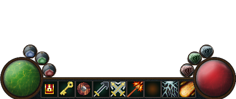
HUD for an adventure game.

Got the bubbles on each side displaying what’s equipped in each hand. Along the bottom the abilities become silhouettes once used and then regain color as they recharge.
Old-style FPS hud:

Very cool Todd!

I think the technology in this game is powered by purple.

I think i want use the green backgrounds in the slots for items and weapons, and the red ones for skills. on the left side added 3 mana/ health/ paralysis potions and on the right 3 kinds of gems.
Thanks. I’m learning that simple is best in pixel art.

I realised I’d shot myself in the foot a bit by having overcomplicated icon panels eating up so much space and limiting the size of my icons, so I redid everything.

My Game HUD.
Well, I’m pretty darn proud of myself for making it this far in the course. Onward to the next section…

Was messing around with health and mana indicators to now have them at different levels. Here is a couple example pics of them.


Oo Nice, Well done for going off and making your own HUD 
These all look great! Well done everyone for sharing your work- be proud of it 
And here is my HUD.
Did not change too much from the template we got.
Hehe, the leftmost orb looks a bit like HAL 9000. 

Used the layer mask feature for altering the orbs.
Sorry a bit generic here at the end. I am still working on my own designs but work is kicking up on me so not a lot of time:


I used the red right slots for potions and the left ones for magic and weaponry. Decided to add some numbers for quantity, red borders for disabled items due to lack of quantity and yellow borders to show what is equipped.
This was quite an engaging exercise. I rather enjoyed it!
(Oops, I neglected to place the orbs behind the HUD)
Good idea with border colors and numbers. 
