Wiesiek’s HUD:


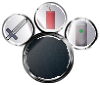
Left slot: Sword
Middle slot: Explosive
Right slot: Healing item

I realised that my icons didn’t really have an overall theme so I made some new ones in the same theme and palette based upon one image I made previously.
I made several versions of the mana bar, one red, one blue and one yellow.

Here’s mine, I used my own backgrounds on the icon slots, but only because in other games that use similar huds, they did the same thing.

Created new icons for the HUD in place of using my earlier ones. I hope the intent is clear behind them.

Those are really nice, thank you for sharing!
I wanted to fully take the challenge, so I made my own HUD, and I must say, it wasn’t easy! But I’m proud of the result, I wanted a slightly gore/demonic look and I think it does the trick. Also, being a bowman myself, I couldn’t resist on making my HUD for an archer! I love arrows.

Here’s my Bottom HUD:
- Trident
- Shield
- Red Potion
- Blue Potion
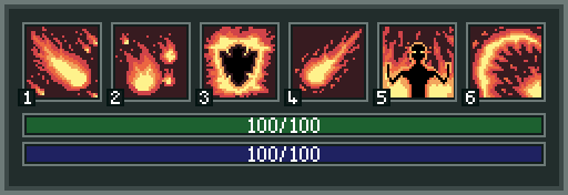
- Fireball Spell
- Raise the Dead Spell
- Pancakes


My HUD challenge!


There’s a goose in a spiral… I created it as one of those lollipops with an imprinted image, but I’m really not sure what it means in this context 

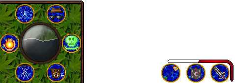
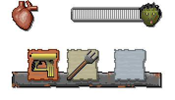
SO I am going for mobile, also, I wanted the health and zombie kill count bars on top, so made as separate to the small hud. Red is active weapon, the next non-active, and the blue one would be for shield powerup, I think I am going to make them all the same width apart or move the shield farther over because it doesn’t look quite right to me yet 


 [gardenfare]
