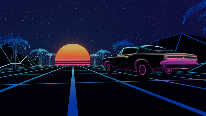
Nice, I like the palm trees. Was wondering to add these too 
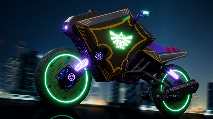
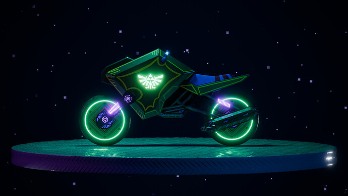
Submitting a recent project where I focused on texturing, painting, shading and lighting a scene for a
Legend of Zelda-themed futuristic motorcycle – whereby the “futuristic” theme definitely leans on a lot of synthwave / neon / “night city” vibes.
@FedPete feel free to use either one of these frames for the vote – I can’t decide 
I like the first one, showing speed in reference to the background. A dynamic scene!
But then the wheels should be blurred a bit too?
The camera that took the photo is also super-futuristic… and has some great image stabilization capabilities 
Looks great!
I like the updated version and the crystal buildings. Still, needs more neon!
Maybe listen to this for inspiration
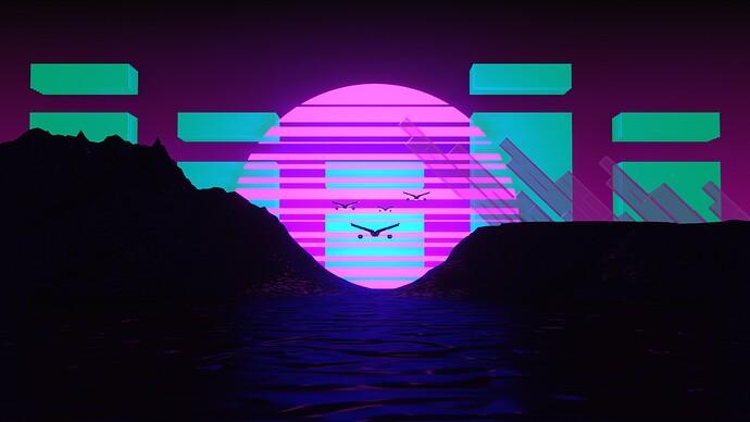
did it all in eevee this time. may do some compositing tomorrow and make a couple adjustments but not sure if ill get 2 it so figured id post now just incase
looking good, i like the strong silhouette effect on the builldings
We @BlenderCollab have a few days to vote. You can vote fast but also think slowly about design, colors, technique, difficulty, subject, realism, etc. Choose consciously and not on your entry.
The new subject week 18 “Alice in wonderland” has already started. The winner of this week’s “Synthwave” challenge may select a subject for next week 19 and win a badge.
0 voters
Really hard 2 pick this week so many great renders
Oh my… so many great renders this week! Hard to chose!
IMO, all should be winners 
This is hard to pick one. And such a great topic! Good luck, everybody!
You can find my walkthrough here >>>
@Joey_Cuevas Congratulations on you Synthwave Collab entry. It has certain Synthwave vibes. I think the car did the trick.
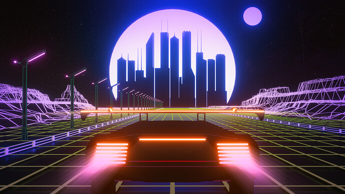
- RayMobula - Love your engine exhausts. Maybe a change of the camera position …
- FedPete - Totally focused on other visual issues (introducing effects), that I forgot to follow the colors and a bit of Synthwave (less 1980 design).
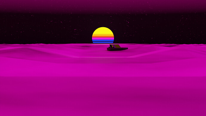
- Kasimir - Great interpretation of Synthwave. I think the dark foreground could be more visible (more present). It’s too dark on my monitor.
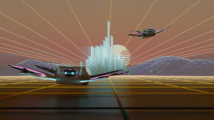
- CypherPoet - Very nice model, but we miss the Synthwave wireframe visualisation. Maybe part of a Tron scene?
- ShadowFireSage - Great colors and reflective ground base. Maybe too futuristic and has a feel towards the Tron movie.
- Willrun - Synthwave is more about 1980 computer graphics, wireframes etc. We miss that aspect in the illustration.
Note: I don’t want to offend anyone. I try to write down positive ideas and visions in my simple use of the English language. I am also sometimes more inspired by a particular subject or solution. I’m also learning from you!
Thx. Camera position would have required having a full car model. Not just the back. LOL
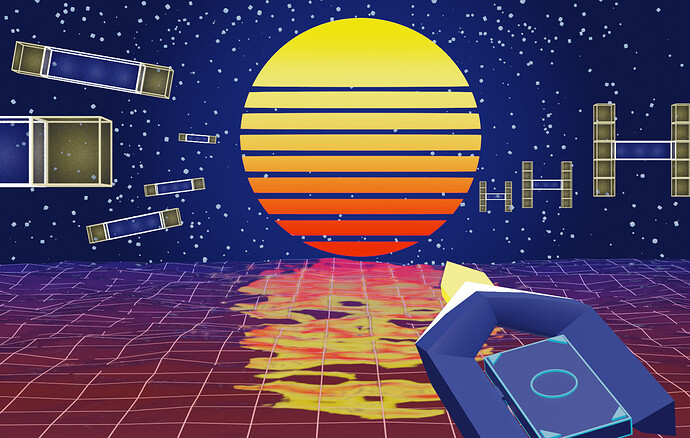
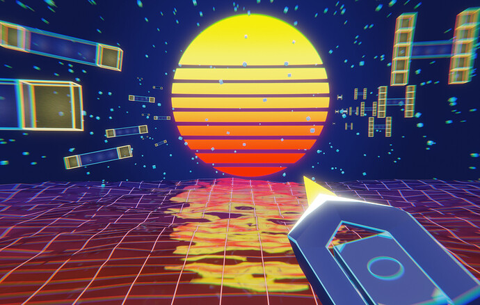
thanks lol it was fan art of speed-running game where you use a grapple hook in space


