Final
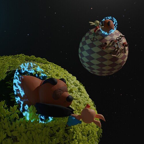
It’s Russian Piglette! That’s even better, and besides, it’s in your style, not 2D cartoon. 
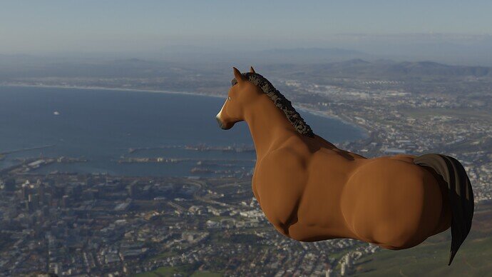
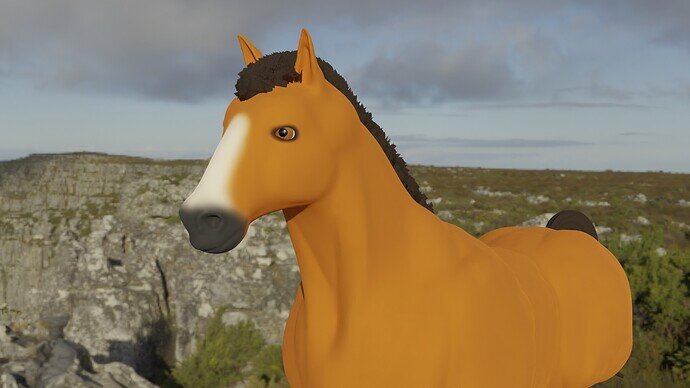
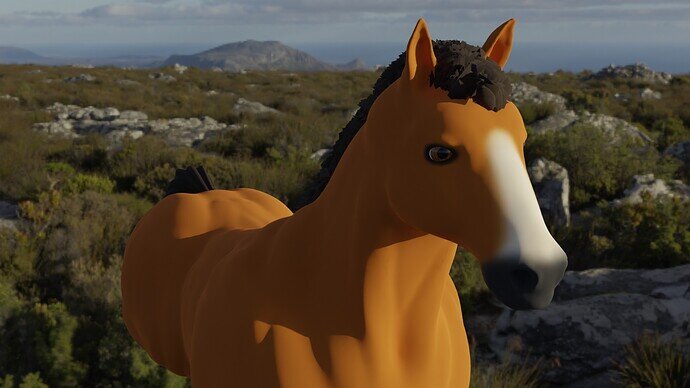
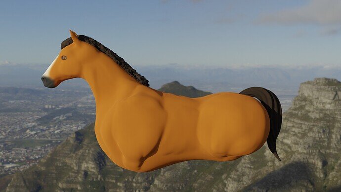
Hey, my concept was originally a robot pulling a rickshaw and then thought a robo horse and buggy would be cooler. That evolved into an organic horse with hoverboard or jet propellor. I’m not going to have enough time to finish before the deadline. I learned a lot sculpting the horse and messing with hair particles. I’m fairly new to blender and proud of it so I still wanted to share.
Guess that’s a 1 horse power rocket pony?
It’s a fine top half to the horse! If you finish post it even if it’s not part of the collab! 
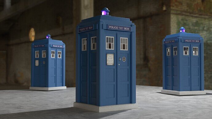
You can have one in any colour you want so long as it is blue.
Distance and time no obstacle to travel.
It is a very good start to a horse. I have that trouble all the time, take on more as an idea than I can get done. Sometime a collab will come round that it will fit into some other way so then you can finish it! At least you learned a lot on the way which is the real point of it all.
I agree, as I’d like to see it finished, even if the collab is over. 
Voting for Futuristic transportation
We @BlenderCollab have a few days to vote. You can vote fast but also think slowly about design, colors, technique, difficulty, subject, realism, etc. Choose consciously and not on your own entry.
And the new subject week 6 " Viking ” has already started. The winner of this week’s “Futuristic transportation” challenge may select a subject for week 7, 2022.
I’ve so little time these days.
I have a new job, more travel time.
I had some fun ’ Viking’ ideas …
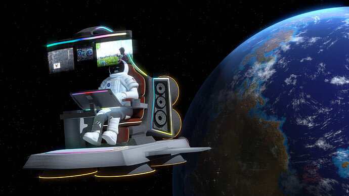
Our congratulations goes to @Blest and @ZachDude for their views on futuristic transportation. Both are funny and it seems that the new generation of transportation, will take place in space …
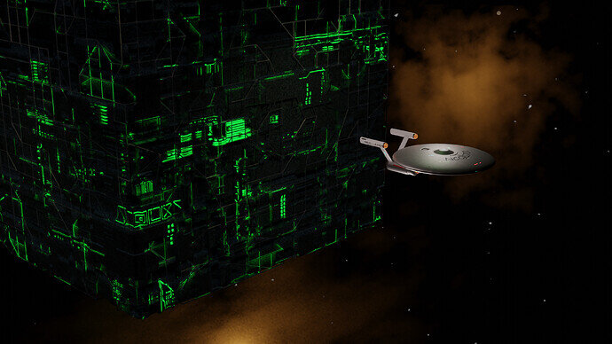
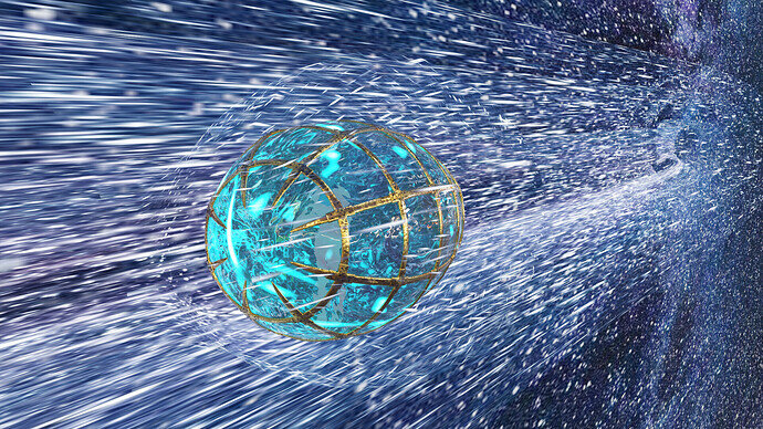
- Mateusz - While visually stunning, I miss the connection with transportation, movement. Because there is no reference to how big it is. And what is its usage (what does it contain).
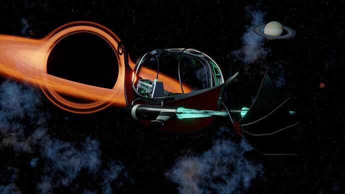
- Digits - Very nice, but where lies the focus? The black hole is colorful and get’s all the viewer’s attention. While the person inside, with a lot of details, is barely visible. Maybe better if you made the black-hole the center of focus (in the middle) and the spaceship as a sidekick?
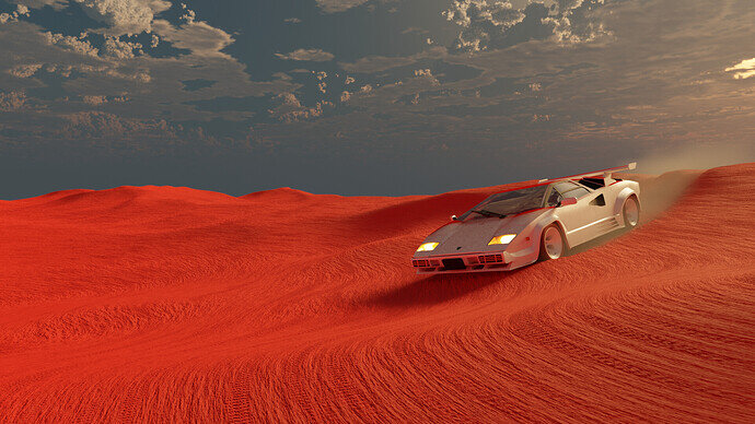
- Lintari - exiting colors and a very good model. But to me, it doesn’t look futuristic. You’ve placed a common car in an unexpected environment. Maybe if you changed the wheels into something magnetic levitation engine thingy …?
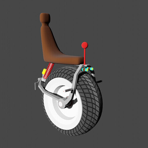
- Ice77 - I really do love this futuristic, minimalistic design! Try to add some details, add bevels to some of the edges. And play with textures. And add a small machine to hire this vehicle. Then you have also a little story.
- sezpul - Finishing on time is hard! It is a nice idea to enhance a horse so it gets a futuristic look. I think the head could be slightly bigger …?
- FedPete - Also Finishing on time is hard! I think you get lost in modeling (details) and composition. Maybe working too hard on the story, golden rules, rule of third, triangles, and areas of detailing, viewers redirection. The technical stuff. But you should try to finish the project (See WIP). And did you learn something new … ?
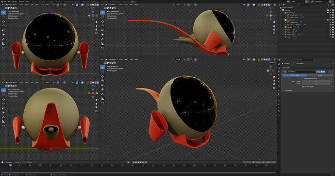
- igorfy - you had something going. It looks futuristic. It has a nice curved flow … but also looks like an egg on a spoon. I think due to the current material. A pity that it didn’t finish.
- NP5 - Unmistakenly Dr. Who! I did see all episodes (I could be based on my age). But 3 Tardies … at once. I got the impression the original is taller. And by adding more realistic textures (lighting) it could score more votes.
- Willrun - While it is high tech futuristic space travel. It’s also very recognizable and therefor it need to be very compatible. People start to compare what they already know. People have references in their mind of how it should be.
At all contestants and viewers. It was a great and fruitful collab. So many different views. You really are creative people. I would thank you all for your positive comments, technical support, and interest.
We start with a fresh collab “Winter activities.”, and a clean (basic cube) .blend file. Have fun!
Yes my intent was to give the impression of a ‘car salesroom’ where tadises? are commonly purchasable travel machines. Needed more sale room paraphanalia but time was against me.
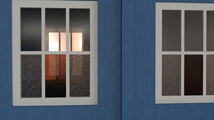
For size etc. researched the real thing blue police box. The props have varied over the years I saw. The originals also had slight variants over time but I chose a middle most standard one, of which it matches the drawings I could get. They are mostly painted cast concrete, rather dull and plain, guess the texture is not good enough.
That would be funny, second hand or new ones 
I sure hope he does, because I want to see it finished. 
Always new! They get ‘flown’ back in time before each sale. 
That’s also true … always latest model … 
Still exploring things … Work in Progress (WIP)
I see what you mean. Thanks for posting the large render, as I can see more details better. I do see what you mean about the planet ring transparency, and with the light coming from that direction with so much force, the rings almost fade away into the bright light at the horizon all the way over on the right.
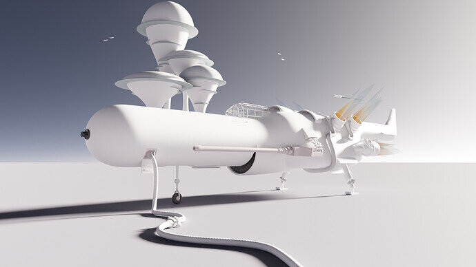
As far as the ship itself being white now doesn’t help either. Once it’s been textured/painted, it won’t look so bright, though if you’re thinking of a metallic look, then it may still shine very brightly.
Oh, and now with the planet in the picture, I’d move the ship all the way over to the left, and then the tail, and those 2 exhausts won’t be in line with all that bright light. Just my 2¢, FWIW.
First time looking at this thread. You guys made some incredible stuff! This might be the challenge topic I most regret missing. Nice work, everyone!

