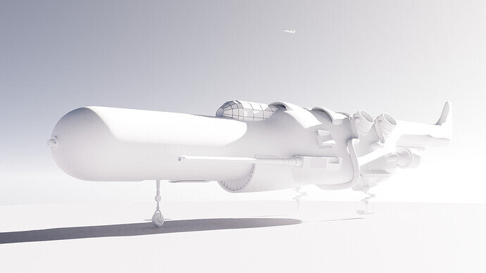
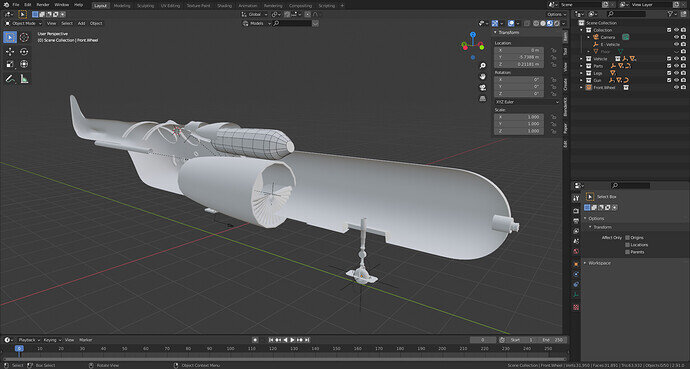
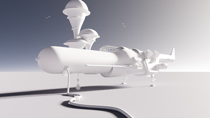
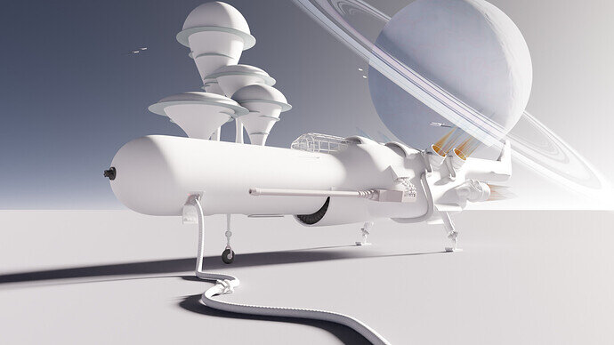
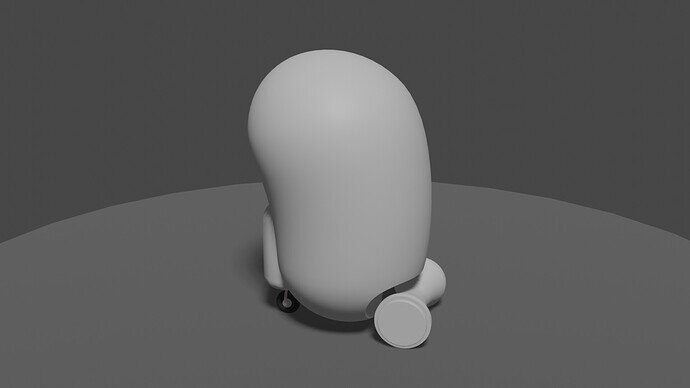
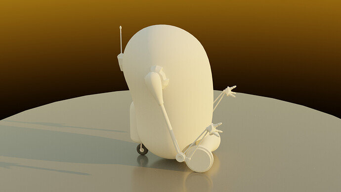
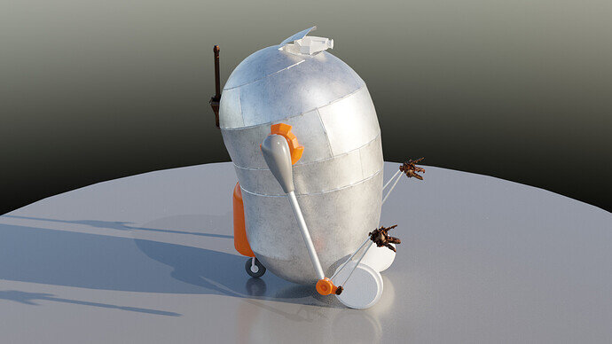
All main items blocked out. Start to add third level of details.
But I experience strange things with the render.
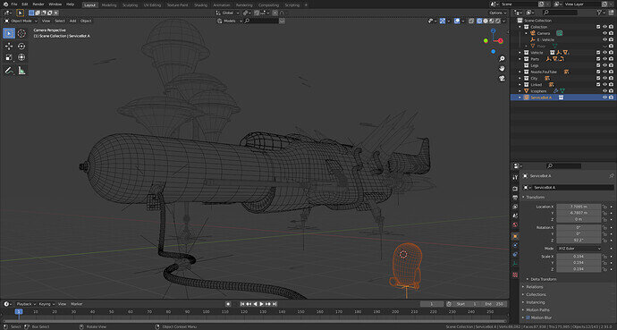
The bullets are gone, hovering high in the sky.
Which is a happy accident, mimicking vehicles in the sky. But why empties aren’t in effect, at render time, I have no clue.
LOL. Is that to ease the load on the computer?
Perhaps it is a feature of you futuristic transport? One side real other side a modifier, not real but there by some future magic science.
yes I try low poly, because later, I need a lot of bevels
And now I’m starting export to different .blend files. And link them in the final scene.
Still working on composition and model details.
trying to find spots to add details and spots to leave blank.
The texture will be difficult and is a lot of time. Didn’t do anything on UV mapping yet.
Showing my progress. Adding a bit of blur and focal length to add some depth. Soften the shadows a bit. All lighting comes from the world, nog lamp involved.
I split the project into several files, it’s cumbersome but still has reasonable editing speeds.
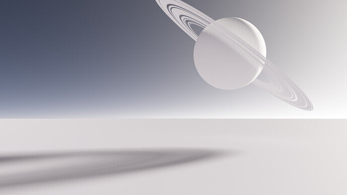
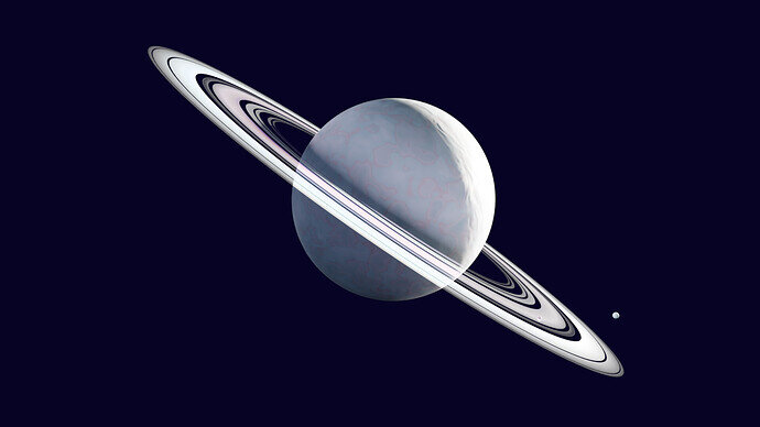
I’m trying to fill up some screen space. Adding a planet to give it a more futuristic feel.
It’s casting a shadow. But I will render this in a different screen. And using Blender compositor.
Combination test.
But the blend type (because of planet ring transparency) is wrong.
But I think there is to much going on.
Just make the planet smaller so it takes less attention?
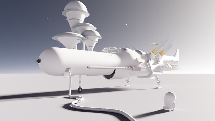
Add a human interest character/robot servicing the fuel line area?
Looking really cool 
Maybe just desaturating the planet, or adding a fog layer to give that feeling of super far away?
Some sort of robot arm, or two, an ‘eye’ and it will have a good place. That size and proportion perhaps two or three working together? Easy duplication.
Every item added, is like a project on its own.
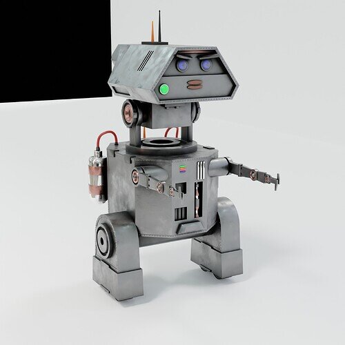
Personally, I think the bot is getting too much ‘funny’ look and feel. Looking Cute, because of those curves.
Not a functional machine or apparatus. flat surfaced, pointy … boxy.
More this style?
origin
(RyanKing YouTube) but nothing special to make. I upgraded it a bit, rivets, etc.
Yes, but I want to make it also some sort of the spaceship design compatible …
Nice work guys
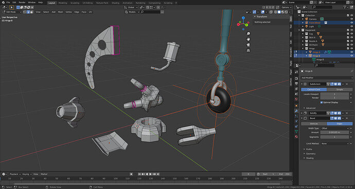
Collection of re-usable body parts. Some look low poly, but relatively speaking they are not.
Because when shown small, it will be too much (when many used).
Last note: I really liked this project.
Something to work on later, but my computer had a system crash. And only an early backup. So this project is lost …
What a beautiful project, everything looks great and in such harmony.


