2022 Collab: Week 28 “Vehicle" - VOTE CLOSED

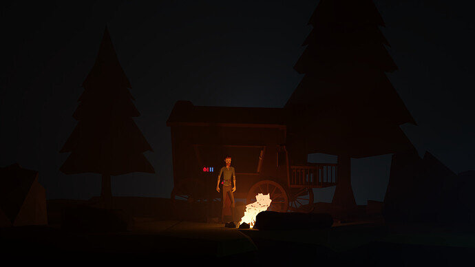
@FoolishJester I’d like to see some more light around the campfire spilling into the wagon. It’s hard to see any of the detail.

Your character looks great. It’s a shame not to be able to see any of the detail in the wagon.

Also maybe a little blue and red light point light on the potion bottles?

Otherwise it looks great.

2 Likes

No, I havnt it’s a decade or two too old but I do like Lego

2 Likes

Yes dark, especially for showing the vehicle, the subject of the collab.
That said the central part on its own is a very nice image at full size.

1 Like

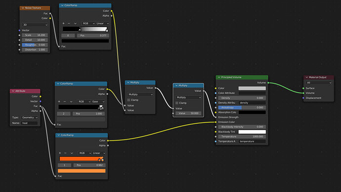
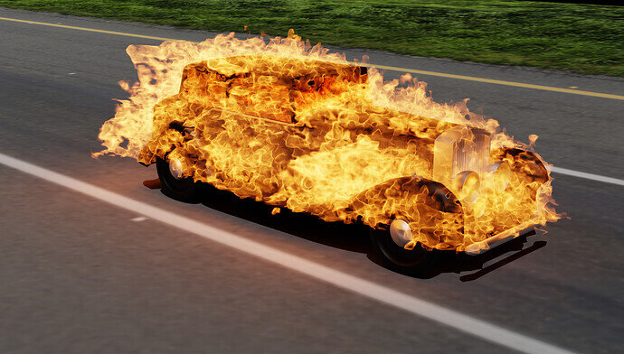
It’s just following a tutorial, with these nodes, and some messing with the basic fire settings.


In case anyone was wondering, I figured out why it was the render was so blurry, in the physics panel, under fire, render, there was a slider for motion blur. It used to be at 1, it is now at 0.

3 Likes

Wish I could do more but this will likely be all I can get done before due date/time. Just adjusted some of the lighting real fast. I’ll probably continue this scene after the collab.

4 Likes

I’ve run out of time for today. The dinner bell is ringing. Just in case I don’t get to finish it tomorrow… here’s my latest version.

The Awakening:

6 Likes

Final entry:


It is from Good Omens, a recreation of Crowleys car in it’s most glorious moments.

6 Likes

Hotrod …

2 Likes

I feel this way too sometimes :laughing:

OK. Here’s my final image. Running it down to the wire this time.

5 Likes

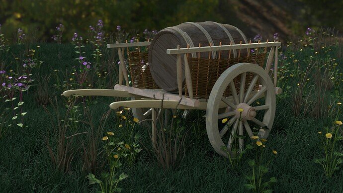
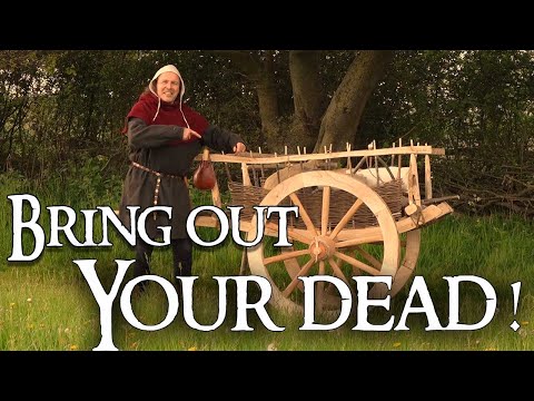
Medieval hand cart. Loaded with a hogshead barrel.

Needs much more work making it look less freshly new and so ‘straight’. But time as usual catches up with me. Going to have to make some better wood textures somehow too, available ones are all to ‘fine’ modern smooth or lap fencing unsuited to anything much but making fences. lol.

6 Likes

So much mesh detail. As you said, the texturing of it is the next challenge.
I also think that the lighting is a bit unnatural (I can’t express it). I see a soft shadow cast.

Did you try a version without HDRI, no light, but only with world lighting > Surface: background > Color: Sky texture > Nishita - and fiddle sun and air, dust ozone properties.
Then the background HDRI image can be solved in a different way

1 Like

We @BlenderCollab have a few days to vote. You can vote fast but also think slowly about design, colors, technique, difficulty, subject, realism, etc. Choose consciously and not on your own entry.
And the new subject week 29 “Music instruments” has already started. The winner of this week’s “Vehicles” challenge may select a subject for week 30.


1 Like

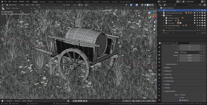
Our congratulations go to @NP5 for his detailed and realistic wooden cart. You need to look at his wireframe to see how many details he has put into the model. The way he presented the scene is also a nice detail. It completes the overall mood of the composition.

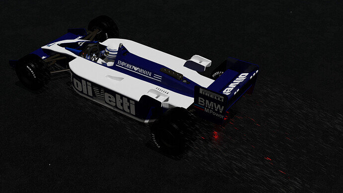
  • Linrari - the rain and red brake light is a really nice datil, but it could be stronger. Maybe adding also a bit of motion blur? Rain means wet road, which should reflect a lot of light (car, brake …)
  • TheDespicableDM - your flames are amazing. But it hides the nice shape and details of your car. Maybe only burning wheels and exhaust pipe?
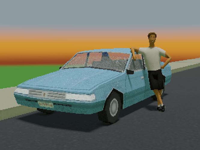
  • Tyger2 - I still like your design. It made me smile and from a distance, it looks good. We had so much fun with such few vertices in those days … :wink:
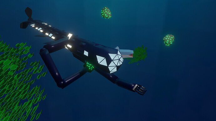
  • Cows - You’ve managed to give us the impression of an underwater scene. A bit more composition tweaks could improve it. Like the shark, which is partly hidden and visually merges the ship and school of fish. Which makes it difficult to ‘read’ the scene.
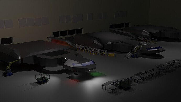
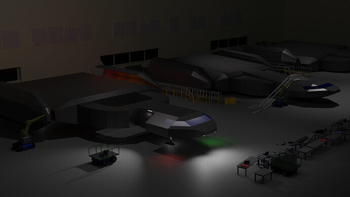
  • GameProgrammer2k - great hangar scene. I know you wanted to show the red, and green lighting. But in a hangar, for maintenance purposes, it should be over-flooded with light. maybe a first-person view would be better, to show the scale of things.
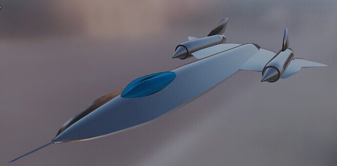
  • DANB1 - Superb model! The camera angle and the lens are well chosen. The only thing I miss/see, is that the real blackbird is black and not shiny at all. It could use more details (texture).
  • Or_Doni - Welcome. You’ve made a nice glider. Try to find reference material on the web. Working from memory could be fun, but can also mislead the artist. Does the metal bar, for example, need to be rotated?
  • Foolishjester - Such a good design (still too dark on my monitor). Your campfire is beautiful! But I think, because of that you missed additional details. Which could bring the scene to the next level. If you add a lantern as an extra light source in the front and back of the wagon, You bring more details and light to the scene. The magic potions could be more emphasized with light. Casting a red, blue glow onto the wagon. Adding tiny fire particles can also give a nice detail. Your scene is more about light setup than, modeling and texturing.
2 Likes

Thank you all!

If interested here is the video I used as the main reference. Very hard to find old paintings or manuscripts with them in. If you read some of the comments apparently the maker of this ‘channel’ is actually a very well off co-founder of a major game company, presumably doing it as an interest.

Clearly, as I mentioned in the entry post I need to do some bending and un-straightening of some of my parts yet. So far I have not added the rawhide ties he had on his, I am unconvinced of their likely use being as they fail in the wet. Simple joints I believe would be more probable. Or possibly both. Doubtless, there were thousands of variations they were not factory made!

There is this Bruegel with lots! Somewhat different, bigger more refined narrower wheels probably related to the more urban situation? Including the use to move barrels to the local pub!

Why are carriage wheels dished? Took more research to discover, that it is to counter sideways stress on roads with a side tilt, and probably the effect of turning. Wheels can break sideways as their weak point. The dishing means the struts go vertically down onto the rims when some degree of side tilt is acting on them

4 Likes

It really is an awesome model you’ve made there. Nice work, man. I’m also quite impressed by the foliage you’ve got it sitting in. Very natural looking grass and flowers!

1 Like

It’s mathematical.
A wheel can only run over an obstacle 1/4 of the height (diameter) of the wheel.
One-meter wheel diameter can overcome less than 0.25 meters of rock height, or stone height.

Thanks Tyger, The foliage is all geometry node based scattering. Same basic process as using objects on particle hairs, just a new way of controlling the instances. Low poly plants with alpha images on low poly shapes for the leaves and flowers. Took all images used myself. I must work up various other plants I took images of. Increase the biodiversity!

2 Likes

Now you say it that makes sense on the size. Presumably also smoother ride over smaller ruts or cobbles. Perhaps it was just the local way there and then too. Larger diameter and thinner like that would be more at risk of side force breakage though.

2 Likes

The bigger they are, the heavier they will become. So they became thinner. "Design follows functionality. But nowadays, with all these electronic ‘smart’ gadgets it’s becoming less and less common sense … "

I’ve just created “flowering-plants

1 Like

Privacy & Terms