Amazing. When I went back over the post, I had to do a triple-take because I thought some of your renders were actually the reference images. I love the image in the rain which really shows movement, but several of the images above it are just as good in their own way.
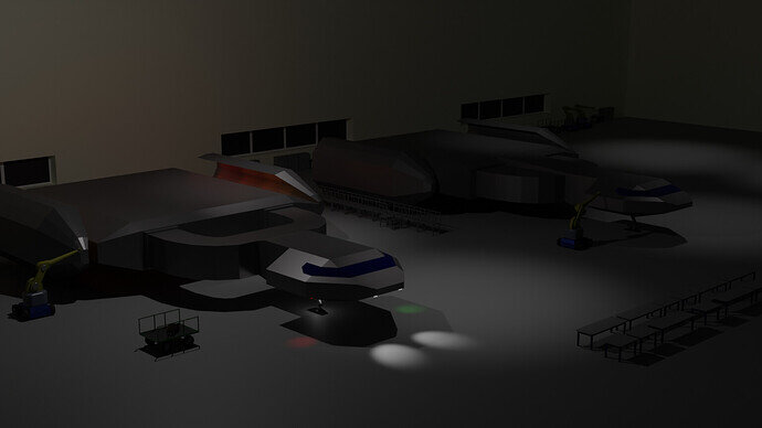
I still have quite a way to go. My lighting is a mess, and I’m missing a bunch of elements.
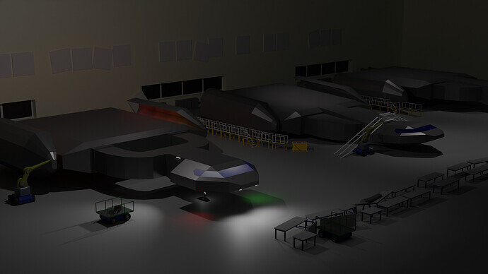
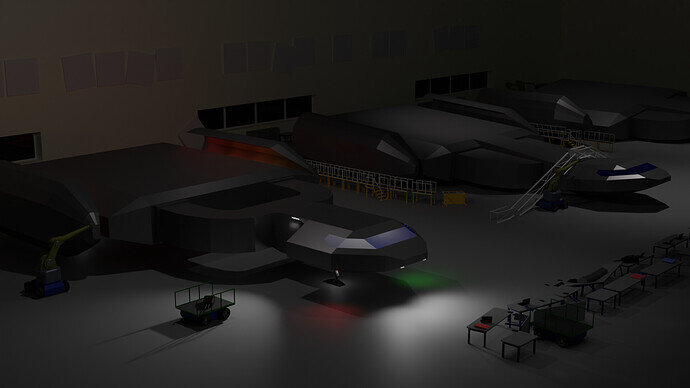
But I created a number of items as part of the ‘Game asset pack’ specifically for this image: A modular robot with replaceable parts, some tables, reworked my walkways.
Also created landing gear, which took longer than I’d like to admit.
The lighting is still a mess.
This is actually a scene I’ve been thinking about for a while, which is an idea I have for a potential future game. This would be part of the opening cutscene.
…
Just realized my monitor wasn’t set to SRGB. Hopefully this image isn’t too dark. I wanted it very much a nighttime render but hopefully it’s well enough.
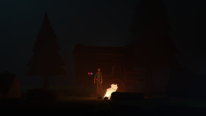
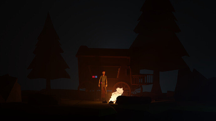
Decided my low poly adventurer would feel more at home in this render 
It’s dark on my monitor!
Can bearly see the tree
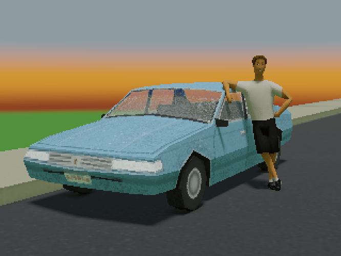
Never Forget Your First Ride
Had fun this week playing around with an early 3D style a la PS1 or N64. The lighting is a bit of a cheat, as those systems didn’t have dynamic lighting, but I ran out of time before I could figure out how to do vertex painting, which I think is how they used to fake shadows and stuff back then.
It’s a fun style. I wouldn’t mind doing more projects like this or maybe even a game some day.
‘PS1’, those were the days, mod-chip, Wipeout with fire-starter 
Awesome stuff, you guys! Glad to see some people trying out the collab challenge for the first time. I think sometimes people are intimidated by the competition angle, but that’s only a small part of it, in my opinion. To me it’s more about being encouraged to make something and get it out for people to see, and then get feedback on my work and hopefully improve.
@FoolishJester I think the day-time render works better, but mostly because the night-time one is too dark, and a lot of detail is lost.
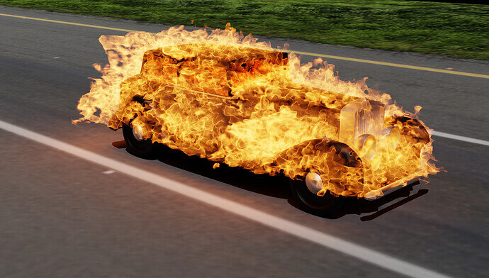
@TheDespicableDM Both images are interesting. How did you make the fire? Also “perfectly functional” depends on the function, I guess. 
@DANB1 Cool stealth jet! There are some faces on the wing that appear flat-shaded where it looks like maybe they should be smooth-shaded. Not sure if that’s intentional or not.
@Lintari This is awesome! My only critique is the interior seems low-poly but the rest looks high-poly, so they don’t quite match. Love your renders and great detail. Should be hard to pick just one image for your submission!
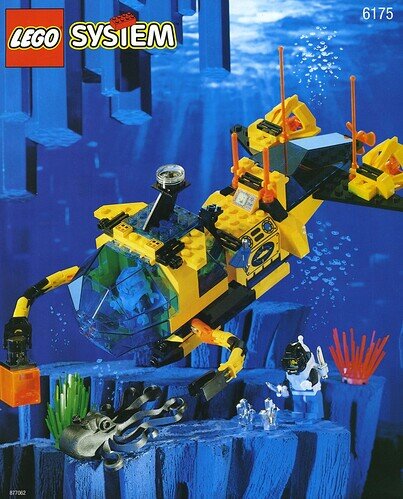
@Cows I’m getting very strong LEGO Aquazone vibes. Did you ever play with these?
@FoolishJester I’d like to see some more light around the campfire spilling into the wagon. It’s hard to see any of the detail.
Your character looks great. It’s a shame not to be able to see any of the detail in the wagon.
Also maybe a little blue and red light point light on the potion bottles?
Otherwise it looks great.
No, I havnt it’s a decade or two too old but I do like Lego
Yes dark, especially for showing the vehicle, the subject of the collab.
That said the central part on its own is a very nice image at full size.
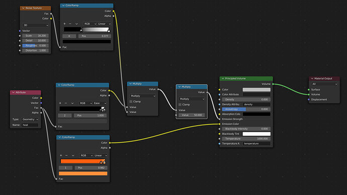
It’s just following a tutorial, with these nodes, and some messing with the basic fire settings.
In case anyone was wondering, I figured out why it was the render was so blurry, in the physics panel, under fire, render, there was a slider for motion blur. It used to be at 1, it is now at 0.
Wish I could do more but this will likely be all I can get done before due date/time. Just adjusted some of the lighting real fast. I’ll probably continue this scene after the collab.
I’ve run out of time for today. The dinner bell is ringing. Just in case I don’t get to finish it tomorrow… here’s my latest version.
The Awakening:
Hotrod …
I feel this way too sometimes 
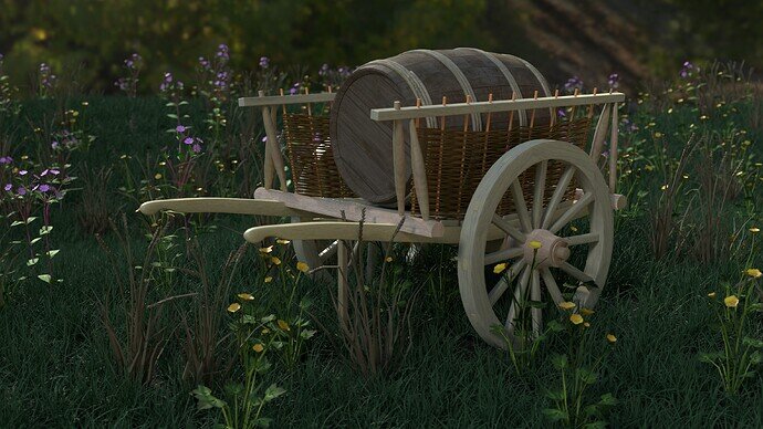
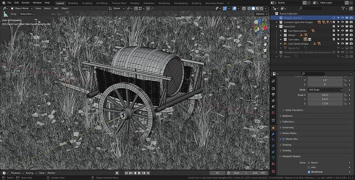
Medieval hand cart. Loaded with a hogshead barrel.
Needs much more work making it look less freshly new and so ‘straight’. But time as usual catches up with me. Going to have to make some better wood textures somehow too, available ones are all to ‘fine’ modern smooth or lap fencing unsuited to anything much but making fences. lol.
So much mesh detail. As you said, the texturing of it is the next challenge.
I also think that the lighting is a bit unnatural (I can’t express it). I see a soft shadow cast.
Did you try a version without HDRI, no light, but only with world lighting > Surface: background > Color: Sky texture > Nishita - and fiddle sun and air, dust ozone properties.
Then the background HDRI image can be solved in a different way


