Just wanted to ask is it allowed to edit the render of the weekly blender collab via a video editor
No, not really! but the goal is to use and learn Blender.
maybe using the Blender video editor …
I don’t really know what the rules are… but I don’t have a feeling that they are strict. This is not really a competition. There are no prizes. You win by participating and developing your blender skills. The compositor in Blender is quite capable… the video editor isn’t (but it’s simple and for my simple needs it’s enough… so I use it all the time for my needs).
If you are unsure, just describe your process. I try to do a break down or a diary, or just a simple explanation (both for others and for my future reference). In this breakdown I usually add information about the tools I’ve used.
My point of asking was not to establish it being a competition . I was just asking could i use it to enhance my render a bit more , that was it
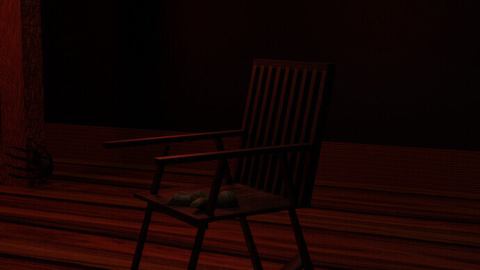
My procedure was just to add a horror build up music to an animation i was thinking about
Just do it!  It would be fun!
Remember, that I need a single image frame, to show in the vore next week.
Have fun!
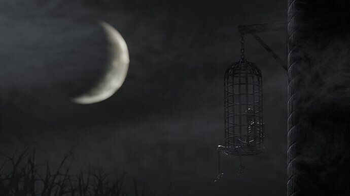
Hanging Cage
Project Details
My idea was to make a game asset, since I’m working on the Crypt Raider project in the UE5 course (Here’s the Devlog if anyone’s interested). So I made this hanging cage which is the only new object, and only took a few minutes, and then I spent way too long setting up the rest of scene.
- Skeleton reused from Skeleton Crew 2020
- Moon and tower reused from Dark Castle 2.0
- Trees from sapling tree gen
I remember @FedPete talking about using separate view layers a while back. Here’s a cool video I found about using multiple scenes to separate lighting https://youtu.be/JzODa47pdS8. It helped me do the lighting for this render.
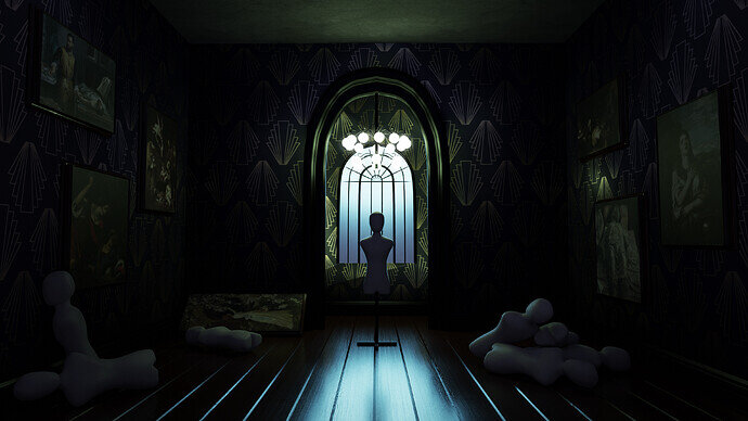
My submission for this week. Was really fun working with different textures and modeling the mannequin base. It’s my first time participating in this challenges, good luck to everyone!
Made a little color retouch on photoshop.
We @BlenderCollab have a few days to vote. You can vote fast but also think slowly about design, colors, technique, difficulty, subject, realism, etc. Choose consciously and not on your own entry.
And the new subject week 22 “Fairy Tail” has already started. The winner of this week’s “Spooky” challenge may select a subject for week 23.
@Tyger2, congratulations for your winning entry of our " Spooky" collaboration theme. It looks simple, but the composition is good. And the pale colors do give a nice touch to the general mood.
- 3DE_Study - You did give an excellent performance on the given course challenge. The camera tilt gives a touch to the scene. Next time add something of yourself to the scene.
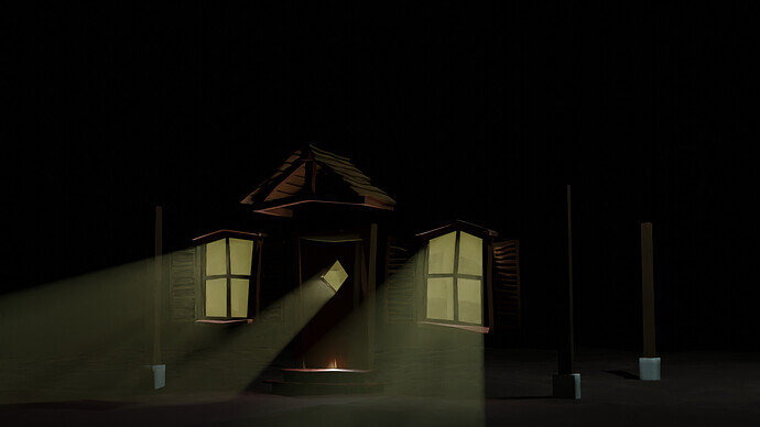
- Andrea07 - Such a nice ‘Victorian’ scene design. It really fits together. But the lamp and window are blending together. There is no need to have a lamp so close to the window.
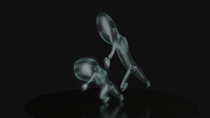
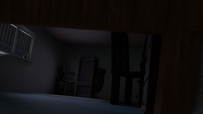
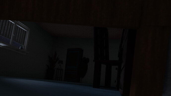
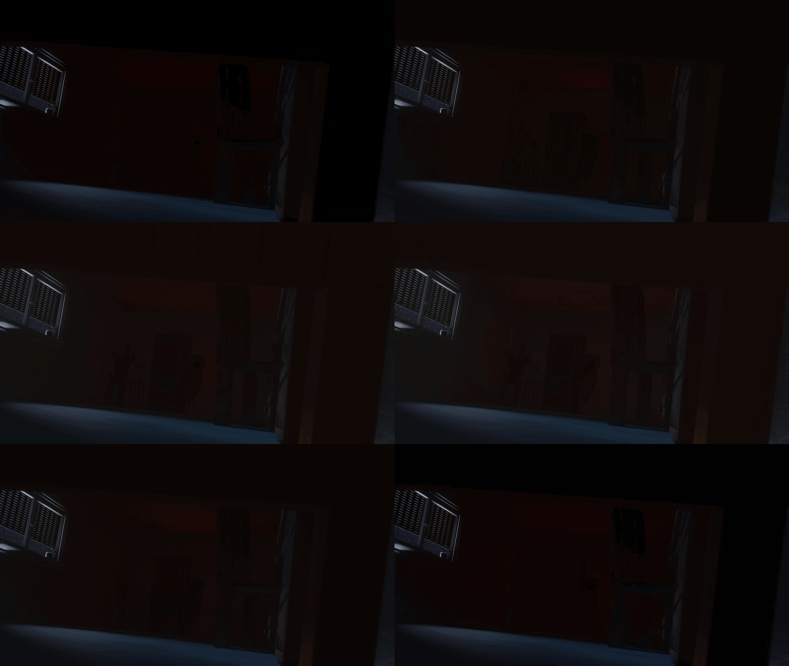
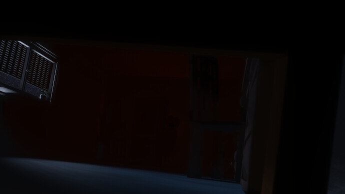
- A_cube - A really exciting idea, but because it’s a dark scene difficult to spot the visual clues. Add more items to guide the viewer, to these clues. For example, use light (spots) to emphasize the hand and puppet.
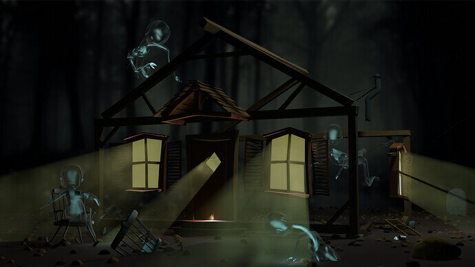
- FedPete - The concept was clear, but not so much executed. The transparency or the absence of the house wasn’t clear enough. Probably also of importance, less is more.
- Kasimir - For me, personally it was too dark. I love the way you’ve used the camera to bring some ‘dissonance’ to the scene.
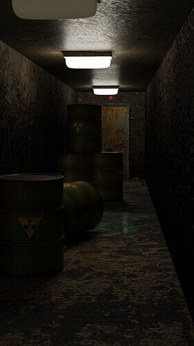
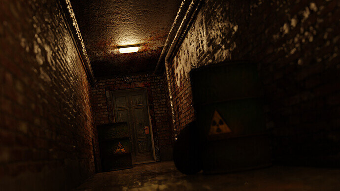
- NP5 - Technically it is a correct challenge outcome. But it misses uniqueness. Parts, techniques that make it more ‘spooky’. And I think the lamp shades are too white, too clean. Everything is dirty, wet …
That’s all folks. I found this a great subject, with lots of different views on the challenge.
Looked at full size there are mice in there! lol.
Congrats to @Tyger2 !!
And @FedPete thanks for the feedback! It really helps out to keep improving our work.
Hope to join in another week’s collab soon, and for everyone have fun creating such cool scenes!
Thanks. I really enjoy doing these collabs. It’s a big motivating factor for me to make stuff every week.


