This is the Blender collaboration 2022, week 23 challenge. Don’t be afraid to join, a lot of us are beginners. This is all to practice, have fun, learn, and get together.
This week’s subject is “Album Cover”.
This could be a recreation of an existing album cover, or something that could be an album cover for an album that may or may not exist.
Subject selected by the previous week 21 “Spooky" winner: Tyger2
The rules are simple. 1 subject, 1 entry, 1 week.
You create whatever object or scene or whatever you can think of that has something to do with the subject. It can be as simple or complicated as you want, all entries are welcome!
Post your picture here in this thread. And at the end of the week, we start to vote. And if you are the winner, you may choose the next subject and win a unique badge.
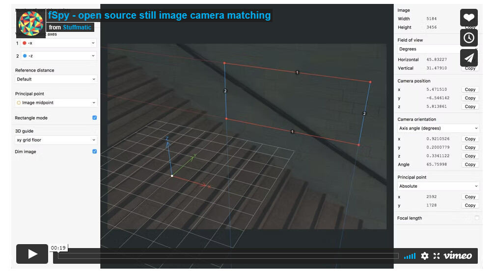
It can help you match the perspective of your Blender scene to that of a still image. The website has a tutorial on how to use it, and it also has a Blender addon.
We @BlenderCollab have a few days to vote. You can vote fast but also think slowly about design, colors, technique, difficulty, subject, realism, etc. Choose consciously and not on your own entry.
And the new subject week 24 “Summer vacation” has already started. The winner of this week’s “Album cover” challenge may select a subject for week 25.
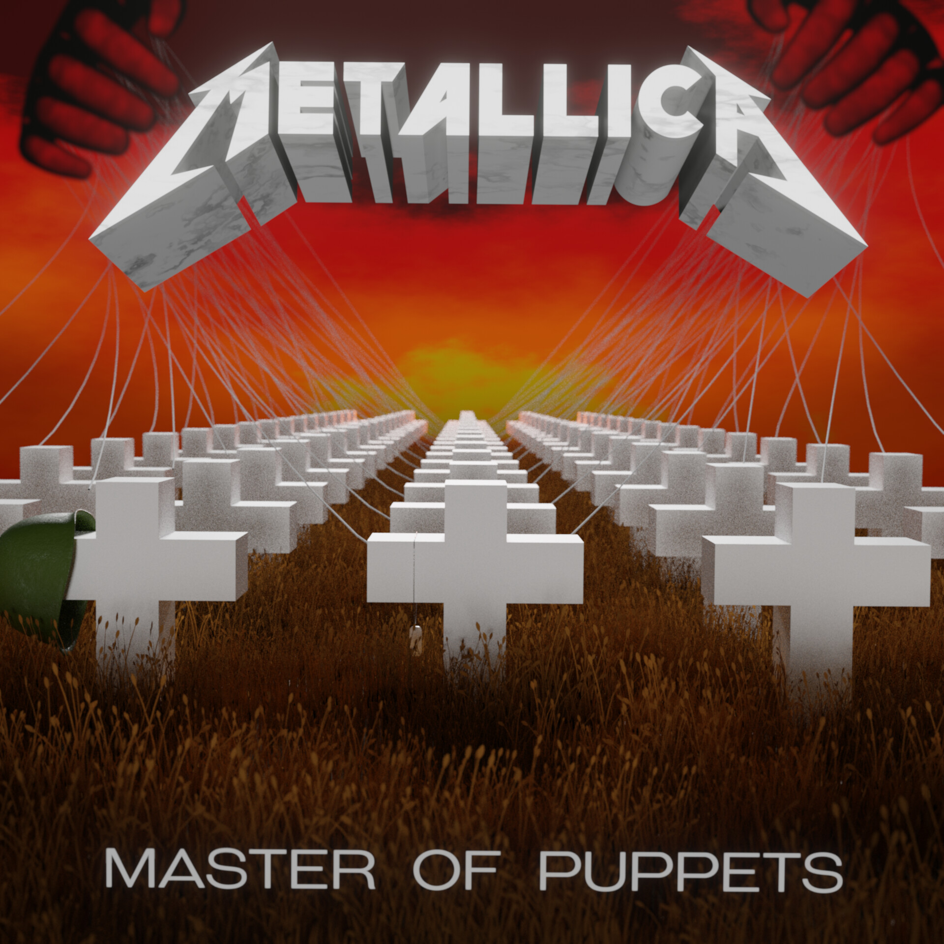
@Tyger2 Congratulations on your winning album cover collab entry. I liked the topic. Too bad so few registrations, but the holiday starts and the sun is burning…
You’ve succeeded in creating objects to match your example. It’s not that easy as it looks.
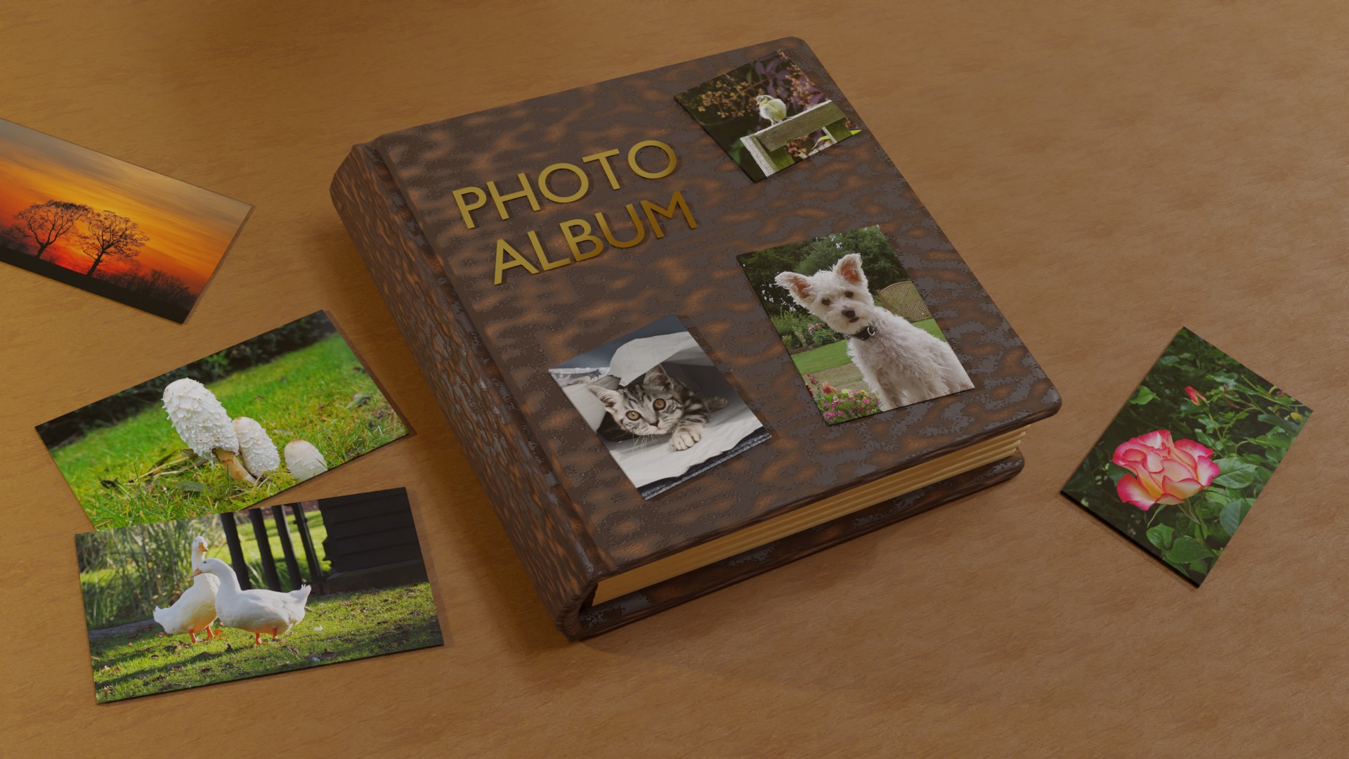
NP5 - An unexpected album cover, but a really fun one. I would have made the title “PHOTO ALBUM” as a texture, not a 3D text because it now casts a shadow. Maybe, disable shadow casting for this object?
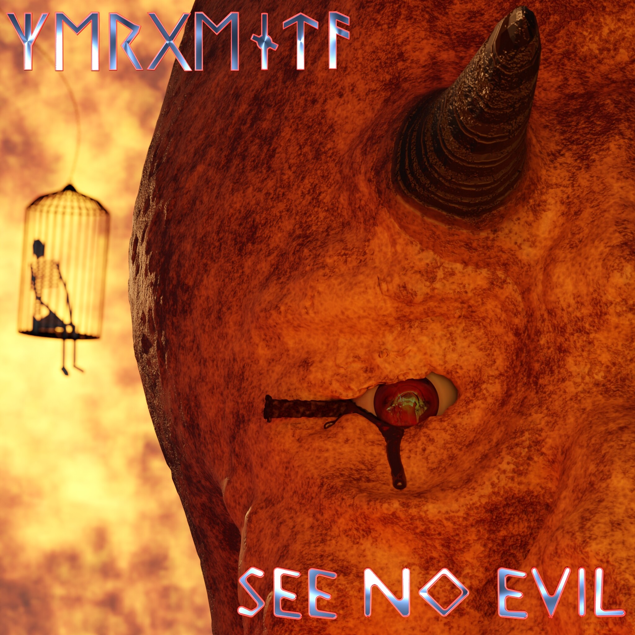
zeRgenTa - I can’t say it’s an exact match, but I do like the complete design. Maybe a slighter bigger, clearer font. Is it a Heavy Metal band?
There is no band as far as I know. I may have pulled something from the depths of my mind. If so, I doubt it’s close enough to the original to be more than inspired by it.
Coming up with a fake band name seemed harder than it would be worth, so I just put my user-name in runic letters instead. Then I modified the English text to mach the straight, non-horizontal lines of the runic letters. If it makes the font less clear, I think I’ll exercise more caution if I need to stylize a font again. Because I’m having trouble seeing a lack of clarity.