This is the Blender collaboration 2022, week 15 challenge. Don’t be afraid to join, a lot of us are beginners. This is all to practice, have fun, learn, and get together.
This week’s subject is “Architecture”.
Architecture is both the process and the product of planning, designing, and constructing buildings or other structures. Architectural works, in the material form of buildings, are often perceived as cultural symbols and as works of art. Historical civilizations are often identified with their surviving architectural achievements.
The rules are simple. 1 subject, 1 entry, 1 week.
You create whatever object or scene or whatever you can think of that has something to do with the subject. It can be as simple or complicated as you want, all entries are welcome!
Post your picture here in this thread. And at the end of the week, we start to vote. And if you are the winner, you may choose the next subject and win a unique badge.
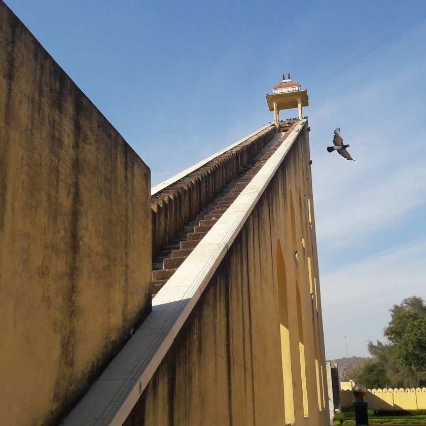
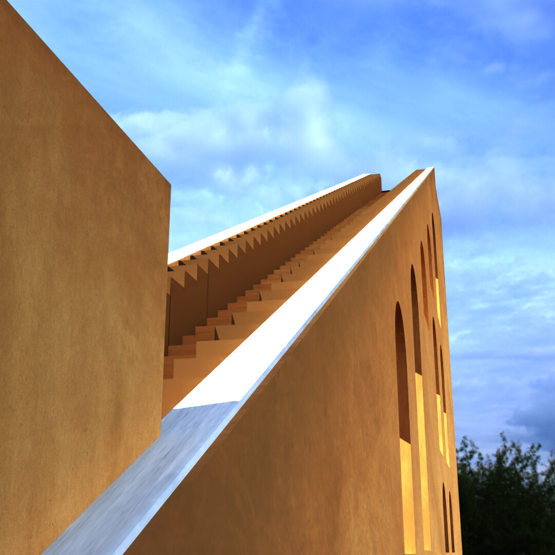
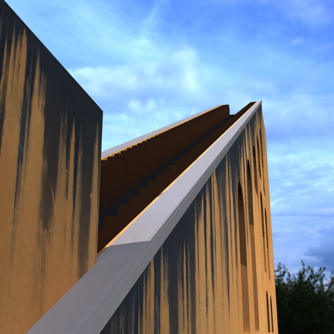
Gonna do a part of the Jantar Mantar observatory of Jaipur, India. Trying to get as close to the reference as i can. Any good tip on how i should approach the smut?
Oof. It worked but i still have to fiddle around with it a little more. Also i “tweaked” some settings and now it looks more muddy than my last version and i can´t reverse … guess i have to figure out a less destructive workflow … like just implementing changes on a duplicate-collection. -.-
Look at broker brochures.
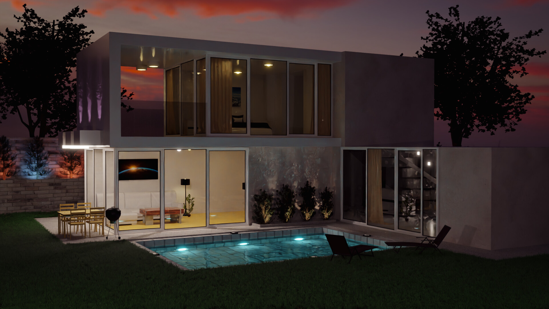
I know you want to play with the light. Hence the dark sky.
But does it sell the house …
Also, I think the camera is too high, not at human height, .175 m. or so.
I think there is too much going on in the scene. Sky, trees,
Try to find your focus.
I like your scene but do agree with @FedPete, there’s too much going on, my main issue is that there’s way too much color and that’s quite distracting, on the left side there’s some red, blue and purple/pink, then you have a very intense blue with the pool, the top floor kinda blends with the background, the color of the trees, or better said their lack of it, makes them contrast a lot with the rest of the scene making them very distracting, then the lights of the bushes, the room at the right side of the picture is way too distracting for all the wrong reasons, it’s like finding Waldo, What exactly is going on there? The reflections, the lights, the things inside that room, it’s just too much.
The bottom floor truly stands, and once I got to see the whole house is actually quite nice, I would love to live in a house like that, but it takes way too much time to realize how great the house is, I think your main concern should be the house since you put a lot of effort into all the details inside it, like the bedroom, it looks great.
@Yee Thank you so much for a detailed review. This motivates me redoing the entire scene, if and only my health permits. I will most certainly redo and repost.
I would only add the subject is architecture, so while the details are great and very well done, ideally the building is the subject. )ok we are not too bothered about pure theme relevance)
Hope your health issues get sorted out.
I think this is very nice… For critique since you asked, I’d only agree and say choose one colour light as a theme instead of orange, blue and purple.
I did spot a little anomaly with the room on the right… that being, with the patio style window door being so tall (the entire height of that part of the building), it affords no space for the height of a ceiling interior or a roof exterior. My eye was immediately drawn to it.
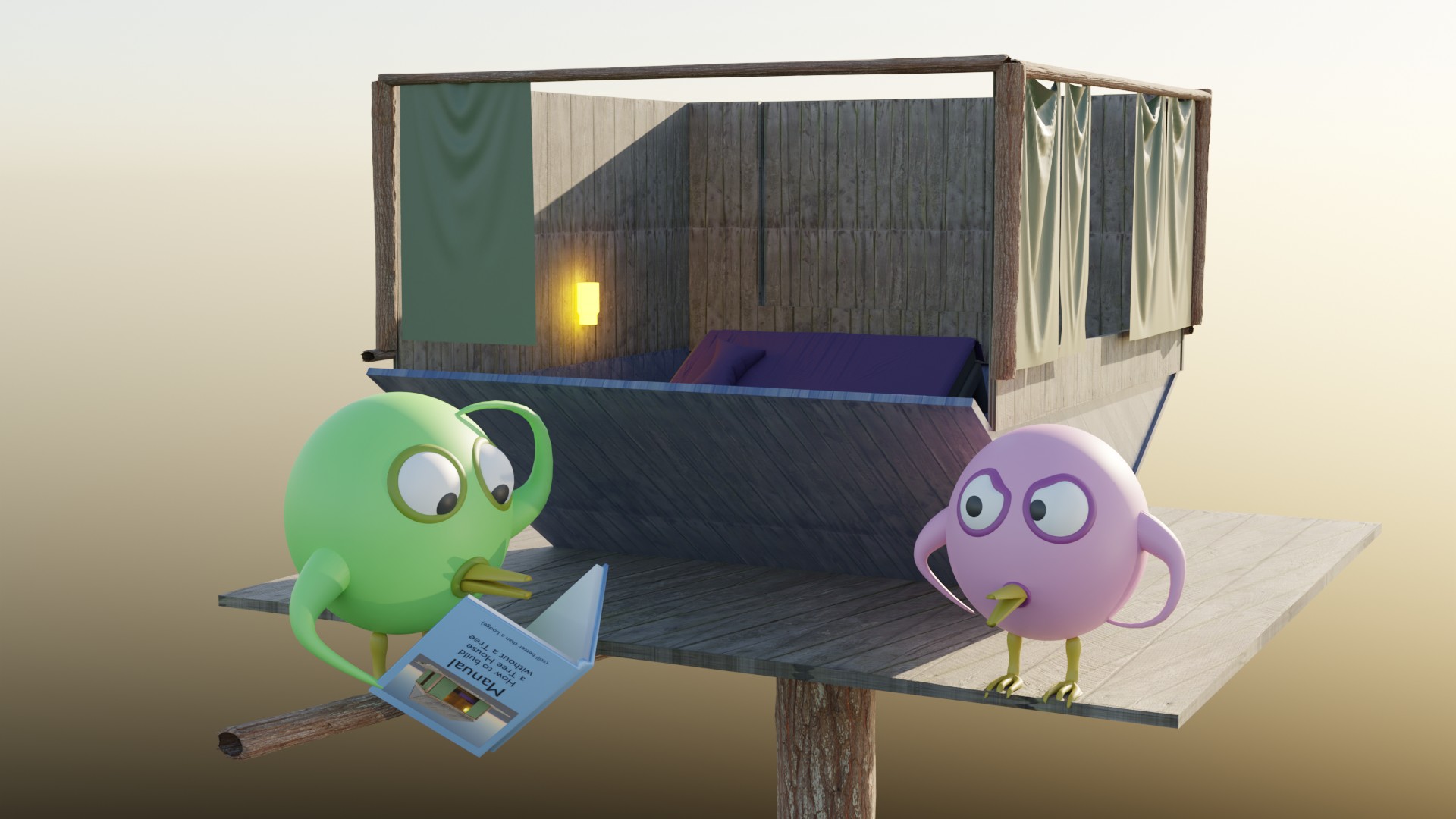
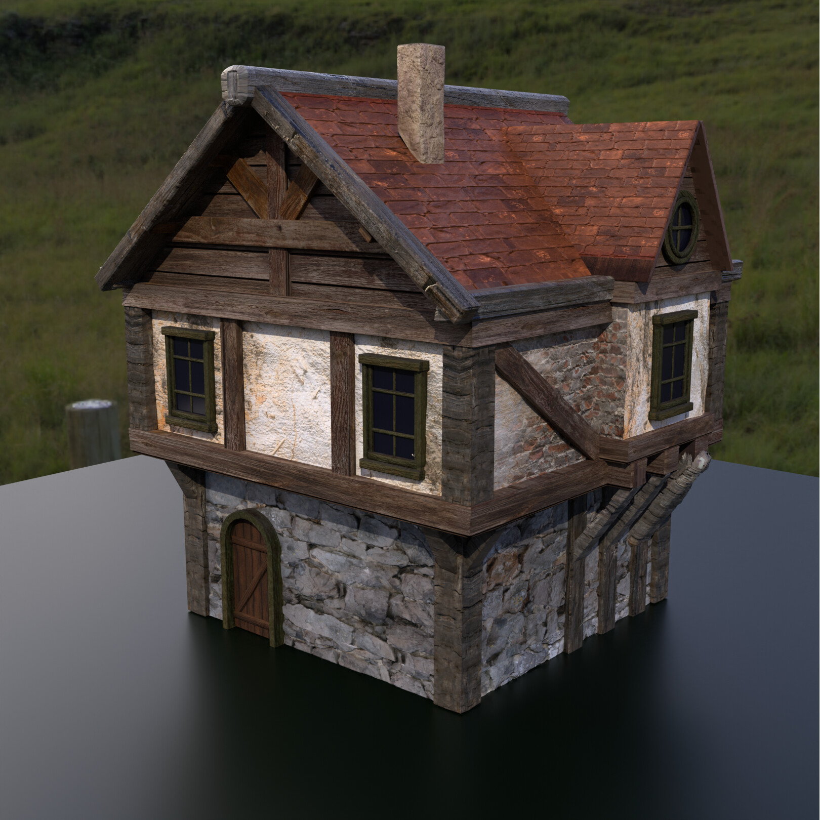
First attempt at modeling and texturing a house. Tried to model the environment as well, add trees, grass and such but wasn’t very happy with it, so it didn’t make the final render.
I’m still learning so any and all feedback is appreciated
I see some texture stretching on the support beams on the side and other than that, it could benefit from some displacement maps or real geometry on the roof and the bottom section but kudos.
The deadline for the collab is saturday night if I’m not mistaken so you can still improve the scene and post again if you find the time this week.
I did add displacement to the roof but anything more than 0.2 blows it out of proportion. And yeah, I’ll add some tiles, bricks and stones to make it more realistic.