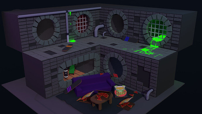
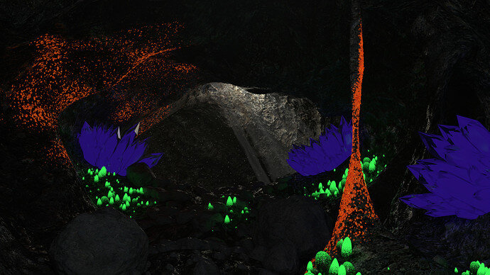
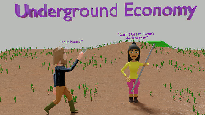
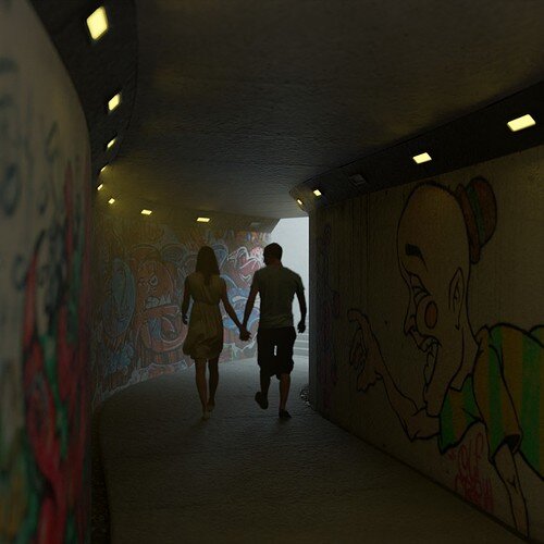
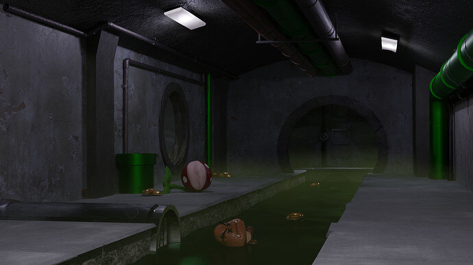
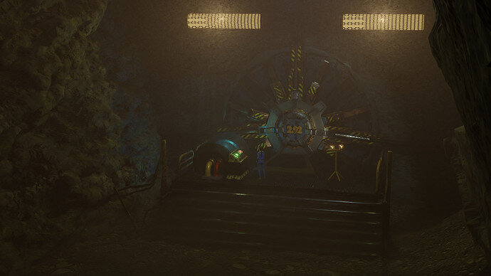
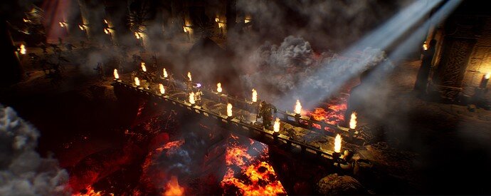
I’ll definitely redo this scene, even for me this wasn’t the expected result. Waiting for my new mouse to be delivered…  . And for sure I’m ready to learn more. Thanks.
Oh great, I’m also nearing one year. I started Blender all sudden, around June, I was looking to learn some new skills in the lockdown, and tried to get AutoCAD but couldn’t get the student’s license, immediately googled for some free 3D software. And Blender was the one with most reviews, what would I’ve done, downloaded it and enrolled for a course in Udemy. Eventhough there are so many free tutorials for beginners out there but this course does it in a special way, all the teachers; Michael Bridges, Grant Abbitt, Rick Davidson and the question bank Marc Carlyon, everyone makes sure to make the topic so easy, and it is an amazing course. 
I see that you are completely new to art as well, I’m lucky in that case, I used to paint before Blender so, know some color related things, but yes new to 3D world.
Hope to see more from you in the upcoming challenges and other posts. 
Depending on how you look at it, I’ve been at this for just over a year, or about a decade.
Time spent on Blender and time passed is not the same thing. Dabbled in Blender many years ago, but never made anything substantial with it. Joined this site in Sept 2017 for the 2.7 Complete Blender course and rushed through 80% of it in about a month period without posting anything then had to abandon the course because other life pressures kept me from it. Around August 2019 was when I altered my life arrangements to make time for Blender type stuff. I restarted the course as 2.8 content was coming out and I started posting at the same time.
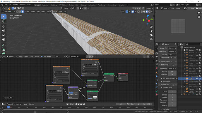
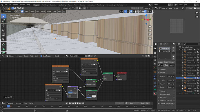
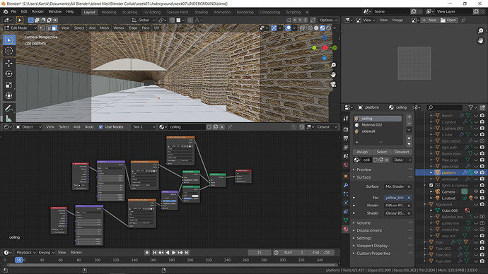
Hope there is little more time left for the entries to close. Here are some screenshots of the issues with textures.
-
The textures are stretched, can’t understand why this is happening. The node setups are taken from a youtube tutorial.
-
Don’t know what’s the case here.
Is there something to correct this?
You seem to be stretching your UVs…
Install Node Wrangler… Ctrl-T on the textures and try the generated or object texture coordinates instead. If that doesn’t work, you’ll have to scale the UVs in the UV editor for the offending faces.
Voting entries week 07 “Underground” theme
We have a few days to vote. You can vote secretly underground but also think slowly about design, colours, technique, difficulty, subject, realism, etc. Choose consciously and not on your own entry.
And the next subject, week 08 “At the museum” is already started. The winner of this week “Underground” challenge may select a subject for week 09.
0 voters
Is node wrangler installed in Blender by default?
Yes, you just have to enable it in the Preferences.
Thank you @Jaco_Pretorius it worked perfectly. There was a lecture about the nodes if I’m right, my bad I forgot  .
.
Those are all great ideas, thank you! I am too late to add them to the contest but I will definitely add those things for the next rendering of this scene. It’s those little details that I miss at first.
This is Awesome…
Some really great entries, a terribly tough choice week. Several would be winners easily in any other week.
I agree, as I see at LEAST 4 I want to vote for. Decisions . . . decisions . . . decisions! Hmmmm . . . 
Separate Wall and Ceiling material. Then check proper UV layout.
When you do bash-kit solutions it leaves UVs unwrapped in-properly. Change your material for wall and set to be gerated or object for better results. Always strive to have a proper UV unwrap. If you ever re-use yur creations- knioing it was done well to start from will save hassel with new project.
We all miss small details… It comes form experience. That is why it is important to leave your work for an hour and take a break… look at the pikture when you come back and it will be in a different light.
Share your picture - the more people reply - the more improvements you will make for your future projects.
Keep up the good work.
Hehe  even though the entries are over was just eager to finish the scene with the textures all applied, and this was pretty much what I expected.
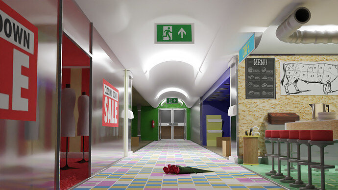
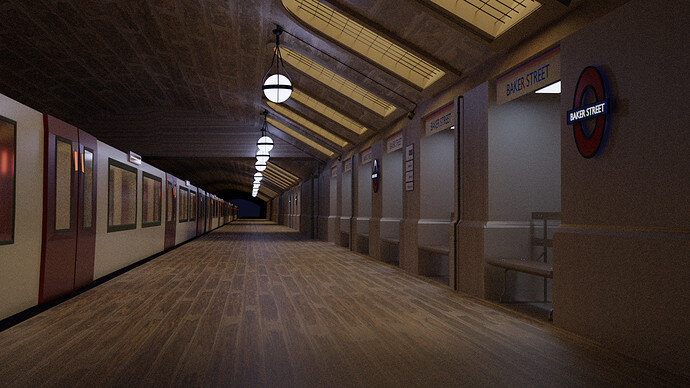
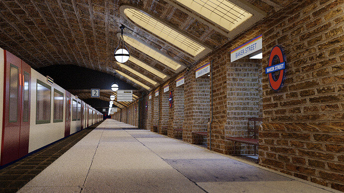
This was my first ever weekly challenge and really learnt new tips & tricks, thanks especially to @FedPete, @Marijus, @Jaco_Pretorius, to help me to make my scene much better. Here it is, and see you all “At the Museum” 
It is improved very much.
Now it occurs to me, that the camera is more at the height of a kid or a dog.
Just 2 cents …
See you at the railway museum.
Hmmmm, I think it looks like an adult seated at the level of those side benches.
In any case, it looks wonderful. 
Awesome that you did improve it! It looks great!
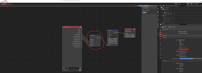
You can quickly improve it a bit further and get rid of the noise (unless it’s intentional) by either increasing sample count or using AI Denoiser (or both). I usually do this in compositor with setup similar to this one:
Metro looks really good.
Make your iterior lights yellow and exterior(windows) blue. This will add constrast of colours.
As some suggested, raise your eye level to the human (1.5-1.7m off the ground).
Most photogrophers would use their creative streak, but common people would take a shot at their eye level.
Separate colour of ceiling and walls. Make ceiling more gray than walls. While at it - if bricks are the same - make sure their size is too. Ceiling is build with much bigger slabs that the wall bricks - unify the environment.
Also add some procedural fog as therei s no envirvonment in the world that is particle free…
Also… Make sure you add distict line/emptyness between the train and the platform. This would separete objects visually. Real world is not perfect and margins should be acounted for. Make a gap between two with near black texture between them.


