
Thank you very much for your comments @Ducaluk.


Really nice scupting on the skull.
4 Likes
Great improvement! It has also increased the magical feel, well done!
2 Likes
Love the sunset and the deer looks really good!
1 Like
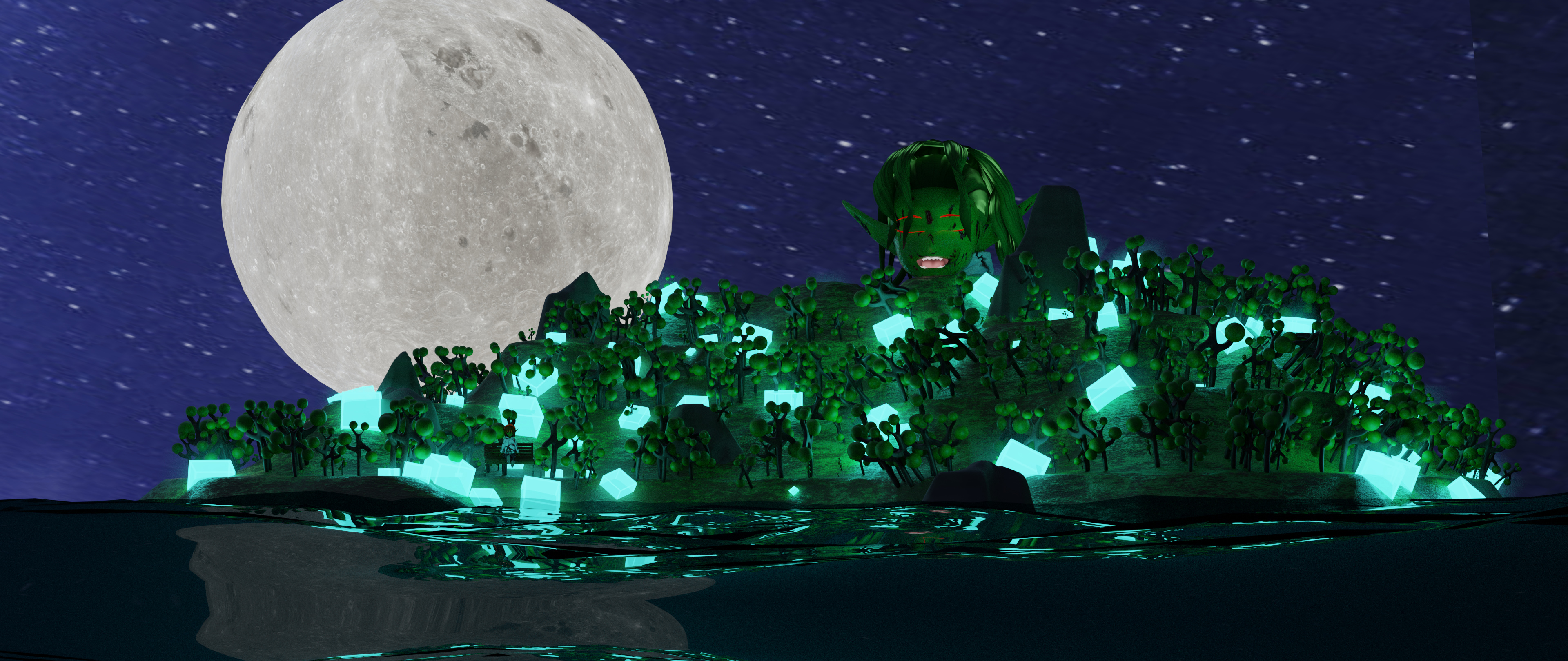
That looks pretty cool (and a bit scary because of that huge green head at the top of the island). What are the glowing cubes all about, though? I’m sure there’s a story behind them. Also, the reflection in the water is pretty neat.
1 Like
Oh I just zoomed in an saw a child with green skin on a bench, dangling her feet. It’s a really nice detail, but so difficult to spot. Maybe you should try getting a different angle, so that we can see her better. Don’t be afraid to experiment.
2 Likes
Perhaps there is no story to this scene i just placed what i thpught would be cool. I wanted it to be a fantasy island and after that i added what i thought would be good. Child i a character i made before the island idea came into my m8nd, so ijustused her in the scene. I made all the models within this week only to be fair. Child model is premade in vroid and then exported into blender.
If you want to make anime style characters really fast . Its a good choice. However i dont know why but all the quad geometr of the model was converted into. Triangles when i imported into blender. Since blender take long time to calculate triangles specially while subdividing my viewport became sloppy and it was hard to position even the camera so i didn’t get to experiment with it.
1 Like
Deleted cubes heaven?
5 Likes

2 Likes
I think they’re gathering together to plan their revenge. The colour indicates the rage meter, the redder and the more glowing they get, the worse it’s gonna be for us.
We’re still safe… but for how much longer?
2 Likes
It’s a cool scene!
Personally, I think it’s OK to use things made earlier, as long as you say which elements are reused. That way people can consider it when they are voting.
That’s my opinion, anyway. What do you guys think?
4 Likes
Absolutely! 
I also see no problem using someone else’s assets as @Digitz did with their entry… As long as you give attribution and the composition is yours. I think the same goes for character-generator software like in @Sahil_Nain’s entry.
Personally, I like the challenge of seeing what I can accomplish from a new default-cube scene and the time-management experience I gain from that, but I’m not beyond throwing in course-pieces I happen to be working on when a new collab gets announced. 
6 Likes
I also agree @Tyger2 and @Jaco_Pretorius . Whether this continues as a hobby or develops into a profession for some of us, having an asset library is going to be necessary for time management and ease of implementation.
That’s what I’ve been doing since early in my Blender learning. Any time I’ve made something, like a bench, for example, more than 5 or so times. I’ll just make a new .blend file, append all the bench models I’ve made and export each of them as .fbx and .obj and organize them in my computer folders appropriately. I use those assets as needed/when needed. And yes, as horrible as the phrase may sound “Why bother making something that has already been done?”, sometimes it is really useful to search out what you are looking for and download it for use or use something you’ve already created in your own local asset library.
I even have a .blend that I add all of my procedural textures to when I play around and come up with a new one that I really like. Never too late to start time saving habits.
4 Likes
The detail is so nice. The hair and the dress look great.
1 Like
@Ducaluk, I really like your use of a limited color palate and it is something I could really learn to do with my own work.  Thanks for your kind words… I cannot really add much to your comments on other’s works.
@Sblendid, I really like your composition and the scull sculpt. The menacing shadow really works. The scull could maybe do with a bit of a rim light (perhaps an area light in the mouth of the cave facing in) and some varied roughness on the scull with a noisy bump-map or something similar.
@Sahil_Nain, I like the mood to your piece. The render-size suggest a massive wall-print… you do need to zoom in quite a bit to see the detail.
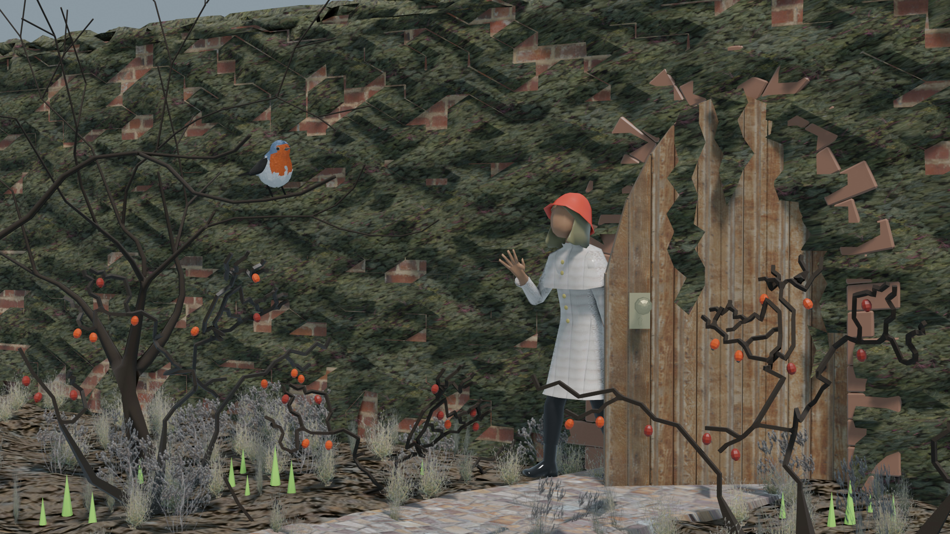
@Blest, looks like a mystical autumn adventure! I like your use of textures. The moss works for me on the wall but seems a bit out of place on the door. Great entry!
Great entries everyone.
If you haven’t entered, just a couple of hours left till the deadline!
2 Likes
Thanks for your Feedback! I tried using a noise texture to vary the roughness (just now), but it didn’t look much different… Maybe I am doing it wrong. ^^ But I increased the brightness and contrast of the image, which I think is an improvement. Do you still think, that a rim light is needed?

7 Likes
I think the eye-sockets would benefit from being in shadow… The light that is coming from “inside” the cave (or from a crevice) is almost too bright… Try lowering the power of the “inside” light and adding a rim-light in the cave entrance to see if it helps at all… 
This is my basic noise bump setup - you can play with the scale and bump strength to get the roughness that works for you:

Hope that helps!
2 Likes