I used the skin modifier to get the basic shape of the tree. Then I sculpted it into a more “gnarly” look and wider stem. Yes, as a square, it would probably look more like an old photograph, you are right! Awesome feedback, thanks!
My favorite render actually looked like this: (Just thought it doesn’t quite fit to the topic) xD
Thank you for the feedback. Spent a few hours trying to add depth of field to my Cycles render. Used nodes and composing mode…I just can’t do it. May be the next time…
@Tyger2 Yeah indeed now that i look at my scene the powerlines are a bit to “detailed” compared to the rest. However i really wanted to capture it since its one of those things that made my “impressions” its actually a bit more messy in real life
Did you try depth of field in the camera settings?
Thank you! You are filling up yawning gaps in my education here ) I found it, but it didn’t make a big difference anyway…!
Wave modifier is good, pretty intuitive to use. I tried a few variations with different speeds, heights, and multiple instances, but I ended up going with this. Definitely has a vibe to it that I’m liking.
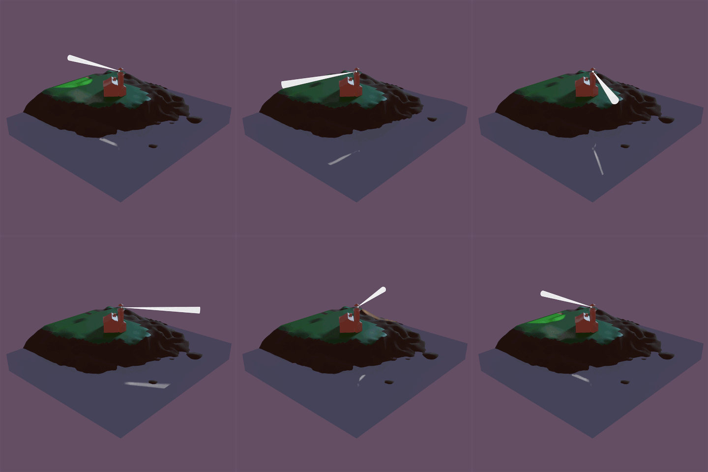
What I really want now is a way to combine the two systems… maybe get some of the collision with the rocky shore without having to go through the trouble of the adding liquid process. Maybe there’s a way to add the wave modifier to a liquid mesh, or add a wave plane on top. I want to do some more research on the ocean system. Might just come down to keying in particles manually.
Thanks for continuing to give thoughts on everyone’s submissions, as for your thoughts on mine:
turned the strength of the world light from 1.000 to 2.500, hopefully it’s easier to see it all and sort out what’s going on.You have so much talent, I don’t want any technicalities to stand in your way!
If you change the F-stop, things get blurry faster. (The smaller F-stop, the more blur). And you can choose an object (or add an empty) as a center of focus, instead of fiddling with the focus distance as well.
Maybe if you try out these things, you can make it work in a way you like!
I think it looks better now. Things are more visible.
Looks really nice. Maybe add several wave modifiers to mix it up a little?
Thanks everyone for your feedback.
I tried to apply some of the advice from @Sblendid, @Tyger2 and @Alexandra_Ispas …
I tried to match the colors a bit better. I tried a different camera angle to frame the subject better. I tried to add some detail and extras to distract from incomplete bits. I tried to really boost the depth-of field to blur the lack of some details. I then also tried really hard to divert my eyes from builder orc’s cold empty stare; silently judging me for not having texture painted or rigged him yet…
Hope you like it!
@Sblendid… That tree is extremely detailed… I think it almost needs extra zoom on top of the suggested square framing. I like the coloring… almost makes it eerier.
lol OK now it’s perfect!
Thank you! Well, next week theme “Aliens”. Waiting for funny pictures!
Can you please add next reply to the Hall of fame here: The Blender Collaboration 2020 edition . It does not allow me to write three times in a row…
Done!
Congrats!
Thank you!
Congrats you are awesome. Keep it up.
Hi Tyger, “don’t judge me” is because of my scene with so many empty beer bottles.
Thank you for your feedback every week!
Nice colorpalette you chose - the tree definatly transports a mood