True… I may have over-committed to that camera-angle…  But noted, I probably should have tried a different angle to hide all the incomplete stuff.
… to do a post-doc or something similar, no doubt 

True… I may have over-committed to that camera-angle… But noted, I probably should have tried a different angle to hide all the incomplete stuff.
… to do a post-doc or something similar, no doubt
Poll!
There’s only one rule: don’t vote for yourself 
Aside from that rule, you can choose the parameter to judge the entries, some possibilities:
The poll ends on 2020-08-16T10:00:00Z
guess I auto-lose this week. 
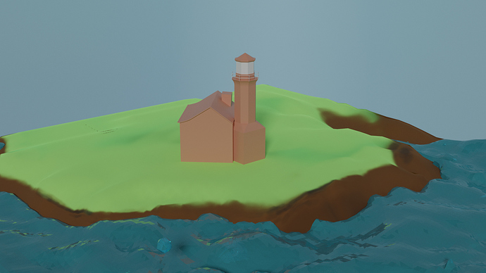
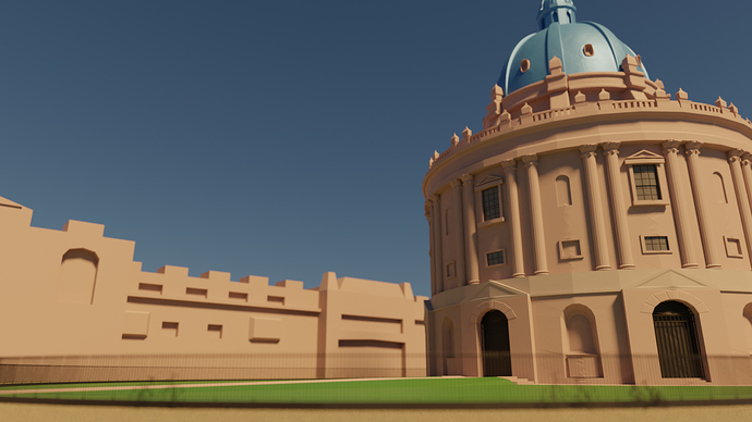
That’s a really cool scene. Is the entire structure supposed to be orange, though? The left part does look incomplete, but the right part is fabulous.
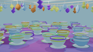
As for my teacups, yea, they’re Disney. There’s this ride Mad Tea Party, themed from Alice in Wonderland where you spin like crazy and get super dizzy.
I didn’t know about the wave modifier! Definitely checking that out and plan to play with it a bit more. No kidding about the processing power… the replay mode wasn’t working for me, just kept looking like the liquid was going through my ground plane which I had set as a collision effector. Switching to modular solved the problem but I ended up having to bake and free about a dozen times to get it looking halfway decent. If I was running on a worse system it would have been a true nightmare.
Edit: PLEASE SCROLL UP TO VOTE - this post is being linked and I don’t want to cause confusion.
It was tough to vote this week… I’m a sucker for good animations and probably would have voted for you if your gif looped seamlessly. 
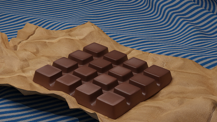
Supposed to be a faded sandstone like this reference image: 
The colors in my scene were really placeholders… but, you know… poor time management.
@Capricas_Kirito: Your entry may be a contender for lowest-effort entry yet… it is even lower-effort than my Nokia entry. So, surely that’s an auto-win? How’s your “Aristocrats of Peril” car doing?
@Blest, I think you managed to knock it out the park yet again. Each entry from you shows a noticeable improvement technically. Starting to think this is not the first time you’ve put yourself and family members into your works… 
Strong entries from the “regulars”…  @Leon_V, @Tyger2 and @Alexandra_Ispas’ works almost got my vote.
Good to see new ppl joining… I think @Sabet’s entry stood out in terms of capturing this week’s theme and almost got my vote also.
Well done for crossing the finish line everyone!
It was so hard to chose for this one, so man great submissions, the main struggle was between Tyger’s and Blest’s submissions. Eventually decided on Tyger’s.
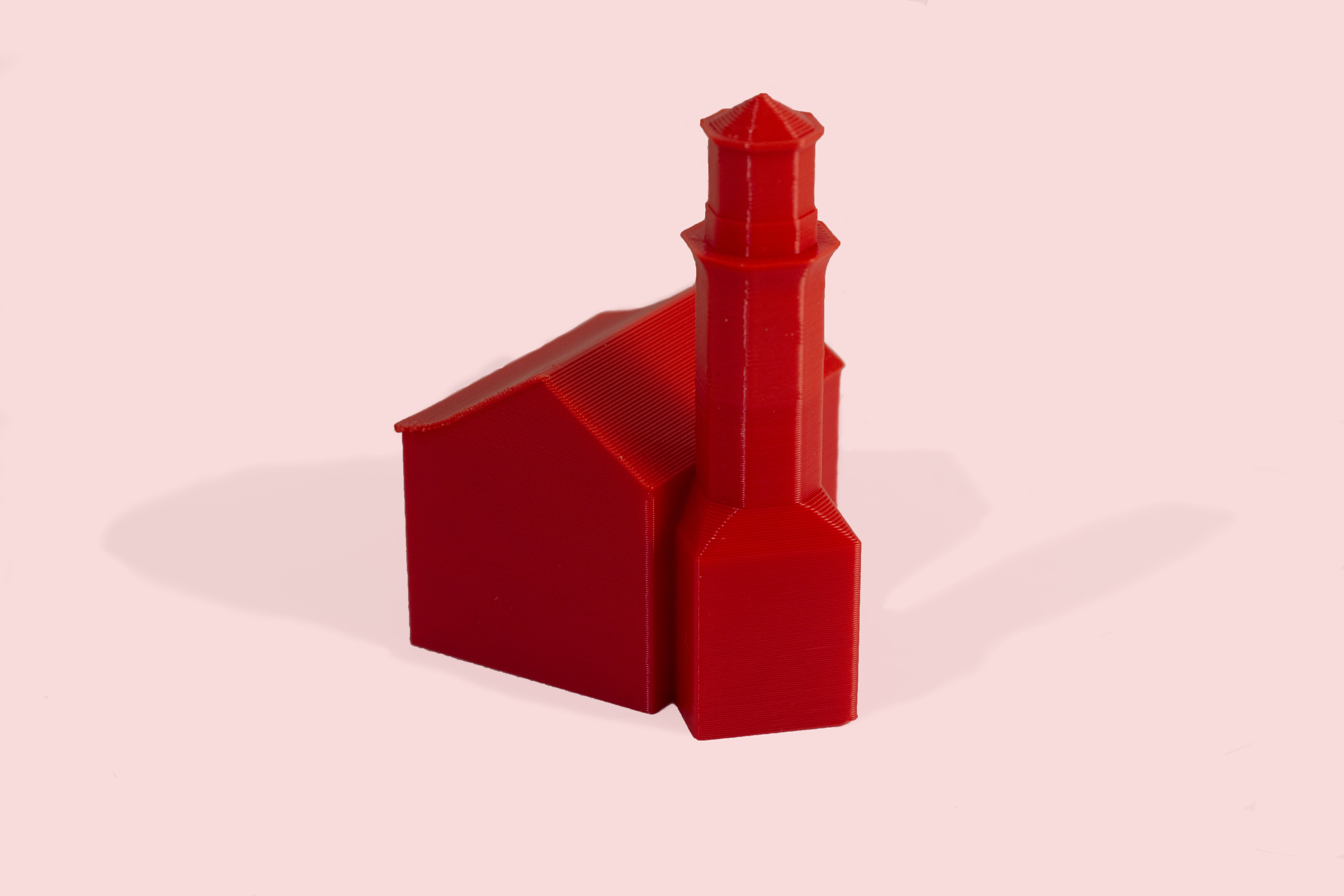
Wow you 3D printed it, that’s awesome! You could make a project with a few more buildings and make up a really nice city. I’d be looking forward to that.
Lots more to do!
I still remember your first entry to the weekly collab, now you are doing things with this level of detail, that’s what I call progress, meanwhile, I still can’t model a decent rock xD
I have a little time this morning, so I wanted to give some feedback to everybody. Hope we can use this chance to help each other improve. As always, if you don’t want any feedback, sorry. Just let me know and I’ll leave you alone next time. 
Part 1/2:
@Sabet I really like your textures on the cloth and the paper, and the paper has some nice crinkling, though it could maybe use another level of subdivision. I like the choclate texture too, though I think it should be a bit shinier to more closely resemble the reference.
@Alexandra_Ispas I like the pastel color palette. The models are simple, but effective, as is the animation. Maybe a slightly different background color would be nice for more contrast, but that’s a nitpick.
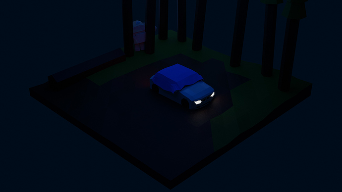
@Ethan_Martinez I like the rock golem, but I really can’t see enough to know what’s going on in the scene because it’s too dark, even on my laptop with the brightness all the way up. Then again it may be my problem, because I’m away from home this week so I can’t check it on my desktop.
@Enodes By “Don’t judge me” do you mean you don’t want feedback? I’ll leave you alone, just in case, except to say that it’s a nice scene!
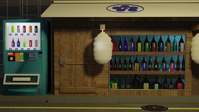
@Leon_V It’s a good scene. I like the bottles in the windows, and the vending machine is cool. I think having the lamp right in the middle kind of throws off the balance of the image composition. I know it’s probably based on a real place, so this may be breaking the reality, but I think it would look better with the door and the lamp changing positions.
@niladri_ghosh A really well balanced scene, in terms of both composition and color. You’ve got a lot of nice detailed objects, but not overly detailed for the low poly aesthetic. As I said earlier, I like how you stylized the window and door shapes. It gives it a slight fantasy/cartoon feel. I’m not sure how far this should be taken, though. Do all the rectangular objects need to be skewed? Probably not, but I think the air conditioner is an issue. It looks fine on its own, but next to the skewed door, their styles seem to clash.
Part 2/2:
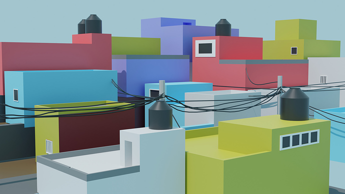
@Ducaluk I like the variety of shapes and colors of the houses. I think it would look better without the power lines, though. I know the real place probably has those, but at this level of overall detail, I think they just make the image a bit messy.
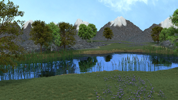
@Digitz Really lovely grass, flowers and trees. The water is quite good too. The weak point is the mountains. The snow on most of them is OK, because you don’t see the edges, but on the main mountain (center-right) it’s a bit rough, and feels like we can see the brush strokes. Also the scaling of the textures on the mountain seems a bit off. It kind of looks like it’s near and small, rather than far and big. Maybe it could be obscured with more trees or foothills? Or maybe just some depth of field would blur it a bit.
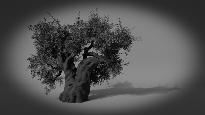
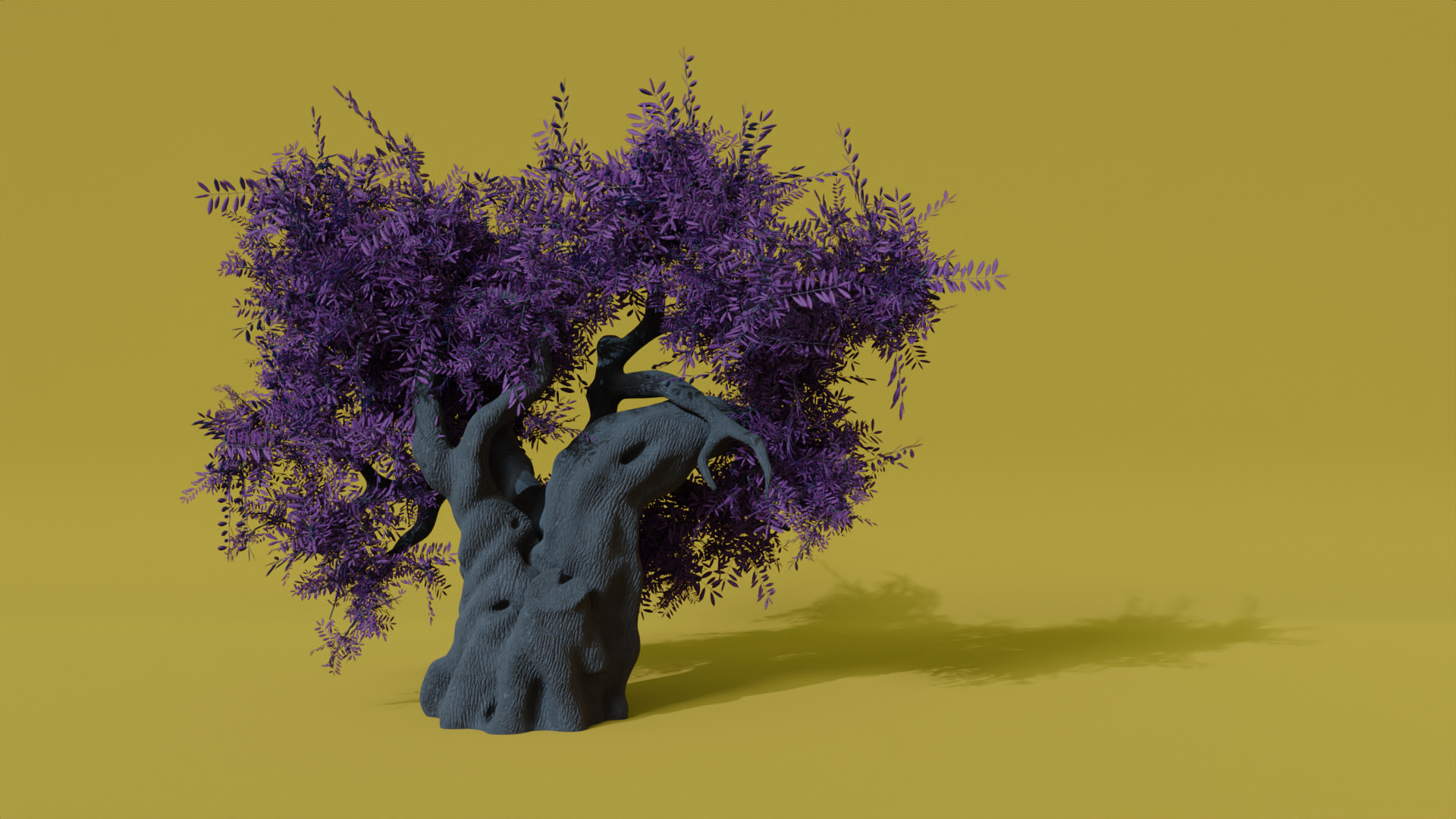
@Sblendid That is one gnarly tree! Did you hand model that? The texture and leaves/branches look great as well. I think the image composition might be better as a square to fit the shape of the tree.
@yo_johann I really like the lighthouse building and tower, and it looks like your 3D print came out really nice! I think the water is the weak point here, and it’s too bad that it took up so much of your time. I think it might have been better to either use the wave modifier, or just subdivide a plane, and deform it using proportional editing set to “random”. Then you could tweak the shape a bit if you wanted to make it look like waves crashing on the shore.
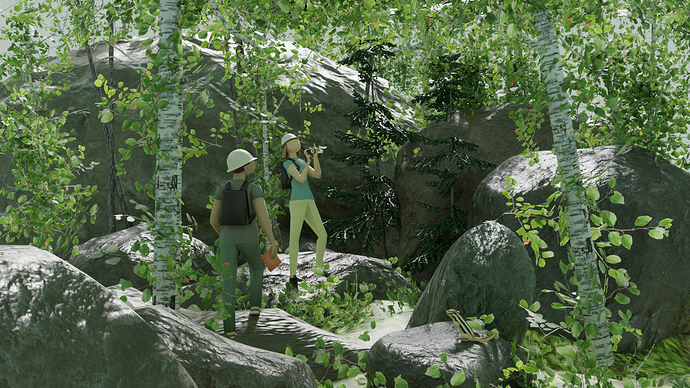
Very True! You seem to get more technically advanced every week. This one definitely feels like being in a forest. I think the colors could use a bit more contrast, as it feels a bit desaturated. I think it could also benefit from depth of field.
@Jaco_Pretorius The building on the right is gorgeous! Love the details! I also like the subtle DOF you put in there. Because the other building is unfinished, I think it would look better with the finished building more in frame, or with something balancing it out on the left of the image. There’s also some kind of jagged vertical lines (almost look like cracks) running up the center of the doors and windows. Not sure if that’s intentional or an artifact of shading.
Nice job everybody!
Sorry, I thought it was a joke! You could just place the map on a table)
Thank you! As it looks from my side I don’t feel tremendous progress in my creations now, though I like making scenes…And have some free time… Just repeated some video lessons. (But I think I didn’t memorise them) For rocks I used this video by CG Geek: https://www.youtube.com/watch?v=4EqLyGsu3AA , for trees this one: https://www.youtube.com/watch?v=y7PdiGXbrD0
I used the skin modifier to get the basic shape of the tree. Then I sculpted it into a more “gnarly” look and wider stem. Yes, as a square, it would probably look more like an old photograph, you are right! Awesome feedback, thanks!
My favorite render actually looked like this: (Just thought it doesn’t quite fit to the topic) xD
Thank you for the feedback. Spent a few hours trying to add depth of field to my Cycles render. Used nodes and composing mode…I just can’t do it. May be the next time…
@Tyger2 Yeah indeed now that i look at my scene the powerlines are a bit to “detailed” compared to the rest. However i really wanted to capture it since its one of those things that made my “impressions” its actually a bit more messy in real life 
Did you try depth of field in the camera settings?