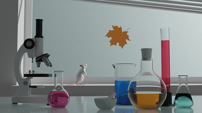
Very realistic-looking cycles render.
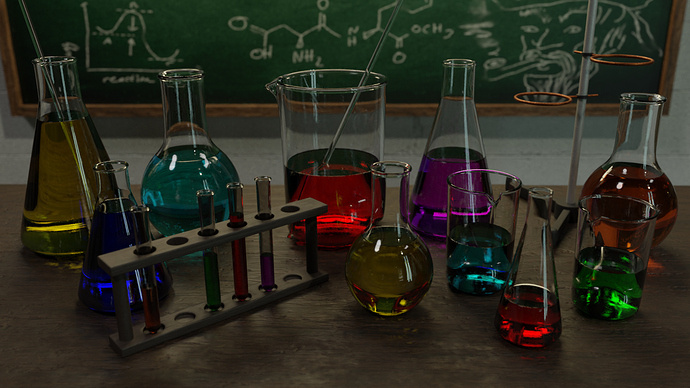
Wow! Did you actually model the liquid’s menisci? That’s next-level attention to detail.
Your computer must have had fun rendering that 

Very realistic-looking cycles render.
Wow! Did you actually model the liquid’s menisci? That’s next-level attention to detail.
Your computer must have had fun rendering that 
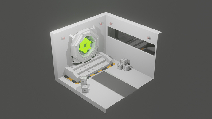
That’s a massive departure in style from your previous submissions, but still manages to retain the character of your previous works.
Very cool! 
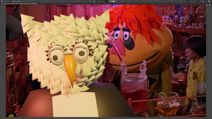
OK, fine, in honor of Charlie Brown & his Duckie & Horsie clouds, (because he’s a good man, Charlie Brown) here is my beginner entry for the Laboratory theme project: Dr. Blinky in his lab, from the 70’s kids show, “HR Pufnstuf.”
with reference:I like the fact that Dr. Blinky is mainly composed of primitives… nice 
Had to google “H.R. Pufnstuf”. At fist glance they look like Muppets who may have been “puffing” on too much “stuff” 
How about a new category for best beginner entry, call it the “Ducky Horsie Clouds award,” to encourage beginners to participate??? I propose to bring it up for a vote.
@albesca, I’m not saying I blame you for this…
but… I kinda am saying you may be responsible…
The “Ducky Horsie Clouds” award may well become a thing.
blame it on Charlie Brown, let’s make it a thing!
Oh dear. curtailed or thwarted.
I try my best to keep the bar low for everyone else 
& this proves the point; how am I, or any other novice, supposed to compete with this?
excellent work, NP5.
Thanks @Bradley_Bowers
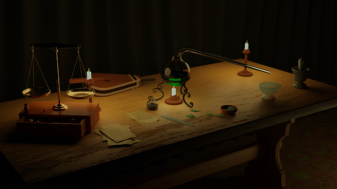
If you see it as a competition, I keep losing, low poly things win, lol. That is my failing, my ‘style’. People vote on all sorts of parameters. To be fair I had a lot of items ready made. Even so I spent days on this. Still failed as far as I am concerned, new render is two mins too late and my concern that in the evee working render, the candles looked green tinged, has led me to make them over white, in proper Cycles. Did improve the flame. But I did rush in a poor, very poor quill and a quick and easy inkpot.
Had been thinking it was Friday evening end.
This one too late, bad candles spoil it anyway.
Voting time! Here are the rules as a reminder:
Note: These are just thumbnails representing the submissions to save space. If you want to see the full submissions, scroll up ↑
In alphabetical order:
0 voters
Well done everyone!
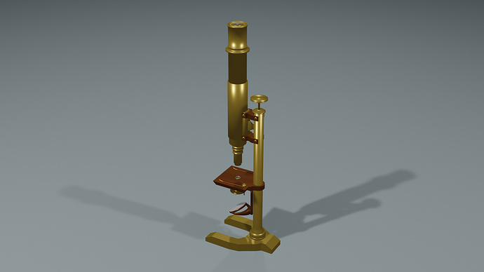
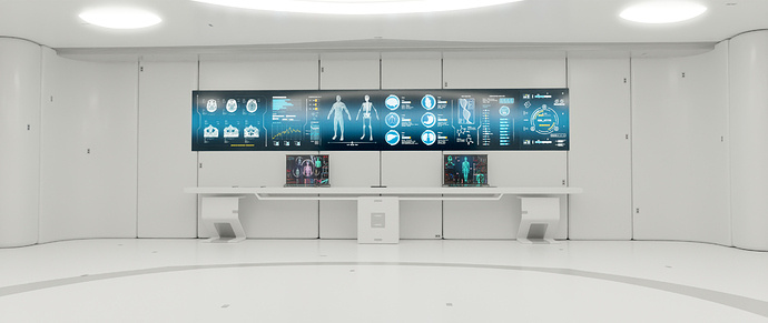
@albesca, the detail on that microscope is great! You definitely captured the “vintage” feel. Good work! 
@NP5, Accepted the 2nd render because it arrived in that gap where I was still figuring out how to make the poll work  . Amazing work! Really good use of light and materials.
@Bradley_Bowers: I agree with NP5… everyone on this site is technically a beginner (to varying degrees), and since aesthetic wins over technique any day, that does somewhat level the playing field. Your entry does stand a winning chance - in the end it depends on the audience  - also, you do it for the XP.
This was such a hard decision, all the entries were amazing, you all guys outdid yourselves!
will try that .
Really good! So realistic,
Hmm too realistic…
I’m starting to suspect you broke in to a high school, poured water and food coloring into the beakers, and took a picture.
Either way be it’s a beautiful composition! Really like how you chose to align the items.