The Blender Collab: Week 24 Themed Gallery (“The Laboratory”)

@albesca, the detail on that microscope is great! You definitely captured the “vintage” feel. Good work! :+1:

@NP5, Accepted the 2nd render because it arrived in that gap where I was still figuring out how to make the poll work :sunglasses:. Amazing work! Really good use of light and materials.

@Bradley_Bowers: I agree with NP5… everyone on this site is technically a beginner (to varying degrees), and since aesthetic wins over technique any day, that does somewhat level the playing field. Your entry does stand a winning chance - in the end it depends on the audience :man_scientist: - also, you do it for the XP.

3 Likes

This was such a hard decision, all the entries were amazing, you all guys outdid yourselves!

3 Likes

will try that .

Really good! So realistic,
Hmm too realistic…

I’m starting to suspect you broke in to a high school, poured water and food coloring into the beakers, and took a picture.

Either way be it’s a beautiful composition! Really like how you chose to align the items.

I just love the mouse!

1 Like

Good stuff guys!

@Ethan_Martinez This may be my favorite of your low poly scenes. Great balance of elements. Also a very nice sparse use of color.

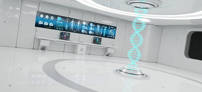
@Sahil_Nain This feels straight out of a video game. Very clean and austere, but real. My only complaint is that the composition feels a little too empty, but if you were to get closer to the desk/screen (for example) and fill up the frame, then you wouldn’t see the whole room, so I don’t know. I almost feel like it would lend itself better to being an explorable room, as in a video game, than one still image.

@Blest Really nice to see you branching out! As always, great composition. You have a way of adding those key details that just give the scene a touch of… what is it? Story? Depth? In this case the mouse, the leaf. With the apple tree it was the chair. Can’t quite put my finger on it but I think you guys know what I mean.

@Bradley_Bowers That’s pretty wild, man! I think from this and your bowling ball that it’s safe to say you have a unique style. I like it!

@albesca I looked at those! You did a good recreation. Which had more fine details, microscope or guitar? :stuck_out_tongue_winking_eye:

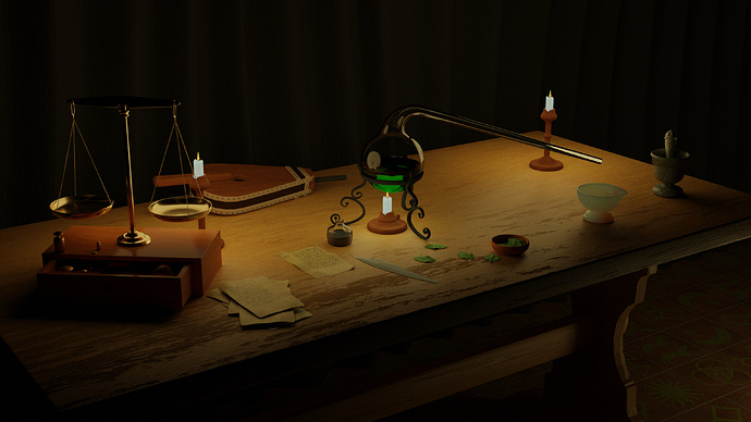
@NP5 This is awesome. Great balance of different objects all together make the scene really rich. And a nice amount of detail! All the way down to the tiles on the floor. Very cool, man.

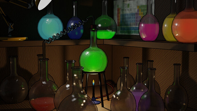
:shushing_face: :shushing_face: :shushing_face: don’t tell anyone! LOL really though the glass and liquid were pretty simple to make. Check out the “Details” in my post for a YouTube link. I think one other important thing though is having interesting things to reflect/refract through and around the glass.

Oh and Depth of Field! I almost always use DOF in my final renders.

5 Likes

@Ethan_Martinez clean and readable, the glass window and the dark strip on the floor hint at a larger layout very effectively, this could be a room in an isometric game. Maybe it lacks something human scaled, as right now only the steps give any indication of how tall a person would be in the scene

@Sahil_Nain great use of the image on the screens to give life to a scene that otherwise would feel too empty. The dna hologram is great, maybe you could put it on some kind of desk or stand in the foreground to fill the scene and hint at the camera side of the room, as the pattern on the floor makes it look like we’re in the middle of it and so it feels a bit too empty

@Tyger2 great school laboratory feel and is that Gandalf on the blackboard :smiley: ? I think that you put in too many bottles and beakers and the scene is a bit cluttered; as always, nothing to say on the technical side. As for my microscope vs the guitar, the latter had way more elements and honestly took me too long to model, with this I used a lot more modifiers (mirror obviously, but also boolean and solidify) and generally did it as smartly as I could and got to this level in about two hours and a half (the guitar took me about ten hours, I think)

@Blest the improvement on the modelling is impressive, and together with your eye for composition and the way you bring life to a scene with simple touches makes for a great picture. The leaf though looks like a sticker on the window, rather than a real leaf, but maybe that’s intentional?

@Bradley_Bowers amazing how you captured the feel of the original character with very basic shapes. I could picture this in a game or animation that starts cute and then veers off into horror, but maybe that comes with the puppets/costume kind of show :smiley:

@NP5 wow, I love everything, from the theme to the execution, great work!

5 Likes

TRied to add some life to the scene . What should i add to this to make it good ?


Thanks for suggestions guys . Hope its good now .

14 Likes

I liked its sparce emptiness. That helix now makes some sense of the open space, and is very effectively done. I don’t like the ‘drunk’ angle, personal taste perhaps, but there is no logic to it, bar arty effect trying too hard.

If you want to develop it more. I would like to see ‘a’ or ‘some’ autonomous robotic tea trolleys. You know what I mean? Mobile working high tech, flashing lights, bleeping if there was sound lol, Cleaning, carrying, recording, sort of thing. AH! on the size type style of the little dustbin one in Star Wars.

Much more testing, some alien or barely a hint of one that is studying humans anatomy, dna etc. Be a challenge to have it only showing indistinctly in one of the reflective surfaces!

1 Like

I like it! The DNA hologram is really cool. It’s a shame it loses the light cone when it’s in such a brightly lit room, but the bright light is a key part of the room, so I’m not sure how to remedy that. Maybe have a dim mode for observing holograms?

As to how else to fill it up, it makes me want to think about the purpose/function of the room in whatever universe it exists. Seems like testing or observing something, so you could add observers or the observed. Scientists? Test subjects? A human hologram?

I dunno. It’s a nice scene. And the sparsity is a part of it’s character, so I wouldn’t add too much, personally.

1 Like

Yeah I didn’t think of size relativity, which I should more but I think it worked out ok.

1 Like

Hi all… Big thanks to all those who have voted.

Everyone else, go vote now!

I messed up the deadline for the voting poll… it is actually supposed to end in about 12 hours from now… Apologies. Will be manually closing the poll at the below time so please get your votes in if you haven’t already.

Actual voting deadline:2020-06-27T12:16:00Z

Thanks again to the participants of the Laboratory Collab challenge

8 Likes

This isn’t done with Blender, right? What is this format?

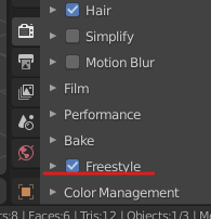
That was done entirely with Blender… It is a Cycles render with default Freestyle settings (Previous work used inverted-hulls for the outlines, and I think I prefer the look of those over Freestyle even tho they’re more work).
image

2 Likes

Well done to all the participants!

Voting is closed and the winner is @NP5!
image
Congratulations!

You have the honor of starting the next Collab thread.

4 Likes

Thank you all very much, a great theme to work on. Lots I need to keep doing on these items.

@Tyger2 Particularly gratifying you noticed the encaustic medieval floor tiles. :grin: Had to add an extra specific light to ensure they were at all visible.

2 Likes

It seems to give them a kind of illustrated feel. Looks cool. Do some of the liquid materials have emission?

1 Like

Mostly, yes. I could not quite get the effect I was going for but I kept those as “happy accidents”.

2 Likes

& the winner of much-coveted, completely unofficial, Ducky & Horsie Clouds Prize goes to… ME!
:horse_racing: :horse: :racehorse: :zebra: :unicorn: :duck: :swan: :cloud: :cloud: :cloud: :medal_sports:
A reminder of the rules & criteria for the D&HC prize:

  1. you can vote for yourself, (not by clicking, but mentally; you know you deserve it!)
  2. the feeling that you don’t really belong in this competition, but you do it anyway (for the XP)!

Shout-out to all the novices out there; come on in, the water’s fine! You, too, can join the competition & maybe you’ll win this much-lauded prize next time! See you there! (y’all know I’m just joshing around, right? :rofl:)

4 Likes

ain’t gonna lie, it was the tiles that gave it the extra extra, well done. :medal_sports: :medal_sports:

2 Likes

Privacy & Terms