Section 1 lesson 11 block modeling with primitives, modified using only scaling.
Hi,
Lot of good efforts from everyone!
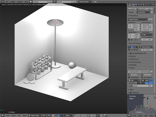
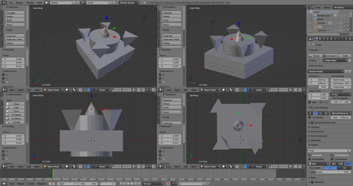
Below is my own effort using a few primitives, including a handful of spheres.
Just finished section one and started making a clock. It will be a clock someday 
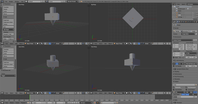
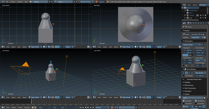
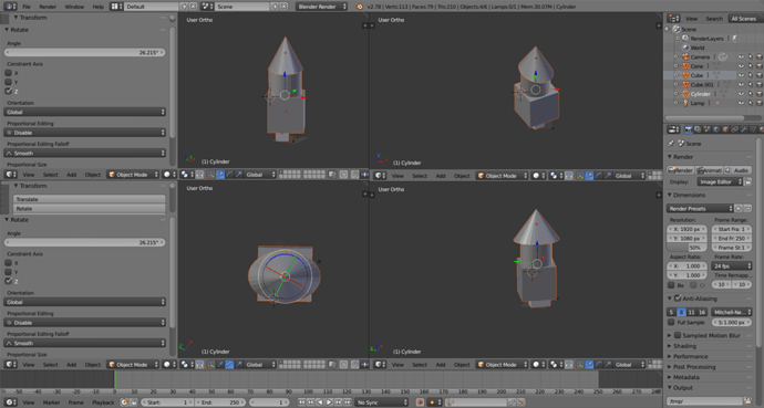
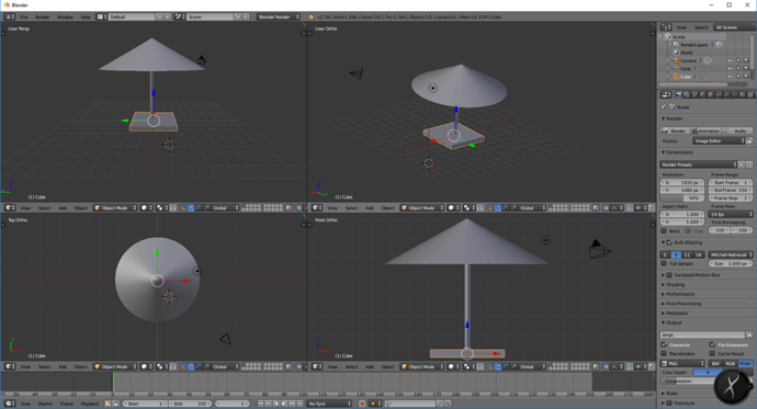
I’ve decided to make a top  I always like restricting which access things move/scale/rotate on by using the quick keys. For example, when I want to scale along the Z access only, I push S, then Z, and can even specify how many units I want it to scale. This is extremely useful with rotation, as I can specify how many degrees to rotate something, and along which access.
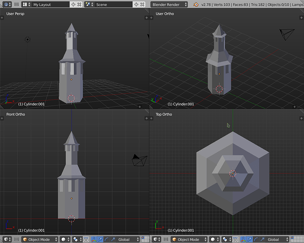
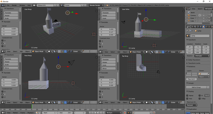
Wow! You guys have done some pretty cool stuff. Here’s my attempt at a tower. I like the user ortho view.
Hi, Here is my first basic attempt. 
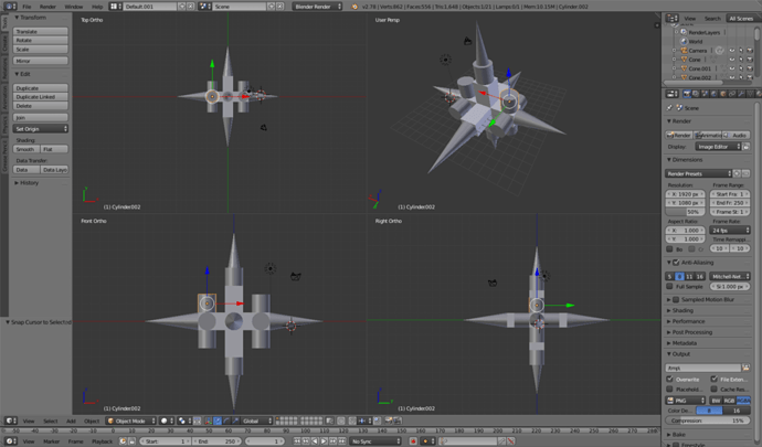
I used a lot the Rotate tool and selected similar objects and rotated for X, Y and Z.
Having a lot of fun with this course.
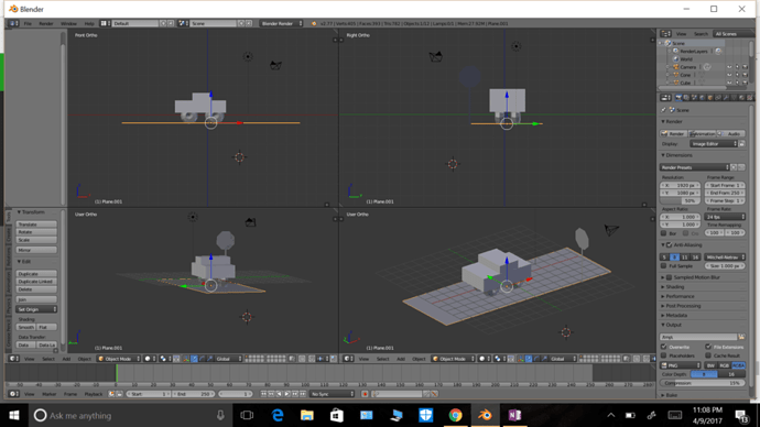
My first attempt at the challenge was pretty straight forward:
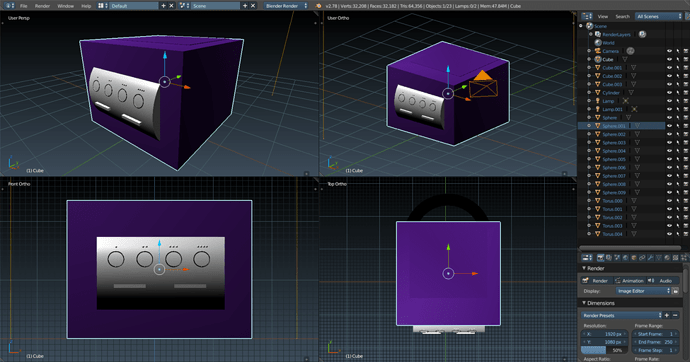
But then I saw all these amazing designs and decided to step it up a bit. I made a (very simple) Gamecube 
Now i can rule the world :V
add shading on “N” right menu and on the four 3D editor windows:
- Texture Solid
- Matcap
- Ambien Occlusion
My first attempt at anything creative, let alone anything with Blender 
I had quite a few issues trying to align things properly, but guessing (hoping) we’ll get to that.
I didn’t have any ideas so heres a basic idk what xD
A shrine I guess.
But hopefully my imagination improves as I learn more in this course, seeing others work kinda made me a bit jealous how much you can just create with basic shapes haha
Here is my attempt. I guess I set mine up like a still life or something - didn’t go crazy on being creative with it, but I tried to get some interesting shapes. I like the monkey head, lol.
There’s so many cool works in here!
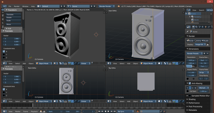
I’ve just finished mine. In the first window, I’ve pressed Shift+Z to make a quick render to see how it looked like with lights. 
I’m loving the course so far and I hope to learn more!
Wow, people have done amazing things here. Hopefully I’ll get to those levels of creativity one day.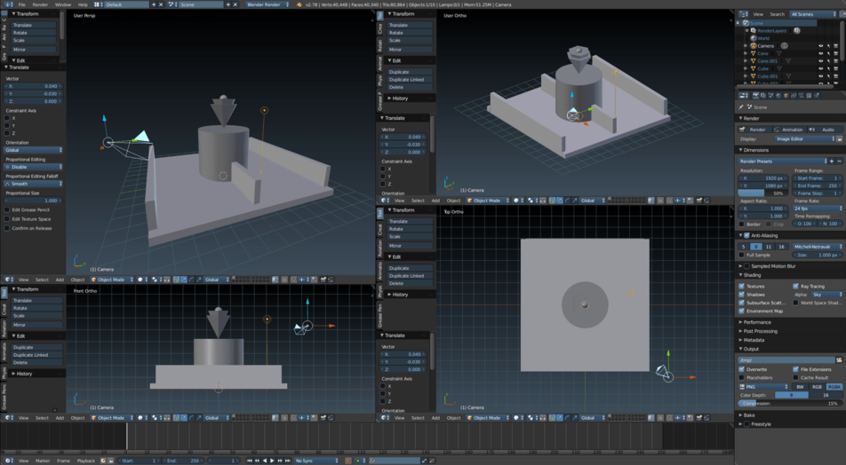
Wow, i like that Theme, Which one is it?
It’s “Science Lab”.


