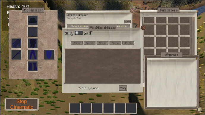
I liked the two-way toggle better than a button that changed from “switch to buying” to “switch to selling”. After all, it always made me stop, seeing things like this on a UI (common in a lot of software): “do I click the button with “buying” in it to start buying, or is it telling me I’m in buying mode?” or also those “accordion” lists where you click an up or down arrow to expand/close the sub list: does up arrow mean close it up or show you that it is closed up? With the horizontal two-way switch, the meaning is instantly clear.
1 Like
Thank you for sharing this. It’s always confusing when the UI is not clear.

