Fun with the Human Head

Thanks!

I’ve been thinking this way more recently. Sometimes I get an idea for a cool scene I want to make, but it’s too complex or would take too much time to make all the pieces. So I’ll just make individual things for now and later I can reuse them.

Yeah! I was thinking of that when I made the glass one :laughing:

Very nice skulls. Good to see modeled not sculpted.

1 Like

Thanks. I haven’t done much sculpting so I’m not that good at it. Seems like some people can make some pretty cool stuff that way though. I was thinking about sculpting to add detail, like in the human head section.

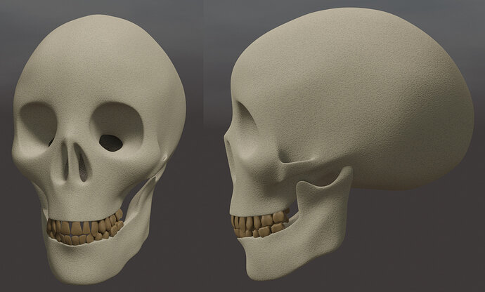
I added a texture and teeth. Modeled the teeth individually. Probably not the most efficient way to go, but it worked more or less. I also noticed in my reference images that you can see back into the skull (or maybe nasal?) cavity through holes in the eye sockets and nose hole, so I tried to add that. Not sure if I like it though.

4 Likes

Yes, I am having nightmares with sculpting, clearly not getting the hang of it. Am adding some very ‘simple’ marks to an entry for the pirate needs challenge. Taken several evenings down a rabbit hole of mesh mess trying to sort it out. It was intended as only a minor addition! Must be me, everyone else does it fine it seems.

1 Like

Well it’s a whole other skill, right? Probably just takes study and practice.

1 Like

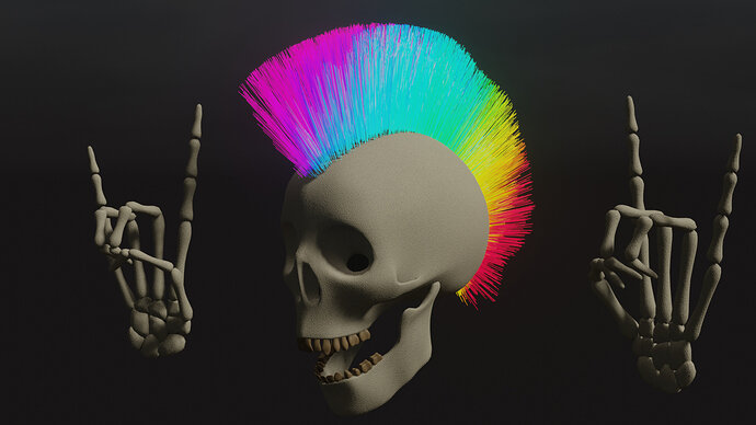
Rock on!

Side projects of side projects. I try not to get distracted, but stuff like this is just too much fun. :man_facepalming: :grin:

6 Likes

:rofl: :rofl: :+1: :clap: I had the same idea … Loving this one. Dead people disco.

1 Like

Finally getting back to this project.

Painting the Gloss Map:


Interesting!

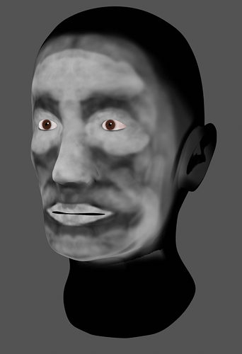
After painting the gloss and diffuse maps:

My impression of texture painting:
A - I hate it. It’s terrible and it needs to die.
B - OK maybe I overreacted. It’s frustrating and I am not good at it. I finally started to figure some things out, but I just found it very alien and unpredictable
C - Texture painting in 3D view slows down my computer a lot
D - The “soften” brush does nothing, is worthless, and therefor needs to die (or maybe I just don’t know how to use it).

Honestly I think the head looked better with just a solid diffuse color. I think texture painting is a whole other branch of this art form and I think it would take considerable more study for me to get better at it.

Got any tips on texture painting?

4 Likes

I didn’t like it either.
Maybe the reason that people jump over to substance painter.

But to challenge myself, I used it a lot recently. Yes it can be slow. Yes it can be annoying.
But practicing helps. Point is in these courses, texture painting has low attention here. Very superficial.
And also I can not find very good tutorials online. But what I found plus some new challenges (do this in texture paint). I still not like it very much. But my annoyances with the tool is gone.
And the process is better than, going back to GIMP. So it’s a process of learning!

It has the same annoyance level, for me, with sculpting. Seeing lot’s of people doing really nice projects. But for me, it’s hell. If it’s your first or second try, don’t give up. Try to think the bender way!
And it needs as much time as you did spend on modeling meshes.

Everything in Blender takes time to learn. There is nothing at Blender where you can say, after a week I’ve learned it all!

3 Likes

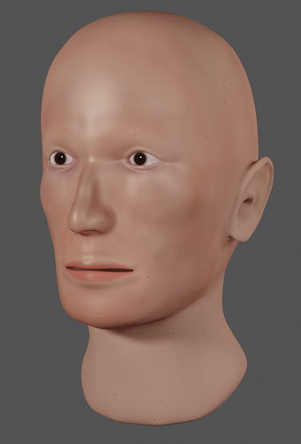
Tiger, the mouth is too low here. It has to be not in the center between the nose and the chin, but at the one-third. A little higher up, it will look more human.

1 Like

Thanks! I will check it out.

the head looks a bit glithchy but it kinda looks like red skull

1 Like

Haha yeah it kinda does. A bit more nose though :laughing: . This is the kind of character that I always like to draw, but it was a bit too cartoony for me to easily follow along with the lectures. So I ended up going to the more realistically proportioned one shown later. I recommend doing that for anyone doing the head for the first time.
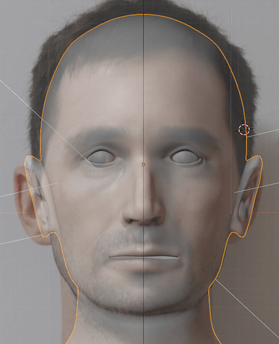
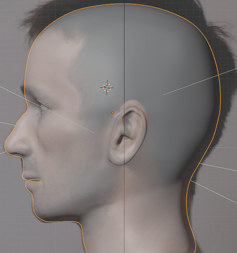
You could also just add more chin instead of moving the mouth up, if that is easier on your wire mesh, if you are looking to correct anatomy.

@wes.m @Blest

I went back and checked on the mesh. It seems to line up pretty closely with my reference images.


(Wow, looks like a serial killer here! Creepy)

The mesh is definitely not a realistic duplication of my head, and there are a lot of details left out. However the mouth seems to be in the right place. So either something else is throwing it off, or I just have a weird mouth :sweat_smile:.

I probably won’t be doing too much more on this project, since it’s kind of old, and I was just linking here to show where I got the skull from. But I appreciate the feedback! Always trying to get better. Thanks guys!

3 Likes

Humans are so difficult to make in 3D.
Because the same humans are very good at recognizing facial expressions and faces.
AI programs generate millions of faces before one is created where we say, it looks human.
Basically, there two AI programs battling with each other.
One generates faces, the other checks a generated face and say yes or not believable.
This process takes also place in 3D animation. Where AI generates many solutions of one subject.

2 Likes

Оh, may be perspective makes it look strange. I have troubles with sculpting, because in perspective veiw object, looking perfect irom front and side, becomes weird…

2 Likes

If you are referring to the way 2.8 flips from perspective to orthographic for proper front side top views, you can turn it off. Then you choose when to be in perspective\orthographic via the standard 5 numberpad press.
Edit, preferences, navigation, untick ‘autoperspective’.

3 Likes

Thank you, I’ll check it.

On the lower reference, if you look, from the bottom lip to the chin you basically have a straight line, that is likely what is swallowing some of the dimension. I’d say you might get a more compelling model is you exaggerated that angle a little, and maybe even have the chin come out a bit more than in the reference.

The other thing is that the reference is already is a sort of idealization/abstraction of a human face, you your model is an abstraction of an abstraction. You will want to slightly exaggerate some parts to have the overall model look real. Faces aren’t symmetrical and perfect anyway, so a weird chin will probably make it look more right.

After writing this I of course saw you weren’t necessarily looking for further feedback on this project. But maybe something for the next one :man_shrugging: :stuck_out_tongue_winking_eye:

3 Likes

Privacy & Terms