If you’re reading this, there probably aren’t very many posts yet. But don’t worry, you can be the first! Either create a new post or just reply to this one to say ‘hi’.

Swords

Nintento Flower and a walk cycle


House from before, added smiley face for sun and turned candle flame into clouds and smoke

Had a very frustrating couple of hours trying to use the transform tool. I had success with a scrap image. Then each time I tried it with an image I’d put some effort into, it wouldn’t work! I wondered if I had check marked something in a selection tool or some other tool that I shouldn’t have. Well, then I finally figured out that half the time I was clicking on image>transform rather than layer>transform. Ahh… finally… successful rotation…
Here is my “rearranged” double flowers (yep…still sticking with the garden theme) … with a gradient background…

New game icon, clash:


flashlight and “light” on two different layers. Linked them to move them around. One of the flashlights I merged after flipping so that it was easier to move the layer since if I tried to link one flashlight and “light” and the other set at the same time, they all moved. Merging one of them made moving layers easier and since I didn’t merge the first one, if I needed to make changes, I still had layers to work with.
New PvP Icon :

Lantern
 Placeholder
 Collected
 Active
Nice Idea 

Abstract game icon made by copying and flipping…

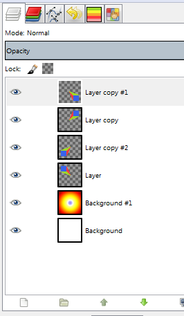
Layer screenshot:

 I used a scythe image from an earlier exercise and used the
 Arbitrary rotation... transform so that I didn’t have unnatural overlap when I duplicated the layer and flipped horizontally.
Note: Arbitrary rotation will do some anti-aliasing magic to your image to give the illusion of rotation so it may look alarmingly blurry in the big view port at first
Swords clashing in the stormy weather


 Dual Sword Overlapping Rotated Eye
Not sure what this icon could be for.

I like that! It would be cool to cast a shadow onto the behind axe. That’d make it really pop!

Had to make Mark’s sword to follow along, but it didn’t take me too long (the sharp bit on the cross-guard took the longest!)
Originally wanted to put my sword over my shield from the past couple of projects, but the sizes didn’t really match. So I made this duel/pvp icon which I thought looked pretty cool!


