2024 Collab: Week 43 “Toys”

This is the Blender Collaboration 2024, week 43 challenge. Don’t be afraid to join, a lot of us are beginners. This is all to practice, have fun, learn, and get together.

This week’s subject is “Toys”.

  • Toys - A toy or plaything is an object that is used primarily to provide entertainment. Simple examples include toy blocks, board games, and dolls. Toys are often designed for use by children, although many are designed specifically for adults and pets.
  • Subject selected by the previous Week 41, 2024 “Cell shaded" winner FedPete

The rules are simple. 1 subject, 1 entry, 1 week.
You create whatever object or scene or whatever you can think of that has something to do with the subject. It can be as simple or complicated as you want, all entries are welcome!
Post your picture here in this thread. At the end of the week, we start to vote. And if you are the winner, you may choose the next subject and win a unique badge.

Deadline: 2024-10-26T21:55:00Z

If you want to stay informed of the @ BlenderCollab?
Subscribe or unsubscribe to this “BlenderCollab” group.

7 Likes

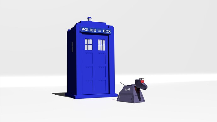
Doctor Who the Warrior’s gate coordinate 0.00 xyz

11 Likes

Oh great with K9 too! My era Dr.
I made one once for an earlier collab but as transport not toy like.

2 Likes

Great Tardis model, @NP5! Has there ever been another color for the Tardis in Dr. Who’s history? I don’t even know if the standard UK police call box’s were ever another color. Now I want to see a series of Tardis’ in different colors. Ooh, what if the Dr. identified themselves as someone from a different country? What would their Tardis exterior look like?

No other colour in Dr. Who that I know of. Unless you count grey! From the first beginnings of the series TV was only in Black and White!
No other colours allowed! Sacrilege.
Interestingly Glasgow had some red ones, same design shape etc. so no Glaswegian Dr. Whos permitted!
It is one of those iconic things that if the bbc messed with they would never survive!

12 Likes

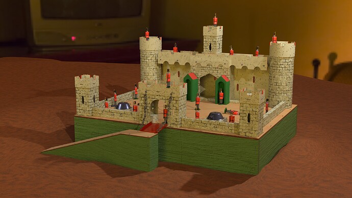
Best get this in, may not get to do more to it.

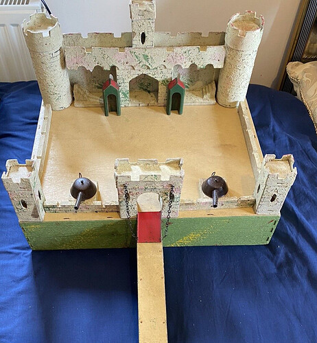
MY toy, from a long time ago. :grin:

Fortunately other parents did not throw their child’s fort out, and there are examples occasionally sold as near antiques with lot of photos for reference!
Yes this is more ‘new’ out of the box than those examples. Maybe I will age it another time I pick it up again. Procedural textures apart from just bump maps for wood under the painted bits. And yes the base was fairly rough, this texture is more so but closer than most that are all too neatly finished.
I needed a way of doing splodged random paint bits of colour over the walls, see originals to understand, Can’t come up with a way to do that in time.

Original

Image example from web.

10 Likes

So nice! When I saw the metal parts, I almost was expecting to find my MicroMachines cars parked inside (that happened here :grin:).

2 Likes

So funny this parent Castle thing.
Here it was garages build by a dad or an uncle.

2 Likes

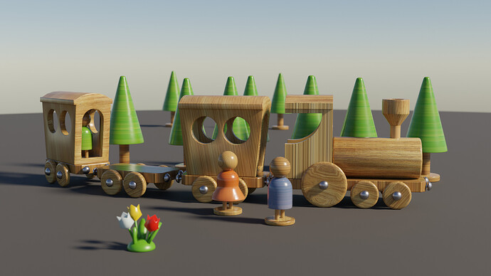
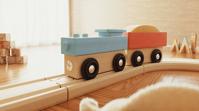
Wow, a simple scene but quite lovely. The lighting and wood material are spot on, though I can see some shading and UV issues. Fixing those would be priority, but maybe an addition of a playmat would help establish the scene.

2 Likes

I’m new here and here’s my entry:)

11 Likes

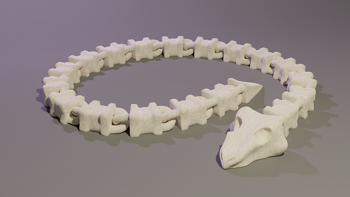
When I bought a 3D printer, I thought I would make my own toys. But I didn’t have enough time. Now I have time, but my printer is far away, so nothing has been made yet.
This will be my second attempt to model an articulated toy. It’s better not to see the topology, the array distorted the geometry, but it’s ready. I’ll call it a bone worm.

7 Likes

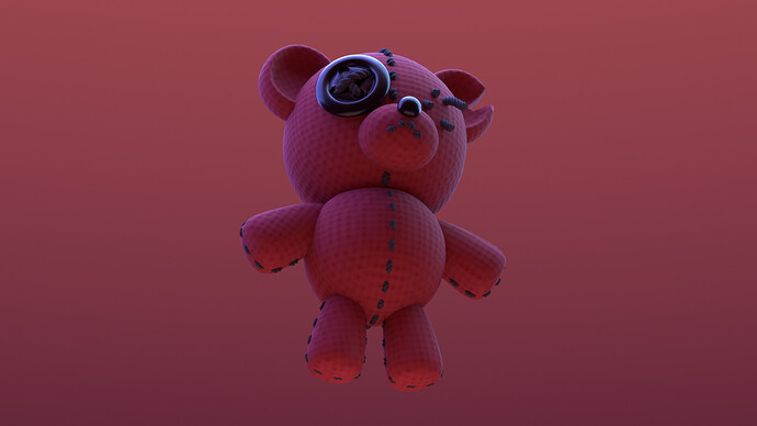
I see most people went for a wooden toy aesthetic, nice. I made a rather ominous-looking bear.

8 Likes

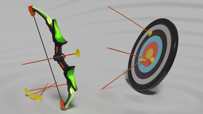
I had very little time this week, but here comes my suggestion for a quite modern plastic toy. Probably most of you have had a variant of this one, though :slight_smile:.

6 Likes

These are all neat! I’ve not felt great today, and it’s definitely been a nice treat to see what everybody put together throughout the day =)

1 Like

We @BlenderCollab have a few days to vote. You can vote fast but also think slowly about design, colors, technique, difficulty, subject, realism, etc. Choose consciously and not on your entry.
The new subject week 44 “That is funny” has already started. The winner of this week’s “Toys” challenge may select a subject for next week 45 and win a badge.

@martin.r congratulations on your realistic entry on the subject of toys. Simple in design but with good lighting and camera composition settings. A very technical entry. Could be a nice example in your portfolio.


  • FedPete - I think the light can be improved. Now you are using external (sunny) environment. Should be internal.
  • xealstrag -I like this angry doll look. Maybe a different background color. Now the subject blends into the background and is less visible.
  • DANB1 - Very iconic and recognizable. To finish it off I would give it an environment (street).
  • Kzanna - Nice toy and it could be printed in one go. More diffuse lighting and color to make it playful.
  • Megane_Wang - Beautiful product presentation of colorful toys.
  • NP5 - Brings back memories and a very good model from the original. Softer (ambient) shadows.

Note: I don’t want to offend anyone. I try to write down positive ideas and visions in my simple use of the English language. I am also sometimes more inspired by a particular subject or solution. I’m also learning from you!

3 Likes

Privacy & Terms