2024 Collab: Week 31 “Still Life” - VOTE CLOSED

This is the Blender Collaboration 2024, week 31 challenge. Don’t be afraid to join, a lot of us are beginners. This is all to practice, have fun, learn, and get together.

This week’s subject is “Still Life”.

  • Still Life - A still life is a work of art depicting mostly inanimate subject matter, typically commonplace objects which are either natural or human-made. The subject can be anything, as a still life is simply an arrangement of objects like fruits, flowers, and glasses, vases, etc. Can also be things on someone’s desk or kitchen table. It’s very open to interpretation.
  • Subject selected by the previous Week 29, 2024 “It’s a Low-Poly World" winner mfortunato

The rules are simple. 1 subject, 1 entry, 1 week.
You create whatever object or scene or whatever you can think of that has something to do with the subject. It can be as simple or complicated as you want, all entries are welcome!
Post your picture here in this thread. At the end of the week, we start to vote. And if you are the winner, you may choose the next subject and win a unique badge.

Deadline: 2024-08-03T21:55:00Z

If you want to stay informed of the @ BlenderCollab?
Subscribe or unsubscribe to this “BlenderCollab” group.

4 Likes

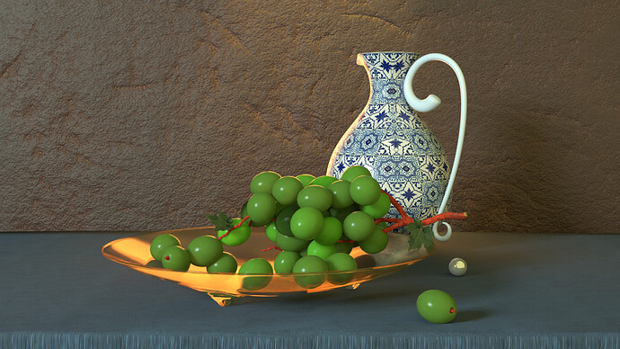
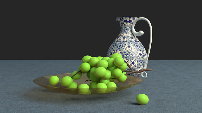
Reviving an old project

WIP

Lighting is hard to do. Lots of render trails.

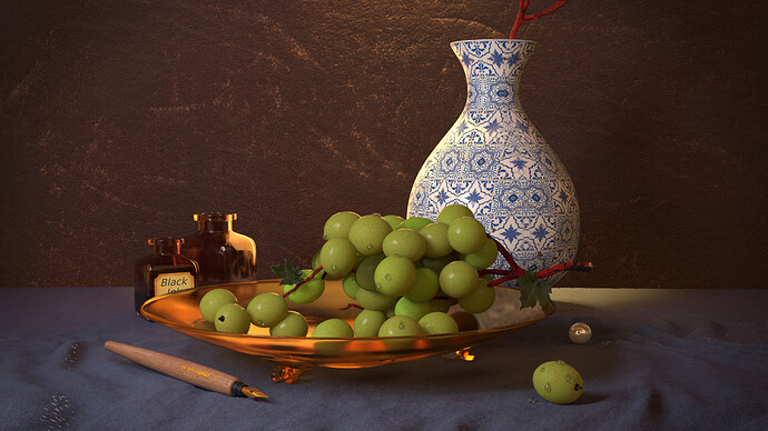
Final

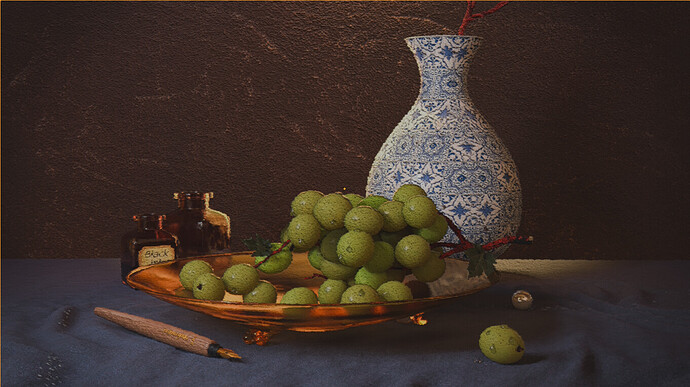
Mimic paint

I finally found my vonoroi node to distort the illustration a bit, more random (paint feel).

10 Likes

Sweet, @FedPete, you’re going to show us progress pics. I love learning processes from others. What do you mean by, “exposure is hard to do, lots of render trails?” Oh, in the color settings, you mean? Where the “looks” are?

1 Like

I love these vases, probably because she liked those, “still life” immediately made me think about grandma’s vases and statuettes :woman_shrugging:. I have a question about the handle, though, Is it me, or the white colour there is different from the one in the pattern?

Lighting is a thing there… Every time I have to work it out in Blender it reminds me of my time as a product photographer, setting up what-had-to-be beautiful lighting in my tiny studio at 2 AM, but “still life” does it even more :laughing:.

2 Likes

Is your tiny studio like mine, a small section of my family room? I trot out the lights and backdrops and transform a corner of the room into a makeshift studio :rofl:, mostly for studio headshot photography, but sometimes for product photography as well.

1 Like

How did you know? :laughing: :laughing: :laughing:. I worked the whole day on my own micro-company, then took the “office/playground/leave-it-all-here corridor/room” as soon as everyone was in bed, mostly for food photography, to be retouched next day (oh dear, most food close shots need it).

2 Likes

I changed the comment into “Lighting is hard to do. Lots of render trails.”.
This is because I want effects like, a bit of subsurface scattering in the grapes.
And using a 5min render time it does about Cycles 25 passes.
Which means, trial and error is a long way to go on a slow machine.

  • The lighting is unnatural
  • I want a glass bowl with more relief (more light bouncing)
  • More craquelure in the vase
  • Fibers in cloth and more fabric look
  • Tiny details
  • Additional items

On these item you can spend hours on fiddling…

2 Likes

Yeah, the handle … It was a quick model session (using a spline). I don’t like it, too thin. I think I will remove it, because the original spline modifier was applied (old project).
And my feeling is that the vase is too tiny, a grape can barely fit in it …

… and I need to look up reference material, I doing this from memory. Which isn’t good at all.

1 Like

Creating fibers is insanely difficult to get really right. I am using a lot of drapery in the still life I’m creating and I finally turned to some online tutes and free blender shaders for my fabric. If you’re interested, here is what I am using in the scene: https://youtu.be/zCtQrQA70j4?si=vdwu0lr4eRF1nNkV
Weavr - Procedural Textile Shader [Blender 2.81] - this is an amazing fabric shader!!!

Right now I am carefully modeling rose petals using splines and hopefully will have those done soon.

-Michael

2 Likes

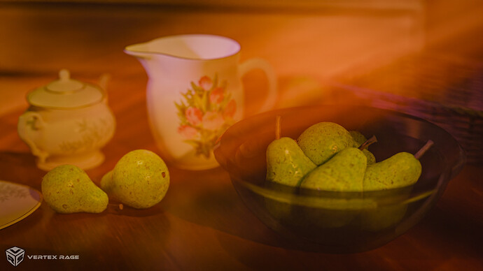
My recent things…Pears… that was supposed to be 1h exercise… which turned into a few days of work :sweat_smile:. This time it’s 100% in Blender.

8 Likes

The pears look amazing, @bOBaN! I don’t think you’re showing the incredible work to its fullest, however. The volumetric fog feels too much, engulfing all your objects. The light rays are very bright and take over the scene. Also, the lighting is very red - like there is a raging forest fire outside of the scene - it’s a color i am way too familiar with living in California. You may also want to increase the depth of field. It is very shallow and your other objects are completely out of focus. Most still life images keep the main subjects in focus (plus we’re missing out on getting a good look at that adorable tea pot). I apologize for all the notes, but I can tell you put a lot of effort into the models and textures and I wanted to help you show those off even better.

1 Like

That’s a great scene :heart_eyes:, and those pears look tasty. I just find that there could be more difference between the blurred and the focused part. Now that’s difficult if you are using a diffuser shader for those rays, because it also has a blur effect, doesn’t it? In that case, would changing the density in some parts help?
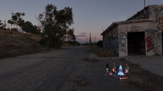
I had some fun with a Fallout setting. I wanted to add a power armor, but it would just take me forever to add all the details to the suit.

5 Likes

Objects look good but the overall effect looks poor and blurry. Have you used an extreme aperture and created very shallow depth of field?

The Nuka Cola looks excellent. If you’re not going to add anything else to the scene, I’d move the camera in close on the 3D objects and use a depth of field to blur out the backdrop. Also, because there is no plane for the objects to sit on, they look like they are floating - the needs some kind of shadows - even ambient occlusion to make it appear is if they are actually in the scene.
I can’t wait to see those models up close!

1 Like

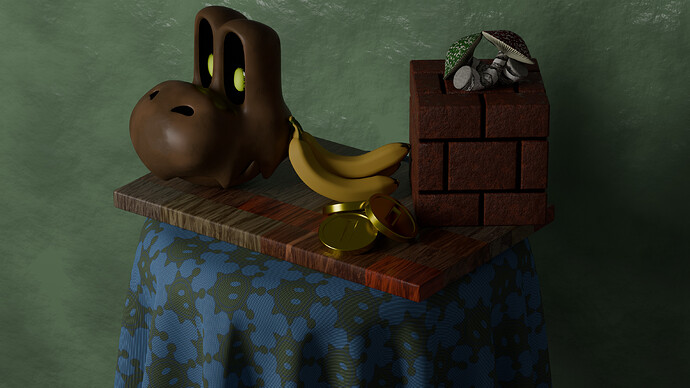
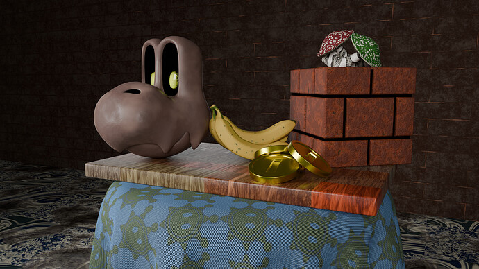
Had so much fun with this week’s challenge


Changed the lighting but I feel the scene lost the gloomy look. Decided to modify the background in an attempt to bring it back

9 Likes

Love the Super Mario theme! The dry bones head is priceless!!! Since there is still time before this is over, I encourage you to do a bit more work on your lighting. You can bring some more life to the scene by adding a rim light to better outline the models and really make them stand out. Take a look at a basic 3-point lighting setup which consists of a key light (main light), a fill light, and a rim light. You may be amazed how much better your already wonderful models will look.
Also, consider changing the camera angle so the scene is more engaging. Think about a camera through the eyes of someone really excited about the world of Super Mario. Perhaps through a child’s eyes? The camera could be a bit lower and closer in. This isn’t necessary, but I always find it fun to play around with angles to see how different perspectives breathe new life into the objects I create.

3 Likes

My near-finished still life. I’m still working on the skull and playing with lighting, drapery, etc. But I am really happy with the way this is turning out overall. I really need to practice sculpting - this skull has been a pain in the butt!

9 Likes

Very nice, skull must have been a lot of work.

2 Likes

Privacy & Terms