We @BlenderCollab have a few days to vote. You can vote fast but also think slowly about design, colors, technique, difficulty, subject, realism, etc. Choose consciously and not on your entry.
The new subject week 22 “Phones” has already started. The winner of this week’s “Stars” challenge may select a subject for next week 23 and win a badge.
4 Likes
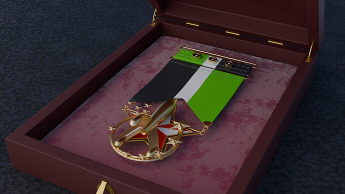
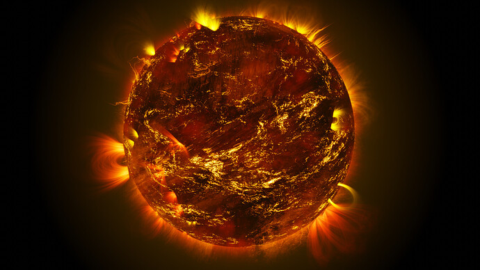
Week 20./21 congratulations of the weekly Collab goes to @Turgul for a beautiful sun (red dwarf) illustration. Very beautiful and colorful sun texture and excellent sun rays with corona.
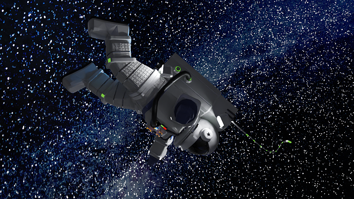
- Megane_Wang - Great space scene with stars. I like the way you’ve solve the lighting problem (space is dark). By adding lights to the space suite, well though off!
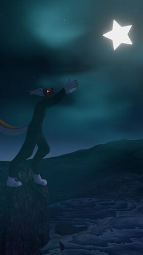
- HobbyPirates - I like entries showing a little story, because the viewer is invited to explore more of the illustration. Maybe paying more attention to generic composition rules.
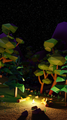
- Kzanna - Great low poly scene, very colorful and atmospheric . But I think the viewers attention goes to the camp fire, and not to the sky filled with stars …
- FedPete - The illustration does not reflect the subject enough. It hardly has any relation to stars.
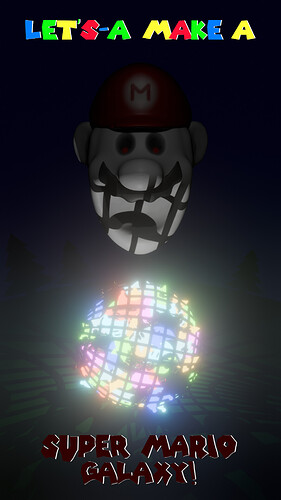
- BH67 - If you don’t know Mario games, then it’s probably difficult to make a connection. It’s difficult to see or recognize a (natural) galaxy. improve lighting of mario (eyes)
Note: I don’t want to offend anyone. I try to write down positive ideas and visions in my simple use of the English language. I am also sometimes more inspired by a particular subject or solution. I’m also learning from you!
7 Likes
