@Gordon congratulations on winning this competitive Collab week with many participants. You’ve created a beautiful bright, sunny, creative dessert scene. Good composition and level of asset details.
General observation:
Voxels are like screen pixels. While they are 3D in shape, the 6 faces contain the same color (variance). Voxels don’t rotate, Voxels do have the same size (scale). Voxels fit the grid.
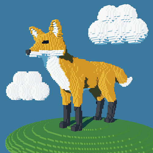
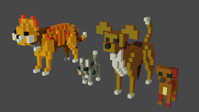
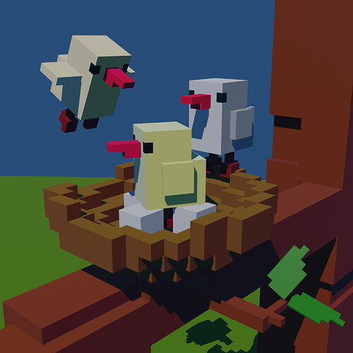
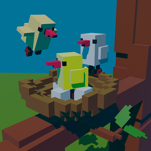
- Kzanna - such a lovely scene. You’ve managed to create animals (foxes, dogs) in their essence. Great achievement. I think your birds are a bit blended in color. Play with color variance in voxels.
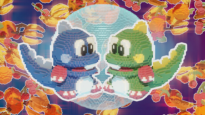
- VVruba - Colorful illustration, can be a wallpaper. I think the background is too noisy. It distracts from the main subject.
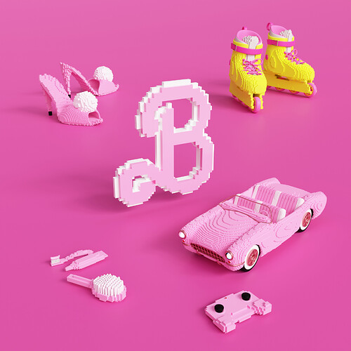
- anastasions - You go with the flow …
 Great assets, The yellow boots are distracting (emphasizing) due to the color. I like the black accents on the controller better, more like tiny details.
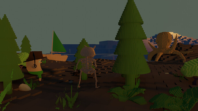
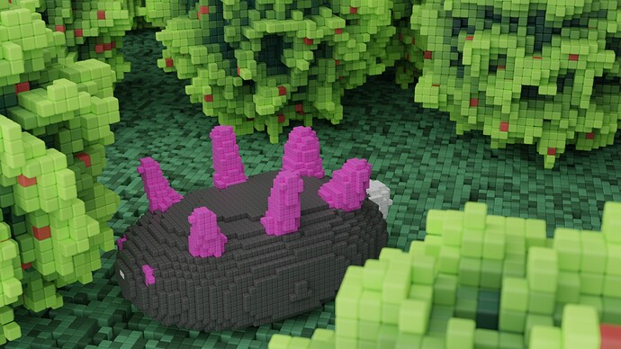
- HobbyPirates - Great scene, lot of details. Maybe too many and due to the color schema, difficult to see (separate). Assets are blending in, like the monster in the middle. A different distinctive color would help.
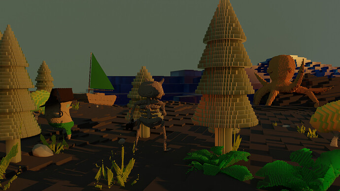
- zeRgenTa - Love your bushes, really! Your scene lighting is very nice in my opinion. No hard shadows, so the voxels look great. They do have a bit of bevel (my choice also). It give a nice texture to flat surfaces.
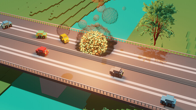
- Cows - Nice action scene! Add more car destruction, more details, and more havoc … Makes it more interesting. I think the scale of voxels used to be too diverse. Road railing vs. cars.
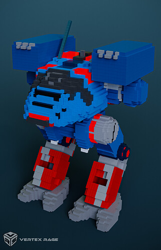
- bOBan - I think the charm of voxels is in using them in organic shapes. While a voxel is still a cube or rectangle combining them as such, makes no difference. Maybe the mech as a subject wasn’t the best choice. But I do think if these were recognizable as LEGO bricks …
Note: I don’t want to offend anyone. I try to write down positive ideas and visions in my simple use of the English language. I am also sometimes more inspired by a particular subject or solution. I’m also learning from you!


