2023 Collab: Week 01 "Toon Shader" - VOTE CLOSED

Not an entry, just my old project for an art contest.


14 Likes

Cool topic choice! Here’s my work in progress, in case I don’t have time to finish it up:

Reused the volcano from the challenge a few months back, and the moon I’ve used countless times, but now it’s pixellated. The gorilla and vegetation are new.

This has been really fun. I’ve mostly tended toward attempted realism in the past, but stylized renders seem to open the door to new possibilities, so I’d really like to learn different techniques like this.

As always, feedback is appreciated.

14 Likes

WIP

just in case I don’t get back to it later still unfinished

12 Likes

Hi,

I am kinda obsessed with animation rendering right now so here is a cartoony sunset animation for this topic. Shader on the mountains combined with sunset animation seemed like melting snow. :lying_face:

Feedbacks are appreciated, thanks.

11 Likes

A very nice transition from day to night.
The water is too fast, more subtle, slow …

4 Likes

It’s the main character from the old short film by Tim Burton - “Vincent”.

Reference

Without textures

15 Likes

I can’t compete with Tim Burton :stuck_out_tongue_closed_eyes:
Vincent is still his best movie for me and this is such a good represantation of that character.

2 Likes

Thank you! It’s my favourite too for many reasons! I’m embarrassed to say that I even know the poem by heart :smiley:

2 Likes

10 Likes


REMEMBER THE CURFEW
5:55PM
YOU HAVE BEEN WARNED

9 Likes

I’ve held off ever trying to do toon/call shading because I always heard people say it was complex and hard and so many ways to do it, but just following the example in the original post was simple and fun and I really like the contrast and abrupt change of using the cell shader and I’m happy this was suggested. This was slapped together with a model I made for the character creation course but I wanted to have an entry. I love the collab.

3 Likes

Maybe play a little more with the composition.
Different camera angles and zoom in on the subject.
Now everything is aligned to the view, looking mechanical.

Fun subject!

1 Like

Probably using the trick of using the skin modifier and object duplication with faces inside out (you see the inside of the copied, skinned object). To generate black lines.

Not to complain or so. But with this technique, the soft shadow looks odd.
What if you decrease lamp, or sun size (angle) to zero?
Making the shadow more harsh?

2 Likes

I tried putting something together today. I wanted to add details with the grease pencil but couldn’t get it to work like I wanted it to and ran out of time, so I’m leaving it like this. Fun subject and awesome submissions by everyone!

8 Likes

The fact that you gave him red eyes instead of keeping the entire character black and white makes his countenance even more sinister! Love it!

2 Likes


HE WATCHES
HE WAITS

8 Likes

12 Likes

We @BlenderCollab have a few days to vote. You can vote fast but also think slowly about design, colors, technique, difficulty, subject, realism, etc. Choose consciously and not on your own entry.

And the new subject week 2, 2023 “Rabbits, year of the rabbit” has already started. The winner of this week’s “Toon shader” challenge may select a subject for next week 3 and wins a badge.
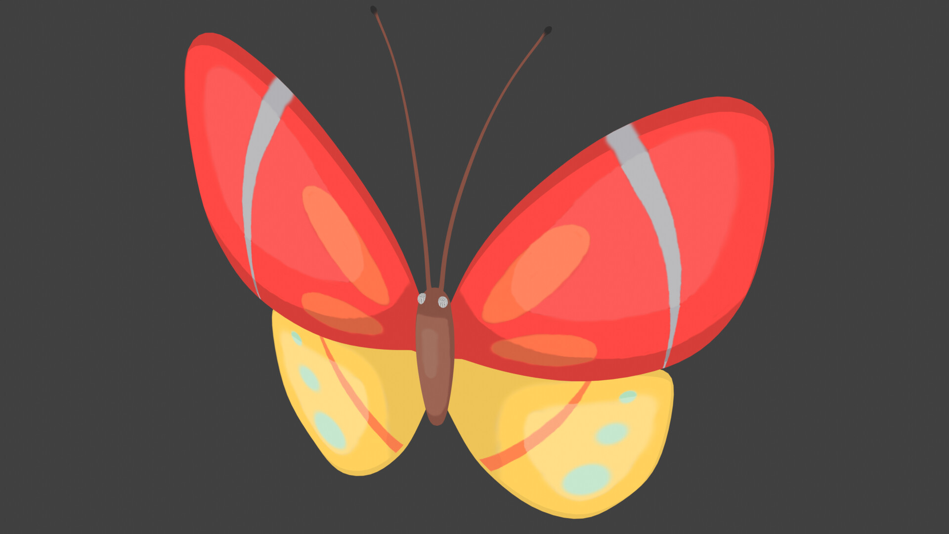
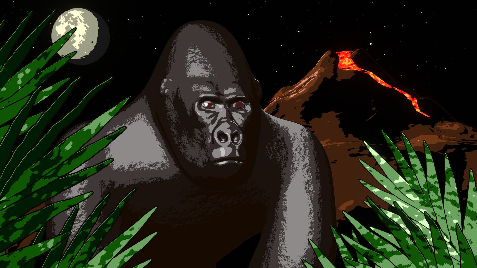
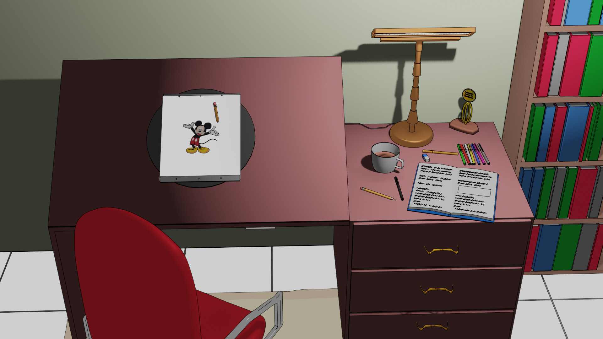
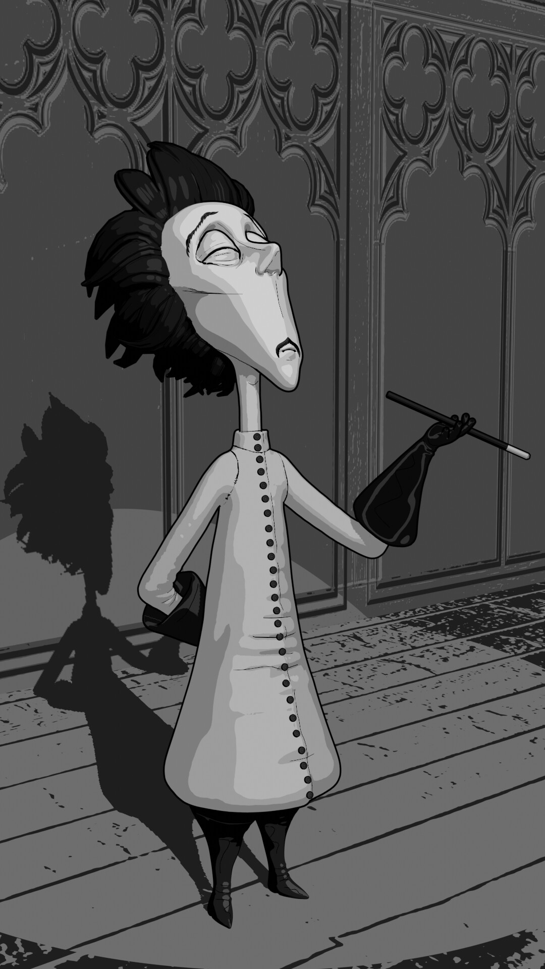
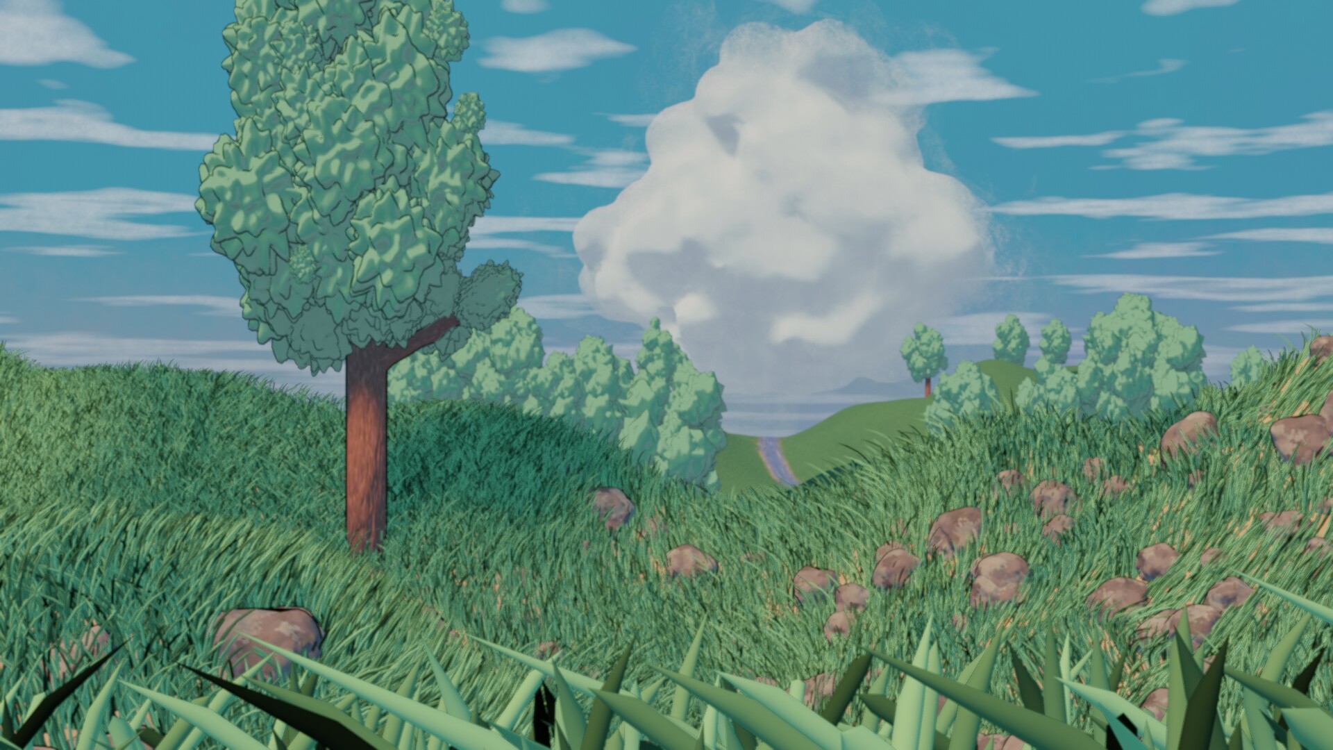

1 Like

This was really fun subject to do. I already forgot this type of shading (shader). It’s nice to get acquainted again!

Our congratulations go to @Cathy_N for a really nice cartoon. A cell shading illustration of Vincent. Much attention to the details. Great theatrical pose reproduction.


  • FedPete - While it was a quick setup of another project I’m working on. I feel like I could have added another coat or two of gray. And also black ‘outlines’ to put the whole thing on a higher level.
  • zeRgenTa - It is a look-a-like of a painting made by Vincent van Gogh. Maybe the colors could be brighter, and more vibrant.
  • Michael_Legrande - Love the simplicity and color usage. Your post was early in the week, you could have spent more time on adding details, like more butterflies, flowers, etc. Creating a setting. Still a very good use of the toon shader.
  • Typger2 - “Skull island”? The gorilla and Vulcan are excellent models. I do think the choice of the color pallet is a bit harsh and very distinctive. They don’t blend in. But that said, it’s the way to go in a comic book. It has its charm.
  • consummatutest - Really great animation. Although the water ripples are too fast. The scenery is great, and the way you’ve animated it. shows the real power of toon shading. I can’t really say, what’s wrong.
  • Gordon - Great storytelling. Good implementation of the shader. I miss a bit more environment, not just a grey background. Maybe sitting on a rock, near a wall …
  • Willrun - So much work! I think the toon shader works best on curved surfaces. Then you see different shades of the toon shader better.
  • sezpul - I write this down, just before the curfew … I like the composition, the front of the body could use more light. Just enough to see more variations of the darkness. Now black is very present.
  • Joey_Cuevas - Ton’s of details, but due to the shading technique it gets even noisier. Textures and toon shading are fighting for attention. The idea of the toon shader is that the shape of things will give it a feel of texturing. At this moment too much is going on.

Note: I don’t want to offend anyone for any reason. I try to write down positive ideas and visions that I have in my simple use of the English language. I am also sometimes more inspired by a particular subject or solution. I’m also learning from you!

6 Likes

Privacy & Terms