Eevee, Five-o-pus - Space Tourism

I am currently studying Procedural Shading using some tutorials from the Blender.org website. And I want to understand Eevee better. So a small project is a way to get some insights. As a subject, I choose the “Space Tourism” weekly Blender collab. Try it out also. Participating is easy, just add a reply with your render to that channel.

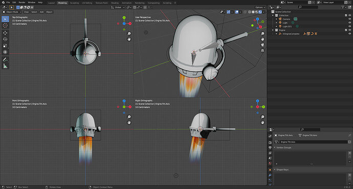
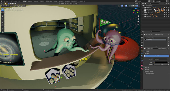
3D work view

A cell shader with an outline in place.

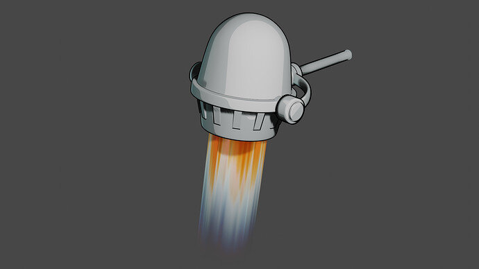
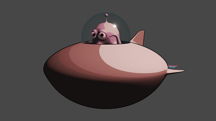
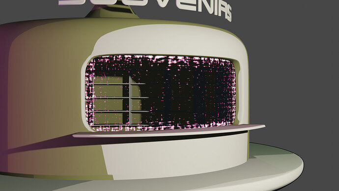
A test render

6 Likes

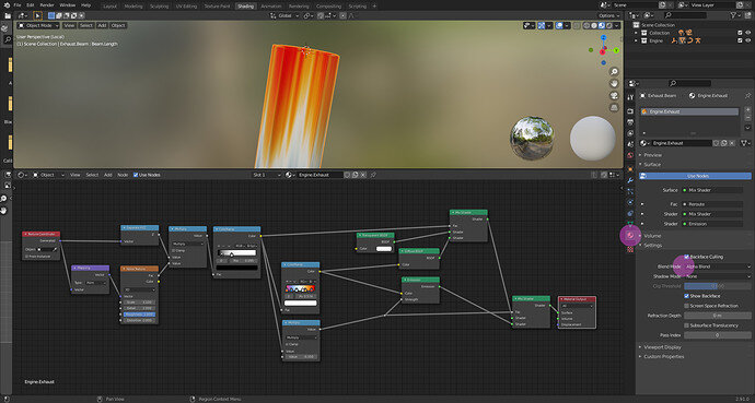
Oh, it looks nice! How did you do the rocket exhaust?

It is a noise texture, stretched over the object z-axis.
This is used to drive a black & white colorramp. Which is used to get a color based of the z-axis. And drives a mixed shader to make it transparent. Don’t forget in Eevee to switch on the alpha transparency.

3 Likes

It was a long time ago when I had a strange irritating Blender problem (bug).
Most of the problems I have are with the “very handy” Blender hotkeys …
And the ‘no feedback’ on what you accidentally just did.

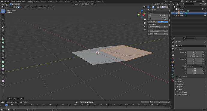
I had a simple plane object with 4 vertices. But I couldn’t extrude it on the z-axis. Even the solidifier modifier didn’t work as expected. So strange, it kept me puzzling. What did I do? Which hot-keys did I pressed accidentally … Which option did I switched on or off.

Extrusion process ends in this flat 3d model …

But I managed to find the culprit. I had set by accident, the object Z-axis scale to 0. Resulting in all actions, that the third dimension (Z-axis) stayed 0. :cold_sweat:

1 Like

7 Likes

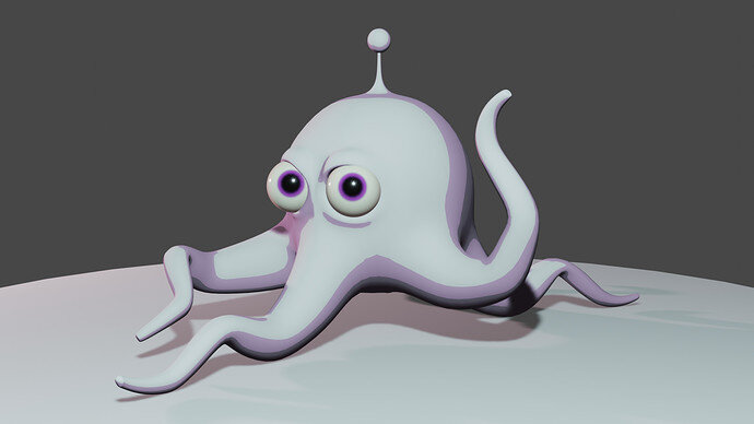
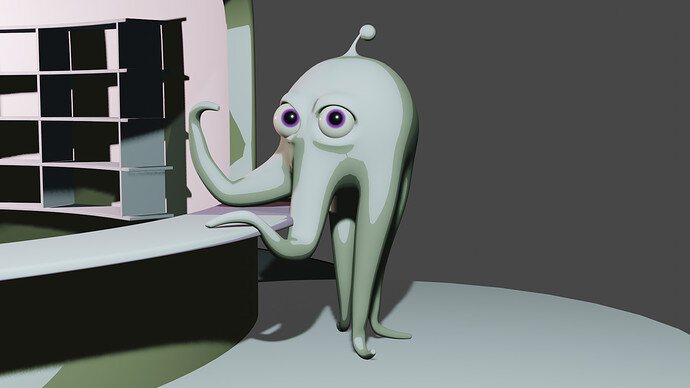
New family member “Five-o-pus”.

9 Likes

6 Likes

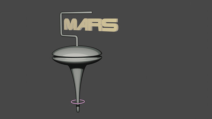
Outlining of the “Mars” text is a problem due to it’s generated mesh complexity.
I could do it manually, but I want to have freedom in text.

4 Likes

Absolutely loving this series of experiments!
Got nothing to add other than I’ll be waiting for future updates. :smiley:

1 Like

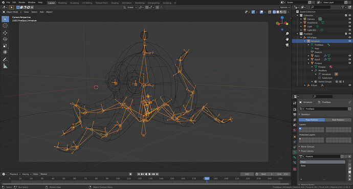
I had a lot of problems rigging this simple object. Working with the local, world and pose coordinates isn’t easy. And I have less experience with this. Every time I corrected things, something else went wrong.
The pose bones have some rotation restrictions, so that part of the model rotates in a logical way. Or have limitations. Engine not rotating into the frame, etc.
It works now, but more a process of trial and error, then good understanding …
Then I thought, I create a quick animation, to test stuff. That process worked but shows some texturing problems of the engine exhaust. World coordinated vs, local texture.
Fun thing was, it is blazingly fast. I did the whole sequence in the same time for one Cycles frame render :wink: in the past. So I am making progress in this.
5 Likes

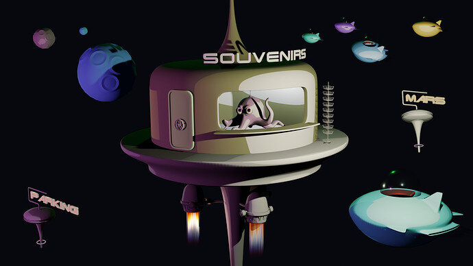
Composition try-out. Testing models and their usage.
Problem is that I have no real goal, except an idea. And many other things to consider.

  • The cell-shader outline does not work with a dark background.
  • Cell shading in combination with light shading doesn’t simplify things.
  • Too many items asking for attention.
  • Small items are noisy (stand next to window)
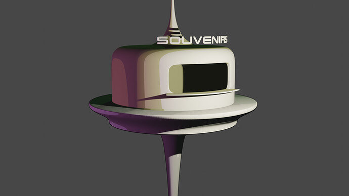
  • How to emphasize ‘Souvenirs’.
  • Apply color schema, no random (UFO, asteroid) coloring.
  • lighting
  • Rule of thirds.

8 Likes

Good concept but a lot to do. How do the tourists in flying saucers get their tentacles on the souvenirs? They need to park/dock, get out to the ‘shop’ etc.

Perhaps a wider platform, that the rack is standing on now, enclosed mostly glass. With a few holes in it for the bubble canopies of the flying saucers to dock, under, open their bubble and get out onto the platform? Buy postcard from Quintopus and return to saucer. Background just star/planetscape.

1 Like

Many things to consider about, so I am struggling … details - not too many details.
Five-o-pus, five arms, so everything need to be five … if possible.

Experimenting with what I have and what I can do with it. Giving the Five-O-pus more attention in the composition. I think he/she/it has more ‘attention’ value.

6 Likes

I have so many ideas. And I have many ideas dropped. galaxy map instead of a door. More shop close-up instead of a ‘galaxy’ feel. It is not an optimal design pattern :wink: Now I am struggling with the shop interaction.

Other ideas I have:

  • Galaxy map more 3D (it is now a flat bitmap).
  • Shop window force field …?
  • Shop lights
  • ‘Air’- tanks or water in the helmet (it’s family of an octopus …)
  • Galaxy background
  • Shopping goods
  • Increasing details at certain points.
  • More textures
  • Different color schemas.
  • Squid kid

9 Likes

Nightmare when ideas run away with the concept for a quick colab entry. :rofl:

Just to increase the stress, the galaxy map should be holographic! 3d.

Logic is getting stressed too, helmets, yes water for aquatic origin creatures, but not spacesuits in a vacuum? Wouldn’t their heads, and water be sucked out instantly

1 Like

Yeah, I know. Each could be a weekly collab on its own. :cold_sweat: :rofl:

1 Like

Force field test run, material shader concept.
It’s too much. Maybe work on later.

4 Likes

Concept modeling, Earth hologram.

7 Likes

Really great work! Can’t wait to get on the same level as you guys. Really good concept for the “five-o-pus”. Would make a great pet in a game or movie! :slight_smile:

1 Like

Privacy & Terms