Thank you so much! I might as well break down the entire scene!
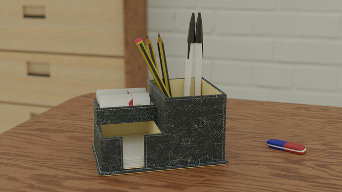
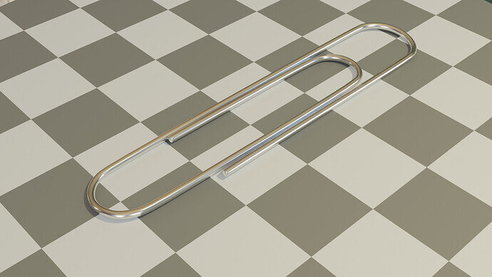
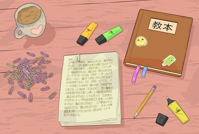
The only object that has a normal map plugged in is the table (the wood pattern is made procedurally with a couple of noise textures). As for the mug, I added the tea part to a vertex group and applied the Displace modifier with a cloud texture to it. The heart is basically an image texture mixed with the toon shader, and the dark outline around it is a grease pencil object. Paperclips are set to pick a random colour within the range of 4 shades, their position is a result of a drop simulation. I made a particle system around a sphere with paperclips as the rendered object, gave them random rotation and then played a drop simulation.
Overall, each object has an outline made with the inverted hull method ( all meshes are duplicated, scaled up and their normals are flipped inside out), and I also added a few thin squiggly lines on the surface with a grease pencil to make the scene look like it was drawn by hand. It’s a very fast and different workflow as geometry doesn’t matter as much, and it’s all about setting up the light correctly and adjusting the colours.
I got the impression that toon shader makes everything look good no matter how simple or complex your geometry is, so I feel like it’s more about choosing the style and colour scheme of your composition rather than being very precise and technical with your setup. I will definitely play with it more, it was quite refreshing and fun 
I couldn’t think of anything interesting to make, so I decided to try a texturing technique I haven’t tried before.
This is my participation.
There are some little things I would like to change but I don’t know if I will have the time. In any case, let me know what you think.
Did I make it on time?
Long time didn’t participate and finally managed to squeeze some time for Collab  .
.
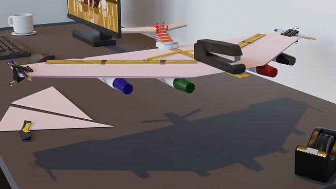
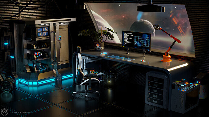
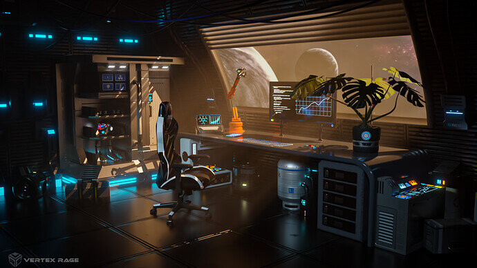
Instead of just office supplies… I made an office… and office on a space station.
Some more info
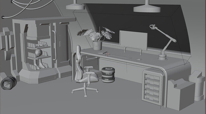
Here is viewport:
I did re-use some of my old models, esp. the one I describe doing here: Making hard surface models for games and Fusion Core Mk II - hard surface doodle .
The plant I found on blenderswap (CC0) by Simon_M and modified it to fit on the space station.
The chair is CC-BY from sketchfab. “Gaming chair” (https://skfb.ly/6VDIv) by snjvsngh_negi is licensed under Creative Commons Attribution (http://creativecommons.org/licenses/by/4.0/).
Edit: replace the file with fixed one (uploaded not final version previously  )
)
Edit2: Made artstation page for this one: https://www.artstation.com/artwork/B3rl66
We @BlenderCollab have a few days to vote. You can vote fast but also think slowly about design, colors, technique, difficulty, subject, realism, etc. Choose consciously and not on your own entry.
And the last subject for this year December 2022 “Best wishes” has already started. The winner of this week’s “Office supplies” challenge may select a subject for week 1 2023 and wins a badge.
I think many participants have outdone themselves. Making a choice is difficult, the diversity is great in style, technique, and realism.
Extraordinary work!
I couldn’t agree more. I can’t remember having such a great collection of entries to vote for in one single Collab. 
Damn that’s cool… maybe you should consider a career desgning office supplies 


I sincerely hope that future offices on space stations will all have that certain futuristic and calm flair 


Hi Will,
I really like your work, but one thing hits my eye and irritates me a lot.
Please do not understand my message as criticising your work, but maybe you find something to think about and develop your art further in it, at least that’s my motivation on writing this to you.
Well, with this said:
What irritates me is the compostion.
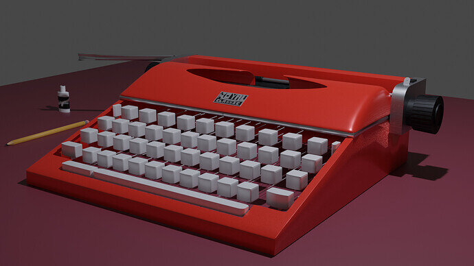
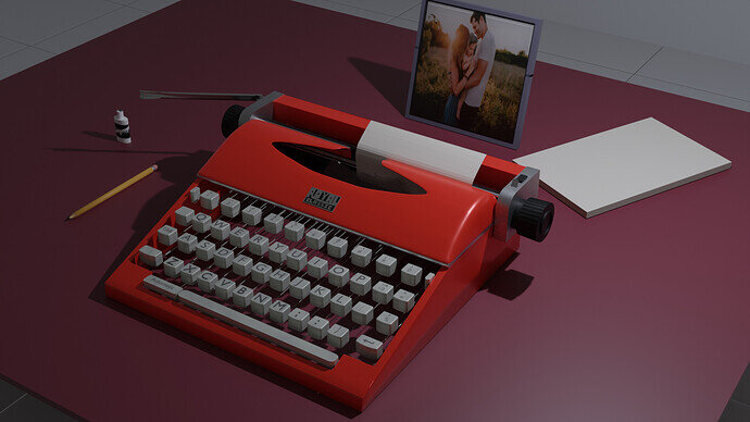
The table, picture, machine itself, pencil and bottle of (don’t know the english term for this correction white, so I’ll keep refering to “the bottle”) look very organised and even the ground fits into this.
The only thing which is out of this system is appearently the paper on the table.
Instead of turning the paper to make it fit into the geometrical system I’d turn the bottle of white a few grades around Z axis to break the system even further. Keeping a clear, organised system at work places is hard enough already, keeping it up with geometrical accuracy seems almost impossible and also kind of sterile, as if no person ever touches the workplace and the devices.
Even a tiny turn of the bottle and maybe the pencil around the Z axis could help to let the scene feel more alive, closer and easier to identify with for the person who’s looking at it.
The other thing about composition which hits my eye even harder is the sheet of paper which sticks in the typewriter; there’s nothing wrong with it, but the upper edge of it is almost perfectly parallel and congruent with the edge of the typewriter. If it overlapped the edge of the typewriter, may it be by just a tiny little bit or a bit more, it possibly made the entire scene look more realistic.
Tidy arrangements are products of peoples efforts to organize, but organized systems fall back into more and more chaotic states over time and start to do so the very moment they are established, just think of dust 
Ok, sorry for texting so much upon this topic, I really like your work and the items look great.
No offence meant towards it in any way.
Happy blending 
I don’t mind criticisms btw , but yeah I agree I actually wanted to have papers scattered with stuff typed on them, wanted an actual wooden textured table, a lamp and other stuff.
But don’t have much time nowadays, doing a full stack web developer course, trying to finish it before the new year, and also its that time of the year. Didn’t enter the last couple so felt like I needed to do something.
I see; yes, limited time can be a terrible thing for sure 
Good luck with the web developer course 
This is a tough one, I had to give it to @Cathy_N, the style is just too cute and something we often don’t see during a collab, even if the shadows don’t necessarily behave correctly (I’m looking at you, notebook  )
)
Thank you so much! I completely agree! Since that type of shading ignores gradient and uses flat colours to render light and shadow, the end result looks quite different on flat objects as opposed to objects with more volume. I had the same problem with the table which I fixed by adding more geometry (placed gaps in between the planks). I couldn’t come up with anything to fix the book though because books are flat and don’t really have any texture. Now that I think about it, I should’ve probably inflated the centre of the book ever so slightly to get a better looking shadow… Oh well, it’s too late now! 
Great changes I like the upper window blind with its shadows across the room.
Advanced artificial gravity they have! Something almost all sci-fi assumes will ever be possible.
Thank you! I did change a lot there:
- redid the lighting from scratch,
- reduced desk height, made the monitor bigger
- more cables!
- removed top lamps (couldn’t denoise it enough, even increasing max bonuces and sample count to high values didn’t help), replaced those with cables
- added window shades
- added more devices, boxes and overall more clutter
- changed the camera angle and focal lenght
- moved objects around
Yes! But I’ve assumed this is rotating habitat, something that’s actually possible to do 


