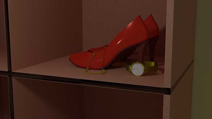
Great work! I love this kind of project. Simple models and the bulk of the work is done through textures and lighting. I think I like it without the vignette slightly better. The lighting is a little more dynamic that way. Is that an HDRI for the reflections? Looks nice.
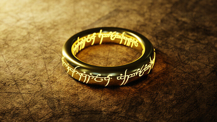
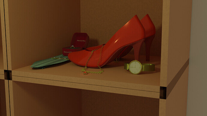
oh- i hope people can tell what ring my project is?

On Youtube there is a tutorial about this.
And how to make the text emit light rays.
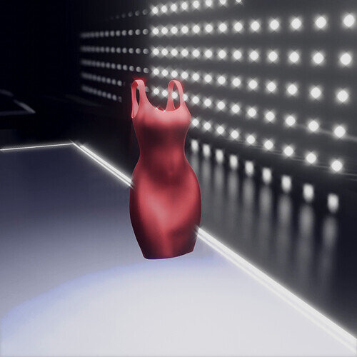
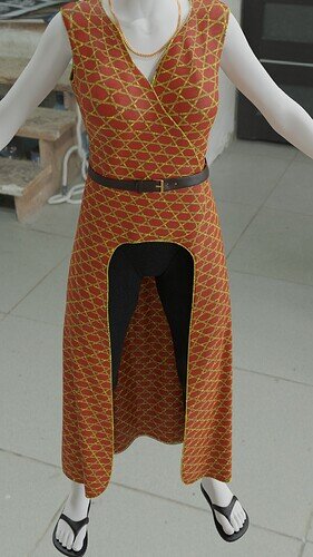
“Red silk dress”
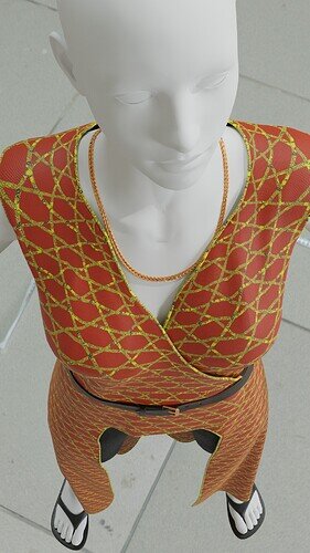
So I played with some cloth physics for this one. Modeled a quick body, rigged it, grabbed a quick walk animation from mixamo, modeled the dress, added some cloth simulation, and baked it. UV unwrapped, made a quick silk-like material to add to the dress, made a quick background and lighting setup. To finish it off I played around in the compositor to tweak the color balance, added some glare, and then threw the rendered clips into a short music video to show it off.
I hope video submissions are allowed.
Yes, but provide a nice screen shot which I can use in the vote!
Loving it!
Great project, could be more … 
Since I picked the prompt for this week, I won’t be competing.
If anyone ever wants to make any wrap-around clothes, you can connect the overlapping parts with a few edges to keep it together. Originally I was using pins, but found out that they could pull through the character when animated.
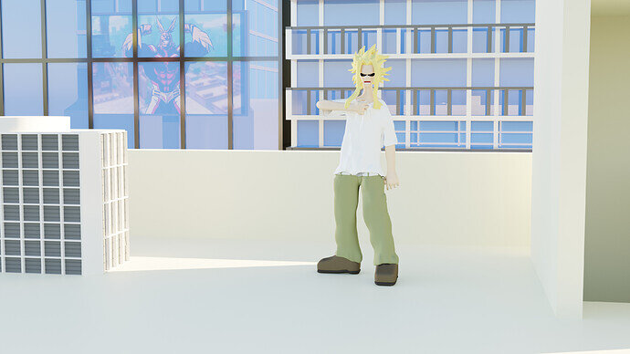
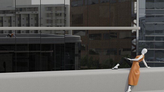
I was trying to put the compositional weight of the character near the center of the image without putting them there, but I’m not sure if it worked.
Credits:
“Women/Female Body Base Rigged” by camilooh is licensed under Creative Commons Attribution.
Some textures from www.sharetextures.com
HDRI from polyhaven
You should, nothing wrong with competing!
Very convenient clothing. Can do a lot of things without needing to take it off. 
I like it, because of the mirroring. Could use more warm light (sun kelvin).
“Very” is over selling it, just wearing a shirt would be far more convenient.
I’m not entirely comfortable competing, especially since I didn’t make the model wearing the clothes.
I’m grateful for the input. If I wanted to understand why you think it could use warmer lighting, should I read up on color theory or lighting.
It looks like unnatural light. in the old Blender version, we had a ‘Black-node’ for the color temperature of the sunlight. The image is is grey (also the sky). … it doesn’t match.
We @BlenderCollab have a few days to vote. You can vote fast but also think slowly about design, colors, technique, difficulty, subject, realism, etc. Choose consciously and not on your own entry.
And the new subject week 39 “Robots” has already started. The winner of this week’s “Aerostat” challenge may select a subject for next week 40.
-
Raiju - SEE VIDEO Red Silk Dress, with music
0 voters
@Cows , congratulations on your winning entry on the collab subject “Clothing, shoes, accessories and more”. Simple and very recognizable. The scene lighting is very playful by using dark and light sides. Exposing the ring engravings nicely. A good idea!
- Raiju - This was really a nice entry and a well-executed video sequence. Although the dance/walk moves could be more extensive, more variations.
- Willrun - Good composition, lots of variations on the subject. Well done. Try to improve the overall lighting.
- Joey_Cuevas - Great pose, could be more in the center of attention. Also, the billboard banner could be more prominent. Making the story more complete.


