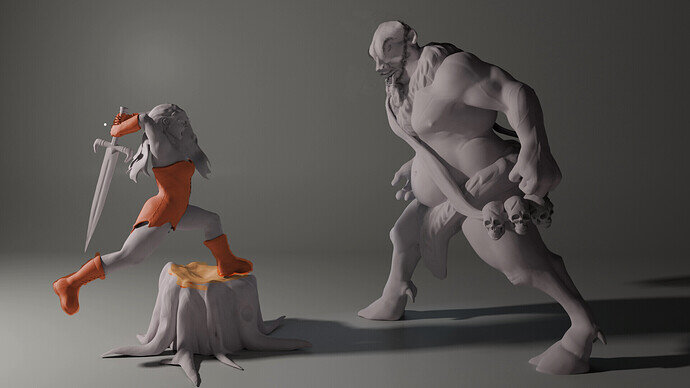
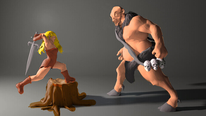
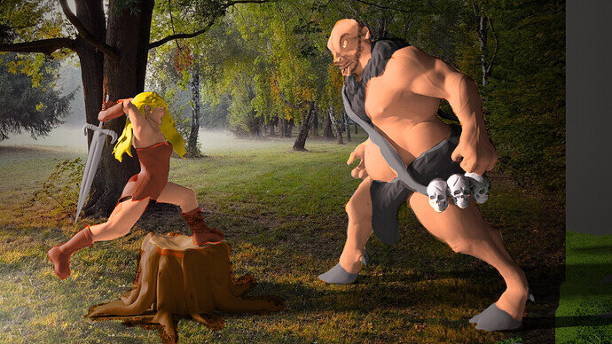
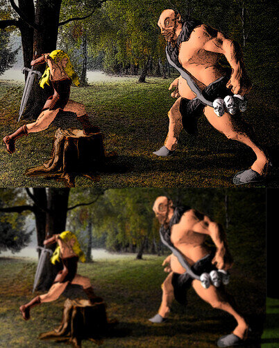
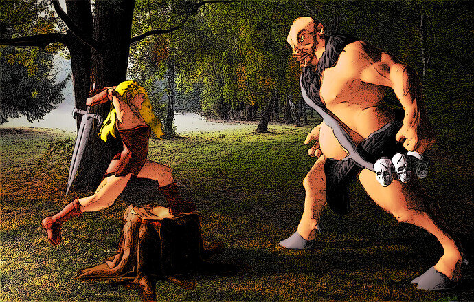
I think I must have run out of steam, and chose not to give it texture and color.
Naw don’t worry about it, I bet you already had a good idea of something to make when you picked the subject 
Idea, yes. Good? It all depends… 
Too late, I already have an idea. I will be on top of it once my real project is done 
Dang it @Zangk it looks so much better 

-
Do I see an edge detect filter for the lines?

-
It’s been sharpened, and of course colorized. I’m impressed with the head, I assume you redrew it in 2d but it I couldn’t have told it wasn’t the original design.
-
Was the background a photo originally?
This must have been at least a dozen layers deep and I’m guessing a solid hour of work. Your photoshop (or other program) skills are beyond mine sir. 
No, never used it. Some of it is just sloppy “paint” work.
Nope again, did not use the sharpen tool this time.
Nope again, did not redraw it 
Nope, about 8.
Actually, probably, give or take.
Methods:
-
Layering and Overlay: I simply used overlay on my layers and painted a solid colour. It is your render’s shadows and textures that is doing all the heavy lifting. Some of the lines are sloppy, but I was not going for perfection.
-
Inking: No edge detect, no sharpening, just simply applying a “artistic” filter- Ink sketch. Twiddle with the features a little. Then I duplicated it and blurred it. This layer I imposed on top as a Relflective layer (I think, but glow, overlay, and some others were pretty close contenders). I turned down the layer filter. This allowed for a nice glow and reflective look, as well as some dynamic colour changes and transitions- making it “pop” if you will.
-
Clone stamp: I did not redraw the head, I actually reused all the material that was already there. I cut the nose and mouth and placed it where I wanted it on another layer, and then used the other parts of the head, in conjunction with the head and mouth parts, as my colour palette. Turning the colour solidity way down (around 24ish in most cases, the highest transparency being about 255), I was able to clone what a wanted and have a decent enough transition between the pieces.
The Scraggly short hair on his head was a happy accident when trying to apply the back of the head shadow. It looked like hair, so I began cloning it everywhere.
I was going to be ambitions and add boots on the villain using the woman’s boots, but I saw that would have been too much out of scope (believe it or not, I actually stopped myself  )
)
Here is the modified head and some colour. His head is different here. I copy and pasted the shoulder chest hair to the other side where it never existed.
More colour quickly pasted on, with some slight touchups, not really caring if I make mistakes.
Background using the overlay features and doing some cloning to fill in the picture. If you look closely you will see that come of the picture bleeds into the character. Those are spot that I did not erase due to laziness. Likewise, colour bleeds into the picture.
I inked it and then Blurred it:
Giving it the dynamic finished look:
Did I plan this? No, it was on the fly.
@NP5
I was wrong on all accounts 
Forgot about the clone tool, and an ink filter makes sense.
Very nicely done sir 
Just goes to show how much can be done post-process.
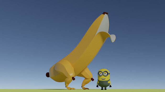
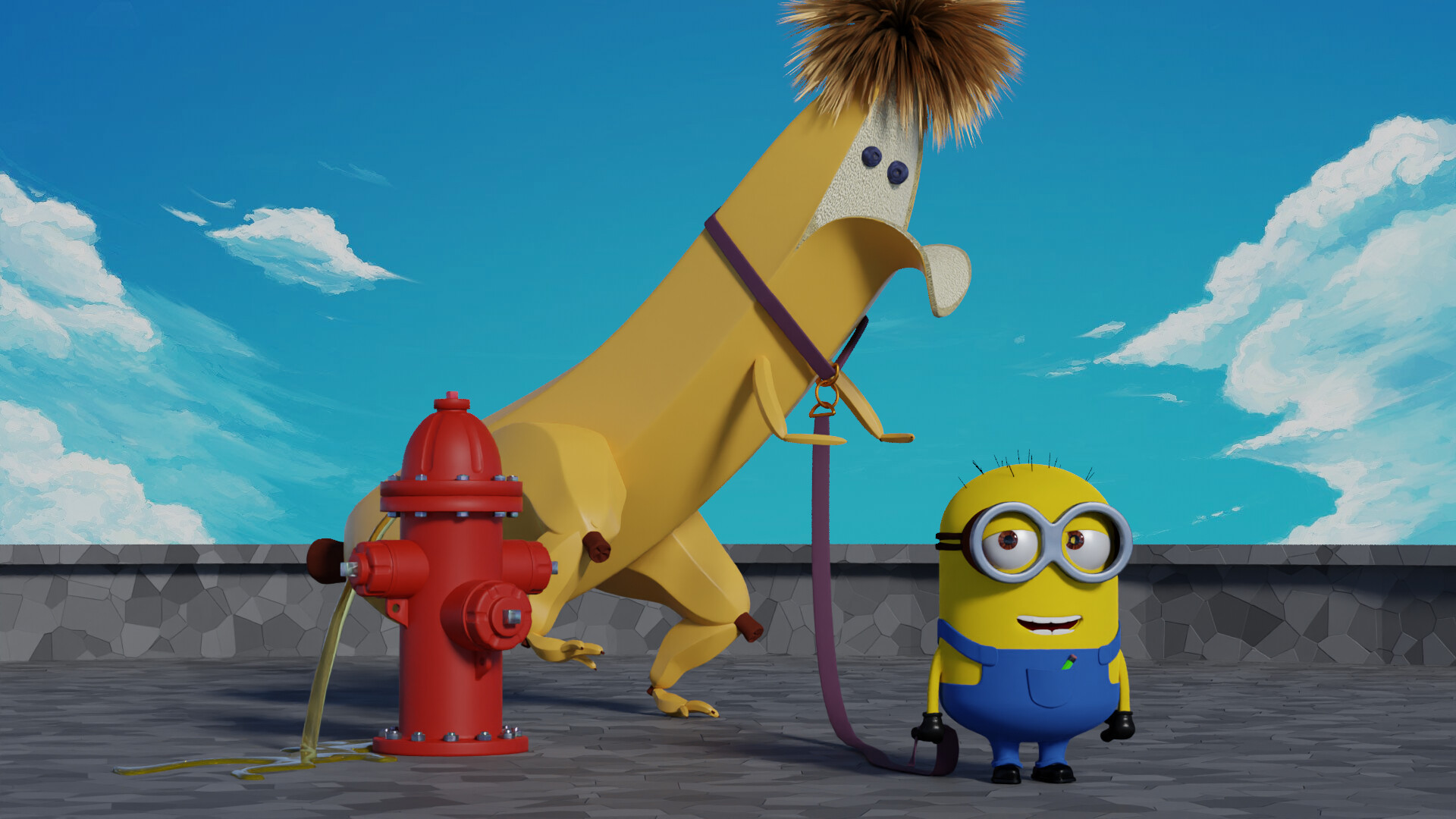
Haha I love it! My only gripe is that I don’t think those ankles would support his weight. But it’s a Banana-Saurus so I guess it’s probably not meant to be realistic  .
.
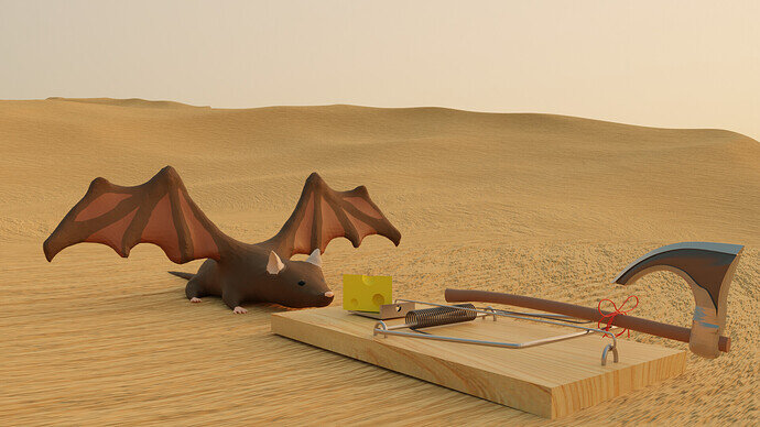
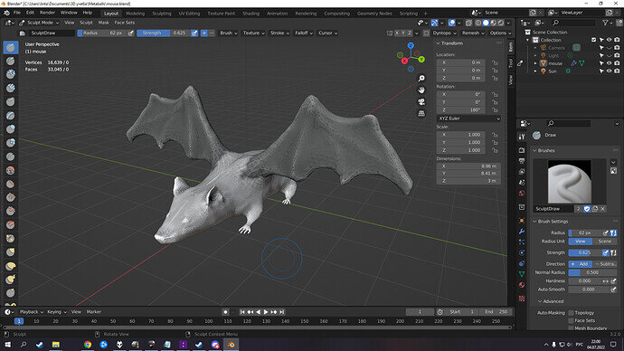
“Do cats eat bats? Do cats eat bats?” and sometimes, “Do bats eat cats?”
Just a little homage to Lewis Carroll’s “Alice”. Also, in my mothers tongue “bats” called “flying mice”
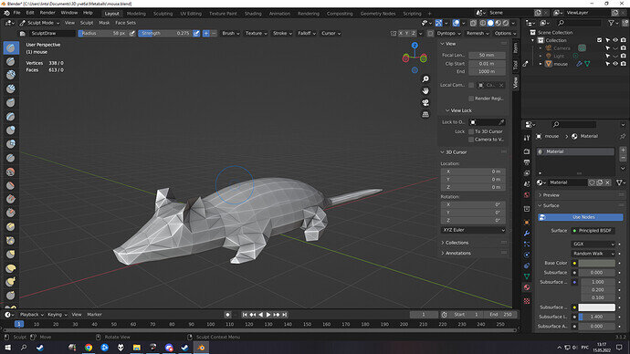
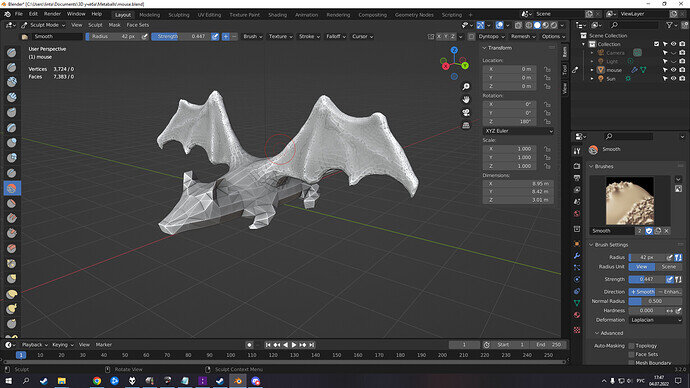
It’s my first sculpting project that came out of “Frankencaterpillar” lesson. Then I left Blender for 2 months and now I’m back in work.
First WIP (2 months ago)
Now with wings! GMO free!
Details-detail-details!
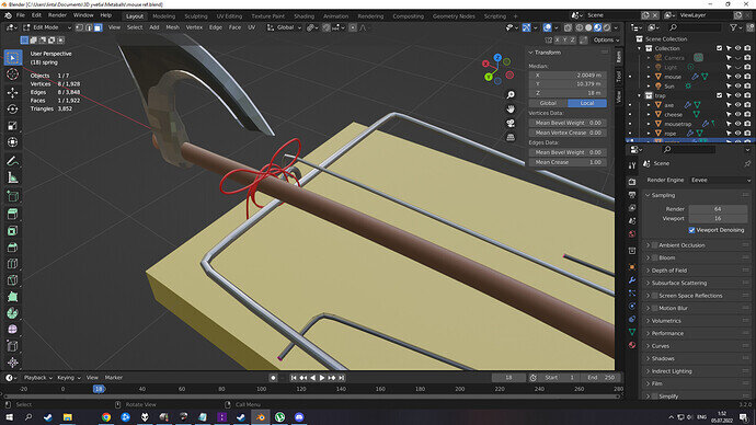
Mousetrap. I’m especially proud of this knot. I found the way to create it by myself.
I took desert out of my old project. Don’t have much time to create some enviroment, sorry.
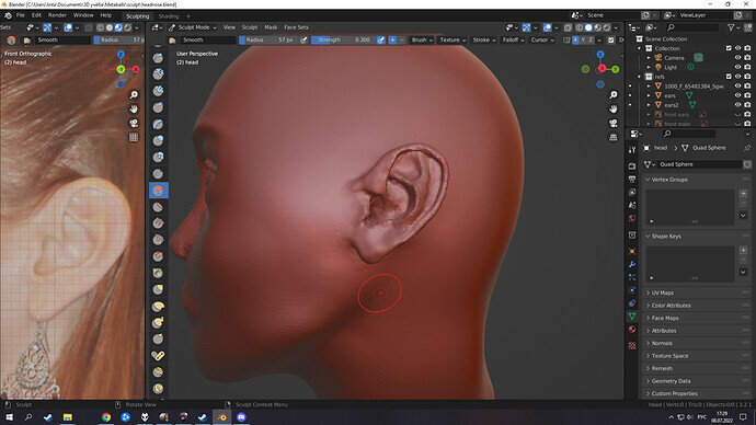
Now i’m selflessly working on head sculping lesson. It already took over 10 hours and I’m still far from perfection 
Some behind the scene on this project:
(yep, over 10 hours and i’m still polish the ears
 )
)
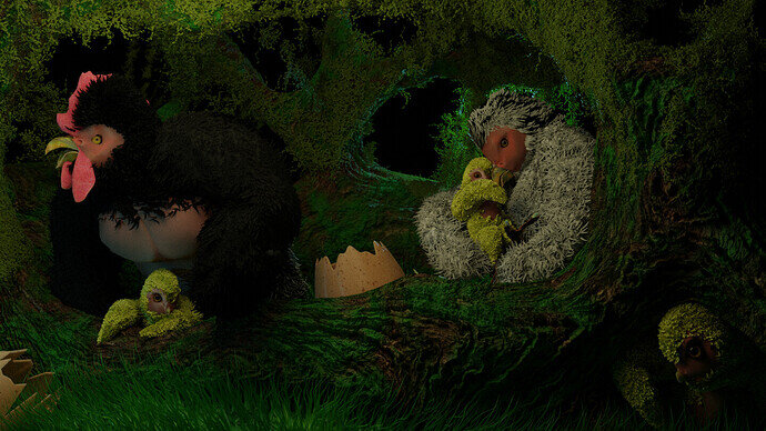
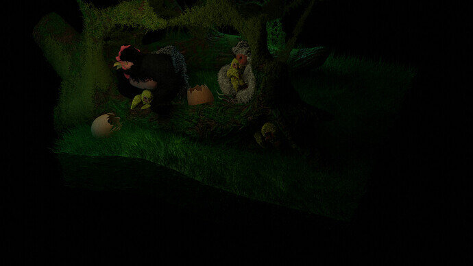
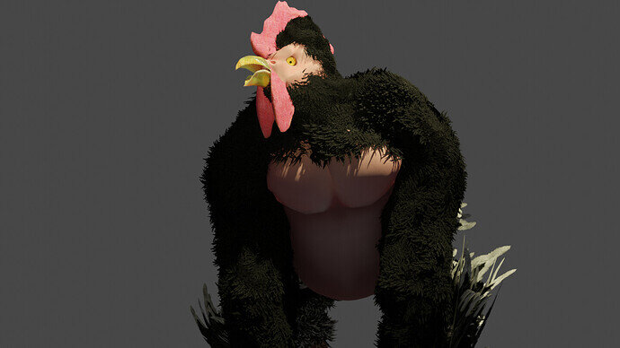
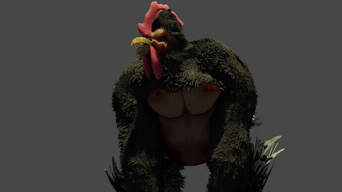
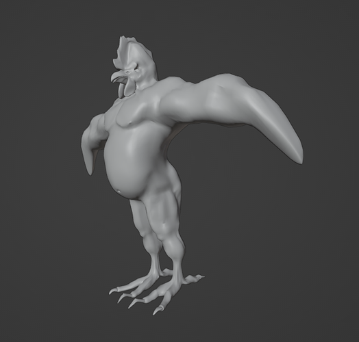
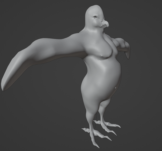
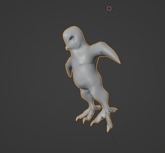
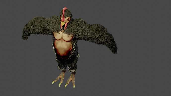
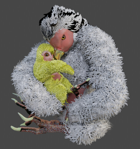
I finally have something in- it took a little bit to do. I was hoping to do something with a barn and a farmyard animal- No barn, but Chorillas are the result:
Here are some other shots and iterations, not included in the challenge. :

The feathers use the hair particle system. I found some feather paintings, cut them, edited them so that I had the individual feathers I wanted, then attached them as a hair particle object. It more or less works.
Fantastic! My favorites are pictures 4 and 5. The first one has a nice environment/background, but I like the framing of the individual images better. The mother and child image is powerful! I know it’s kind of silly (because it’s a Chorilla) but it conveys a deep emotion. I can feel something from it. Great job on the feathers, BTW.
@Zangk , be sure to let me know which one is the final, normally I will select the last entry!
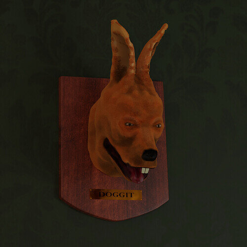
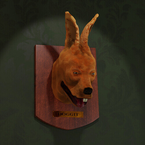
Doggit
This rabbit dog (or doggit, colloquially), an odd-looking beast even in life, was not done any favors by its taxidermist.
Edit:
Updated with better light
It will never fly! 
Great animal mix!
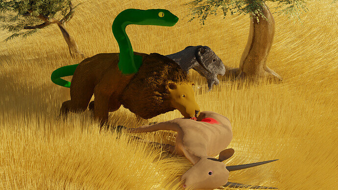
Interesting mix. Two carnivores snake and lion and a herbivore goat. Eating decisions must be interesting!
It was the first one, I was not clear enough.
But at @Tyger2 suggestion, I agree, Send in picture 4 as the entry one.
Nice Doggit, by the way, I actually mean to make my Chorillas dorky as well, but it accidently turned out kind of, well “Legit”. That was not on purpose- since I prefer the joke.
It has better lighting and has less going on, the other, is a little cluttered.
Here are my resources for the feathers and texture (crest for the Roarilla  )
)
![]()
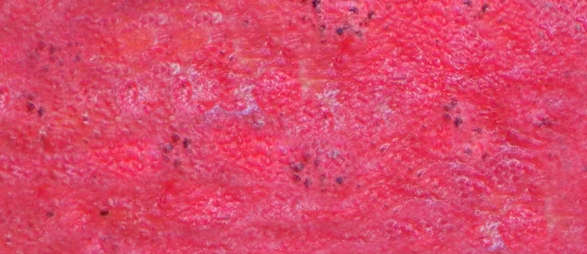

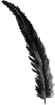

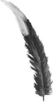

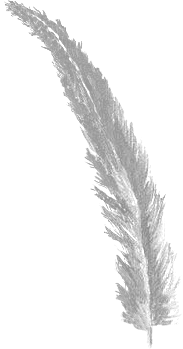
The Crest came from this Pic:
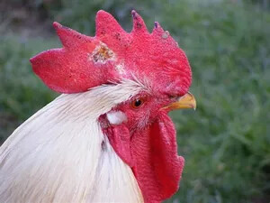
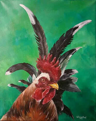
the beak something I picked up online, and the feathers were grabbed from this painting:
Can you locate the three feathers I used?
New and improved!, with Banana arms and blueberry eyes- but it seems to be leaking orange juice.
I like the texturing.


