2022 Collab: Week 22 “Fairy tale” - VOTING CLOSED

This is the Blender collaboration 2022, week 22 challenge. Don’t be afraid to join, a lot of us are beginners. This is all to practice, have fun, learn, and get together.

This week’s subject is “Fairy tale”.

  • A fairy tale, fairytale, wonder tale, magic tale, fairy story or Märchen is an instance of a European folklore genre that takes the form of a short story. Such stories typically feature mythical entities such as dwarfs, dragons, elves, fairies, giants, gnomes, goblins, griffins, mermaids, talking animals, trolls, and unicorns, or witches, and usually magic or enchantments.
  • Subject selected by the previous week 20 “Spaceships" winner: Lintari

The rules are simple. 1 subject, 1 entry, 1 week.
You create whatever object or scene or whatever you can think of that has something to do with the subject. It can be as simple or complicated as you want, all entries are welcome!
Post your picture here in this thread. And at the end of the week, we start to vote. And if you are the winner, you may choose the next subject and win a unique badge.

Deadline: 2022-06-04T21:55:00Z

If you want to stay informed of the @ BlenderCollab ?
Subscribe or unsubscribe to this “BlenderCollab” group.

3 Likes

Eye of newt and tongue of dog,
Witch’s brew, my progress log.

7 Likes

7 Likes

4 Likes

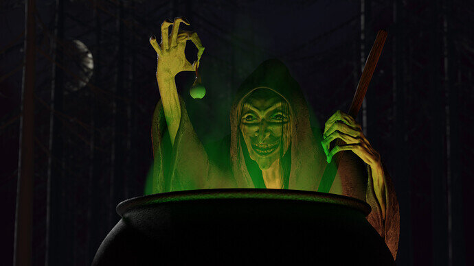
Witch’s Brew

Round about the cauldron go:
In the poisoned entrails throw.
For charm of powerful trouble,
Like a hell-broth boil and bubble.

Project Details
  • Rendered in Eevee
  • Reused assets: night sky and moon
  • Robe texture from Textures.com
  • Other textures procedural
  • Trees made with Sapling
7 Likes

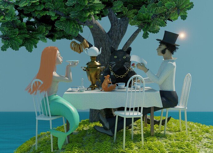
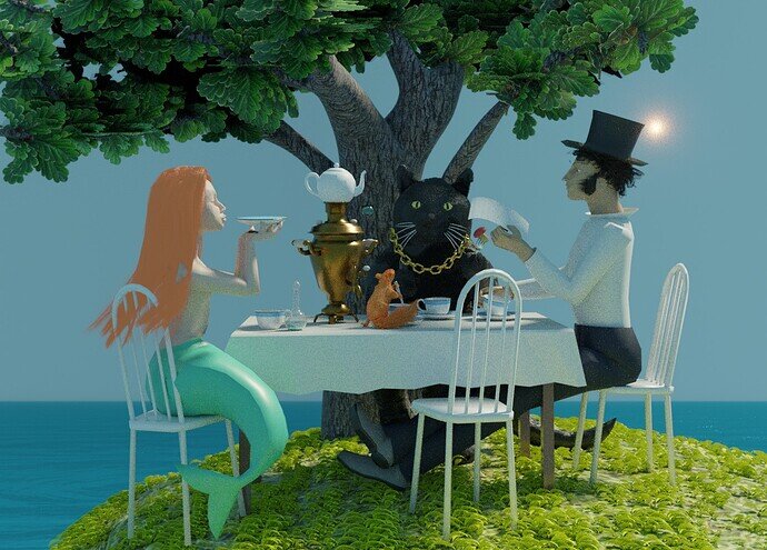
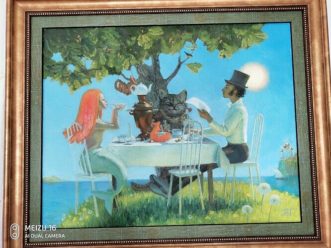
Fairy Tale tea party - “The sun of russian poetry” Alexander Pushkin and some of his heroes.

10 Likes

We @BlenderCollab have a few days to vote. You can vote fast but also think slowly about design, colors, technique, difficulty, subject, realism, etc. Choose consciously and not on your own entry.
And the new subject week 23 “Album cover” has already started. The winner of this week’s “Fairy tail” challenge may select a subject for week 24.


4 Likes

@Blest , Congratulations on your friendly fairytale tea party with friends. The details are beautifully crafted. Great facial expressions. And as a overall style, very recognizable as made by Blest! Well done!


  • Tyger2 - Well-made witch working on a new stew. In my opinion, the scene environment could be better highlighted. I miss details. Like the stew, the dark front side should be covered with red light (flames). Cooking the stew.
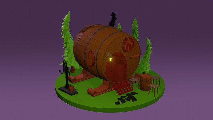
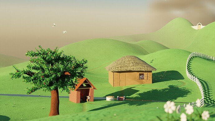
  • ice77 - It is a nice cozy fairy tale home. Fun details. Try to work on the lights. Experiment with a sun lamp, changing the sun angle for softer shadows. Use world environmental lighting for global lighting. add some texture variation. This scene has potential!
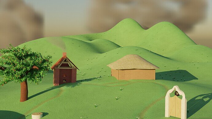
  • zeRgenTa - Very nice and bright (sunny) scene. Love the grass texture (material). The object could be placed more together. Improving the composition. I miss the connection between these objects. The grass paths are really a good way to do this. But walking through the portal, or next to it?

Make fun!

4 Likes

Thanks for the feedback! I agree. Flames would have been good. Could have shown some on the pot or even bouncing off the trees in the background. I would have liked to show a bubbling stew in there as well, but I needed a low camera angle to make her look more menacing. Maybe if I could’ve reflected some off the eyeball … :thinking:

@Blest awesome work yet again! I wonder if you would have the time and inclination to give us some insight into your process for making low poly characters. You’re quite good at them.

3 Likes

It’s going next to it; in the Story, it doesn’t seem that the old woman who lives here ever uses it herself, so I didn’t think it should have a worn path. I probably should have added a less worn path that went to it.
Thanks for pointing out a blind spot I have, I’m going to have to make sure to watch out for it in the future.

I was using space as a way to show the time that took place between them in the story. A better way might be to have a basket of apples under the tree, fresh baked bread on a little table by the oven, and have the door open (or add a window) with some dust coming out. Then I’d have past, present, and future represented, instead of it being so temporally flat.

I’ve appreciated your suggestions on all of my submissions, I would have replied to some of them if I hadn’t misunderstood the “CLOSED” you add at the end of the title. I thought that it meant that no more replies could be posted.

2 Likes

ah, yes. It could be seen like the thread was closed. But its goal is to show that the VOTING was closed.

My suggestions, after the vote, is only my personal opinion. Based partly on the number of votes it gets. Most of the times, entries aren’t bad. But they didn’t win, because of … what ever and I try to express that. And some of use have more experience and or know what to add to a scene to make it more interesting. After doing a couple of collabs, you’ll see, know why people are voting on specific entries. So you could try to copy that.

Have fun. Keep practicing, it’s hard work to improve yourself. :wink:

3 Likes

Thank you! Voted for your witch, I love the magic atmosphere and light.
As for my characters… I am more a 2D artist, than a 3D one… My characters look well just from our side, they are not good 3D creations, they are cripples. And they are mostly my previously made objects. I just changed their poses for the scene. (They were not made properly, I did not use Ctrl+A combination in right time.)
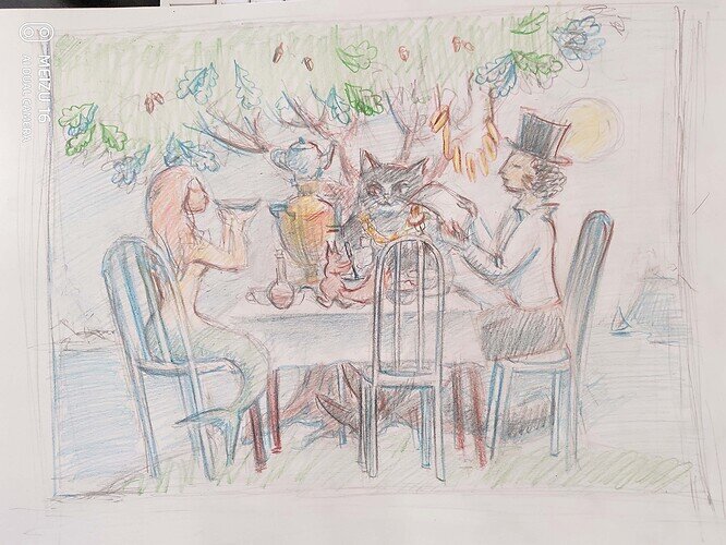
I am not used to making “armature”, and I change poses by hand to make them more alive and looking like my sketch. (From the Camera view.) I often detach arms and legs, and hands, change them individually and attach. The only object made for the scene from zero is a Samovar. I think, that the most important is a good sketch.
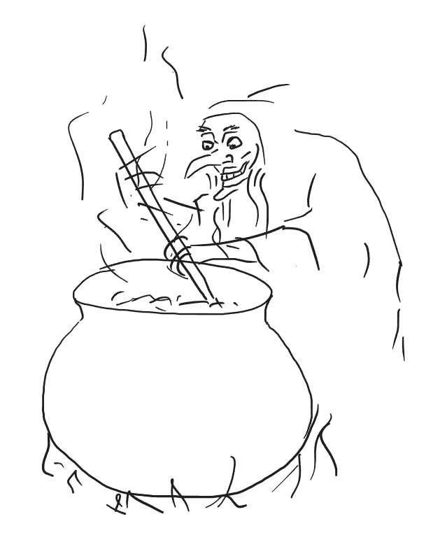
Here is the one I used:

3 Likes

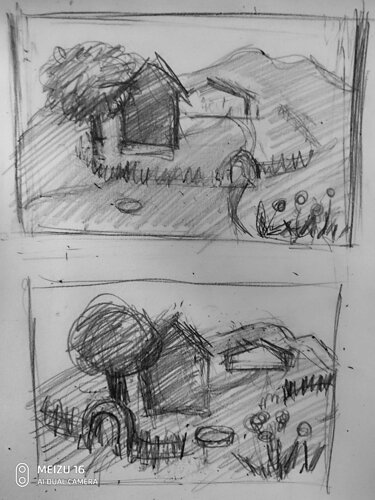
You created many beautiful objects. But they were somehow lost in your scene. I just suffer seeing the way you struggle with the composition.
I love the ground and its place in the picture (except that paths run parallel at the bottom of it). All other objects I would change by their place and size. It always doesn’t look well, when objects have equal sizes and when some lengths are equal. (Except when everything is symmetrical in the picture.)
Two houses and the gate are of the same size. I would make the dark house bigger or put it closer to the viewer to make it look bigger (because it has more details and can become a compositional center.) I would bring the tree closer to the house and make it bigger too. And cross with its foliage the edge of the ground. May be the smaller gate would be better, and I’d add a fence. And don’t put objects too close to the edge of the picture. You could also make few flowers bigger in the front.
There can be a lot of varieties…

5 Likes

I’m grateful for your summarization of compositional rules, with concrete examples.

I’ve been neglecting composition, If I’m being honest.
It’s a little abstract to know where to start. I started reading a book about it, that I really should get back to, but I wasn’t getting much out of it at the time.

I’ll try to fix the composition on it in a week or so, when your suggestions are not as fresh in my mind. Because I don’t want to do exactly what you said and learn nothing.

Here are the bullet points I made after reading your post.

  • avoid symmetry / create contrast
  • Have a center of composition
  • emphasize prospective
  • avoid putting points of interest near the edge of the frame

I’m going to look at them before I try to fix the composition.
Thanks again for taking the time to try to help me.

4 Likes

I’m not sure the composition is good, but I think it’s better.

5 Likes

Painted in oil.

5 Likes

So much fun!

Thanks! Yes, I enjoyed making it. Now it’s on the exhibition in Ostrogozhsk.

3 Likes

Privacy & Terms