Modular dungeon final project - WIP/Diary

Very small actual progress. But I did finally cofigure git server and moved my projects there. Also I’ve realized that trims on some floors are different between sets… and for smooth transition between them I should keep them standardized. So I fixed it. Plus I added some half sized floor modules (for those narrow corridors) and 1/4 sized (for platforms or small corners). Though for platforms I still need to add bottom parts to them. How they look in blender:

And that’s how they look after importing them to unreal:

4 Likes

it was funny when i first did the dragon I was like “ugh references” and stopped doing it then realized they are as important as having skillz. I have about a hundred on pureref for my ogre and used even more from searches I didn’t put there!

1 Like

Yeah… our minds are so imperfect at remembering the true form of things… It gets better with practice, but still one would need to have really great photographical memory to remember all the things. Pureref ftw! :slight_smile:

1 Like

Today… was a lighting day… Didn’t really plan to spent that much time on it… It took maybe 8-9h to get it to the stage I like it in unreal. The good side of it is that I will be working soon with lighting that will be approximating the final one.

UE5 changed some things about lighting… so none of the tutorials, even Epic’s livestreams, are correct. Documentation wasn’t fully updated yet as well… Plus this is “night” scene, so it’s inherently harder to do. I had to learn a bit of Niagara (new UE particle system) and wrote my first particle system for increasing density of volumetric fog in places that I want to have light shafts. But to do this I had to refresh my shader knowledge and wrote my first volumetric material in UE5 for that particle system:

Again, I have additional examples that one need to be very, very precise with modular pieces. For example, to avoid overlapping faces Grant in one of the lectures simply moved top part of the wall down. And I forgot to adjust it. So now, I tried stacking walls on top… and light was bleeding through this 1-2 pixel gap. So I had to fix all the walls and pillars.

I feel that the end result was worth it:

Question: What do you think about this lighting setup? What can be improved?


Last, but not least - I started doing ceilings modules:

And in Unreal:

I am making ceilings one sided, but as I want to have multiple stories - floors fit perfectly on top of them. For convenience I’ll make some two sided meshes merged from them (as seen in the screenshot from unreal).

4 Likes

Very quick update, but information might be important for people wanting to move assets to game engine.

  1. Walls from the course are a mess. Overlapping geometry, not very precise placement of top/bottom/left/right ‘edges’.
  2. Walls shouldn’t need a column to tile nicely. It’s not hard to do, just requires some planning.
  3. The removal of a few faces from the walls in the course is unnecessary. It doesn’t save triangles in any significant way, but makes working with them further along more difficult and limits walls usefulness as a modular piece.

Example of correctly build wall:

Breakdown hidden below

3 variants for better variety. They tile from both sides, even when rotated 180. Can be stacked on top without any light bleeding issues, etc.

tl;dr: I’m redoing all the walls. Almost done, just couple of variants remins…

1 Like

Update time! First thing first, I fixed all the walls.

And than I diverged from my plan to work on 2022 Collab: Week 18 “Low poly art style game props" - VOTING ! !!

Here are the details of some of the new props

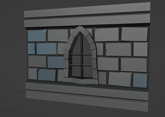
I’ve added a window:

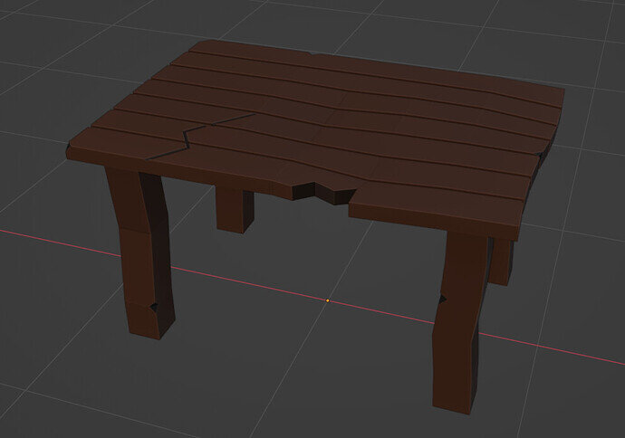
A table:

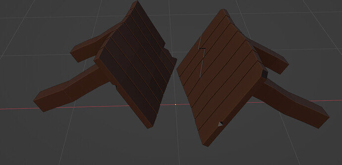
And I broke it :sweat_smile:

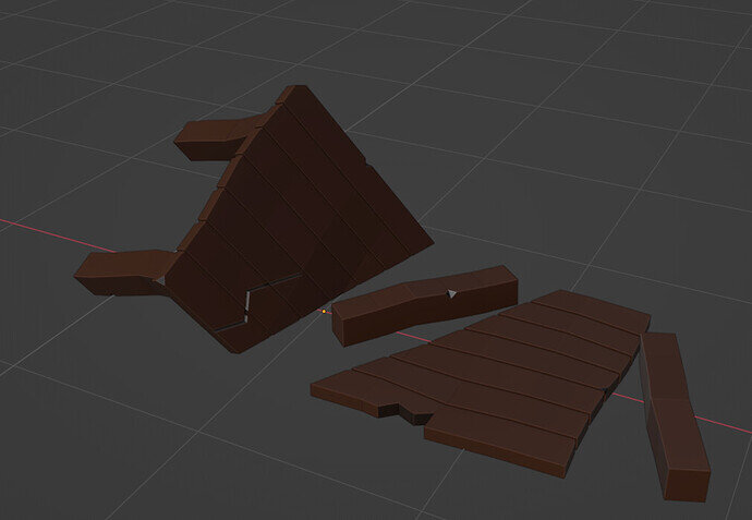
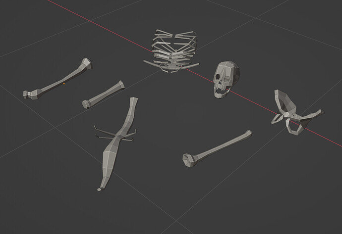
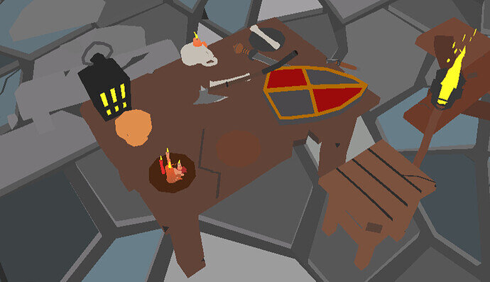
Next, I’ve broken my skeleton to some parts:

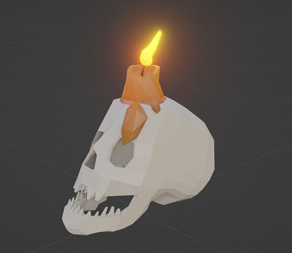
And made a candle out of it!

I took it to unreal to create the room

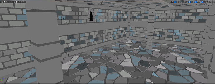
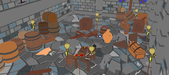
Showing in unlit mode, the room is very simple:

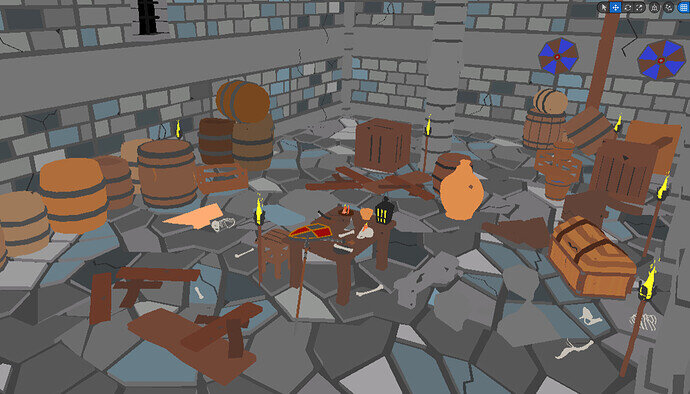
I added props to the room:

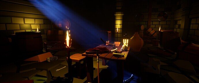
And last, but not least - lighting and composition. The emissive materials finally in unreal can emit light, but it wasn’t enough to illuminate the scene. So not only sun (or rather moon) was required, but also additional lights everywhere:

I was running out of time so I had not enough time to really work on composition. So I basically took a few shots and asked :leaf: #blender channel for help. I got some help and feedback there, esp. I sent my thanks to unimportant (user name).

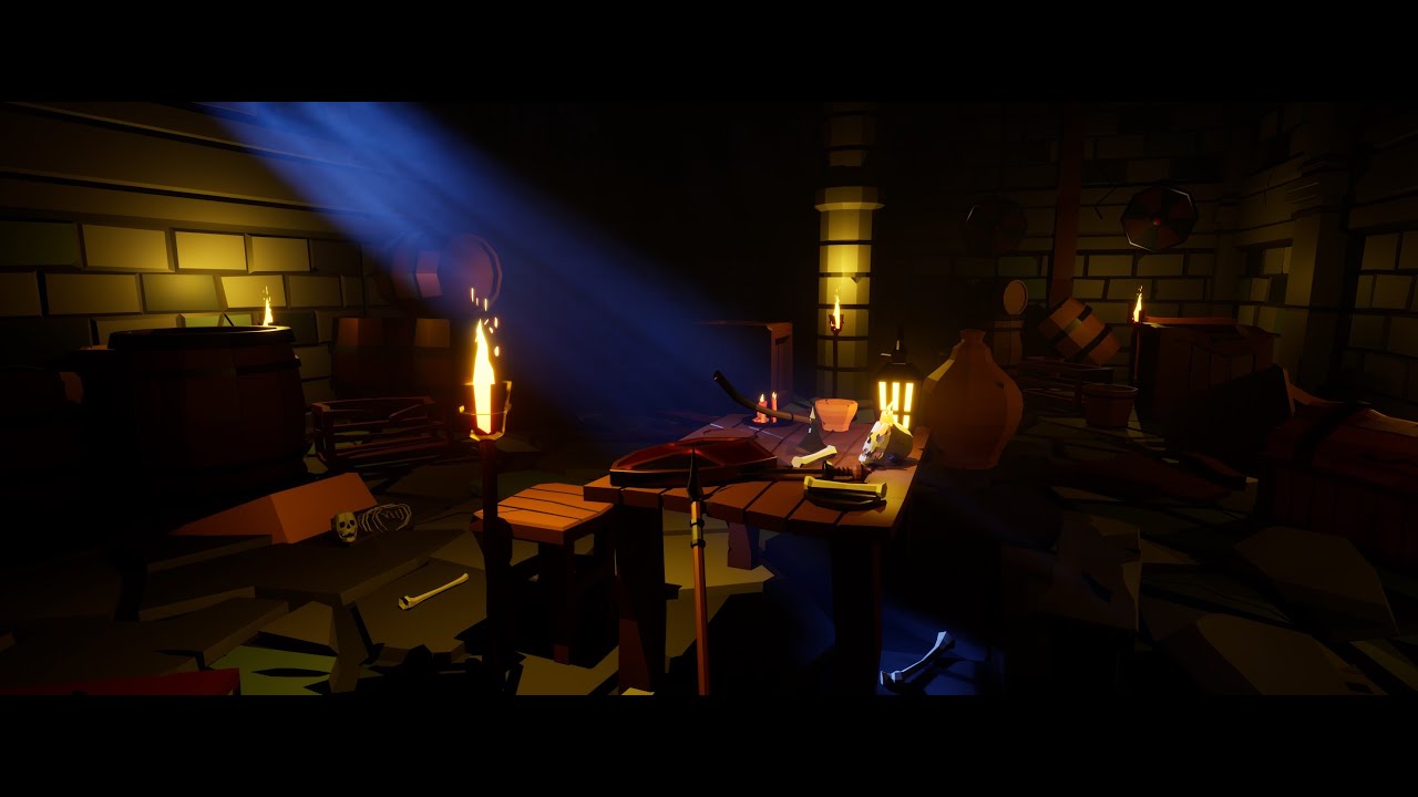
And here is the final render:

Some lessons were learnt...
  1. Even best plans will crumble in face of bugs. I was planning to finish ‘architecture’ part by ~Wed and do lot’s of props. So that I would have whole Sat for preparing final render. It’s not a new lesson for me… but I keep being reminded about it on every project :sweat_smile:
  2. When working only in Blender it’s much easier. And I’m not talking about just moving data between different applications. More about that game engines are much more unforgiving and will show any little mistake you make. Plus you have different shaders to worry about, different lighting model and in general different ways of doing things.
  3. Contradicting the above - having the ability to “play” (run in real time around the level) is super cool.
  4. Night scenes are hard. Night scenes with volumetric lighting are super hard. Real time night scenes with volumetric lighting are extremally hard. And even new Unreal’s global illumination solution (Lumen) don’t help that much here.
  5. Low poly is fun :smiley:

And I recorded a short video from that room:
5 Likes

What weapon do you plan to have? Looks promising so far, good job!

3 Likes

So far I have those ones:

And I did rough outline in my checklist of what more-or-less I want to make:

image

I will probably end up with 50 or more models for weapons :sweat_smile:

4 Likes

Great progress and so many problems overcome.
Definitely stay in Blender!
Just need a game engine back in it! For those as want it.
Dark is stylish and fancy looking but an asset pack would probably be used in a variety of lighting, so much is lost in the dark.

Weapons auto generate them!

2 Likes

Thanks!

Ha! There used to be a till 2.79, wasn’t it?

I actually don’t mind this separation of purpose. That way Blender can focus on what it does best and add features around it’s core purpose and game engines can focus on pumping as much triangles as possible each frame :).

But who knows… maybe such convergence will come at some point…

That’s a good point! Maybe I’ll need to add some ‘daylight’ levels or otherwise some parts of the map with bright lighting… I have to think how to achieve it :thinking:

Ha! I was looking at this the other day and have this course wishlisted on udemy. Too much stuff going on at the moment to start new courses… and the new environment course has priority!.

2 Likes

For some reason, I assumed the player will only have one weapon but you got a nice selection there!

May I suggest adding spikes to the club? It looks more like a bat at the moment. Or you could make the top larger.

By the way, you can add a torch for the player to get through dark levels. When I finished that part of the course, I made 4 levels in Roblox (it’s just an easy platform to test games/assets lol). I based the gameplay on switching between the sword and the torch. There was a dark level with holes in the ground that triggered the death event if stepped on. You could implement something similar rather than adding well-lit areas. Darkness suits the concept of your game better in my opinion!

2 Likes

All good suggestions! Thank you!

Right now I didn’t scope the ‘game’ part of this project… I have only a rough scope for the ‘asset pack’ part of it (which I am specifying more as I go). The minimal scope of the game will be a simple character controller that allows for walking through the dungeon.

After I finish that I will consider what kind of game I want to make out of it… at this moment the possibilities are endless… from TPP action game to turn based RPG like Ishar/Eye of Beholder/Might and Magic. I will probably try to make it rather small (couple of weeks of dev time) though.

Just a quick update… I hit the wall… Literally… Moved on to make doors… and realized that the doors in the course were not designed with gameplay in mind. Why this is a problem… tl;dr: FoV in games vs ours (longer explanation here: Why the doors in games are huge - YouTube)

So I started to do 4m tall walls… This will slow the progress down by a few days.

Here is the beginning:

Made out of the 2 modules:

This is how different rooms with 3m vs 4m walls fee (with still ‘too small’ doors):

3 Likes

The relative scale of objects in game is something I never considered, thank you for that.
And respect for working on such a project. How is it doing in terms of performance in Unreal Engine 5?

3 Likes

Yeah, I wish Grant would have a lecture on it… or at least point that this might be a problem…

Thank you!

It’s ok… This is low poly stuff, so by itself it is quite performant. Ofc. the volumetric lighting and such will cost some performance, but this can be manage by quality setting (and just turning it off or faking it with simple planes+textures). I doubt that I will go crazy in optimizing every little bit of it, but managing ‘quality levels’ is not hard in unreal.

And for such a project (low poly) I think any modern engine would be ok to do it in.

1 Like

Today was busy day out of Blender… All I did is a wall… it’s not much, bur it’s a honest work!

Built out of 4 variants (5th is placeholder to finish tomorrow):

4 Likes

I think your big wall has subsidence, all the angled cracks go the same way! The left side foundations are sinking. :rofl:

Continued good work on your project.

The door thing is interesting. Seeing those games not only are the doors big and tall but that makes the rooms extra tall too.

Solution, make proper sized doors work for players, by players living real life with one eye covered to make life more like games!

Oh, must be the same for those into architectural presentation if making a virtual representation to walk round?

1 Like

the bottom/top might not be visible for ‘normal walls’ as I plan to add socles/facades (I don’t know the right English word for it)… basically those parts:
image

as a separate modules to put on top of the wall.

Overall the irregular shape is to hide tilling a bit, so 2 walls near each other overlap a bit. Plus the crack are going from one wall to the other to further hide the tilling effect. On on the game engine side I am thinking about putting some randomized color variations (basically grunge map) that will go across modules to hide it even more.

I went overboard with it, but I want to make this as awesome as I can. Normally, in game there will be loads of clutter, columns, stuff on the walls etc. That would made the tilling alone barely noticeable.

Thanks! And yes sir, I will sir! :vulcan_salute: :grinning_face_with_smiling_eyes:

One cannot unsee that video… and now I will see it everywhere :eyes:

:joy:

Or make it VR :thinking:. Though VR also have limited FoV… (and I have it as a ‘nice to have’ goal already on my list :sweat_smile: ).

I was imagining that ArchViz was aiming at accurate representation of interior :thinking: Will definitely pay attention to it next time I see some ArchViz video.


Btw. those walls from yesterday are probably too much in terms of low poly (~5k triangles for double sided). Will probably mark them as high poly if one could try to use them on mobile or a toaster :wink:

1 Like

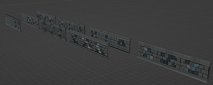
Short update… That took way longer (also because of RL stuff)… But I finally finished new set of 4M tall walls. Here they are after importing to unreal:

Overall 30 pieces (with a few ‘base ones’ not show above → for making new variants if needed), all tillable.

Now 4M pillars (those should be fast) and wall trims/facades…

3 Likes

You will have to increase the height on door modules too presumably.

1 Like

Privacy & Terms