Thanks
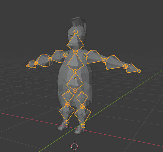
Maybe turn the nose and runner just a few degrees to get a slightly better profile of the nose?
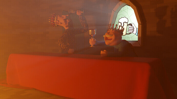
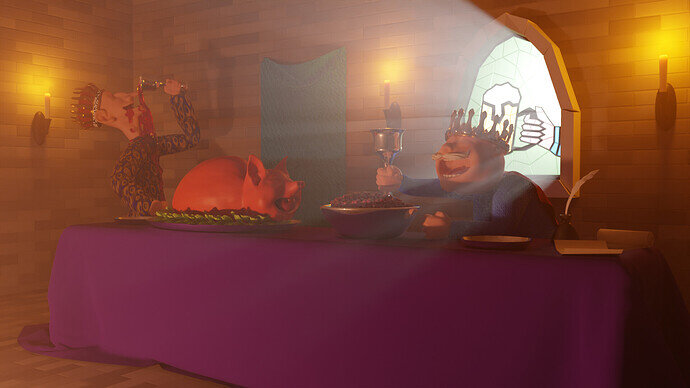
WIP Drunk as Lords
Having fun with fluid sims, a bit tricky. I figured out the back wall spherical haze, it turns out my haze box that I had the volume scatter in was just too small and needed to be bigger than the room. One I scaled it up, it went away.
We @BlenderCollab have a few days to vote. You can vote fast but also think slowly about design, colors, technique, difficulty, subject, realism, etc. Choose consciously and not on your own entry.
And the new subject week 13 " Snow flake society ” has already started. The winner of this week’s “Idioms” challenge may select a subject for week 14.
Great entries on a (for me personally) difficult and cultural subject. You all did a great job.
Saw you msg but was too tired last night to implement
This topic was automatically closed after 13 days. New replies are no longer allowed.
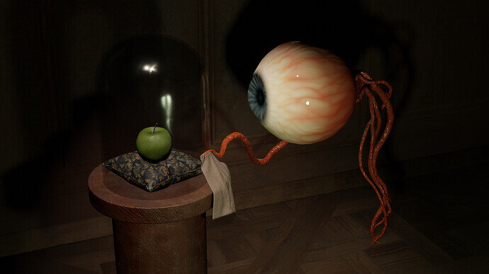
@Cathy_N , congratulations on your winning idiom “You are the apple of my eye”. I think the composition is good and a well-told little story. The lighting does the trick, focusing on the idiom subjects. And the “caring for” is well expressed. You’ve submitted your entry at an earlier stage. Still time to improve the little details we like so much … well done!
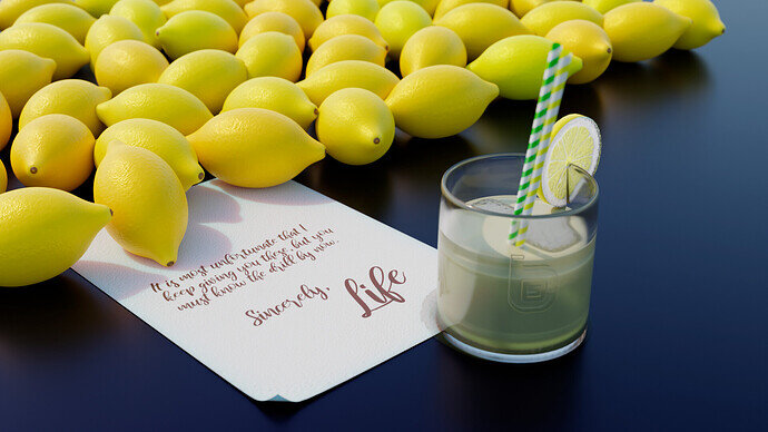
- bitpatio - great scene. A well-deserved second place. The lemons are beautiful, but their position looks to ‘mechanical’ as lined up in one straight line. A nice touch would be a half lemon, because of the piece on the glass.
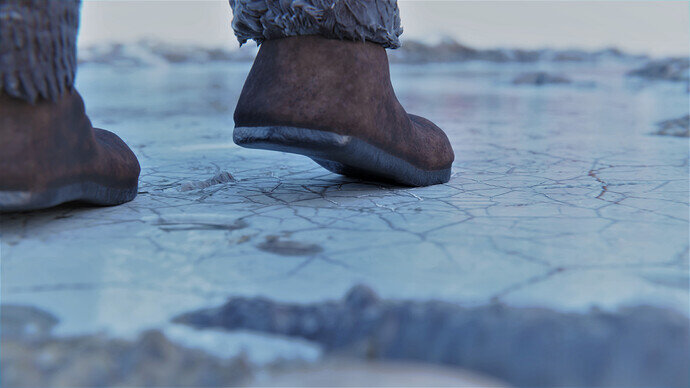
- ZachDude - I recognized this one as an idiom. I think you focussed so much on the ice that shoe details were forgotten/simplified.
- sezpul - great lighting as in a foggy, filled with smoke party room. Most action goes to the upper half of the image But the table cloth has a lot of presents in the scene. Tilting the camera bit, less table, more room for ceiling chandelier …
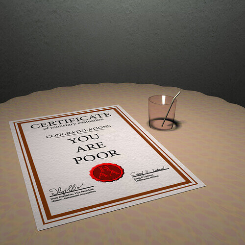
- Kasimir - Add more details to the scene. I’m not familiar with this idiom but expresses poverty more … Cheap, worn-out table cloth, used wrinkled paper. Try to tell the story to the viewer in image expression.
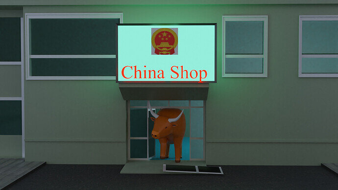
- Rao - Storming the market … but I think you could have spent more time on basic details like the size of the building and windows. They feel a bit out of scale.
- Yee - love the simplicity of this one. Really! But having a good idea and a final illustration can be difficult. Maybe you didn’t have the time.
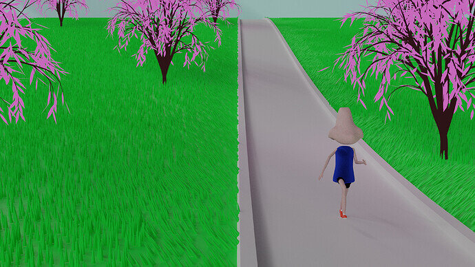
- Willrun - Great idiom, even I could read, interpreted, your illustration. But the scene looks surrealistic because of the hard colors. Which shouldn’t be a problem, but then, somehow the composition doesn’t match. I would have dropped the shadows, making them flatter. More a 2D illustration.
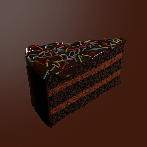
- deezy - Also a very good, readable, understandable idiom (from my point of view and knowledge). Just a piece of cake. But it is just floating in space … add a spoon, a dish. Adding details to finish the composition.
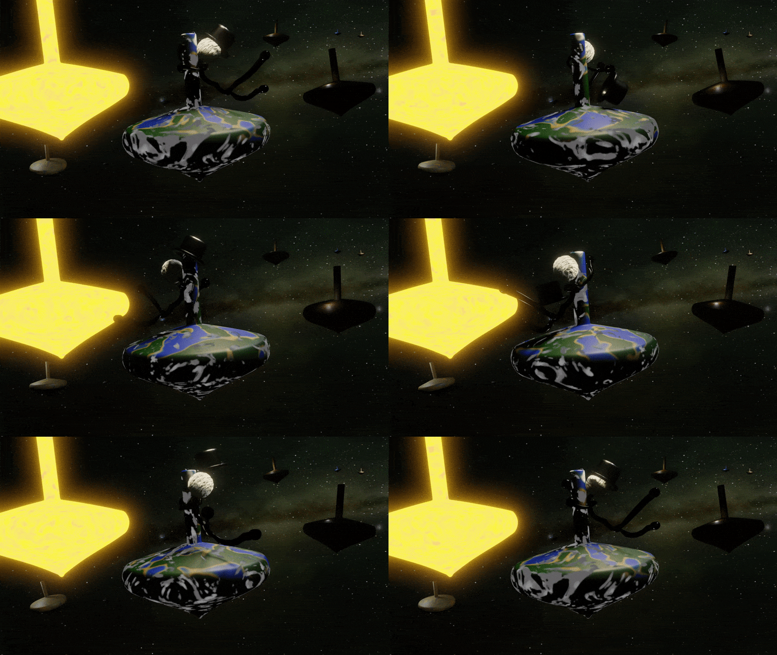
- Kax - Very recognizable idiom. But for me, the hat is too disturbing. It’s dark to see, but it ‘consumes’ all the viewer’s attention, trying to recognize the object.


