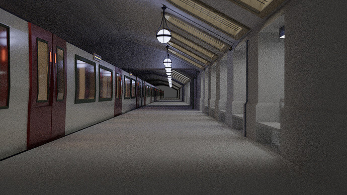
Made some station interiors and aligned the scene, also facing problem in panning around with the camera as the scene is of small scale. Next step is to add in some textures and tweaking up the lights. Maybe remodeling the train as I can the low poly triangles here n there. Hope I could submit on time. 
Great work so far getting the whole platform and walls done. Nice lights. Reflecting well in the train windows.
If I might add 2 cents - You have angle windows with no lights - put through some cool white arealight to simulate sunlight.
Add volumetric fog with in the area to get some god rays. Keep in-house lights warm white - it will add two contrastic colours and should make your image pop a bit more.
Guess who was there  I start to late so i never have time on lighting and camera settings, I have to find some good tutorials about that.
@Orion_Dauter Like it a lot, but i think fog is too dense and I can’t see the details or it’s just my monitor settings
@Exitus19 ninja turtles are close to my heart, I like this style.
Edit: i forgot to add image 
@Marijus I’d love to get some cool ray effects but still don’t know how to get there, already went through so many tutorials. Like I wasn’t even knowing about the spin tool, wiremesh modifiers n so many other stuffs. But I’ll surely try some fog if it’s not too time consuming. Thanks for the tip. 
You only have a few hours left to finish work on “Underground”. And what you find in the underground, you can display it “At the museum”.
The new subject for week 08. Have fun, keep it safe.
There are few changes you can make with a few clicks.
- Shade Smooth the roof. To preselve sharp corners, Object data Properties > Normals > Auto Smooth.
- Where you can, add edge bevel. Edit Mode, Select edge (ctrl+e) > Bevel, mouse wheel add few subdivisions. Repeat above on the same object to have smooth corners, while retaining perfect flats.
- Delete one of the doors, mirror then array. At the moment they are a bit diffferent.
- Make back wall black/dark gray to imitate dark tunnel with no light pass the station.
Overall - great work. I just wanted to share few tips that I have missed in my early days. Keep up the good work.
Denoise option
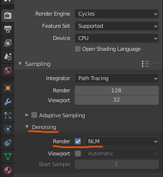
More samples is still better for low-light and interiors.
The viewport one is also useful.
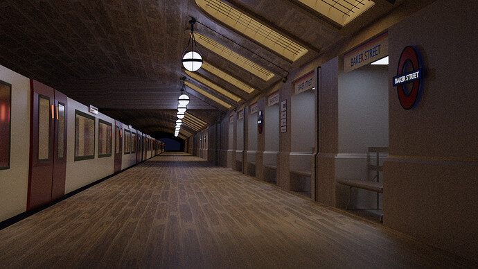
Thanks all for sharing such important tips, I tried to tidy up the scene, but I know it could have been better. And unfortunately I couldn’t complete the texture part: my mouse’s done, just managed to add in a simple texture, with keypads. Mouse is really a big deal  .
.
Anyways this will be my final submission.
And it was fun to be a part here, also learnt new things. 
Because of the new texture, I find the lighting much improved.
but maybe, it is a more personal taste.
Great entry.
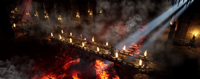
There are just couple of hours till the deadline. So just in case to avoid Murphy’s Law (e.g., problem with internet connection just before midnight) I’m submitting my render.
It’s called “The Last Stand”. Gurukk is saving mankind from hordes of undead!
Heavily inspired by Lord of the Rings (Mines of Moria) and Dragon Age (Deep Roads). Will keep tweaking it more, probably till the last minute  .
.
 How long did it took you guys to be at this stage, making some super scenes. I’m wowed.
I cannot speak for the others… but I’m beginner (6m maybe of Blender practice + longer in unreal and unity, maybe 2.5 years in total). Obviously I used some assets (like the army of skeletons) and my previous models (e.g., Ogre). I actually never did such a complicated scene as the above… @FedPete and @NP5 are to blame for teasing me 

wow just 2.5 years… now I’m too motivated. 
But seriously love this entry.
That is amazing!! great work I love the atmosphere and theme
Time is irrelevant. Experience is.
My advice - don’t be afraid to post your work. Everyone will do their best to advise you. Ones with more experience will see their own mistakes in your work and will guide you to be better.
My biggest hinderance was that none of my work I could share as it was all NDA projects.
I, personally, have over 5 years with Blender, +years in Solidworks, +years in 3Ds Max +years in AutoCAD. None of these years matters. Experience comes from continued work in a field.
I might not be able to share all my works, but will give advice where I can.
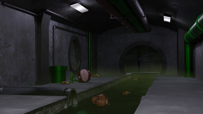
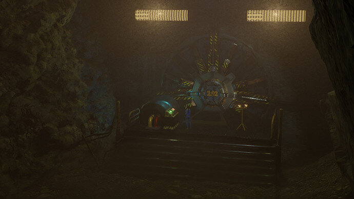
Updated the lighting and the volumetrics, there are some weird artifacts but I think it looks better than the original overall.
It is better. Few cents.
Grill is for lights? put two horizontal cilinders in each emmisive shader - obvious relation to real world flourescent lights.
Entrance would have some external lights to guide the way to the vault. Raise luminance by putting spot light with wide blend(soft shadows) from top towards the entrace (street light). It will light up the scene and focus on elements that matter. You have to highlihgt the area/message you want to express.
Maybe put another partial light as if behind the frame to show that there is a path leading to the walt.
A personal question;
How did you end up here?
Most are students. Me since 2016 when I did the old Blender 2.79 course and stuck around. I can imagine you don’t need these Blender cources anymore.
I am self taught - youtube, udemy, this site and many other sources. In a past I’ve been given task to accomplish and no one cared where I get skills to improve - I had to learn as I go.
There are some skills (gaps) that even experienced person can learn in a new course and find a better ways to accomplish certain task or even find new ideas for the project.
I joined as I needed a challange to improve myself (other than constant 3D project visualizations from drawings) and a chance to learn something new. I constantly discover a new ways to improve in my workflow or to try a new artistic approach from pelople in this community.
If I can help - I will. I want new ones and members people to see that there is one more way to see the task and accomplish it. Some will take challage in most time efficient way, some in most artistic and some in most real to life image. Latter is my goal… and all are relavant and important to everyone browsing this community.
Some images shared might look avarage, but it might be a lightbulb moment even to the most experienced ones.


