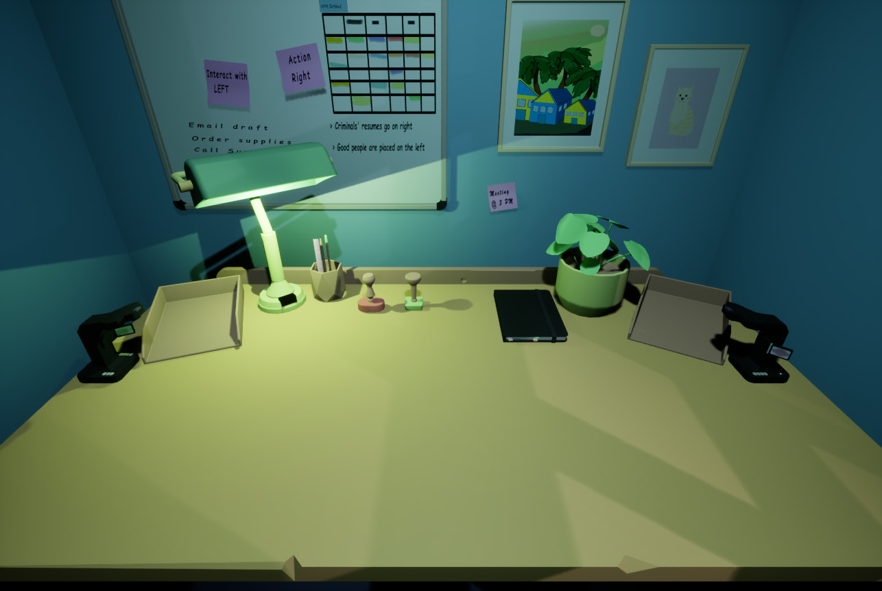
There are a few constraints: the camera cannot move left or right, and everything needs to stay simple. I am not very happy with the lighting in particular, but that is always a difficult area for me. All opinions are welcome.
The center of the (camera) scene is where the subject is located, but now it is empty (desk). Therefore, there are no standard aids to guide the viewer to the subject.
The perspective is that of a surveillance camera. But also that of a first person, only there is no indication to the viewer which of the two it is.
Add the main subject in full detail (a typewriter)
Add some stuff to clutter the desk, but not to much otherwise it draws the attention too much away.
If it’s a cubical workspace, show more of it. It gives context to the scene.
Play with colors. Now it has the same color space (greenish)
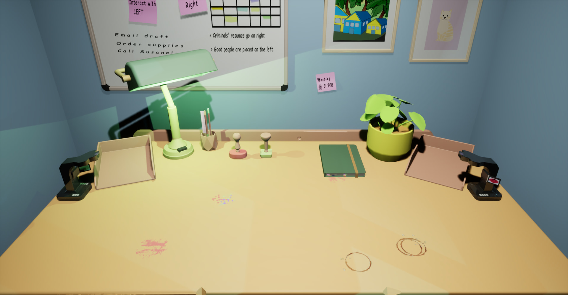
As for lighting I’d recommend an area light pointing downward. Use Hex #FFCAA9 or #FFCAA9FF depending on your blender version. Adjust the size and strength depending on how strong of shadows you want.
For camera. I’d use a focal length of 35mm and you will need to move the camera closer since it will be a wider angle. This will remove the Closter phobic feel. Unless that’s what you are going for.
I probably shouldve mentioned this is the gameplay view from player perspective, and that area in front gets filled with items during gameplay so I cant really put anything there. I didnt fully think everything through when wrote question, thats my fault. Other than that you guys gave me good insight to think about and improve on, thanks.
In that case, you must show the player which items can be picked up/manipulated.
Give him a visual cue as to which items are operable. And show some marker to say, he’ here will will the action take place. Like a mouse mat or alike.
But it depends also in the given context of the game. Which is part of the story flow before you’re sitting in front of this desk. Purpose of sitting here with the object in front of you.
If it’s a game area, I’m guessing you’ll be putting things in the paper trays during game play? Otherwise, put paper in the paper trays to make them look in use
The desk is very spotless, except for the nicks in the edge - if textures are an option, scratches, nicks, maybe circles from a coffee mug, pencil/pen marks from when you’re so tired you slump and fall asleep and the tip of said pen/pencil slides across the table (completely not speaking from experience ^^’ )
The edges of all your desktop could do with a bevel - even just one extra edge close to the other one would go a long way. At the moment, they are super sharp.
I love the atmosphere you’ve got going, though. Sorta cozy homey feel meets efficiency. And I can completely see a game being played in the focus area
Edit:
I just read what the whiteboard said - nevermind the paper trays xD
Thank you everyone for your insights. I made some minor adjustments and published the game on Itch.io. I will do a proper post a bit later. Here is the link for now.
I love what you did with the lighting! I can see the green notebook now, instead of the black phone/ tablet I saw before
And the tabletop looks really used and lived-in now. Or lived-on? The whole setting got a lovely face-lift, and it just seems more real and less like a render. Well done!
I’d love to give it a whirl, but I’m on Linux. I might give it a try through Steam, but I don’t have a lot of time today to mess around with wine or proton.